I want to create interactive dashboard, for this I created component,
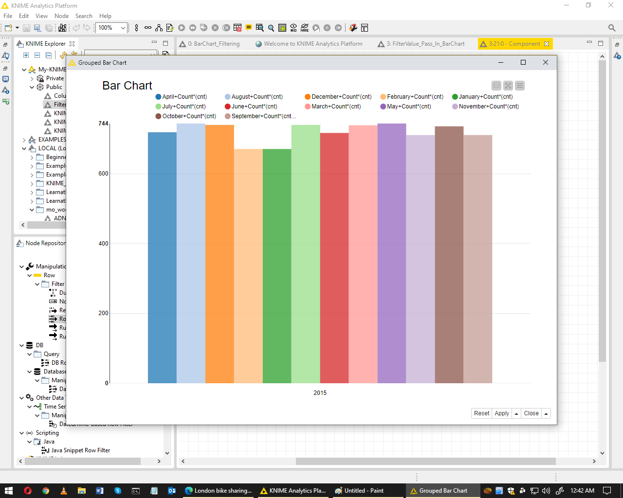
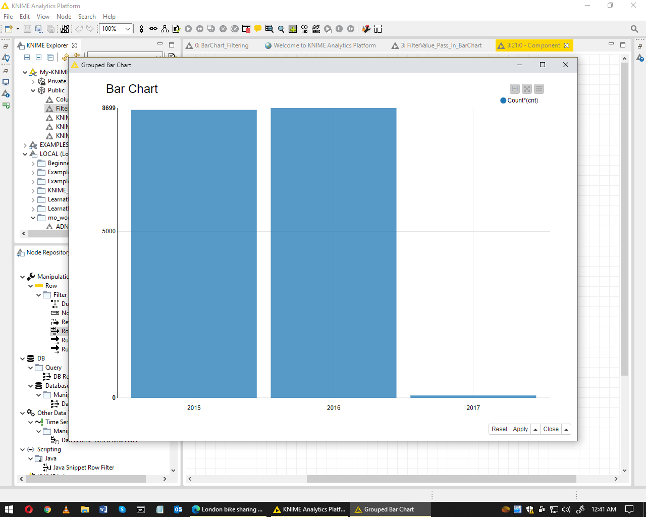
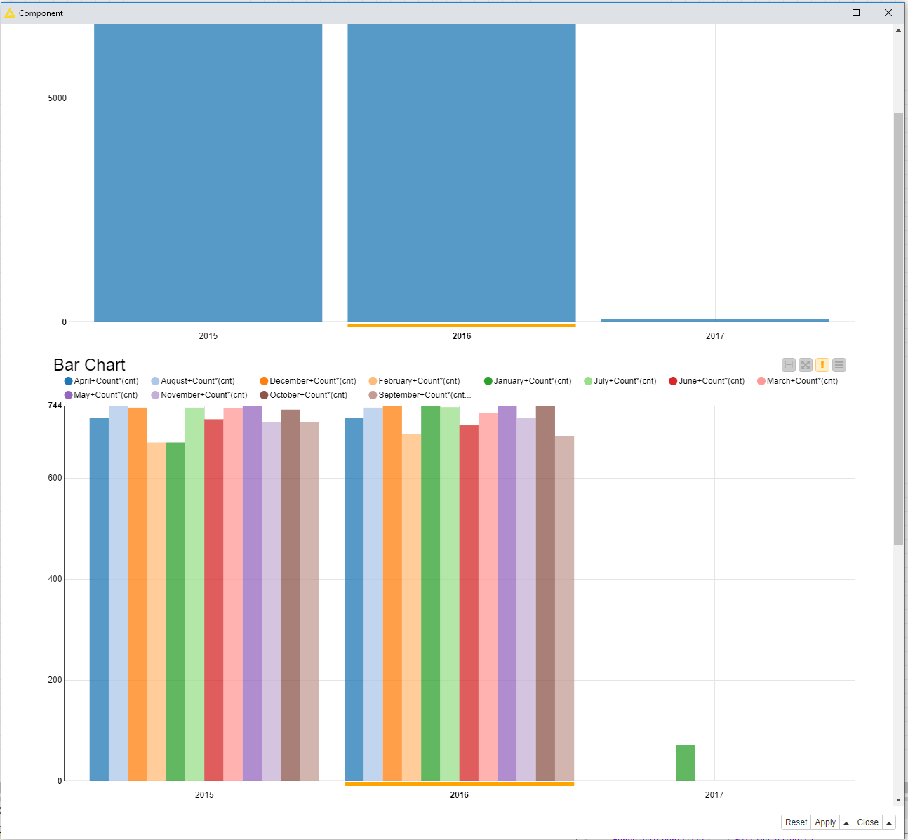
there is a first bar chart which shows number of records in years,
user can click on any year,
below bar chart will only show the month of the selected year.
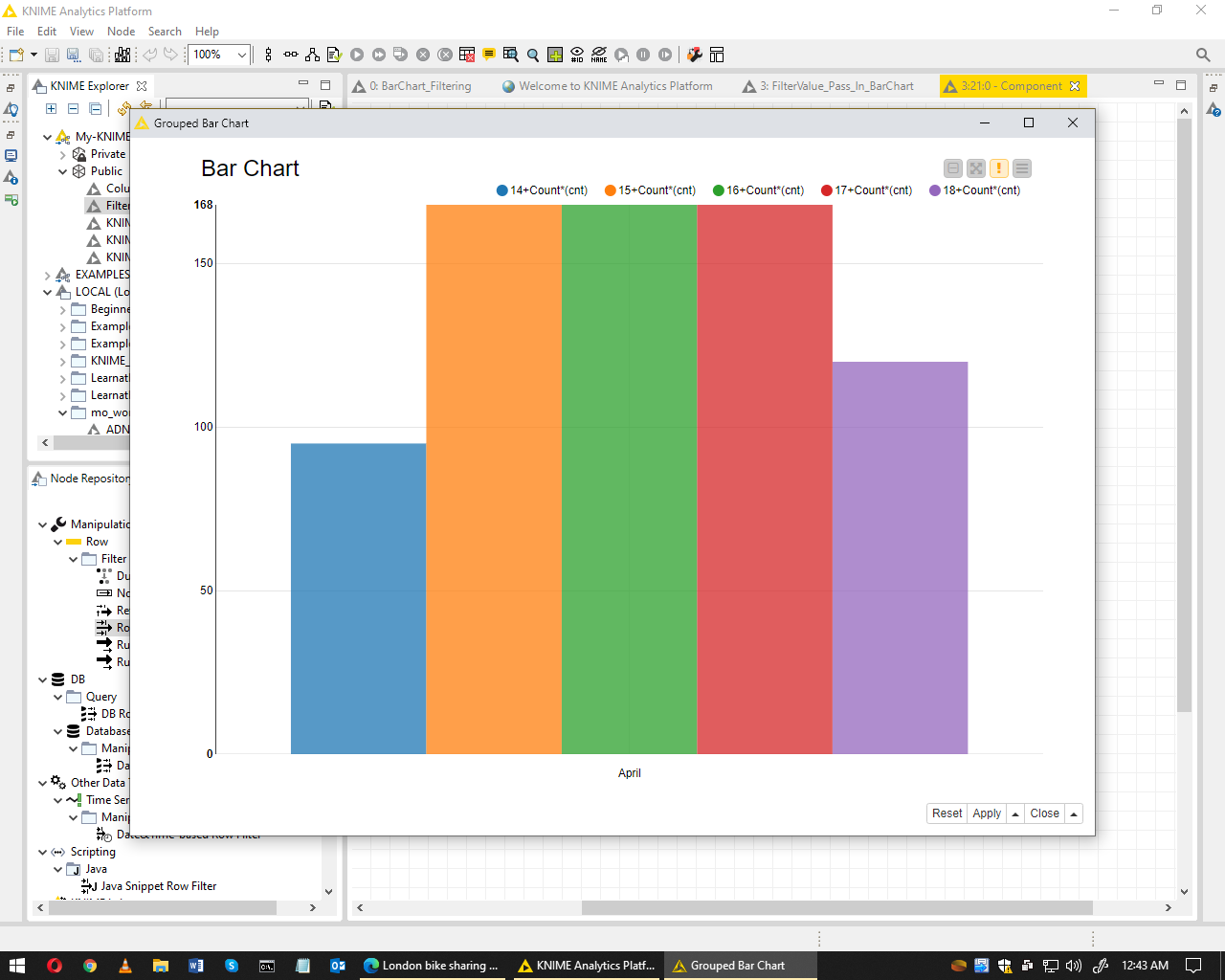
when user click on any month, another bar chart will show the week and so on
see the attached pictures, work flow is in my public space,
any one please tell me how can i pass the selected value to another bar chart
I am afraid it is not possible to show only the months of the selected year in the second bar chart. You will always see all months, and depending upon the bar selected in the first plot, the bars in the second plot will be highlighted with an orange line under the bars:
This kind functionality is possible, but not with all kind of JS views. If you have an option for filtering and selection in the plot configuration, it will work as e.g. with the Table View, the Scatter Plot, Tile View, etc. (often that is a checkbox “show selected only”).
What you could do is either have a component (=interactive view) for each selection step. Or a solution that is a bit complex and hacky: you’re having a plot for any kind of selection, write that plots as a svg or png image, put these images to a table, have a Table View and then show the selected rows (=images) in the Interactive View depending on the selection made. But that will increase the execution time a lot…
Another option is to use specialized tools like Tableau or PowerBI for visualization.
Anyways, don’t forget to check “enable hiliting” in all nodes that change the Row ID, like in the Pivoting and Groupby nodes