Hi @Jerome_G,
welcome to Knime and feel rest assured that pretty much everyone had it’s first data-encounter with Excel ![]()
For a beginner your workflow exhibits a really good and professional approach. So you can proudly say to yourself you made the right choice with Knime.
About your question, I happen to work with the Stacked Area recently and know your struggle. The option to convert to a percentage chart is missing in the new nodes. Though, you might use the JavaScript based simplifying the process. But, you loose control whenever you want to calc the average or median.
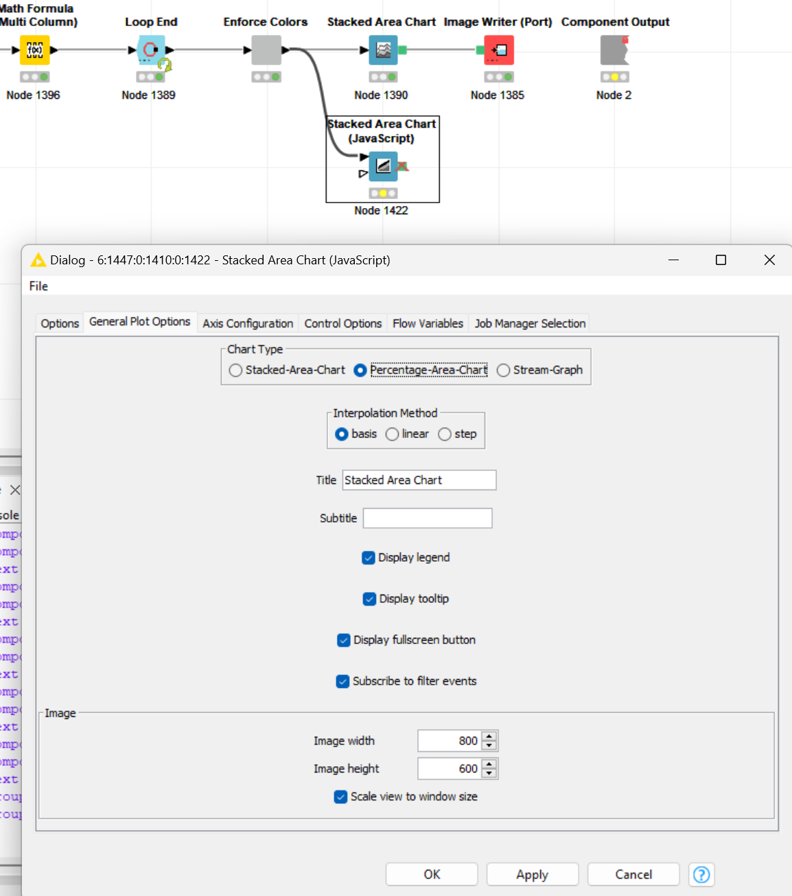
Knime Devs stated to have followed the pareto principle when integrating the new ECharts. I raised a feature request so maybe you vote for it to get integrated ![]()
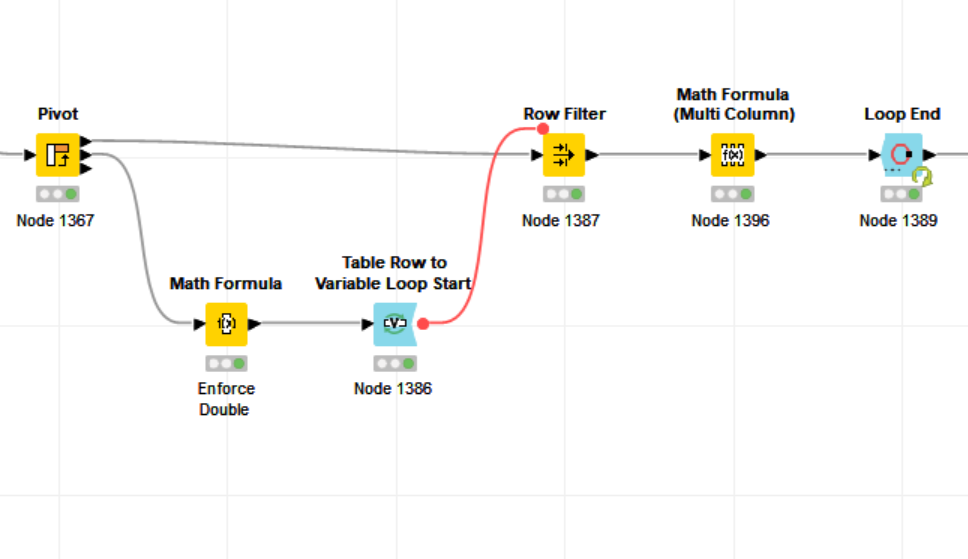
About your question using a variable, yes there is always another option. Here is mine:
- Calc totals via Pivot (note the 2nd and 3rd port provide totals)
- Loop per column or in my case row (depending on your data structure)
- Filter for column or row
- Do some math and you are done
Best
Mike