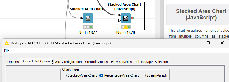
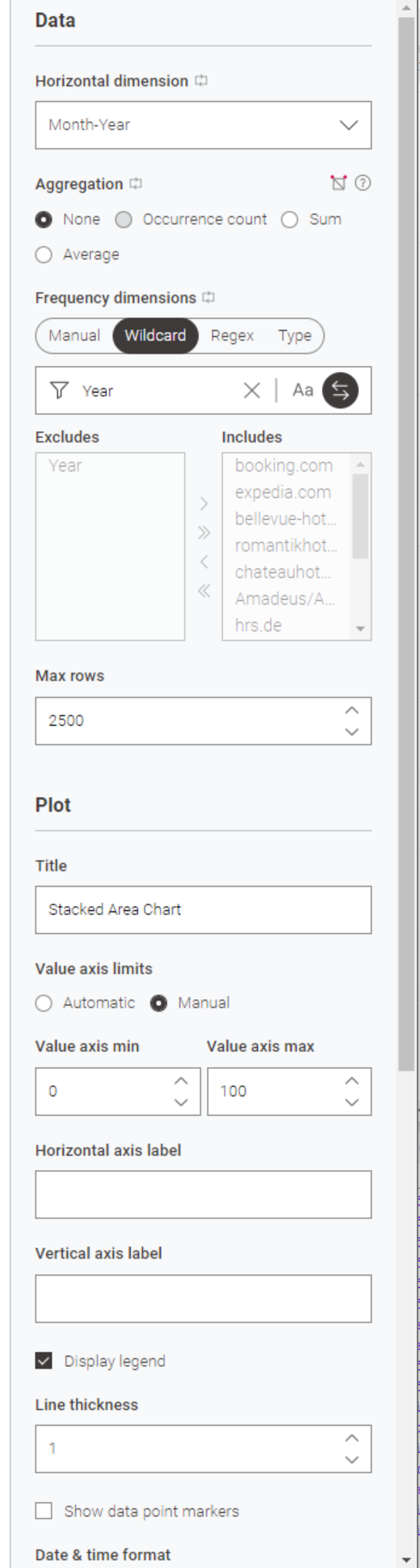
I was searching and trying like stupid but only after testing all new chart nodes and starting to go through the JavaScript based ones I realized the new Stacked Area Chart node misses the option to switch to percentage based representation.
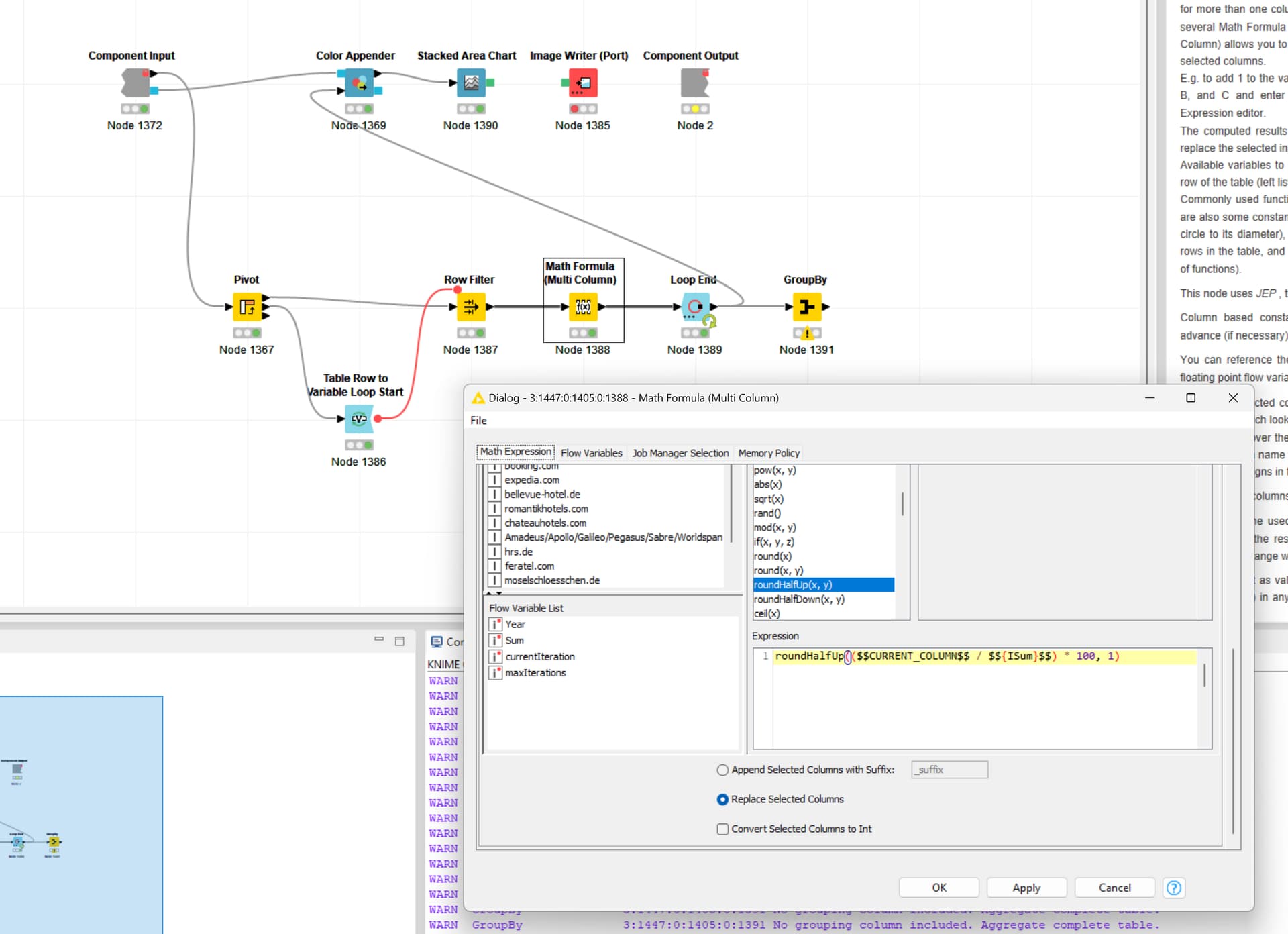
currently the way to achieve a normalized Stacked Area Chart would be to use a Math Formula (Multi Column) to normalize all columns. If you have many/a changing number of columns, use a Column Aggregator for calculating the sum prior to the Math Formula (Multi Column).
One of our goals with the new View nodes is/was to focus the nodes on the ~80% most common use cases, and remove functionality that is covered by 1–2 additional nodes. It is good that you raised this case, of which I am uncertain whether it falls in the 80% or not. I suggest we wait and see, if this topic attracts votes.
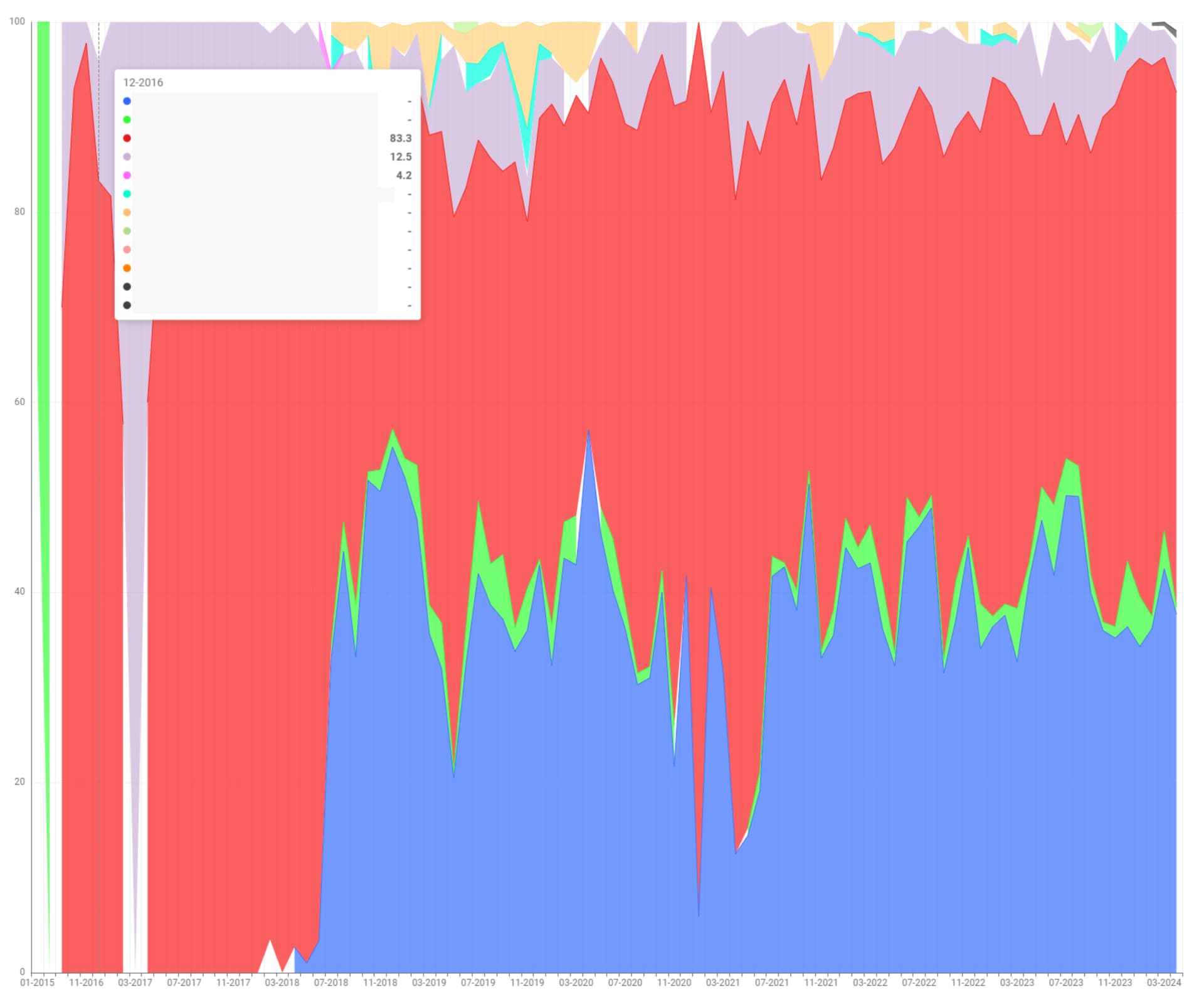
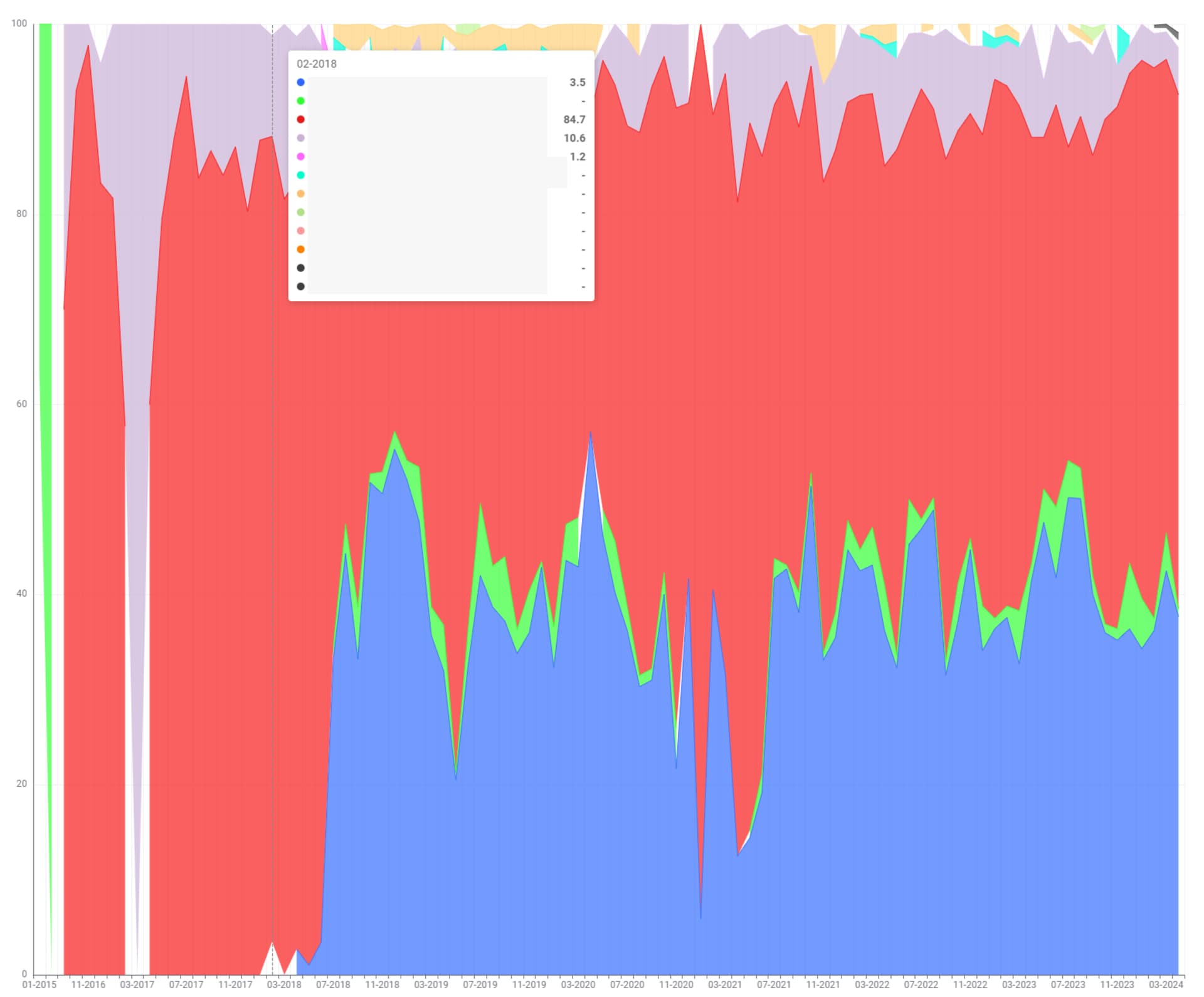
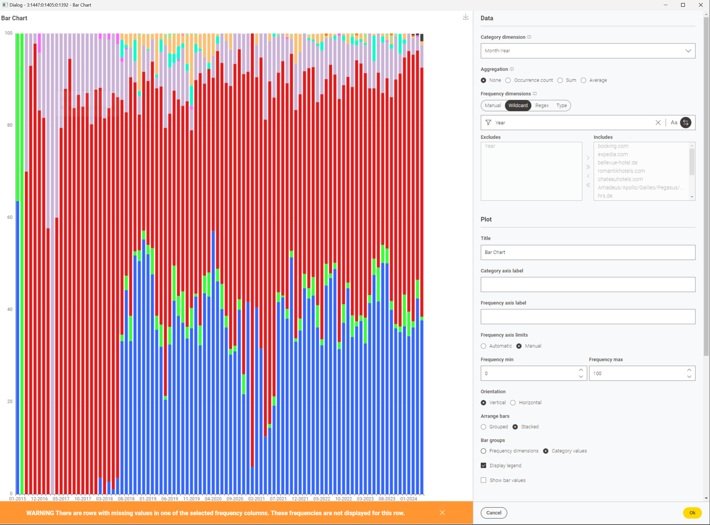
something isn’t quite working here. Regardless if I use round to int, round half up or down, on many occasions the total, albeit adding up to 100, creates holes.
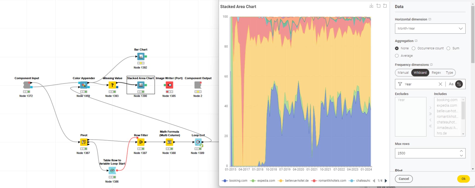
To my surprise, using a missing value nodes to insert zero, it fixed the display. Since this is another issue, separate from this feature request, I will create a new ticket.
Thanks for the detailed description.
We will need to look into this. Not showing data that is there definitely is a problem that we should fix.
However, treating Missing as 0 might also be unexpected, given that the Line Chart leaves gaps. Maybe we can come up with something better here that works for exploration as well as presentation.
Glad to hear using the Missing Value node got you to the expected result.