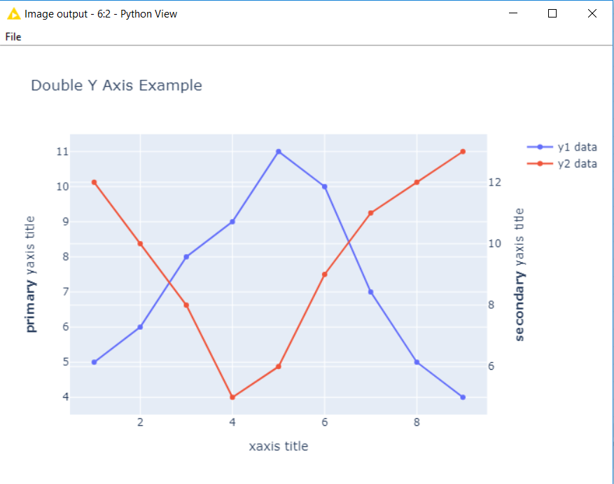
Is there a way to do either of these in KNIME? I can’t seem to find a way to configure Bar Chart (JavaScript) or Bar Chart (JFreeChart) to have multiple Y axes; is there a different bar graph option I can use to do this? If possible I would like to have the secondary Y axis be a line graph with the rest of the data plotted on bars but that’s not critical.
You could use the Generic JavaScript View node to generate such a plot.
One of the workflows on the EXAMPLES Server under /60_Innovation_Notes/02_Inventory_Optimization/02_Guided_Analytics could help you to get started. Check the Wrapped metanode “3rd Page View:Inventory Review”. The Generic JavaScript View node there uses plotly package.
Please add another one for me! I am trying to visualise correlated time series of different magnitudes.
Has anyone found an easy to implement workaround?