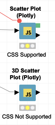
For the marker element in the 3D scatter plot, unfortunately you cannot use CSS via flow variable to change styles. This is because the 3D graphics are generated using the OpenGL graphics library which doesn’t use traditional SVG elements in the browser. This is also why these nodes do not offer the option to export an Image from the node.
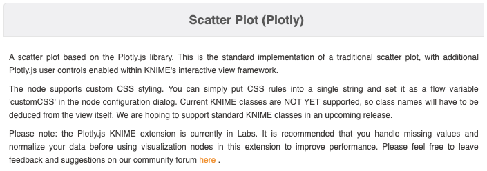
If you want to style other Plotly nodes, you can check in the node description to see if they support CSS styles. Most will support styles except the 3D nodes (such as the Surface plot and 3D Scatter plot). The example below of the 2D Scatter Plot shows the typical documentation for Plotly nodes which support custom CSS styling.
However, many of these nodes have an option available in the dialog called “Use WebGL graphics library” (see very last option in the dialog window pictured below). This option generally increases the performance of nodes especially with large amounts of data, but will also disable the use of custom CSS.
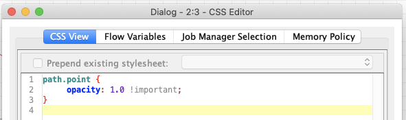
Note, while most of the Plotly nodes support custom CSS classes, they do not yet have documented KNIME classes like some of the other KNIME visualizations (documentation here). Hopefully, we can add and document these selectors for a future release.
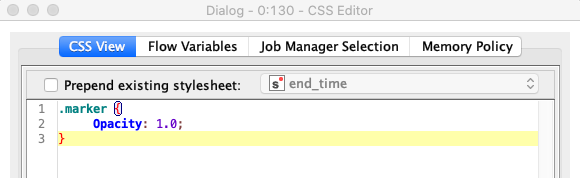
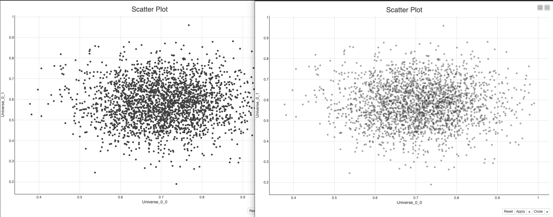
In the meantime, here is an example of how you can style the markers in a 2D Scatter Plot (Plotly).
If you use the developer tools that are available with the browser, you can generally find valid CSS selectors in the image. This does take a little bit of work (which is why we hope to add dedicated KNIME classes), but it should yield good results (as you can see on the left in the image below; the opacity was successfully changed from .5 -> 1).
Problem: X-Axis tick lables are not fully displayed because of their length.
Is there a possibility to set automargin:true for axis for a plotly lineplot via css?