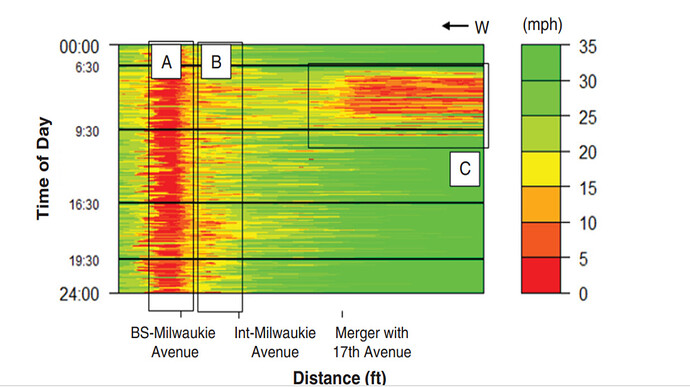
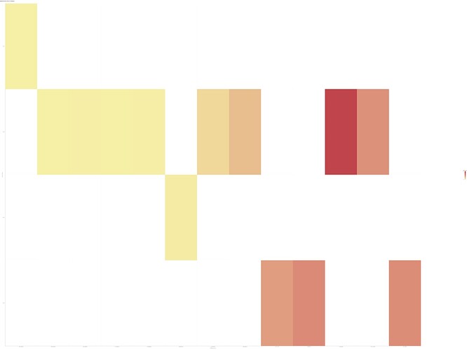
I’d like to get support on how I can use my GPS log data recorded from buses that has time stamps, coordinates, and trip details be used to plot a speed heatmap in order to identify the sections that are facing reduced speed (or delays). I want to obtain plots like these as attached here. I see that MATLAB can be incorporated into KNIME. But as of now, I havent got asolid ground to start with this requirement.
Hi @najath_ambalakk,
welcome to the Knime community. Without some sample data to work with, it is going to be challenging to provide you a suitable answer or solution. Would you mind sharing some test data please?`
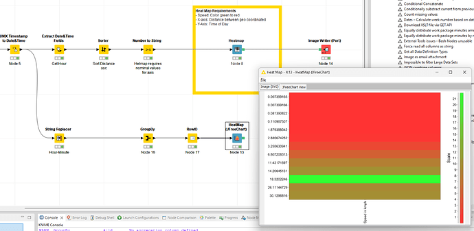
If that is impossible, I could only encourage you to check the Nodes and scroll to the bottom to find other workflows which use the Heat Map nodes:
Best
Mike
Hi @mwiegand,
Thank you very much with the workflow. It seems almost to have solved my requirement. But I have a few questions in addition that needs some more support.
- I tried to run them on my dataset. Following were some points :
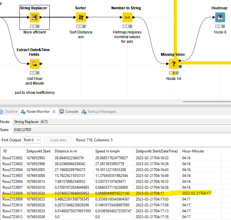
When the conversion of Date-Time is converted to Hour-Minute form, I had some entries which didnt change as some had the entries with no HH:MM:SS (seconds) in the data, probably because it was 00 seconds and hence remained as such. I couldnt figure out what the pattern in “STRING REPLACER” node “[1]+T(\d+\W\d+)\W\d+$” was checking to the changes myself.
- My logs are actually massive. With over 7-8 million records, of a single bus line (records of 4 months in one CSV) which looks like the data sample I gave. I tried to run the workflow with a group loop node, so that one trip from the whole dataset was selected and plotted.
If I need to get a continous high resolution speed plot as I provided in the figure earlier, how would i need to aggregate or modify it? I cant simply plot the whole dataset directly right?
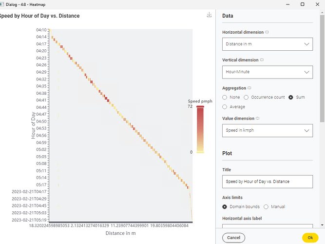
This is how the plot looks now for data of one trip -
Best,
Najath
^T ↩︎
Hi @najath_ambalakk,
glad to hear we are heading into the right direction. About the date transformation / extraction issue. That is happening because the pattern does not match. It has been an inconveniency for me quite aa long time but one I knew and how to handle. I took a few minutes to raise a feature request. Maybe you upvote it?
Back to the wrong values. Try this RegEx ^[^T]+T(\d+\W\d+)(\W\d+)?$ which made the second optional.
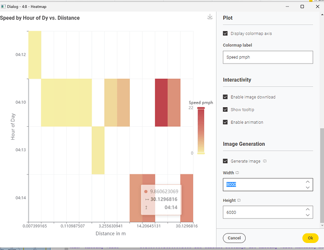
High-Res Image
Either you enable image generation at the very bottom of the config and crank up the resolution (less advisable due to processing bottle necks) or try using the JFreeChart HeatMap as it is able to generate SVG (Vector based images). Though, I haven’t figure out the correct settings yet.
Note: There seems to be a rendering bottle neck when previewing the generated image. I have a fairly decent system but the image rendering was stuttering. There are also font sizing issues as they do not scale but seem to be set in pixel.
Also worth pointing out the other feature request of mine to enable SVG generation in the new nodes ![]()
Here two bugs I reported which would love to see your vote too:
About the large heat map. You might want to cluster by hour of day as a minute wise representation does add little insights. Using the already present Extract Date&Time Fields node is then the best choice.
PS: I updated the workflow in the Hub. With more sample data I could have engineered is in such aa fashion that each column represents aa bus line which is what I believe you aim for. Though, you might give it a shot figuring that out yourself ![]()
Best
Mike
Hi @mwiegand Mike ,
At first, thanks for the detailed support once again. I have upvoted for the issues you mentioned to make things better.![]()
The issue with the string pattern, yes it works perfect now!
Since we are already in the attempt to fine-tuning the intensive dataset, let me go in detail about the problems and situation a little.
- One of the issue with the current data set (after my pre-processing) is, the direction of the bus line. As one could imagine, there should only be ideally a “to” and “fro” as per the schedule, but the records also show some routes which are deviated. A part of the problem is to be able to filter out the the ideal 2 direction routes and get rid of the rest (from the 4 month records containing 8 million records) to analyse further. As the heatmaps we desire, is to be plotted for 2 direction seperate and would not make sense if we have them all in 1 diagram.
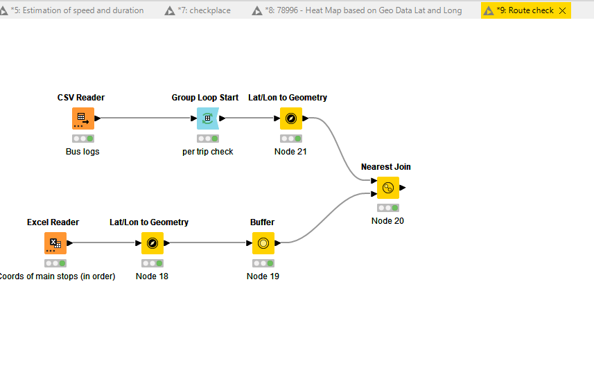
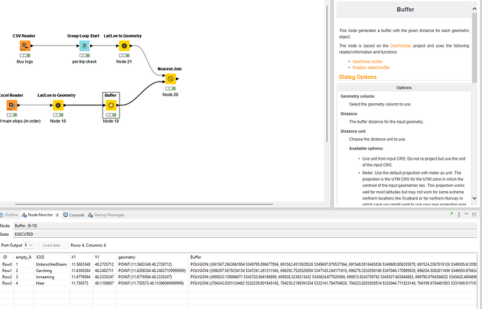
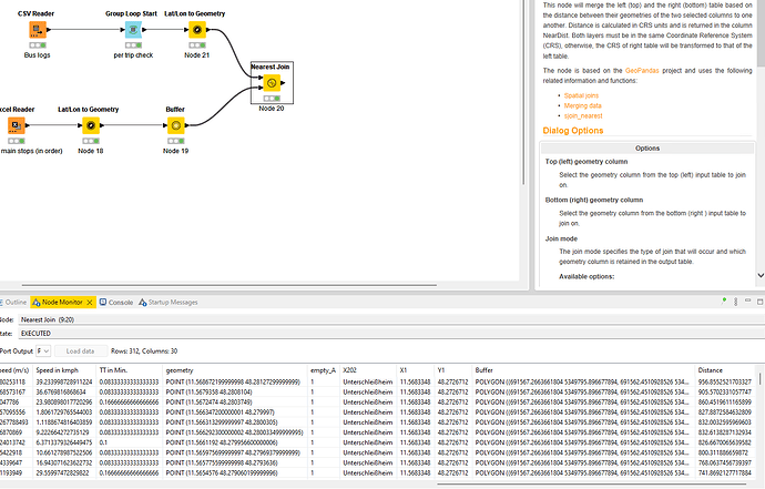
What I have been trying right now is following: I used the raw logs we have, and extracted the cordinates of 4 main stops that is present along the ideal bus route, created a 1000m buffer around them, and did a “nearest join” of the logs with the bus, assuming it would give the bus coordinates that passed through these stop buffers. What I presumably expect from this is that, if part of the logs are passing through these buffers and follows certain order, they are aligned with the scheduled route. Else deviated. I am not sure if this would actually give me the right results as I wish, but right now I am stuck at not being able to define the logic for the order of sequence check, to determine and assign the route.
eg: if it follows 1 2 3 4, then assign 1 as route or if it is 4 3 2 1, assign 2 as route. Your suggestions to modify the logic would be appreciated.
In addition, Is there a way I can see these logs on the map? I tried the osm map, but apparently they werent showing it either. To match it over map and see where these points are?
Here is the workflow I have been trying right now, but stuck at how to define a logic to do a check of order of occurence to determine direction:
mainstops.csv (266 Bytes)
onetrip_sample.csv (169.3 KB)
I have attached only data for a trip. This would have to be run for the whole record, for each trip to determine the route after cross checking with the stop coordinates.
- The second part with heatmap tuning would only make sense after the routes are seperated as mentioned in previous step, but nevertheless let me ask,
One thing to mention is that, the coloumn “Distance in m” is actually the distance between the recorded logs (each row) of cordinates. It wouldn’t logically make sense to be pliotted in the X axis right? The distance we need in the X axis should be the distance from the Start of the trip till the end, more like cumulative distance, so that it actually means the “location” of the speed variation (or delays).
I didnt actually get your point as how the aggregation could be done for these several trips with respect to time yet. Yes, at the end what I would want to see on the plot is, how much delay or speed is encountered at the sections of the route as an average of the speed of all the bus trips that passed through it, with time on an axis and the location of this speed, so that i can focus on the section that encounters constant delay.
I tried to incorporate a “moving aggregator” node and Group loop, assuming to split the records per trip and then calculate the cumulative distance in your workflow, but it didnt work as I expected it to.
Let me know when you need something more in addition.
Best,
Najath
Hi @najath_ambalakk,
albeit highly interesting, this is becoming pretty complex. I believe other community members would agree that everyone is happy to provide a reasonable level support.
Though, upon a certain amount of time was spend but the request is getting extended, more in depth support is required. We have bank holidays in Germany today and I want to spend some quality time with my family.
May I suggest to have one last look at it somewhere this week but if there is no finite solution that we connect on a commercial level?
Edit: Chilling in the sun now and letting my thoughts roam free. About the deviating routes which you described as
ideally a “to” and “fro
You could do a simple count of each from-to, than decide to either discard them to remove outliers or overwrite / harmonize the data i.e. if the total distance is within a certain margin, absolute or relative wise.
Though, for me the question is, pardon me if I forgot the data context due to the complexity and me writing from my mobile, how a concrete connection is identified.
Best
Mike
Hi @mwiegand ,
Yes, I totally understand the complexity and the limitations as to how much this community platform can help itself, I mean no pressure;)
I am also trying to sort this with my knowledge meanwhile incorporating help from here.
Reagrding the route identification, the said logic is still a little hard to implement as the count doesnt seem to be a good identifier for the massive record when I checked.
Thats why I though of checking with the stops, and a buffer region around it, and filter the ones that pass through them to determine the direction. But as said, its not successful yet.
Best,
Najath
Hi Knime community,
I have been able to sort the issue with route splitting. Meaning, now I have the trips that are only along one particular direction.
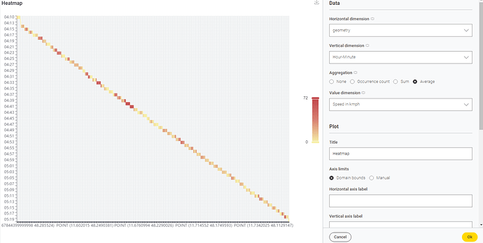
Now, I want to create the heatmap for all the trips aggregated. This is how I could plot so far, and following were the gaps I found and needed assistance with:
- I used geometry points as the values on X- axis, which I thought could represent better wrt location. So that multiple routes over same points would be represented meaningfully.
I am running a group loop node, to run the workflow for all the trips from the massive dataset seperate. But with the plotting, the aggregation doesnt work as I wish to see. I want to see the avaerage speed of all the trips that occured over the span of 5 months, during the operating time (eg: 5 am till 22),
Trip 1, from 5:15 till 6:20, Trip 2 from 5;35 till 6:40 etc,
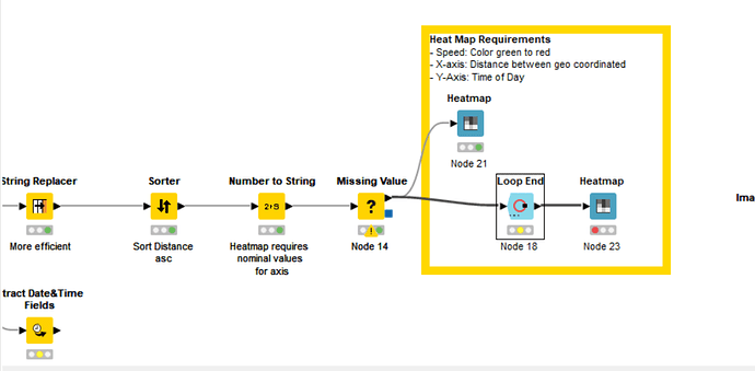
How would the aggregation be proposed? I couldnt plot the multiple trips, although I tried the group loop. They wouldn’t plot using heatmap after ending the loop.
- I realised there are limitation when it comes to customising the heatmap with color range and additional settings. Since it was the speed, I wanted the color scale with lower speed values( denoting congestion) to be red and the free-flow speed to be green. Is there any existing workaround or should I consider other options due to the limitations as identified?
Thanks in advance.
This topic was automatically closed 90 days after the last reply. New replies are no longer allowed.
