I am having an issue in the Report Designer regarding how to set which element stays in front of the other. I set the margin-top of an image as -10, and when opening thw report in my browser, the following happens:
I would start the other way around and reduce the margins on the graph. You can edit the graph in BIRT, click on the 3rd tab over “Format Chart”, then click the top entry on the left dropdown to select “Chart Area”, then click “Custom Properties” button at the bottom, then adjust the margins for a better display fit.
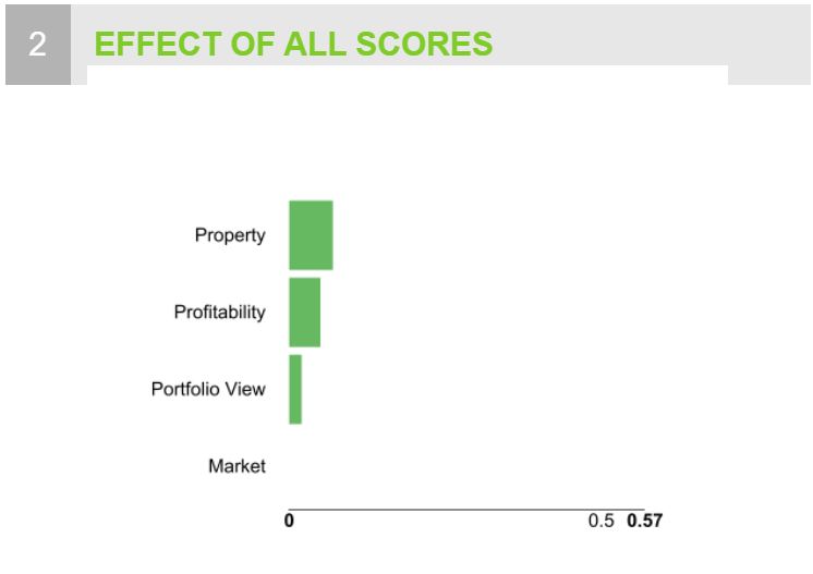
Hi, thanks for your answer! Giving a little background: the point here is that there is an upper bar ) in the chart (above property) that is set as invisible, so we can control the max_value of it.
Because of this workaround, the upper part of the chart has a quite big empty area, that we want to hide by setting the overhead in front of it. This means: the overlap is actually intentional, we just want to change which of them stays in the front.
So, even if we reduce the size of the graphic, we will still have this empty area. Do you know any possible workarounf for it?
The point is that here we are using the graph as an image actually, that comes from the workflow as “Image to Report”, instead of creating a “native” graphic in BIRT. This however is a great idea for further solutions we come to implement.
Did you try a negative top padding on BIRT cell where you placed the graph image? Can you share a simple workflow with this in the BIRT report? FYI - I typically find more workaround options by searching the BIRT forums on challenges like this.
Hello! Thanks again for the attention! So, I have tried a negative top padding, but apparently a padding property cannot be negative. I have created a workflow that simulates the issue
Now I see the issue. You are attempting to get around the lack of a parameter controlled minimum and maximum graph value by including a row and then not displaying it (however a space is left when it is not displayed via custom CSS). Unfortunately I don’t know a way of forcing a layered overlap to cover the blank space that is being left on the BIRT side.
Personal note - I find the lack of basic graph capabilities extremely frustrating as well. They ability to dynamically set an appropriate minimum and maximum value is such a necessary basic requirement for graph storytelling that it effectively makes KNIME’s graphs useless for most of my tasks. Another massive shortcoming is the lack of an ability to add and format reference lines / marks for things like Budget vs Actual.
I made a run at trying to use knime image processing nodes to handle the crop, but I can’t seem to get BIRT to accept modified images within the reports. I will post the attempt to see if the approach spurs ideas in one of the image processing heavier users. test_02_AI_Viz_Web_pdf2.knwf (140.4 KB)
This may offer you a temporary “non-interactive” solution for sending the image to BIRT with a defined max value in the mean time while we wait for an upgrade of the interactive bar chart. Haven’t tried it myself yet, so I am not sure if you can control the min and max via variable or not.
Hey @iCFO,
I totally agree that we are missing a few graph capabilities with the current views.
Thats why we decided to do a complete rewrite of our visualisation nodes. For most nodes we already added the possibility to switch form using the min max of your data to use the min max from your data domain. This domain can easily set higher than what is included in your data. Sadly this is currently not possible in the bar chart, as it is a bit more complicated for charts that are aggregating data. There exists a ticket for it, but we didn’t get to it, yet (internal reference UIEXT-389).
For the other point you mentioned it would be nice if you could go a bit more into detail on what you need. We recently introduced the possibility to add reference lines to the Scatter Plot node (see attached screenshot). It is very basic at the moment as you can define only horizontal lines at given values. Next steps would be to enable this feature also for other views and enhance the capabilities of this feature. So it would be very nice to hear more about your use case.
I am pleased to hear that the bar chart will not be neglected in the rebuild. It may not be as flashy on the presentation side, but it is often the best tool for intuitive communication to prompt management decisions.
If you are working toward minimum and maximum controls, then please allow us to pass those values to the graph via flow variable. Attempts at “automating” these values based off of the domain will fall short of user requirements because uses, preferences and story telling requirements varies so heavily. (For instance, our charts are often used to represent budget adjustments based on averages. When doing this, great care must be taken to visually display in a way that clearly shows average differences for decision making purposes without setting a min / max that skews a user’s interpretation of those differences.)
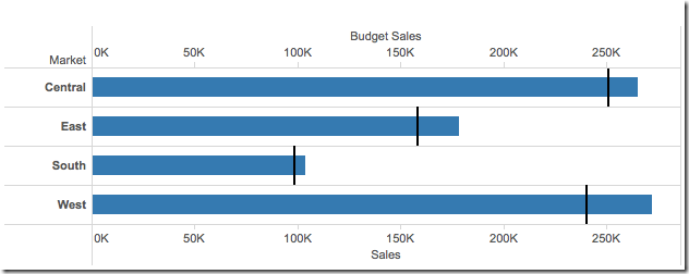
I utilize reference lines in all of my reporting. They are a crucial tool for displaying budget vs actual, instant visual feedback of changes applied during user interaction, and visual feedback as to how a change is being applied. Here are some visual examples.
This shows a basic image of a calculated “per bar” reference line that can be used to easily show budget vs actual within an interactive dashboard.
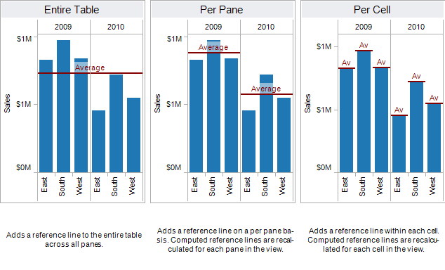
This shows other ways that I utilize reference lines to display different calculation practices. (Ignore the label of “Average” as this is not really a great use case for the need of this capability) Ideally all of these reference line approaches could be utilized, uniquely formatted and overlapped on the same chart, as well as multiple uses of the same type of reference line (aka more than 1 per bar reference line showing 2 different concepts, such as one reference line for budget and another for user proposed changes). A reference line controls should include color, thickness, percent of the bar area, value / labeling and “fill up to line” (this would fill the area up to the reference line with a certain color / transparency either in the background or layered in front of the graph.)
A strong upgrade of this interactive bar chart would be a massive game changer. It represents an entry point opportunity for me (and potentially thousands of other business users) to fully migrate from Tableau server over to what would become a much simpler and more capable platform of KNIME Business Hub.
In general, I would add that there is far more KNIME revenue potential for exponential growth of Business Hub with a heavier development shift toward highly flexible “business reporting friendly” interactive visualizations and user dashboard interaction control options.
This got long quickly… Would you like me to move this post over to the suggestions area of the forum?
Just wanted to add that I would definitely prioritize enhanced visualization options over “in chart aggregations”. We already have almost infinite possibilities to handle aggregations in the KNIME platforms prior to our chart visualizations. I personally can’t imagine ever using “in chart” aggregation options for review, adjustment and proofing reasons.
Maybe there are a few things that might be user friendly like combined total on a stacked bar chart for value display or something, but I don’t see why we can’t just calculate things like averages and labels first and just feed them through for display in columns. There will always be way more flexibility in the overall platform then anything you can pull off with a single visualization node.
Hey @iCFO,
thanks for the explanation and the examples. Makes a lot of sense to continue this discussion in the feature section, thanks for moving the thread.
Regarding your point on the aggregation: I think it makes sense to have some way of aggregation in the plots themselves, as this will help especially new users to get faster to a first result. But I totally agree, that KNIME offers better and more explicit ways to perform this aggregation. Therefore the new default in the new views is to perform no aggregation.