Quick Node Insert Upgrades to replace Repository

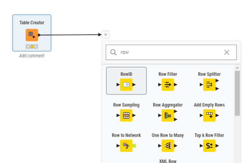
I believe that the quick node insert is the key improving the handling of nodes and components. I discussed a few of these on a call with the developers when they were working on v5, but I wanted to make sure to get them on the Forum as well. The quick node insertion in the Modern UI (keyboard shortcut “Control + .” on Windows & Linux, and “Cmd + .” on Mac) holds the key to simplifying navigation and selection of the hundreds of nodes in KNIME. Since it is a single purpose popup, it has the potential to get around the space constrictions of squeezing everything into a crowded workspace UI. Unfortunately it is currently only a small popup window that is search driven, but it has the potential to be a universal solution to node and component management.

Popup Size - The first change I would make is to make this popup either full screen (or at least near full screen) size. We need a lot of real estate to manage the massive node libraries. Be sure to utilize the full horizontal space when building out the sections below.

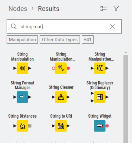
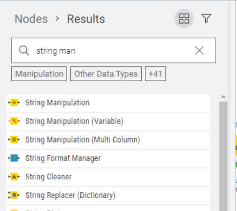
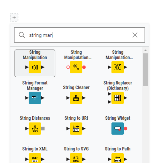
Icon size - Now that we have enlarged the popup window size, keep those icons small to allow us to view a large number of nodes / sections / folders.

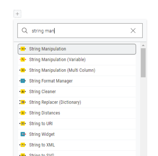
Keep the current search approach as it is now in the primary top location - This works nicely and it allows for easy macro node search, selection and insertion. I would personally like to see components included in these search results as well for quick insertion, but I know that there is some hang-up on keeping nodes and components separated… Perhaps there could be a component search toggle option if that is the case.

Add a section for “Node Favorites” next that can be organized into groups by the user. This should be organized and added to by a simple drag and drop from the installed node / component list.

Add a section for “Component Favorites” next that can be organized into groups by the user. This should be organized and added to by a simple drag and drop from the installed node / component list.

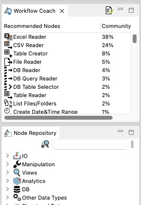
Add an area to explore all installed nodes and components organized by folder similar to the new 5.2 node repository. Components should have a visual cue or separate folders to signify that they are different from nodes.

Bonus points for searching and exploring “uninstalled nodes” and the ability to select and install them - I would have an option for “include uninstalled nodes” which would included search results of uninstalled nodes (either in a secondary search results list or into the original list with visual cues for what is not installed), and a full list of installed and uninstalled nodes in the bottom area where all nodes can be explored. Some visual color (or greyed out) cue could be used to show uninstalled vs installed nodes. Selection of nodes and folders could be used to directly trigger node installations, or in the least a shortcut for node installation should be present.

Make all of the above sections collapsible so that users can best utilize the space for their own approach and needs. The window should always re-open with section collapse settings of the prior use.

Add a shortcut to this upgraded node / component insert to the bottom of all right click dropdown lists (with the keyboard shortcut reminder) regardless of what is selected, to ensure that it is universally easy to find and access.

Some great ideas there @iCFO .

I would love to see components become “first class citizens” within KNIME and have the ability to mark favourites.

I regularly use the Ctrl . to add nodes rather than the side panel, along with "dragging out from the node "

One thing I found was that switching the node panel to “list view” rather than “icon view” works much better for me. It is marginally poorer usage of screen “real estate” but I now find the nodes I want more easily

e.g. side panel:

image

I prefer…
image

and “Ctrl .”

I prefer…

Maybe it’s just me, but I find it easier to choose the right one first time when I can see the whole name :wink: albeit that’s only a problem for the really long named nodes.
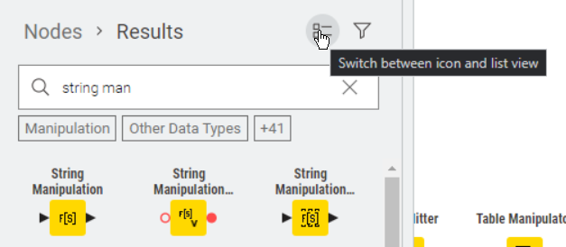
Whilst having icons is a good thing, for the most part the actual icons themselves are insufficient differentiators for me, and I recognise the nodes by the name and not by the pictures and I agree with your sentiment that the icon sizes in the panels should be kept smaller.

1 Like

I agree. The smaller icon / full node names in your screenshots above appear to be the presentation in the modern UI of the newest version.

1 Like

Yes indeed they are. For anybody who hasn’t seen the toggle, I had meant to upload this screenshot from 5.2

image

1 Like

I totally disagree - I almost never get what I want next from quick insert. Indeed the new repository is still near useless for me…

Why?

  1. Loses the ‘logic’ that developers have put into their categorisations
  2. Takes up a huge amount of desktop real (virtual?) estate to show a tiny number of nodes
  3. Assumes you know what exactly the node you are looking for is - almost never shows me what I want no matter how I try searching - almost invariably have to go back to the “legacy” UI to find things
  4. This is even worse when working with lots of custom in-house nodes

I’ve had discusssions with developers where the option of allowing a return of the tree view has been suggested - please please prioritise this!!!

Steve

2 Likes

I have all of the same problems you listed, but why that would cause you to dislike the idea of turning the current less useful quick insert window into a full screen beefed up version of a Node Search / Favorites / Node Repository / Component Repository? Seems like an opportunity to recover that old functionality without cluttering the UI… I very much envisioned an improved version of the old favorites and tree selection format to be brought back and enhanced in that larger user friendly window.

The beauty of the quick node insert window approach is that it is a popup and only occupies the screen when in use rather than cluttering the UI. If the window size was adjustable and size / placement was remembered between uses, then even that would be customizable.

@takbb it is a great idea. Here is my two cents:
favourites, what is favourites? the most frequently used components after you query something, right? or, the component is created just now, you believe it will to be the most frequently used component.

As I described this, I wondered if we were thinking about a high-level form of node commendations combined with query:

  1. It has the ability to leverage community recommendations

  2. It is able to customize some node order (cut in front of the community recommended node)

  3. It would be nice to auto-maintain a list of commonly used user nodes like Least recently used (LRU).

This problem comes with Modern UI, because in classical UI, we have two separate functions, one is recommendations, one is query the node.

image

But looking at Modern UI, it’s actually a combination of the above two features, and we even want to add more features, such as favourites, such as the dynamically updated LRU I mentioned.

This is indeed a very, very important feature of Modern UI. But it’s important to realize that there’s a lot of uncertainty in the mix.

Hi, @takbb interesting.
We all know KNIME node icon is very refinement. When I look at it closely, I find that I understand the metaphor to a certain extent, but when I don’t look at it closely, I ignore it.

My question, if it’s really that refinement, why doesn’t our minds make good use of it, but just use it as a vague tool to distinguish between nodes?

If this assumption is true for most people, can we improve it and take advantage of the subtlety of this icon? Make it more obvious. For example, if I try to make the content in the node icon larger, will you make more sense to use the node icon to understand your workflow?

BTW, @takbb you always have something interesting :partying_face: :partying_face: :partying_face:

The boarder size on those icons are totally a little pet peeve for me as well. I will grant that the boarder around the icons looks good visually, but they also cut the icon size in half which means only the most basic and low bit icons translate. The boarder is even larger on components. I always craft the perfect logo for my components and then have to scratch them and go with something ugly, low bit and blocky… :pleading_face:

2 Likes

Hi @HaveF,

For me “favourites” with respect to components would be a panel where I could store the components that I use (either my own, or those written by others) on a regular basis and wish to have quick access to. At the moment in both Classic and Modern UI, there is no repository for components, so I either have to go find them on the hub each time, or I have to copy and paste from an existing workflow.

I would really like for there to be such a “component repository”, where I could drop my “favourite” components for re-use. I’m not so bothered about “favourite nodes” since I generally pull in the nodes I require by typing in the name in the repository search bar, and then dragging it in from there.

2 Likes

The favorites area for me would not just be about easy grabbing my “go to” nodes / components, but it is also a means of escaping a folder / tree structure where nodes don’t fall where I would logically expect them to or have names that are not memorable / descriptive to me.

This is less of an issue for me personally since I tend to insert my favorite nodes and components via hardware macro buttons these days. I can just customize the layout / folders however I like.