Hi,
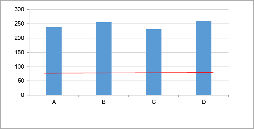
I would like to add a reference line on a bar chart. How can I do this?
Example : red bar in the graph below.
Thank you!
Hi @olambert
Welcome to KNIME Forum!
Interesting question. I don’t know also how to do this. But in in KNIME 5.2 there is K-AI . And with the help of KA-I I was able to creatie this graph.
First I K-AI created the bar without the reference line. I asked K-AI
I want a bar chart. On the x-as column1 on the y-as the sum of the column2 values
This automatically creates a workflow on your canvans bar_with_reference.knwf (81.2 KB)
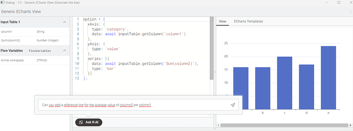
After executing the wf. I opened the Generic EchartsView by right-click configure,.
In this menu K-AI is already present.
Here I asked K-AI (to be honest, the KAI question that led to the reference line took me a few tries)
Can you add a horizontal reference line indicating the average value of column2 per column1
After this, KAI comes up with a suggestion to adjust the configuration of the Generic Echarts node. You can easily accept that, and the reference line will be added to the bar graph.
Hope this helps. Happy KNIME-ing
gr. Hans
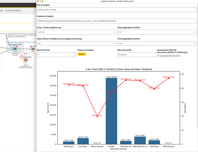
@olambert I use ChatGPT and KNIME Components to create an interactive tool to present a numeric value on two different axis split by a categorical one. The results will be displayed and can also be saved as PNG files.
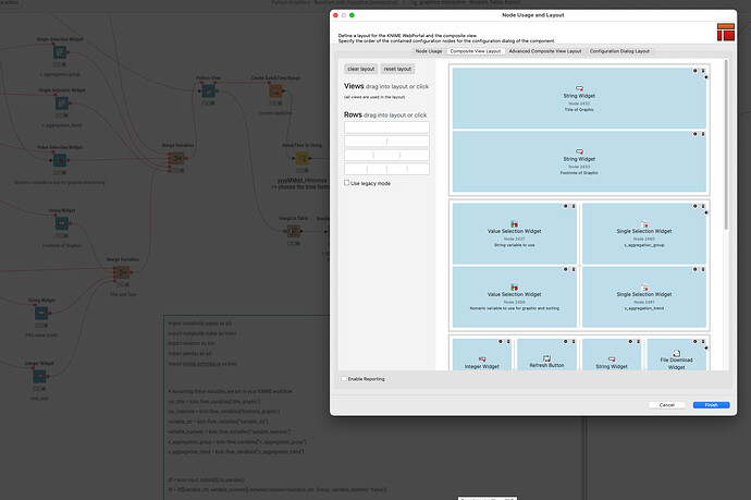
The Python View node is configured with Widgets and the Refresh Button allows for interactive use.
Python Graphics - Barchart with Trendline (interactive).knwf (594.3 KB)
Hello @olambert ,
You can use the Generic Echart View node and select a bar chart from it,
Actually, In Generic Echart View, they provide an AI tool,
So I asked AI about drawing a reference line and then AI returned a code like
  type: 'line',
  markLine: {
    silent: true,
    data: [{
      yAxis: 10000
    }],
    lineStyle: {
      color: 'red'
    }
  }
and this code worked for it.


