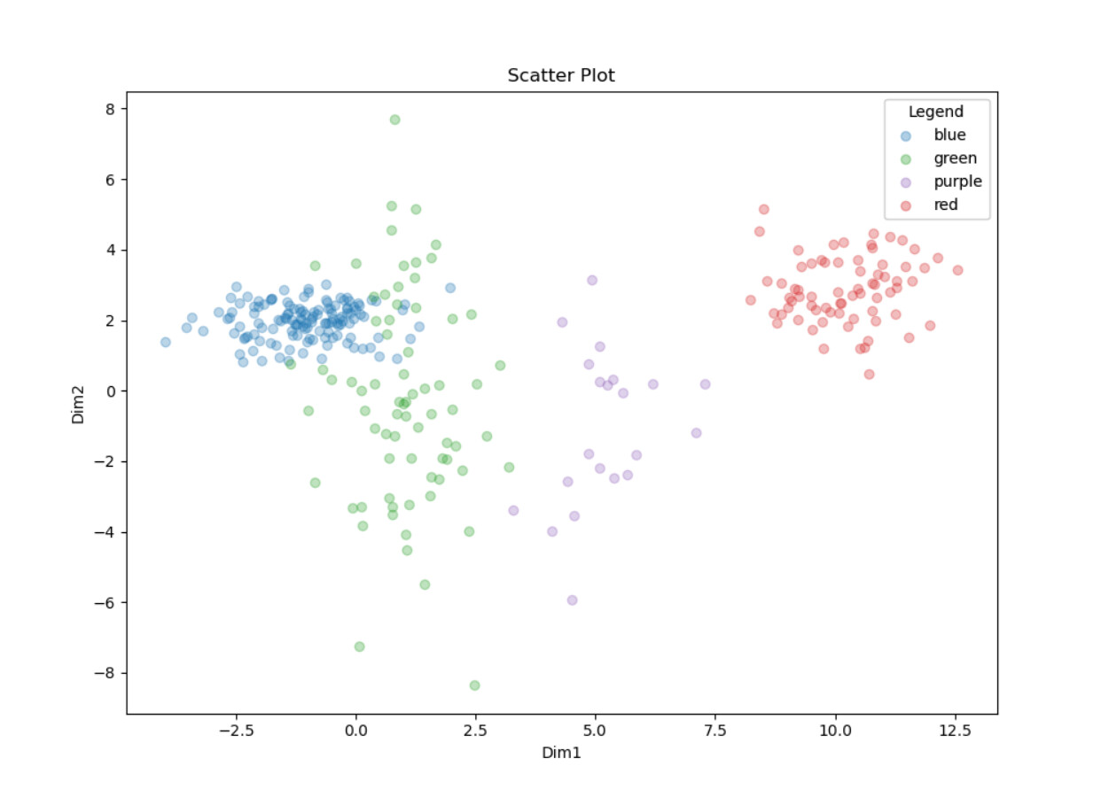
I have been working on another Matplotlib visualisation using the -Python View- node. This time a scatter plot that uses different colours for different clusters. The plot is also accompanied by a legend, whose position can be changed based on user selection in the interactive view of the component.
Sharing the code for this to improve searchability
import knime.scripting.io as knio

from io import BytesIO
import numpy as np
import matplotlib.pyplot as plt

# Only use numeric columns
#data = knio.input_tables[0]._get_numeric_data()
data = knio.input_tables[0].to_pandas()
#matrix = data.select_dtypes(include='number').to_numpy()

print(data)

# Figure with plots construction
fig, ax = plt.subplots()

# Matrix construction
#matrix = input_table.values
matrix = data.values
# Color column selection
#colors = data[knio.flow_variables['color_column_selection']]
colors = data['Color']
# Set of unique colors
colors_set = np.unique( colors)


print(matrix)
print(colors)
print(colors_set)


#for every color in the set, extract those who matches
#the condition in a submatrix
for current_color in colors_set:
    #condition
    #condition = colors == current_color
    condition = matrix[ :, 0] == current_color
    # print( condition)
    #submatrix creation with only two columns of numeric numbers
    color_submatrix = matrix[ np.nonzero( condition), 1:3]
    #squeeze to remove a dimension
    color_submatrix = color_submatrix.squeeze()

    # Abscise column of scatter plot
    x = color_submatrix[ :, 0]

    # Ordinate column of scatter plot
    y = color_submatrix[ :, 1]

    # Color selection for points in scatter plot
    color_tab = "tab:" + str(current_color)

    print(color_tab)

    # Scatter plot construction
    scatter = ax.scatter( x, y, c = color_tab, label = current_color,
    alpha =knio.flow_variables['color_transparency'])


# Legend option
if knio.flow_variables['include_legend']:
    legend = ax.legend(loc = knio.flow_variables['legend_location'],
    title=knio.flow_variables['legend_title'])
    ax.add_artist(legend)

# Grid option
if knio.flow_variables['include_grid']:
    ax.grid(True)

#plot title set
ax.set_title(knio.flow_variables['plot_title'])
ax.set_xlabel(data.columns[1])
ax.set_ylabel(data.columns[2])

# Replace row ID by number
#data.index = range(0, len(data))
# Create buffer to write into
buffer = BytesIO()
# Create plot and write it into the buffer
fig.savefig(buffer, format='svg')
# The output is the content of the buffer
output_image = buffer.getvalue()


# Assign the figure to the output_view variable
knio.output_view = knio.view(fig)  # alternative: knio.view_matplotlib()