Sharing the Python Code for improved searching on Google etc 
import knime.scripting.io as knio
from io import BytesIO
from matplotlib import colors
import numpy as np
import matplotlib.pyplot as plt
import pandas as pd
import seaborn as sns
# Only use numeric columns
data = knio.input_tables[0].to_pandas()
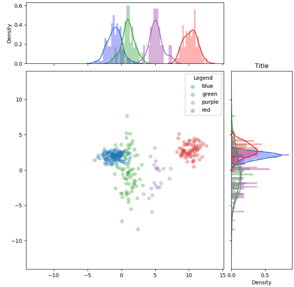
# Scatter plot with histograms function
def scatter_hist(x, y, ax, ax_histx, ax_histy):
# no labels
ax_histx.tick_params(axis="x", labelbottom=False)
ax_histy.tick_params(axis="y", labelleft=False)
# Useful data for setting colors
c = data['Color']
colors_set = np.unique(c)
matrix = data.values
# binwidth:
binwidth = 0.25
xymax = max(np.max(np.abs(x)), np.max(np.abs(y)))
lim = (int(xymax/binwidth) + 1) * binwidth
# For every color in the set, extract those that match
# the condition in a submatrix
for current_color in colors_set:
# Color choice
condition = matrix[ :, 0] == current_color
color_tab = "tab:" + current_color
# Submatrix creation with only two columns of numbers
color_submatrix = matrix[ np.nonzero( condition), 1:3]
# Squeeze to remove a dimension
color_submatrix = color_submatrix.squeeze()
# Coordinates of the submatrix concerned
x_mat = color_submatrix[ :, 0]
y_mat = color_submatrix[ :, 1]
# Scatter plot construction
ax.scatter(x_mat, y_mat, c=color_tab, label=current_color, alpha = knio.flow_variables['transparency'])
# Histogram construction
bins = np.arange(-lim, lim + binwidth, binwidth)
ax_histx.hist(x_mat.tolist(), bins = bins, density = True, alpha = knio.flow_variables['transparency'], color = current_color)
ax_histy.hist(y_mat.tolist(), bins = bins, density = True, alpha = knio.flow_variables['transparency'], color = current_color, orientation='horizontal')
# Density plot construction
sns.kdeplot(x_mat.tolist(), ax=ax_histx, color = color_tab)
sns.kdeplot(y_mat.tolist(), ax=ax_histy, color = color_tab, vertical = True)
# Plot size
left, width = 0.1, 0.65
bottom, height = 0.1, 0.65
spacing = 0.025
# Scatter plot size
rect_scatter = [left, bottom, width, height]
# Histogram sizes
rect_histx = [left, bottom + height + spacing, width, 0.2]
rect_histy = [left + width + spacing, bottom, 0.2, height]
# Start with a square Figure
fig = plt.figure(figsize=(8, 8))
# Adding plots to the principal plot
ax = fig.add_axes(rect_scatter)
ax_histx = fig.add_axes(rect_histx, sharex=ax)
ax_histy = fig.add_axes(rect_histy, sharey=ax)
# x-axis column
x = data['Dim1']
# y-axis column
y = data['Dim2']
# Use the previously defined function
scatter_hist(x, y, ax, ax_histx, ax_histy)
# Title
plt.title(knio.flow_variables['title'],loc = "center")
# Legend option
if knio.flow_variables['legend_required']:
legend = ax.legend(loc = knio.flow_variables['legend_location'],
title=knio.flow_variables['legend_title'])
ax.add_artist(legend)
# Grid option
if knio.flow_variables['grid_required']:
ax.grid(True)
# Replace row ID by number
#data.index = range(0, len(data))
# Create buffer to write into
buffer = BytesIO()
# Create plot and write it into the buffer
fig.savefig(buffer, format='svg')
# The output is the content of the buffer
output_image = buffer.getvalue()
# Assign the figure to the output_view variable
knio.output_view = knio.view(fig) # alternative: knio.view_matplotlib()