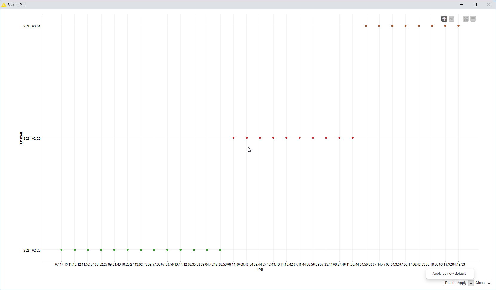
Hello, I want to be in the Y axis the time from 00:00 to 24:00
and write in the x-axis as date (days). The source data comes from
emails (time and day of receipt). As you can see from the screenshot,
the Y-axis is not correct.
I didn’t mean to replace axes. I meant to have column with dates as Date column type and column with time as Time Column type in KNIME. (Not as strings.)
Don’t know. What do you want to show on/read from your visualization?
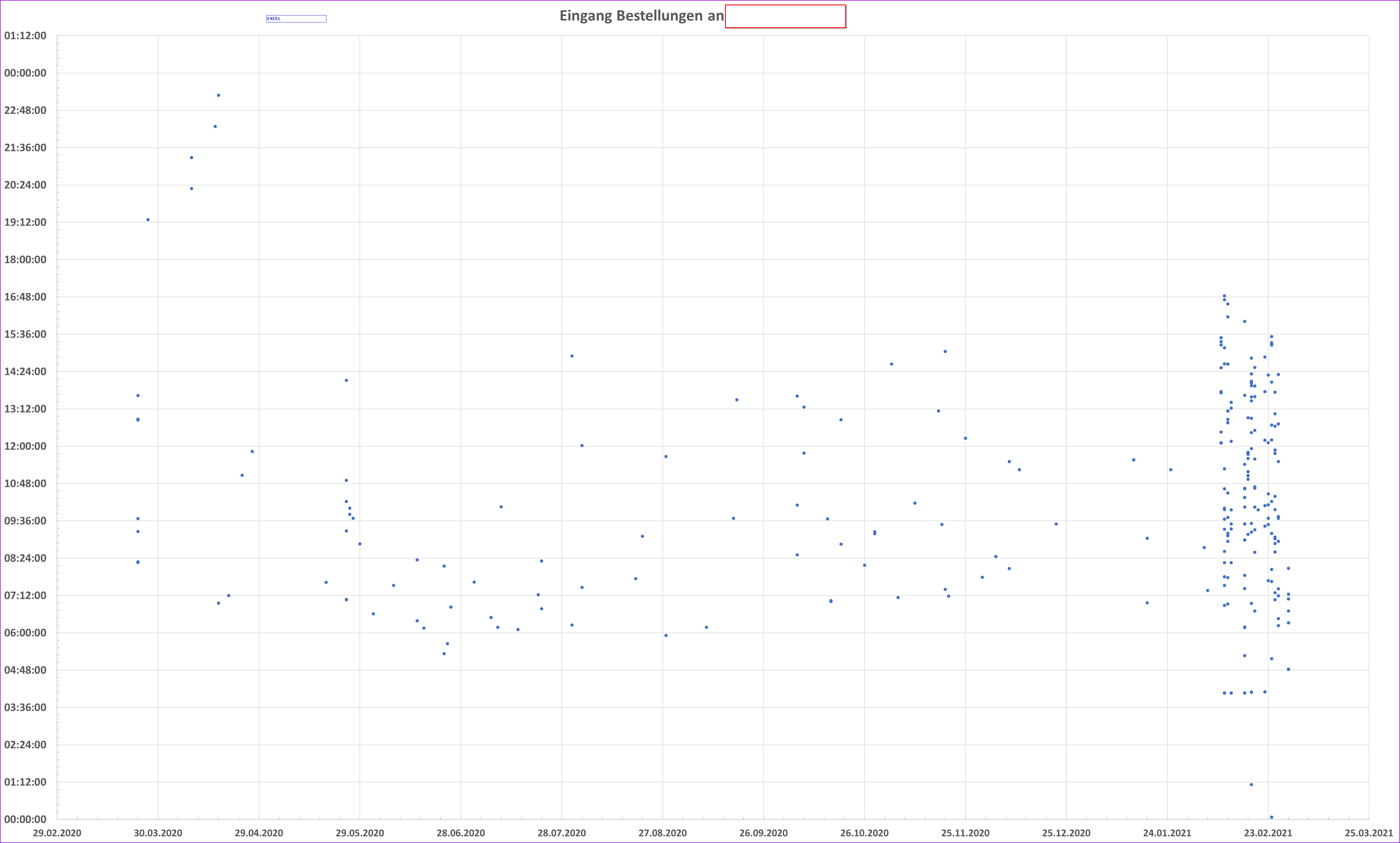
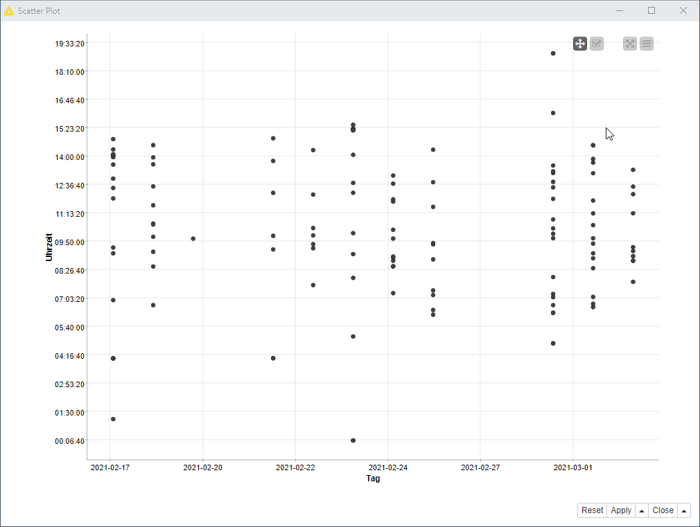
well I would say above picture gives you some indication how to determine workload. Additionally you can create time frames (06:00-10:00, 10:00-14:00,14:00-18:00 for example) and then show count in it. Also if days don’t matter you can average values and if they do you can average values over Mondays, Tuesdays… You can use Bar Chart for it.