Setting up a bar chart, adding colour, different legend layout and interaction with other views

Hello everyone,

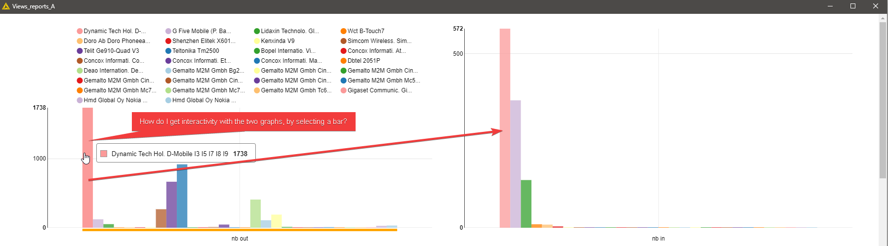
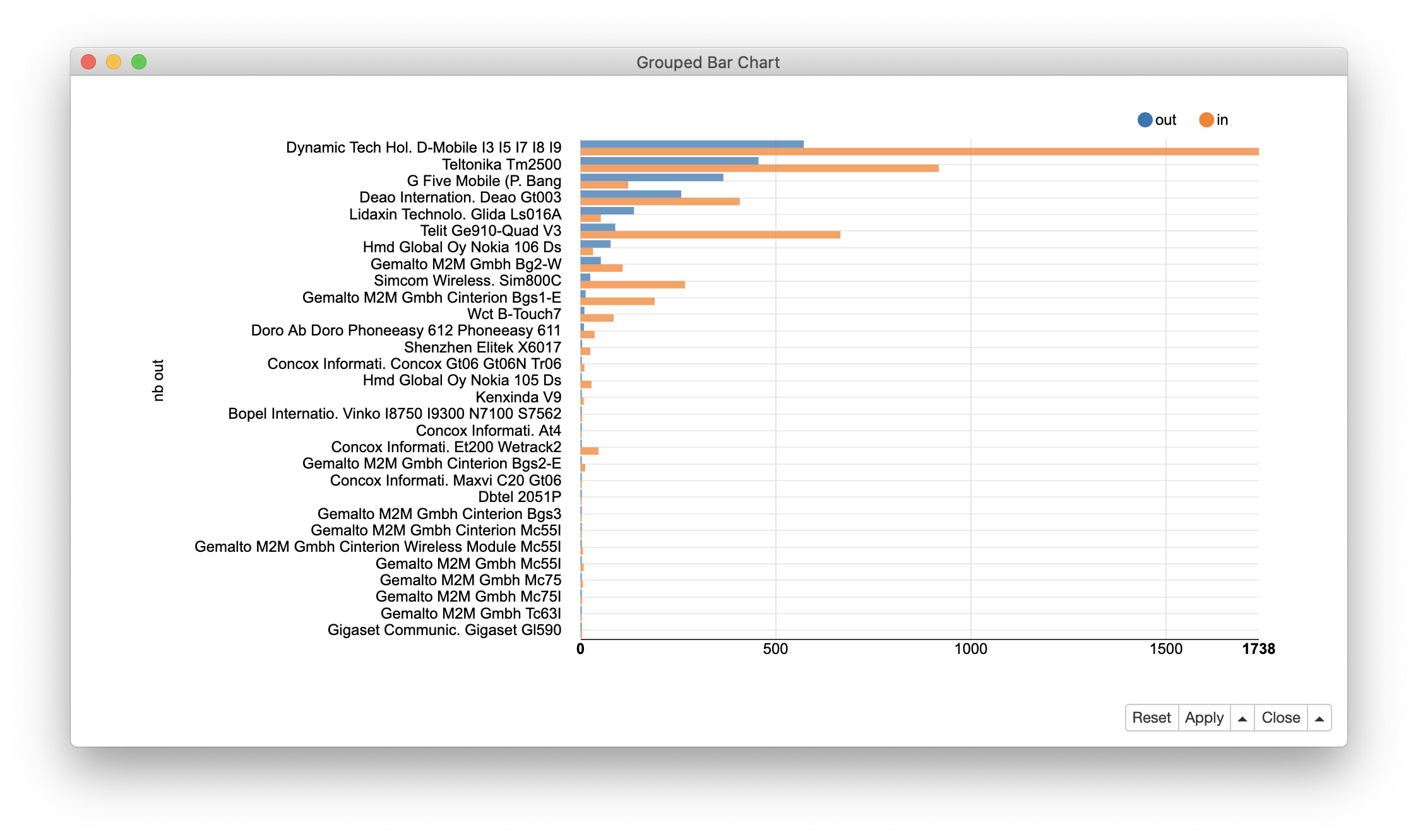
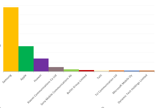
I want to make this type of graph with this file as input.
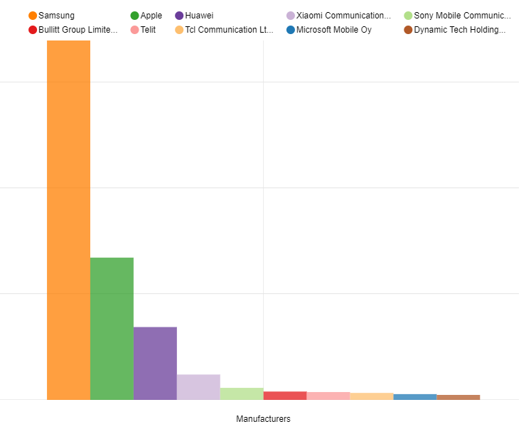
I found another method in the forum, to add the colours on the bars, but I am obliged to separate my data.


Is there any other method to have all the data in the same graph.

export_graph.xlsx (9.9 KB) graph_test.knwf (162.3 KB)

Is it possible to have the legend in another format, so that it is readable.
Thank you for your help.
BR,
Stef Pf

Hi @stef_pf,

what about a graph like this. Would this solve your problem?

If yes, then you just need to activate the checkbox “Plot horizontal bar chart” in the Bar Chart node.

Cheers
Kathrin

Hello Kathrin,

This is the first view I tried, but this one doesn’t fit.

When the bars are horizontal, the legend does not appear well.
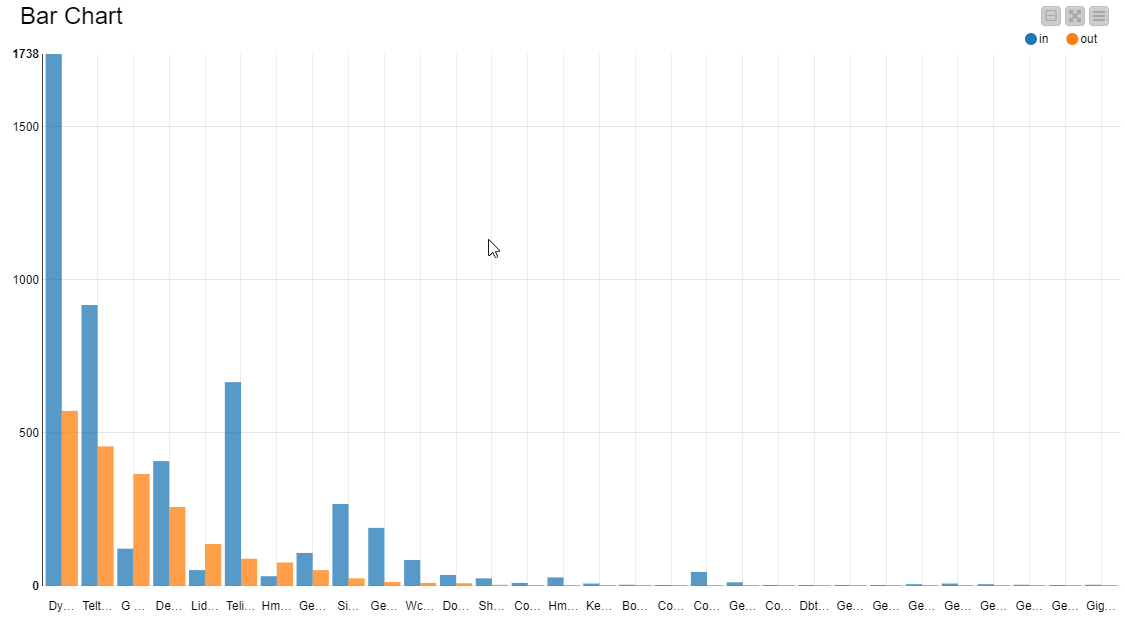
In this view above, the legend appears at the top of the chart, is it possible to position it below?
Is it also possible to change the width of the cells, so that the name appears entirely?
This should be possible with the css editor, but there are very few examples of the syntax


I got around this problem by adding a table view.

image

Is it possible to put the text of the legend like in this view, made in Excel?
image

Thank you, in advance, for your response.

BR
Stef PF.

Any update on this topic?
I’m also interested in how to change the position of the legend for instance, but after trying different CSS classes (see: KNIME Data Apps Beginners Guide), I couldn’t find the perfect match for my case.

Any news would be useful and interesting!

This topic was automatically closed 90 days after the last reply. New replies are no longer allowed.