Hi there all KNIME friends, (Right now it is about 2 years for me since started with KNIME!)
In a particular situation I am interested in showing just how extreme weather is over just same months over some years. I found out that the low temp extremes are cut away by JavaScript Line Plot. I have not found a method to set the lows or highs creating my own range. Initially I thought that it might depend on number of pixels set (1000w x 600h), but that is not the case.
In my simple example thedata file is in the Data directory within the workflow.
I think I figured out what’s going on here. Basically, your view is a bit zoomed in. I believe at some point you must have changed the zoom in the interactive view, and then applied that zoom as the new default.
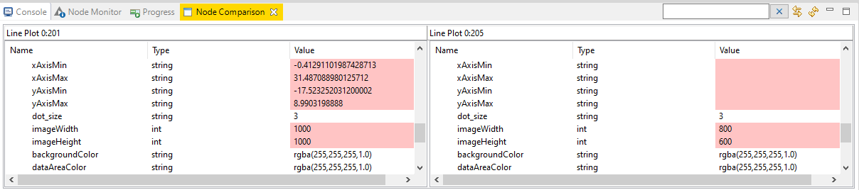
Initially I was confused, as when I used a new Line Plot node from the repository I couldn’t recreate the problem. But once I used the node compare feature for the new node versus your node, it was clear something was going on:
As far as I can tell, the only way to set these values is by setting the zoom level via the interactive view as I think you did, or by using flow variables - you can’t do it using the configuration dialog directly.
So, long story short, this should be an easy fix. For a slightly different flavor of your visualization you could also try the Line Plot (Plotly) node.
(As an aside, if you don’t need a static image generated by this node, you can speed up its execution significantly if you uncheck the “Create image at out port” box.)
Yes! You are as always(?) correct?! Thanks ScottF!
So, in configuration tab “View Controls” enabling the Show “zoom reset button”, then save and Excute, and then view the graph! Then press the reset button and saving as new default. Finally go back to configuration and disable the “Zoom reset button” (and some else things you not need on the final image, is the way to do it.
A couple of other comments: 1) It is very hard to relate the configuration tab options to names in the “Flow Variables” tab. This is a general observation I have made in many nodes, but sometimes thaey arer obvious. Getting information on what flow vars’ names are when hoovering over the interface option left side label would be optimal.
You mentioned the Line Plot (Plotly), and I have also tested JFree Chart Line. In the latter there is a miss in the flow vars in several of those plot types.: The labels for graph_height and graph_width are swapped. I.e. graph_height labels comes just before/over graph_width. It is only a labeling problem. As I recall in the two other graph “systems”, Width comes over/before Height. But its just a flaw, anyone detects and works around, so swap the labels is a safe way to go.
I hope you are enjoying a well earned weekend right now!