Hi Everyone! My first post on the forum and what better way to do it than post my solution to Challenge 1!
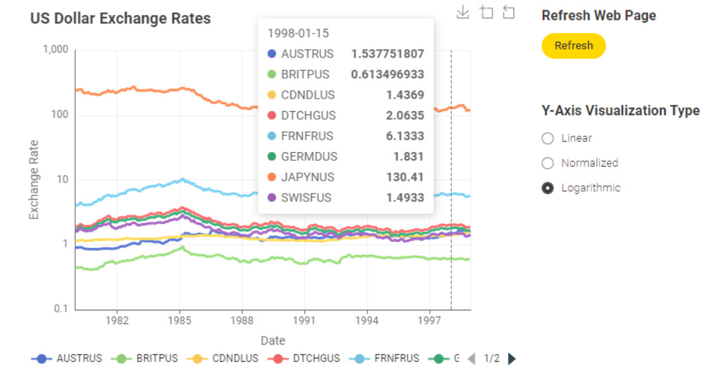
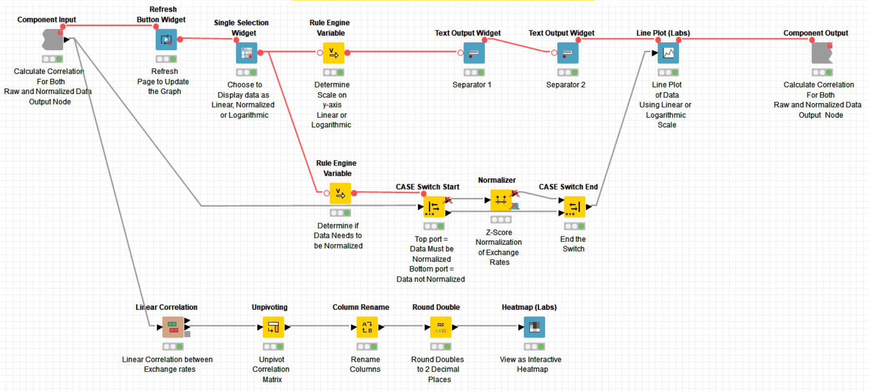
My solution uses a -Single Selection Widget- node to decide whether to view the data as a Linear, Normalized or Logarithmic Line Plot with the -Line Plot (Labs)- node. The -Refresh Button Widget- node is used to update the data when choosing a different visualization:
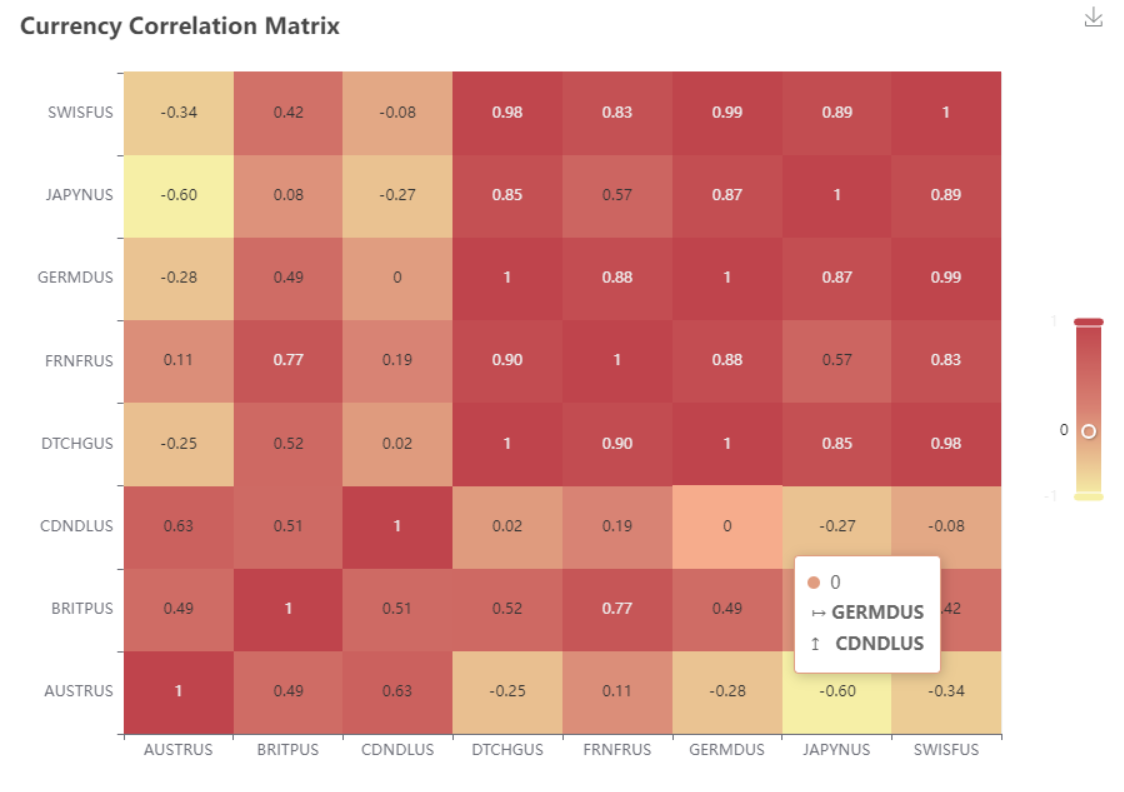
I then use the -Linear Correlation- node and display the correlation matrix using the -Heat Map (Labs)- node:
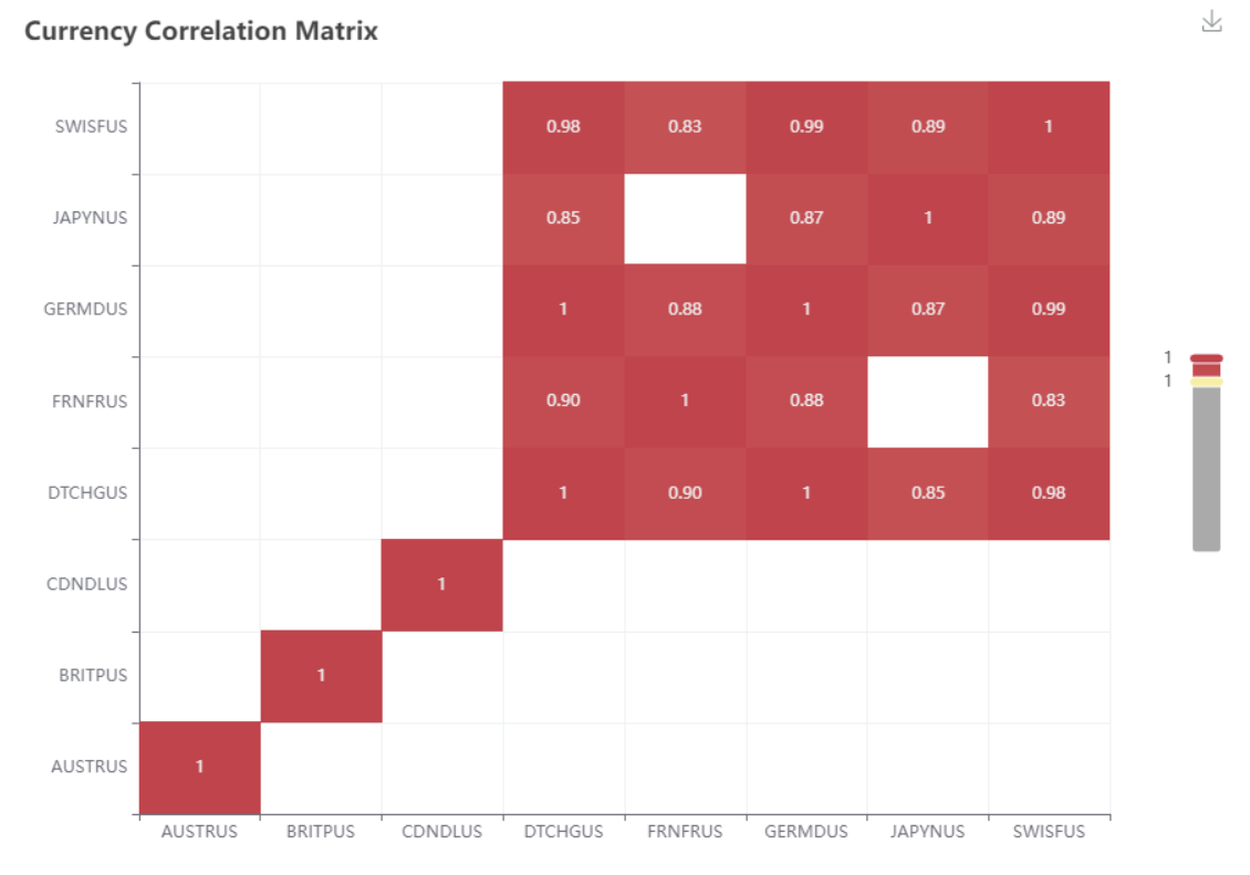
The slider on the -Heat Map (Labs)- can be used to filter the matrix. For example, to display the most positively correlated currencies (Swiss Franc, Japanese Yen, Deutsche Mark and Dutch Guilder):
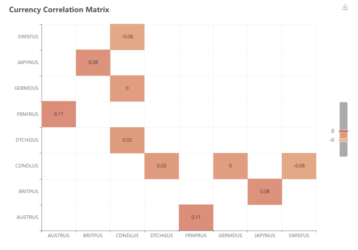
or the least correlated (for instance the Canadian Dollar and Deutsche Mark) :
The workflow is available from my HUB account at:
Take a look and I hope you enjoy it!
Heather