Hi @Mpattadkal
Totally agree. I should have used denormalized node.
Much better!
Thanks!
Hello All,
Here is my late submission for this 2nd challenge:
Some snapshots:
Best,
Pranab
print("Keep Learning!")
I completely missed PCA for my solution. Good work arddashti.
Hi Everyone! I’m a little bit late to post my solution for challenge 2. Perhaps I’m competing to be the last entry!
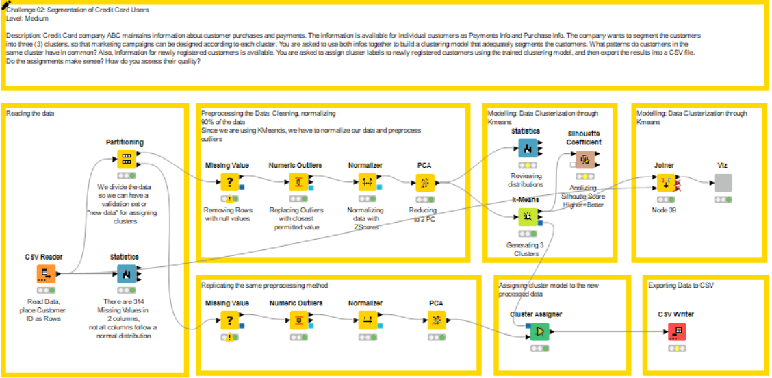
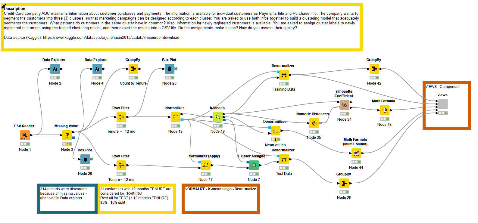
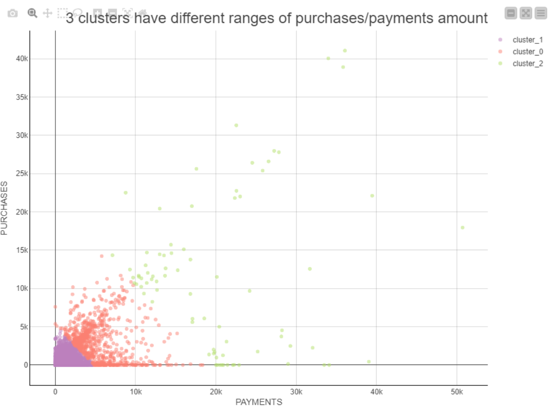
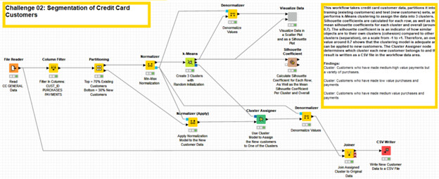
My solution follows the same path as many others in this thread. The workflow uses the -Partitioning- node to partition the data set into training (existing customers) and test (new customers) sets. I then use the -k-Means- node to assign the data into 3 clusters. I have used the -Scatter Plot (Plotly)- node along with the -Color Manager- node to visualize the different clusters.
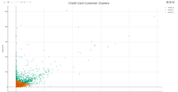
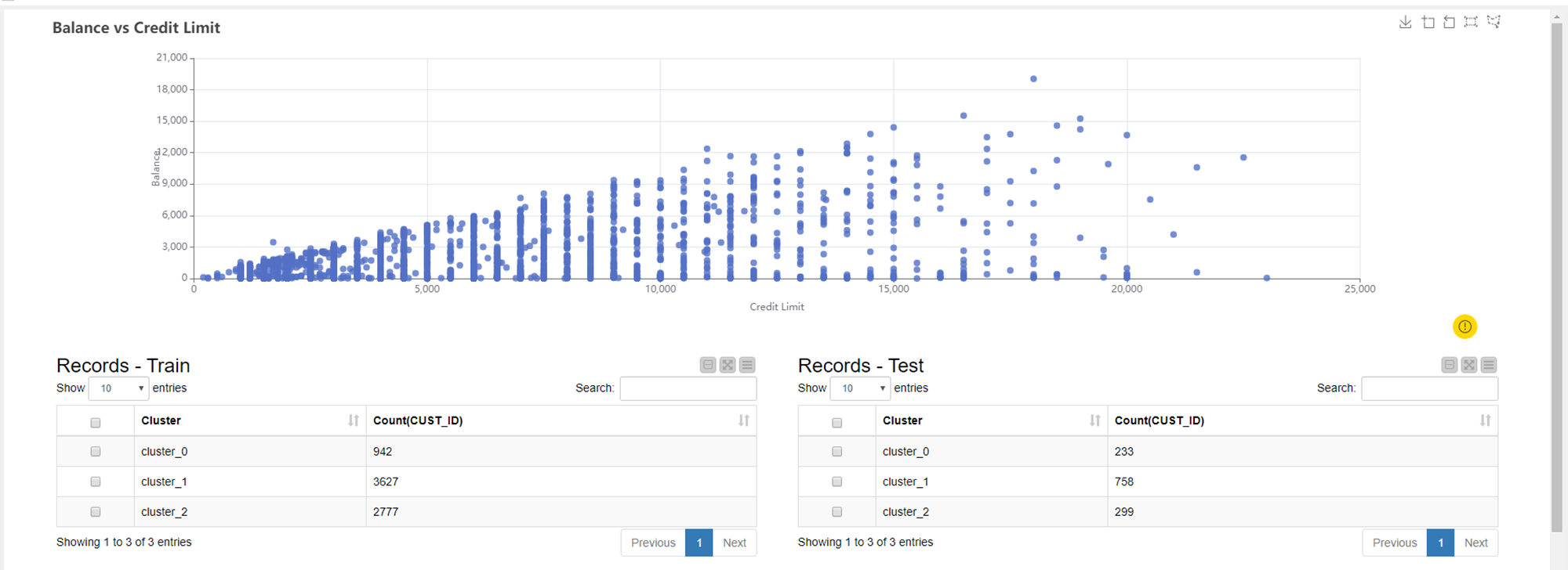
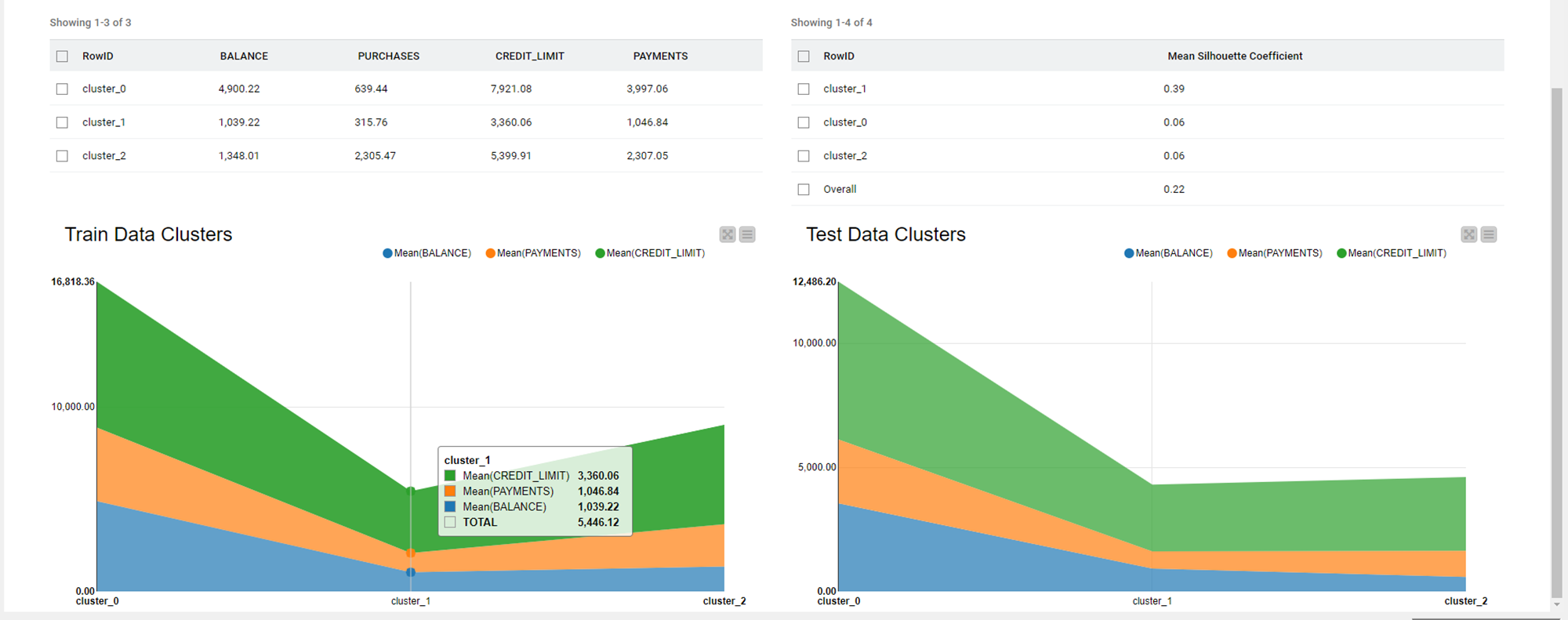
You can see that there is a cluster of people who make low value purchases and payments, another cluster of people who make medium value purchases and payments, and a third cluster of people who make medium-high value payments but have made low-high value purchases in the last 6 months. It is also noticeable in the graph that the bottom right-hand corner is data-free. This could be as a result of credit limits and therefore people cannot continue making purchases without making any payments.
The clustering model can be applied to new customers using the -Cluster Assigner- node and can determine which cluster each new customer belongs to. The result is written as a CSV file in the workflow data area.
The solution also uses the -Silhouette Coefficient- node to calculate the silhouette coefficient for each row, as well as the mean silhouette coefficients for each cluster and overall (around 0.7). The silhouette coefficient is an indicator of how similar objects are to their own clusters (cohesion) compared to other clusters (separation), on a scale from -1 to +1. Therefore, an overall value around 0.7 shows that the clustering model is adequate and can be applied to new customers.
Additionally, I found a really nice example from Scikit-Learn that explains how to create Silhouette Plots using Python:
After tweaking their Python script a little bit in order for it to work with the data from the output of the -k-Means- node, I have been able to create a silhouette plot and a scatter plot of the 3 clusters using the -Python View- node.
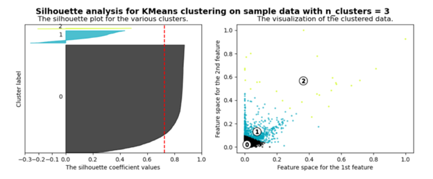
The Python script calculates its own silhouette coefficients, so the result is not exactly the same as the result from the -Silhouette Coefficient- node. However, they are not significantly different and the silhouette plot can therefore be used as a convenient graphical representation of the data.
The positive silhouette coefficients tell us that the values are very close to their own clusters and far away from neighbouring clusters. Where as the negative silhouette coefficients suggest that the values could have been assigned to the wrong cluster as they are closer to values in neighbouring clusters.
Scikit-Learn make an interesting point, when looking at the silhouette plot. The thickness of the plot for each cluster symbolizes the size of the cluster, and therefore, the more similar the thickness of the plot for each cluster, the more evenly distributed the values are in each cluster.
You can find my workflow on the hub here:
Hope you enjoy the solution, especially the silhouette plot!
Heather
This topic was automatically closed 90 days after the last reply. New replies are no longer allowed.