Hello Everyone ![]()
My solution for challenge 5 creates 2 Bar Charts, one for Air Quality and one for Water Pollution using the -Bar Chart (Labs)- node. I chose to display them horizontally, due to the length of the country names, although this could be improved with shortened versions.
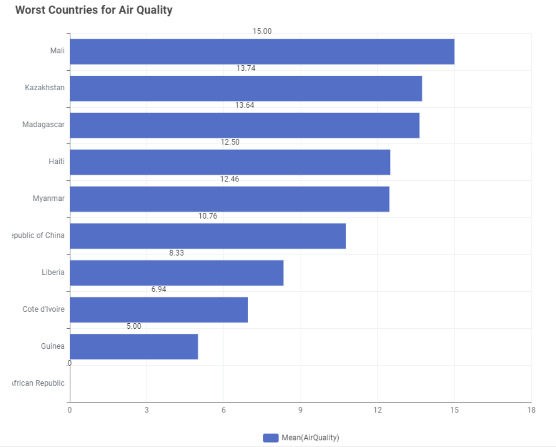
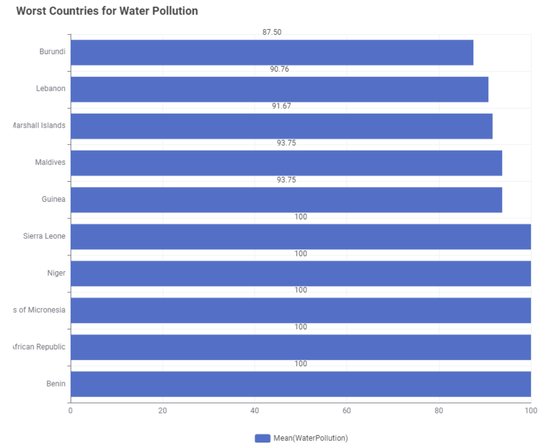
I also have provided some interactivity by using -Single Selection Widget- nodes to allow the user to select the type of aggregation in the -GroupBy- node (Mean, Min or Max) and to select whether they want to see the Best or Worst Countries displayed.

The selection of Best or Worst then sorts the rows in ascending or descending order in the -Top k Selector- node. The chart title also changes accordingly.
By default I’ve set it to the worst for both cases, as stated in the challenge ![]()
You can find my workflow on the hub here:
Best wishes
Heather