A new Just KNIME It! challenge has just been released!
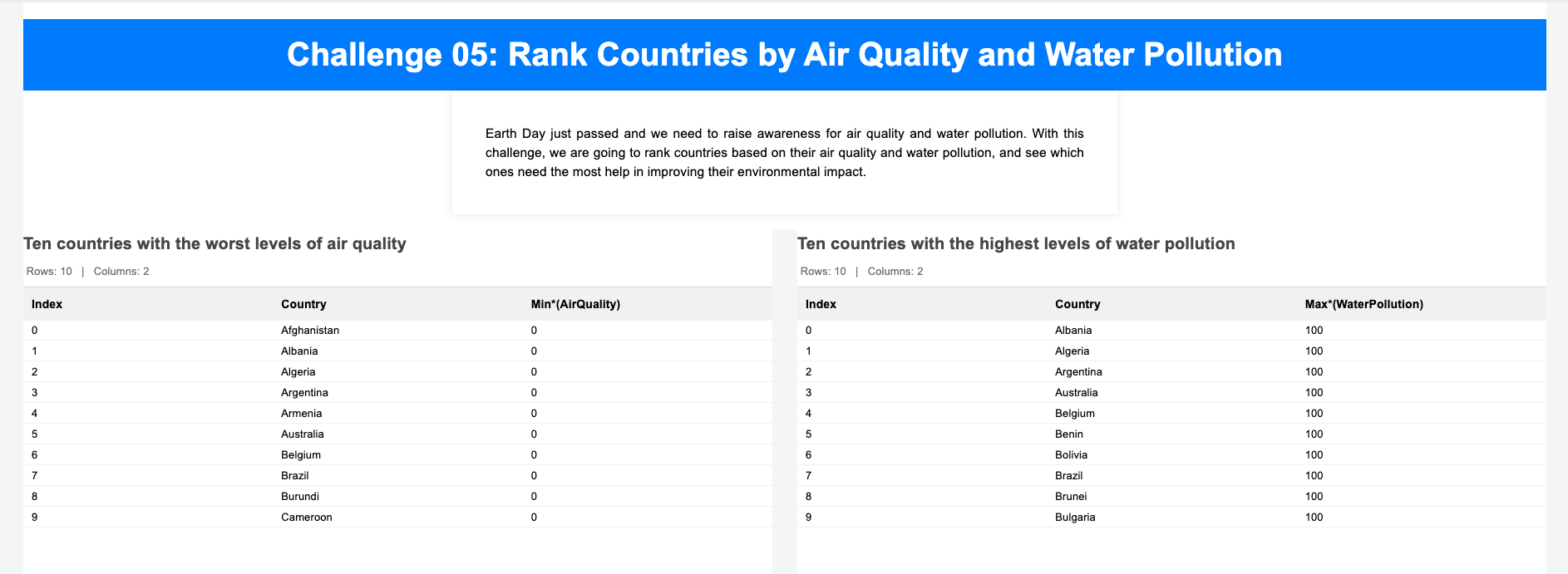
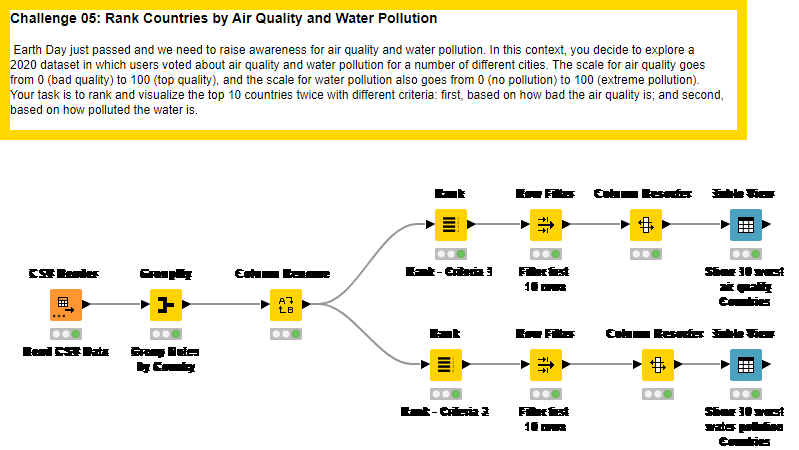
Since Earth Day just passed, let’s use this week’s challenge to further understand air and water quality across different cities in the world. To this end, we expect you to be creative with data processing and visualizations!
Here is the challenge. Let’s use this thread to post our solutions to it, which should be uploaded to your public KNIME Hub spaces with tag JKISeason2-5 .
Need help with tags? To add tag JKISeason2-5 to your workflow, go to the description panel on the right in KNIME Analytics Platform, click the pencil to edit it, and you will see the option for adding tags right there. Let us know if you have any problems!
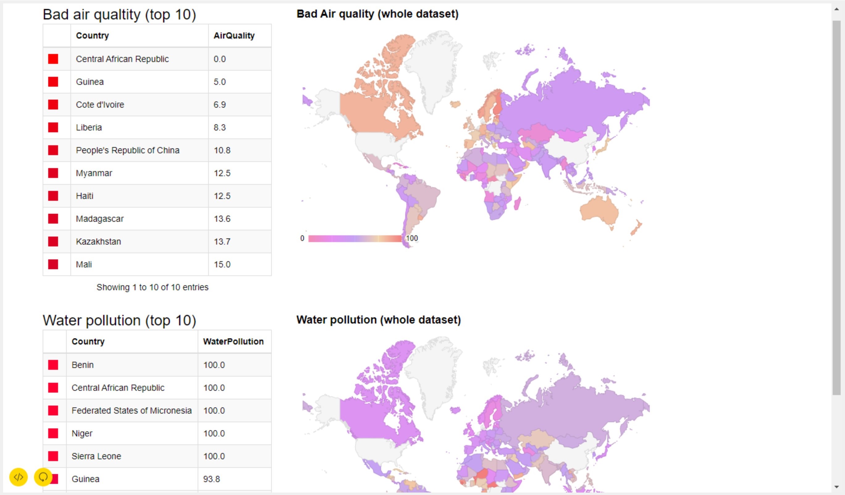
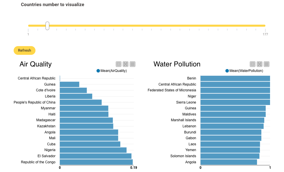
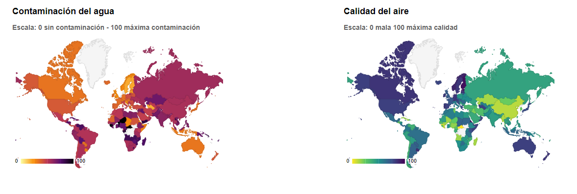
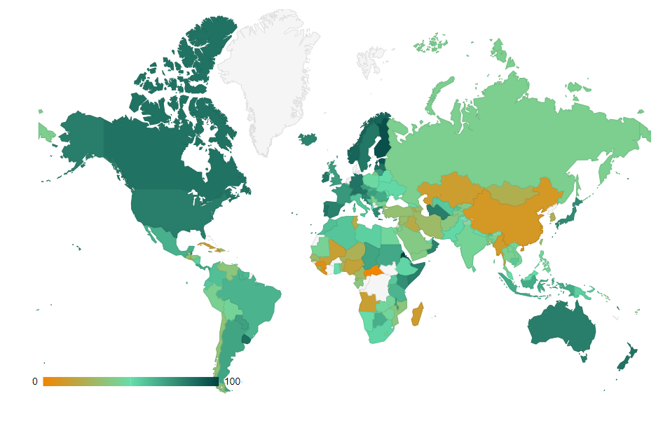
Hi! This is my “easy” solution. I decided to use a Slider Widget to choose how many countries visualize (10 by default). @morpheusTM very nice use of Choropleth Map!
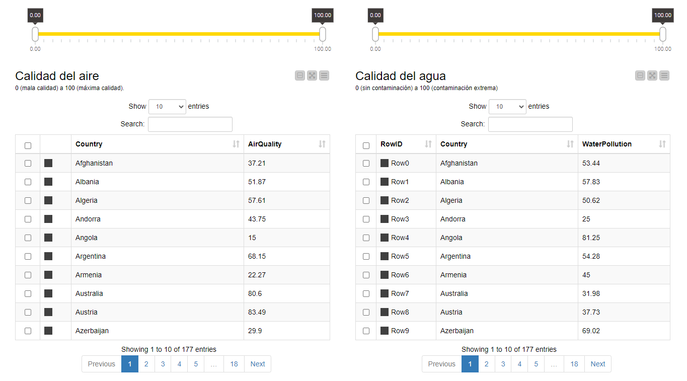
Included a data explorer node to see if I have to deal with e.g. missing values in the evaluation columns - turned out, I don’t but you only know afterwards
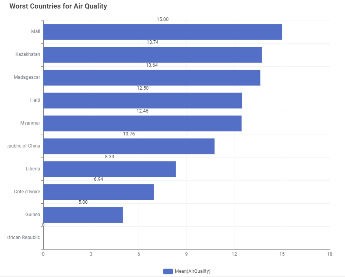
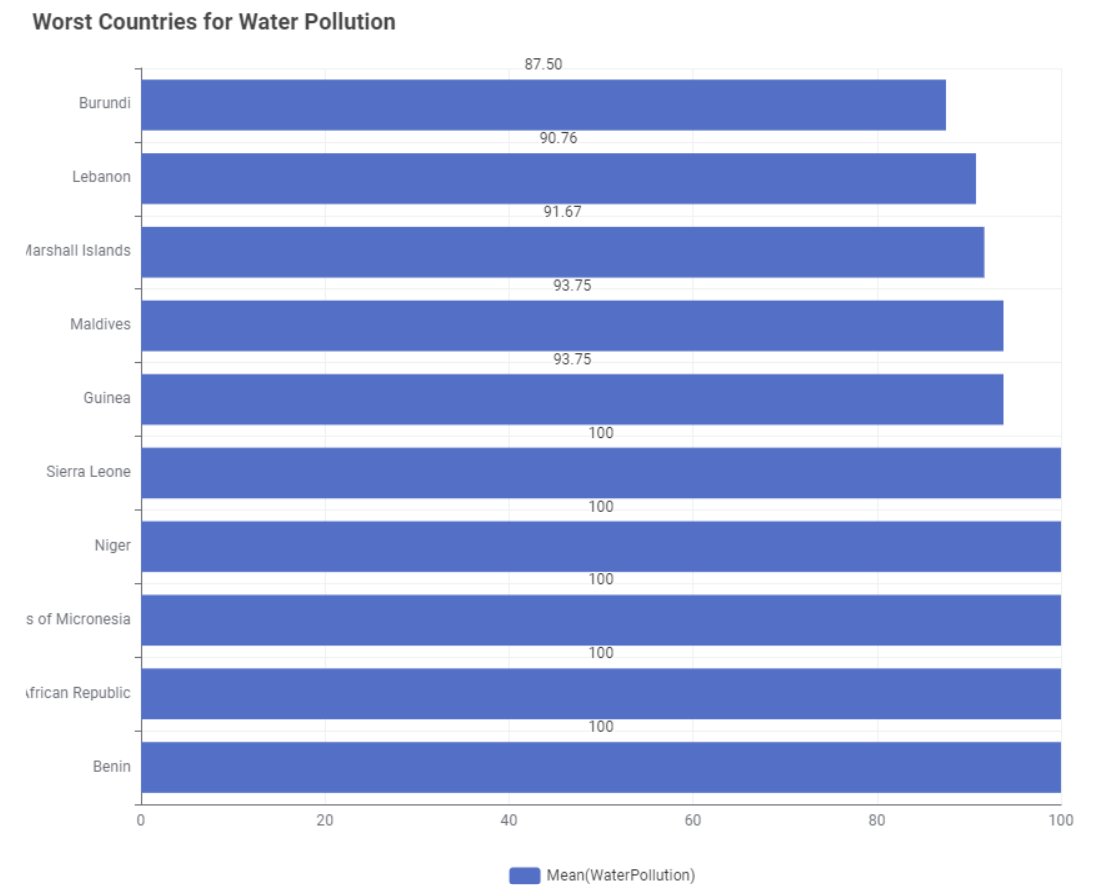
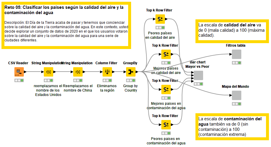
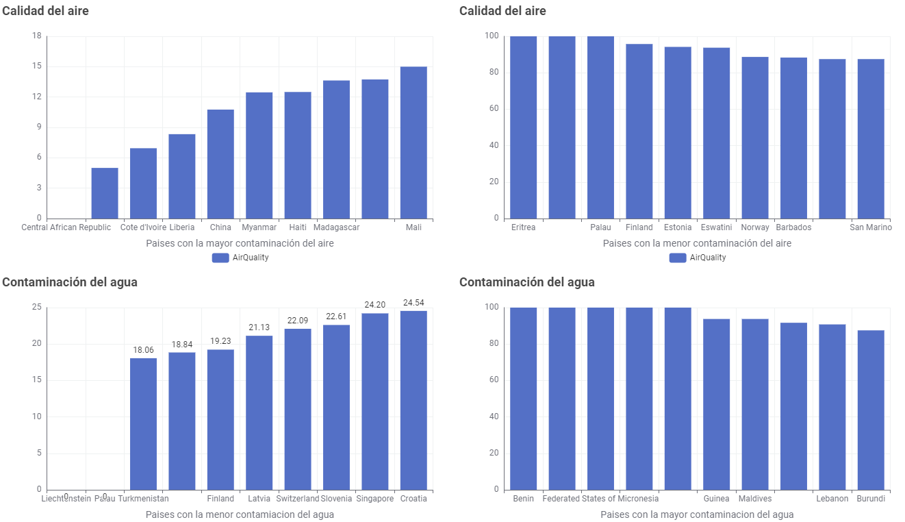
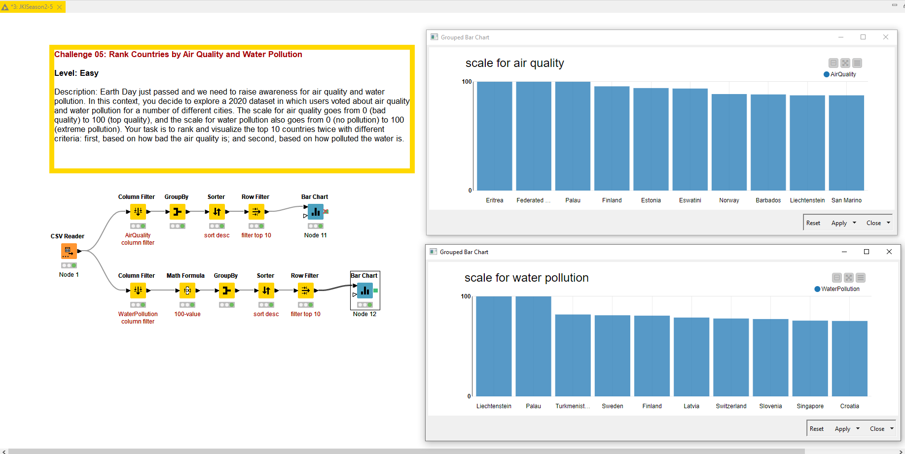
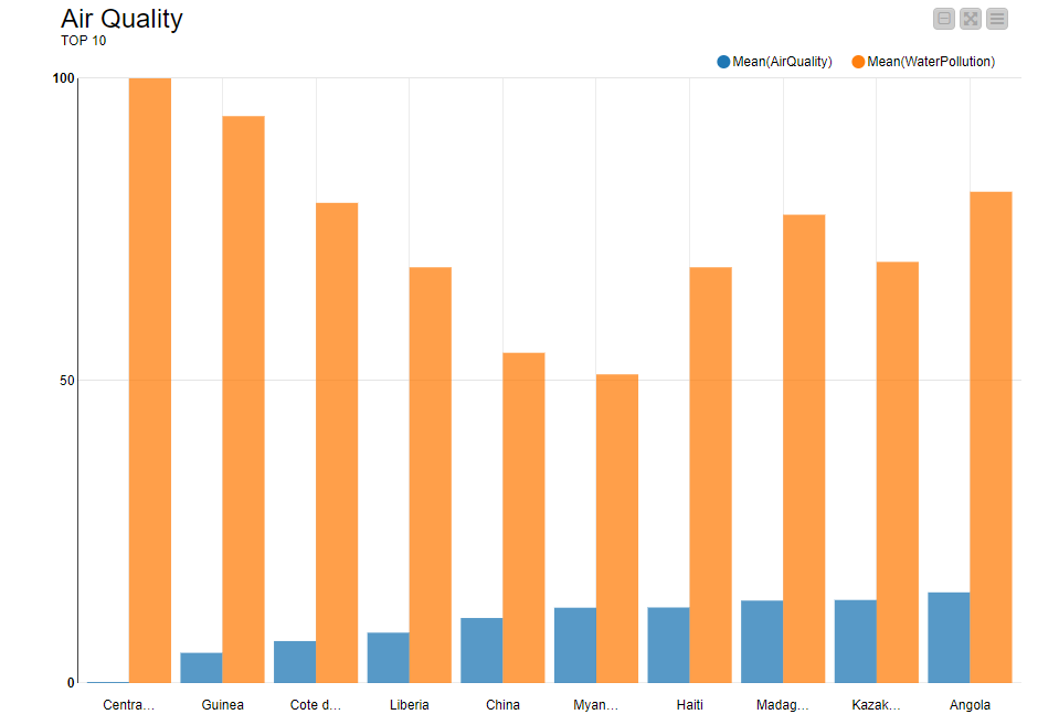
My solution for challenge 5 creates 2 Bar Charts, one for Air Quality and one for Water Pollution using the -Bar Chart (Labs)- node. I chose to display them horizontally, due to the length of the country names, although this could be improved with shortened versions.
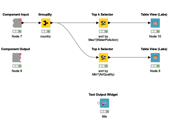
I also have provided some interactivity by using -Single Selection Widget- nodes to allow the user to select the type of aggregation in the -GroupBy- node (Mean, Min or Max) and to select whether they want to see the Best or Worst Countries displayed.
The selection of Best or Worst then sorts the rows in ascending or descending order in the -Top k Selector- node. The chart title also changes accordingly.
By default I’ve set it to the worst for both cases, as stated in the challenge
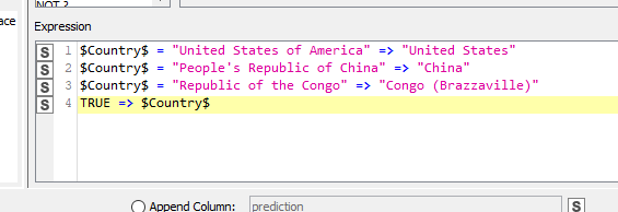
I replaced some country names in order to represent them:
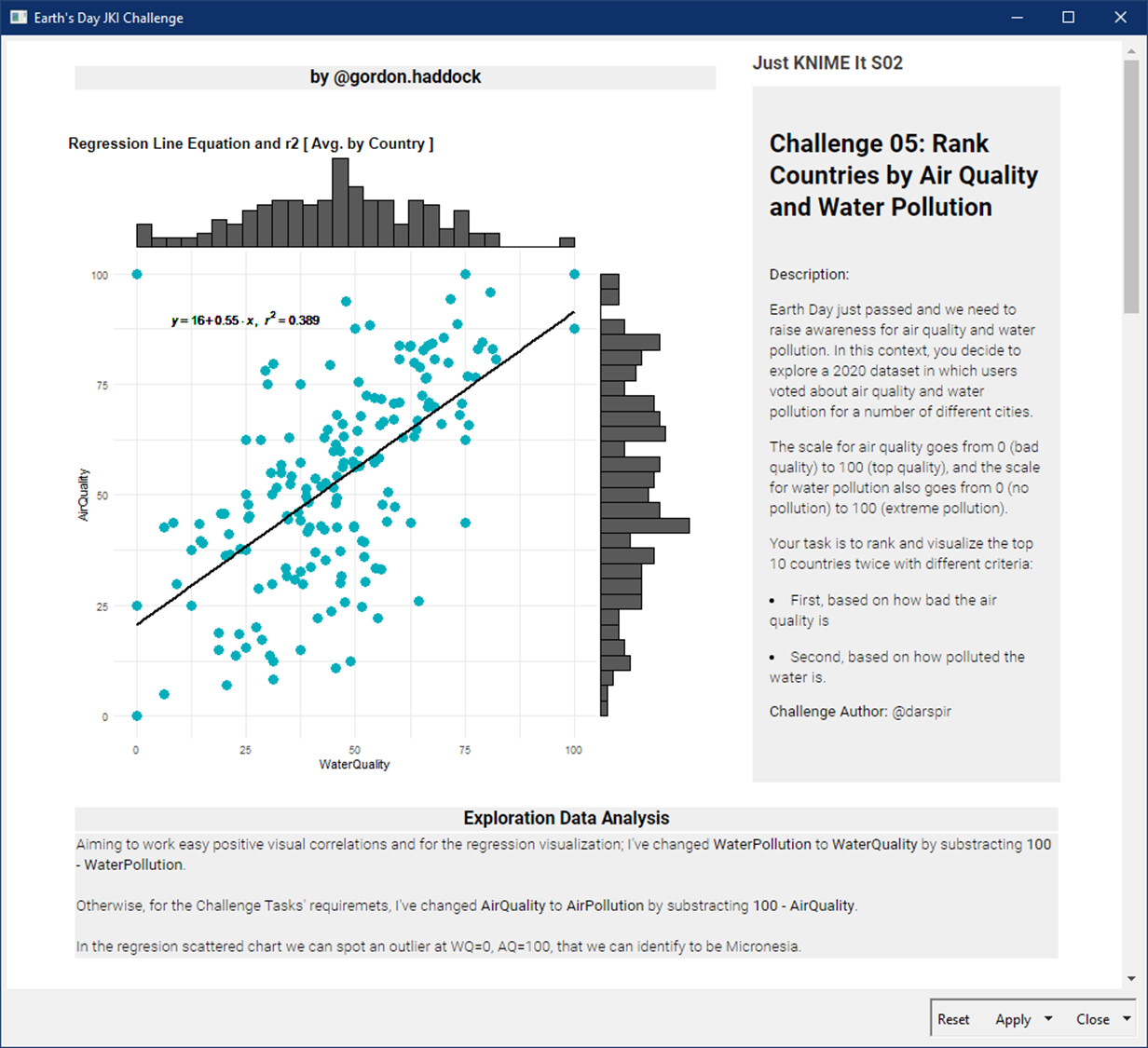
Talking about air quality and water pollution (0 can be either good or bad, depending on the fact you are talking about quality or pollution level), so i decided to convert water pollution into water quality
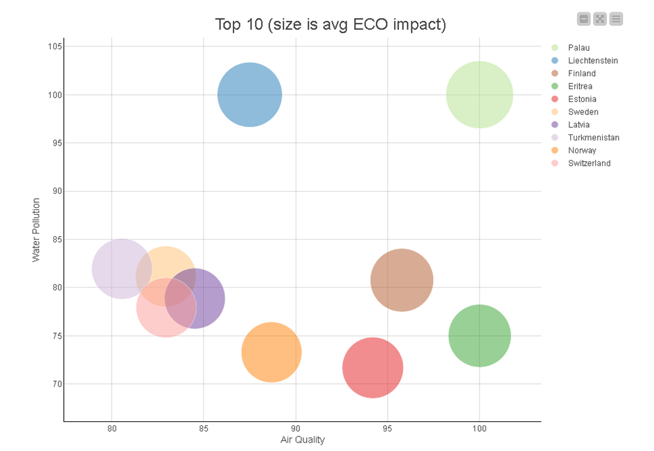
I introduced an overall score, that is a simple average between the two quality scores.
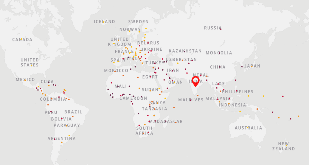
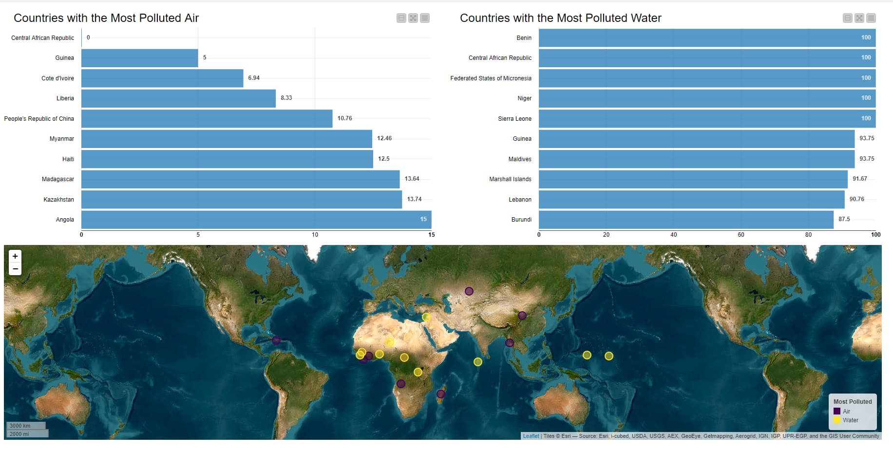
I computed the average score for each country in each category, then queried the long lat of each country and used this to display the most polluted country for air and water on a map.
Here’s my solution. Top and bottom 10 countries for both air and water. Also % of international mean. Added small value to any 0 score so country/average would compute.
Hello KNIMErs
This is my take on JKI S02-CH05. The challenge is quite interesting; I could recycle my R visualizations from previous S01 Challenges, then I could concentrate on building the dashboard, adding value to the analytical part.
Running the Dashboard may require some R-packages that are not listed, sorry for that, I’ll try to update in workflow labels later.
My solution is quite simple.
Just used the mean o of the cities notes to attribute a note for the Country.
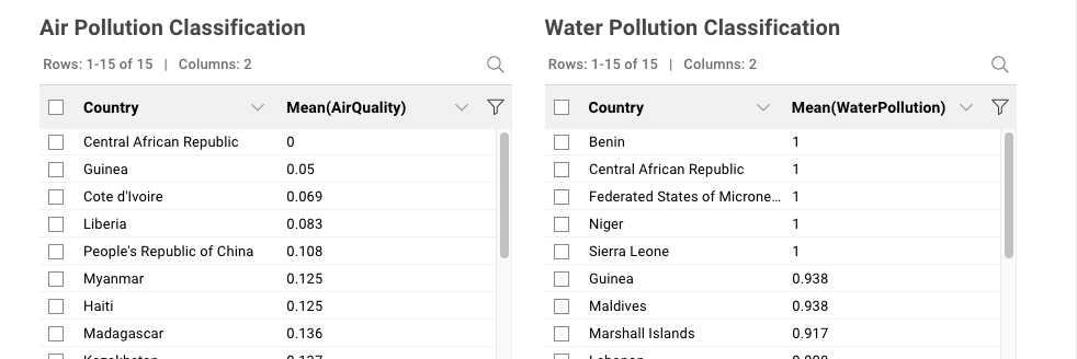
Then, created two separated ranks, filtered the top 10 rows and displayed them with Table View Node.
Here is my solution.
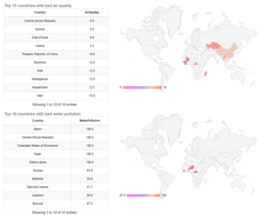
Only the Top 10 countries are shown on the Map.
Cote d’Ivoire must be converted to Ivory Coast or CI to appear on the Map.
The following three countries could not be displayed on the Map.
Federated States of Micronesia, Marshall Islands, Maldives
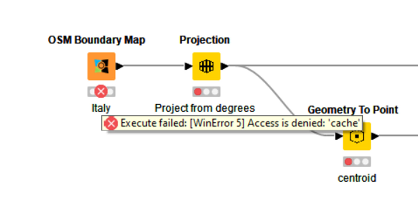
hey all… ive never used the Geospacial or OSM nodes before so i was really excited to learn some ew things here. however, after updagrading to 4.7 so i could use them, i am getting this problem… i cant seem to find a solution. has anyone seen it before? thnak you in advance.
Also- i am sure this isnt the right place to ask about this, but since i knew there would be many people working with these nodes i here, i thought it was worth a try…