Hi Crazy KNIMErs ![]() .
.
No me quedé muy contento ![]() con mi solución, y la he mejorado un poquito este fin de semana.
con mi solución, y la he mejorado un poquito este fin de semana. ![]()
Saludos!
Hi Crazy KNIMErs ![]() .
.
No me quedé muy contento ![]() con mi solución, y la he mejorado un poquito este fin de semana.
con mi solución, y la he mejorado un poquito este fin de semana. ![]()
Saludos!
Ps: source of Python Code: Drawing a Pass Map in Python - FC Python ![]()
Hello Community,
I saw many exciting solutions and someone very interested supported by the use of Python programming to draw a Soccer Field.
I developed my solution based on the flows published for other members.
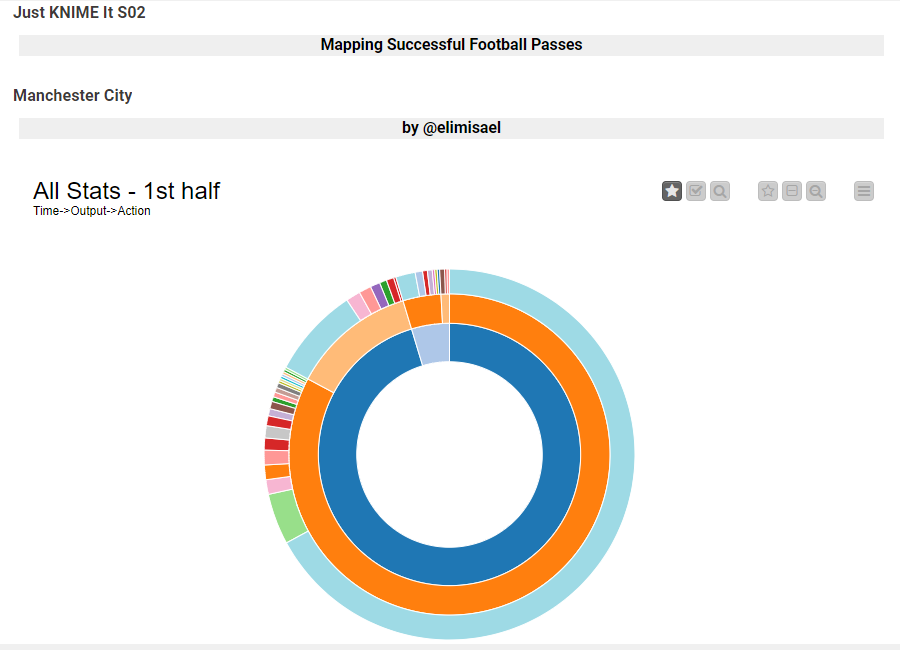
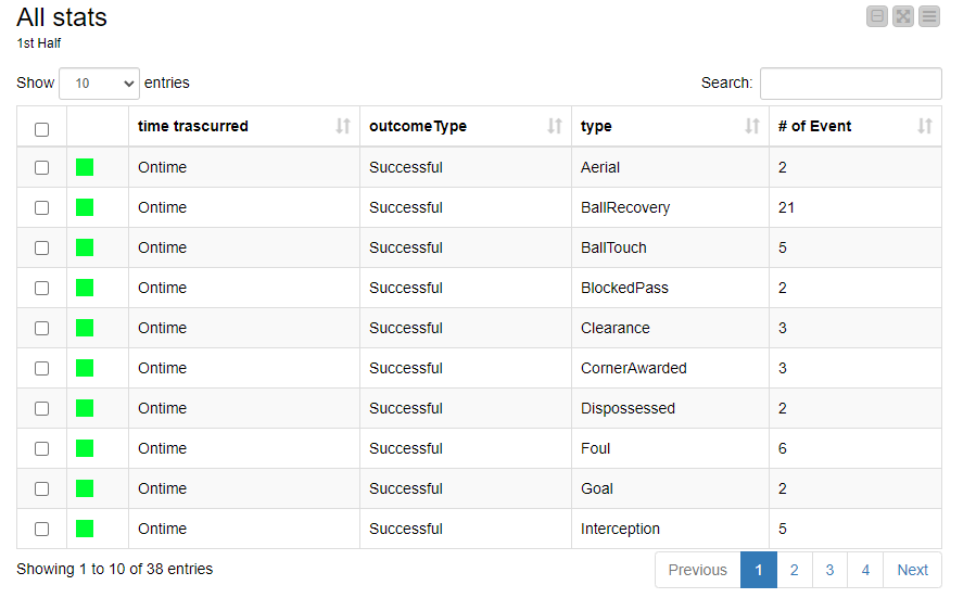
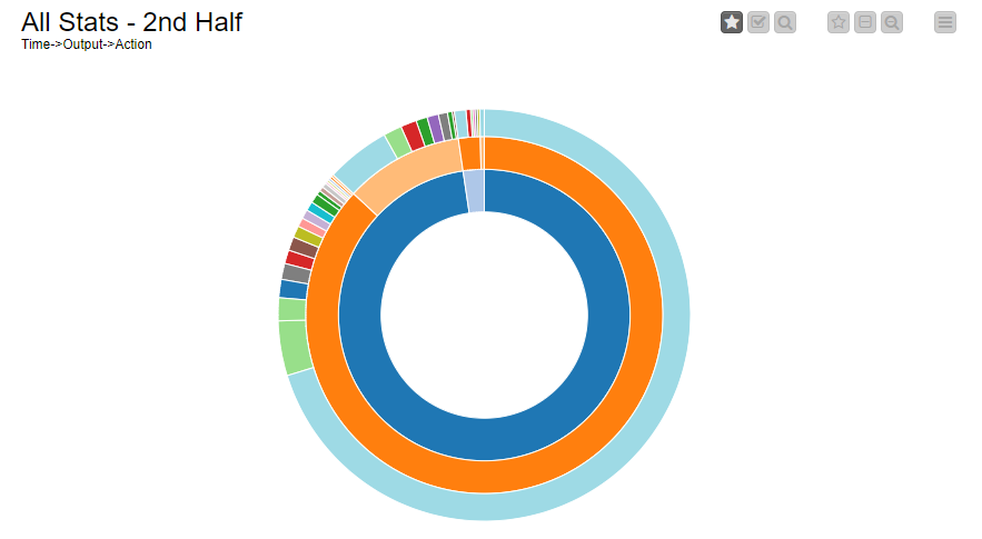
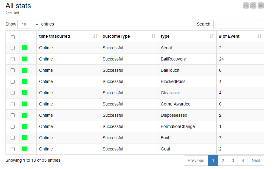
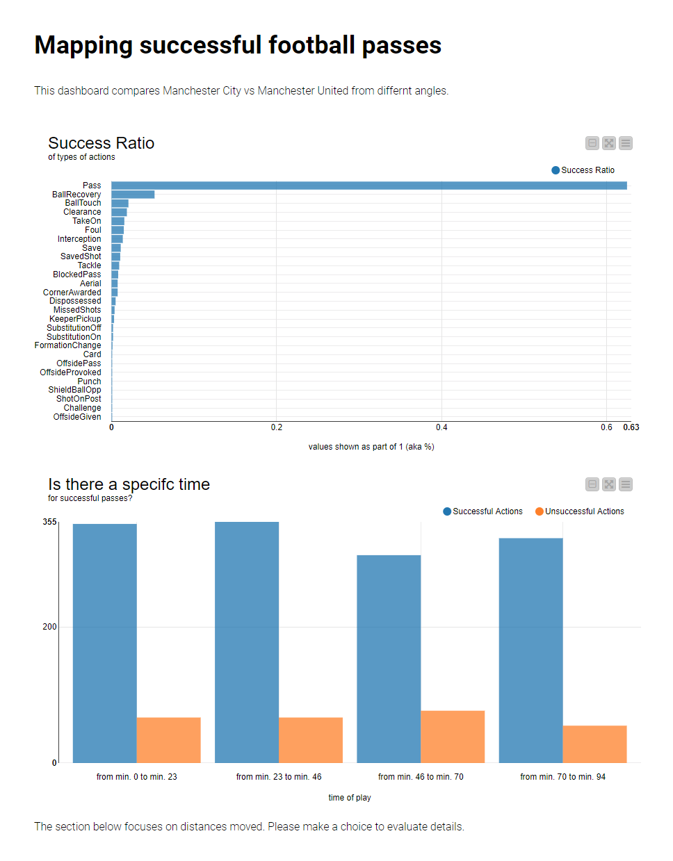
I share the following carpet: JKISeason2-7 – KNIME Community Hub, this contains the same solution showed in different presentations.
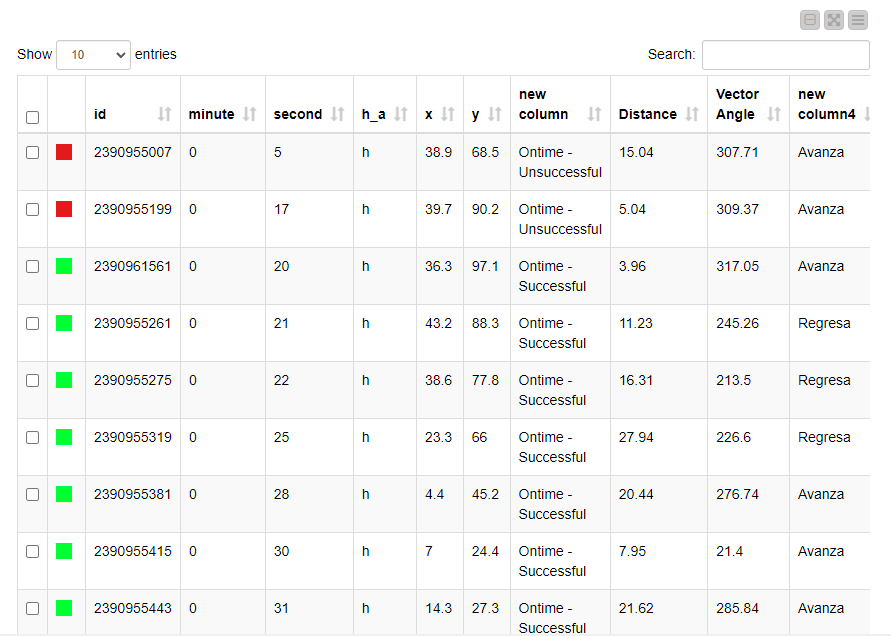
All have the following information based on both teams, full stats from the data source and only the information relevant to the passes, grouped by each halftime.
Thanks @l6fader! I’m glad you found it useful! I was learning too ![]()
My solution to Challenge 7
Hi, KNIMEr, ![]()
![]()
![]()
Here is mine
Best,
HaveF
I wrote a relatively detailed analysis post in Chinese. If you are interested, you can take a look(maybe use translator?).
Dear KNIMErs,
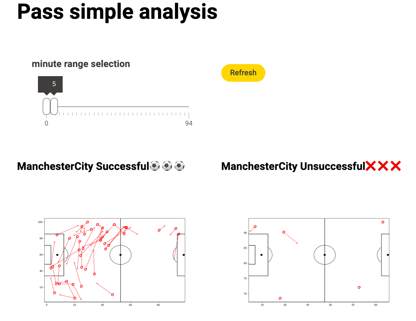
alright, here’s my solution. Looking at the submissions so far, it feels a little bit “lame” because I have now soccer field visualized etc ![]()
Learned again a lot about re-executing when making changes in this little dashboard and also used some Auto-Binner functionality to bin some “match times” and the Euclidean Distance (aka movements in the 2D space rather than just from A to B) ![]()
Never thought I actually will like mathematics again hahaha ![]()
Cheers
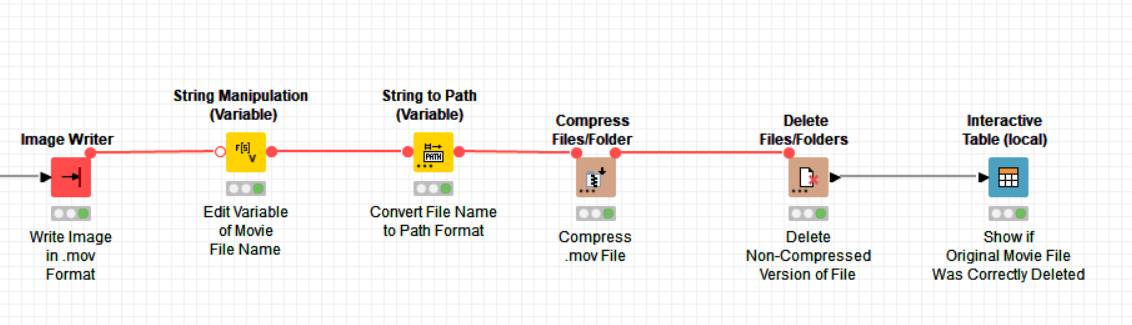
Hi Everyone ![]()
I just want to share an updated version of my workflow (in case anyone enjoyed the video!) because I had an issue generating a full video in AVI format and I have now received a solution from @gab1one on the forum:
The NativeQT format in -Image Writer- successfully generates the full video ![]()
I have also added a little bit extra at the end of the workflow to compress the video and delete the original version in the data folder:
The original link to the hub workflow should work but I’ll share again:
Just for fun, I made a video with the passes of both teams in different colours, you can watch it here:

Best wishes
Heather
![]() As always on Tuesdays, here’s our solution to last week’s challenge!
As always on Tuesdays, here’s our solution to last week’s challenge! ![]()
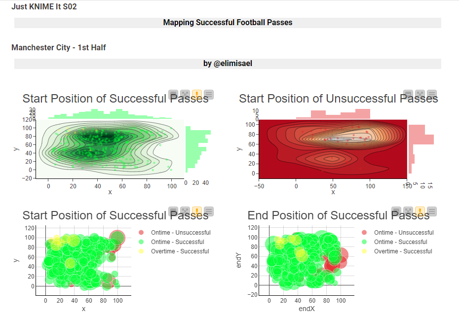
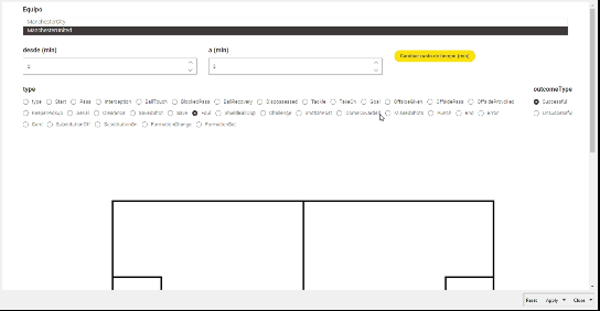
![]() Since this was an easy challenge, we kept the solution very simple and didactic, relying on a heat map that is quick to build with the 2D Density Plot (Plotly) node. As you can see, most of Manchester City’s successful passes are initiated from the center of the field.
Since this was an easy challenge, we kept the solution very simple and didactic, relying on a heat map that is quick to build with the 2D Density Plot (Plotly) node. As you can see, most of Manchester City’s successful passes are initiated from the center of the field.
![]() Once again your incredible solutions AMAZE us!
Once again your incredible solutions AMAZE us! ![]() This year it seems like you folks are really going the extra mile and really exploring how KNIME can be used. We are so happy! This really means a lot to us.
This year it seems like you folks are really going the extra mile and really exploring how KNIME can be used. We are so happy! This really means a lot to us. ![]()
See you tomorrow for a new challenge!
@HeatherPikairos @gab1one
I found this solution to be very cool (as i mentioned above) and immediately tried adapting it to a real use case in my regular job. I generate the PNGs by converting from SVGs generated by the generic javascript node. What i find is that when i use the PNG to ImgPlus node, the image loses resolution and the colors really get messed up. Do either of you know how to overcome this?
Hi @l6fader thanks again for the comment about my workflow ![]()
Unfortunately as I am a newbie in this area I cannot help to answer your query, but hopefully @gab1one can ![]()
This topic was automatically closed 90 days after the last reply. New replies are no longer allowed.