This week we come back with a problem involving visualizations. It is on the topic of football analytics, and the tricky part is to properly choose the visualization technique for the problem. Give it some thought!
Here is the challenge. Let’s use this thread to post our solutions to it, which should be uploaded to your public KNIME Hub spaces with tag JKISeason2-7 .
Need help with tags? To add tag JKISeason2-7 to your workflow, go to the description panel on the right in KNIME Analytics Platform, click the pencil to edit it, and you will see the option for adding tags right there. Let us know if you have any problems!
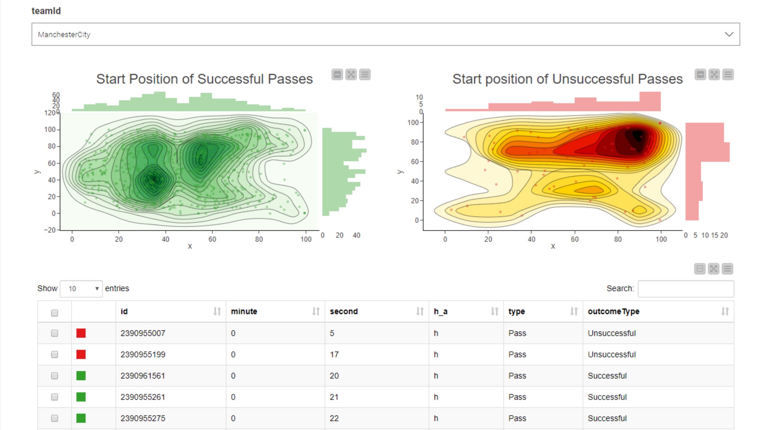
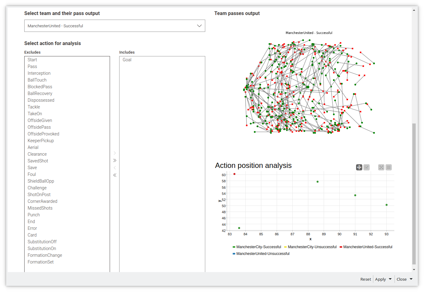
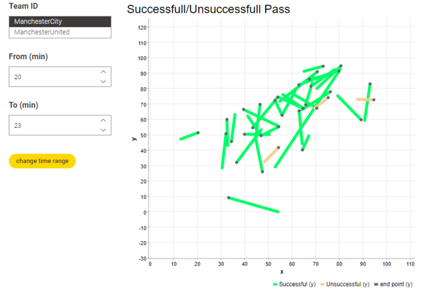
An interactive filter allows you to select the team and the dashboard will show the successful/unsuccessful passes. Moreover it can be possible to select a subset of passes in the graphs to make them selected on the table and viceversa.
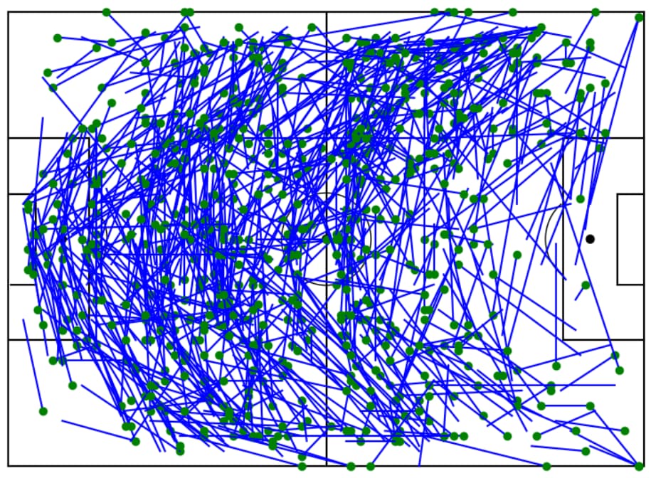
This challenge was pretty fun and I found a great resource from FCPython explaining how to create a pass map!
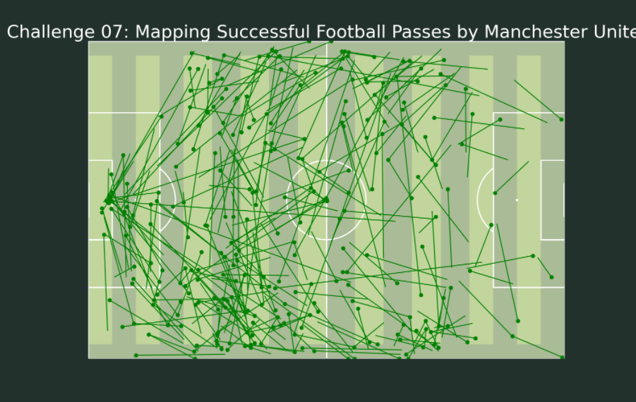
After separating the Manchester City successful pass data from the file, I then used the -Python View- node to generate a Pass Map, where the dot is the starting point of the pass:
I then decided to take this further and create a moving video of each pass over time by using a -Chunk Loop- to create an image for each row of the table. After converting the image with the -PNG Image to ImgPlus- node and transposing the data, I was then able to use the -Merger- node to create one image object from all the images. Finally, I used the -Image Writer- node to generate a video in AVI format. You can find the video in the data folder of the workflow as a zip because it was too large to upload here.
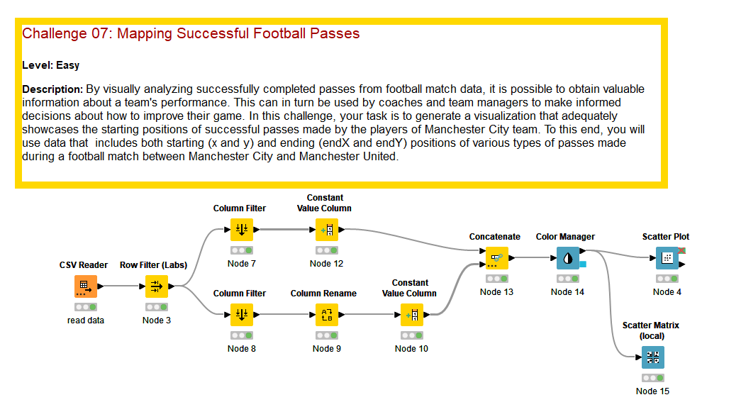
Here is my solution: JKISeason2-7 – KNIME Community Hub
Thank you @HeatherPikairos for this idea of visualizing the football pitch, it was very helpful.
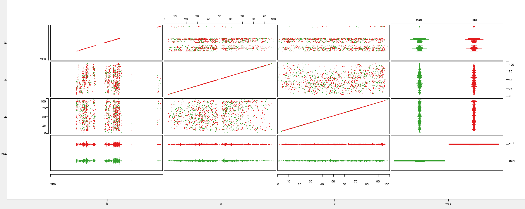
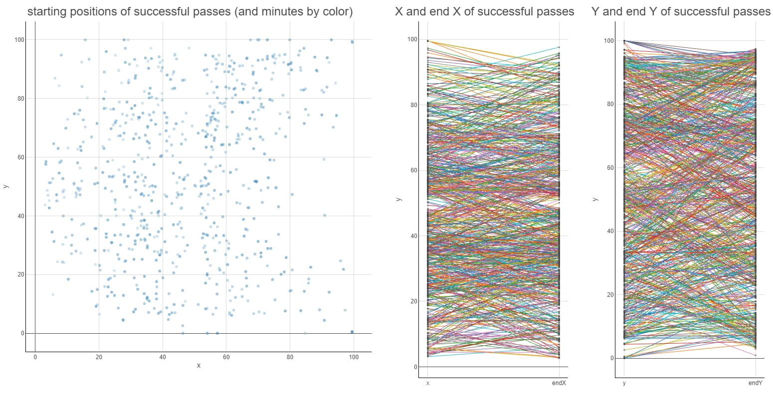
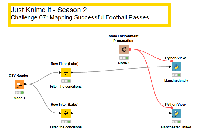
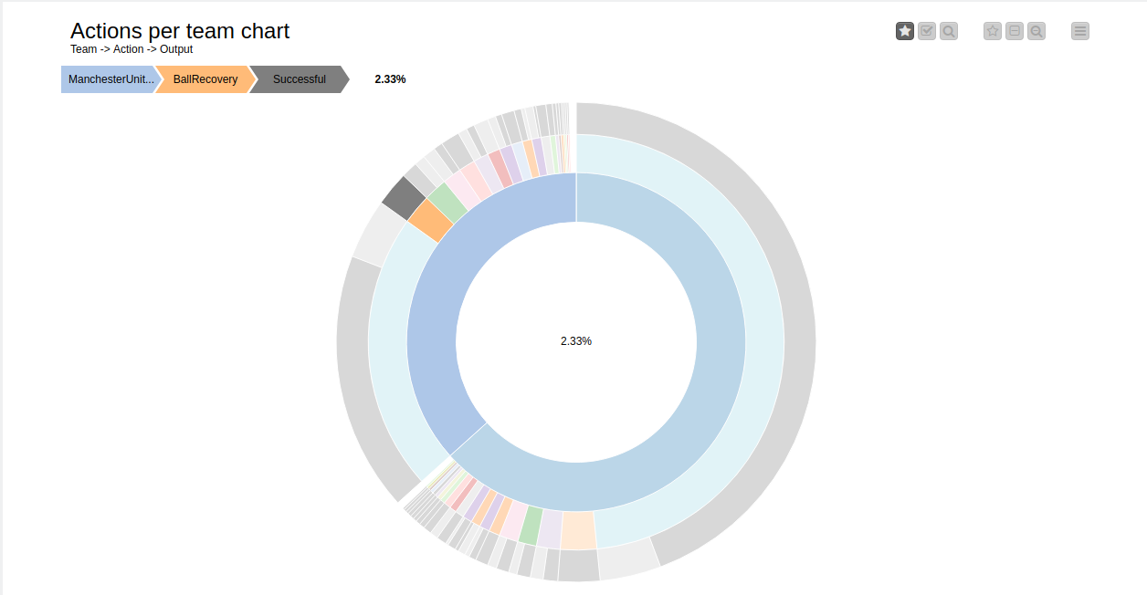
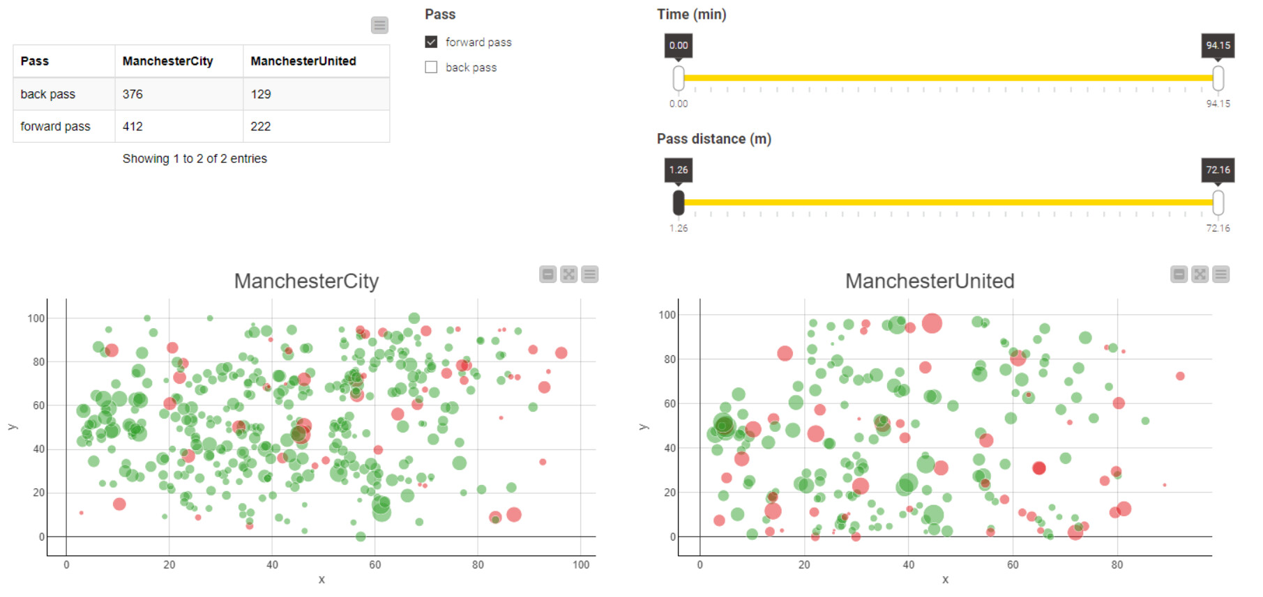
I decided to add overall visualization for each team, their actions and the output and make it possible to select which action to visualize on the pitch^W scatter plot.
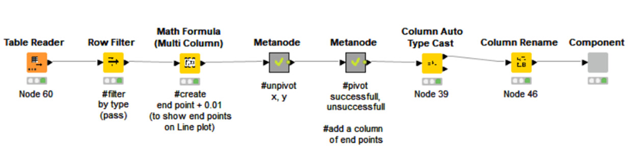
Line plot was used for visualization.
In order to draw the end points of Pass, data was added with coordinates slightly shifted from endY.
This process was also necessary to prevent Pass from being connected to each other.
I think there are better ways.
I have created my workflow for analysis at the following points.
・Back pass or forward pass?
・Time Zone
・Pass distance (plot size is the pass distance)
Back passes have a higher success rate.
ManchesterCity has a higher percentage of back passes than ManchesterUnited.
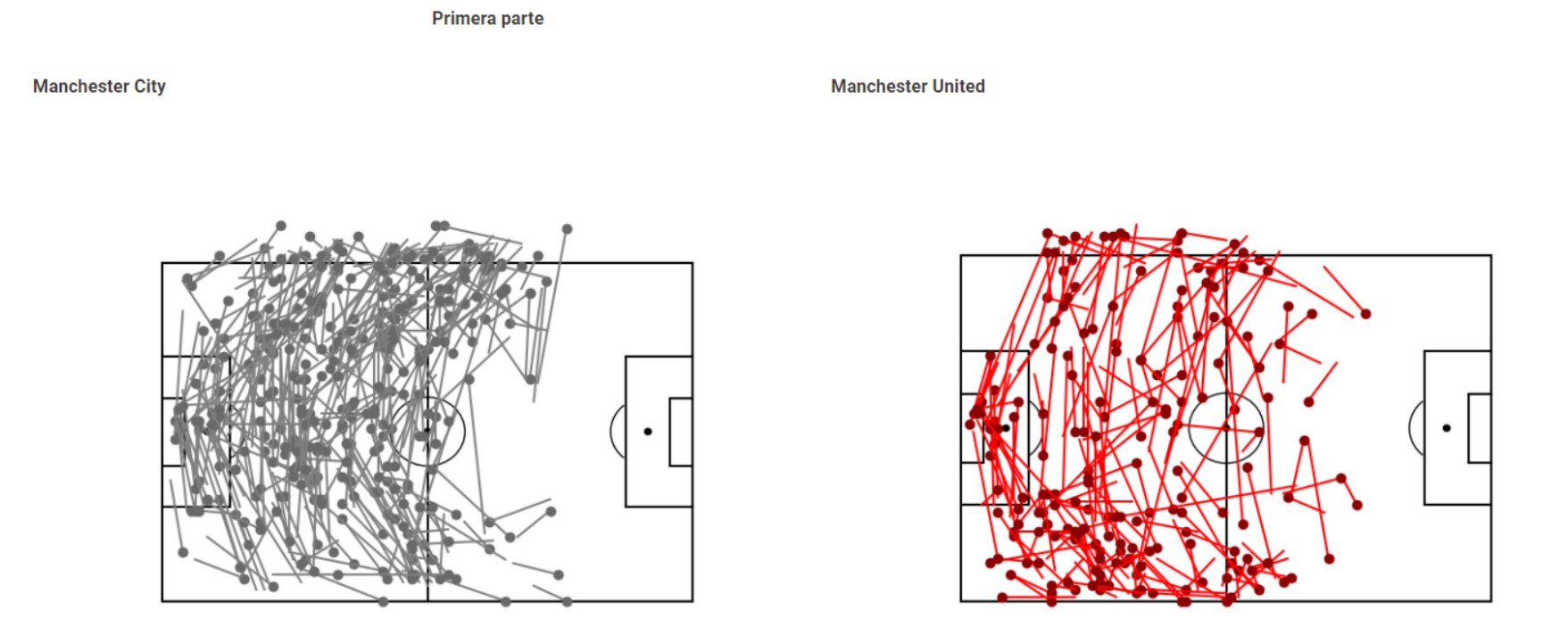
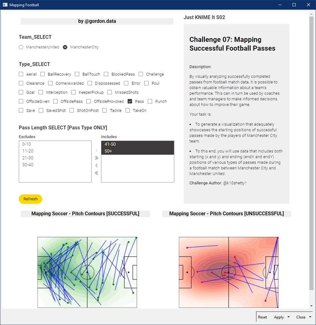
Hi All- here is my solution for this week. Overall, i see some people had similar idea in mind as what i had. I built in a Filter-by-Team functionality and then added time intervals in order to add a bit of granularity… all of the data at once was not really informative. I did use a refresh button (instead of using the re-execution setting of the multiple selection widgets) to allow for changing multiple filter settings at once before the refresh occured… much smoother this way. When both teams are added to the visualization, i colored the markers by home jersey color. The markers are placed at the starting point of the pass attempt. The color indicates successful (green) or failed (red) passing attempt.
Hello KNIMErs
This is my take on S2 Challenge 07. I thought at the beginning as a good idea to try it with Py, but it took me more time than expected. Besides I have the feeling that R allows more creativity and more flexible too in combining charts Good lessons learnt and fun anyhow.
Hello JKIers,
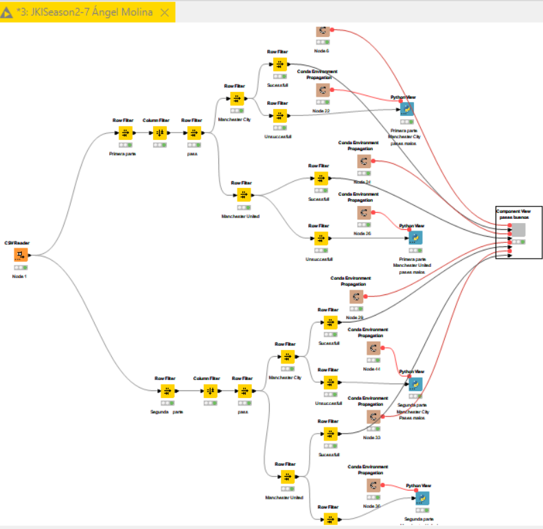
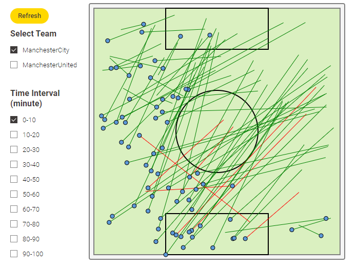
Just for the records. I’m still working in the workflow with some upgrades. Pass arrows layer has been added to the dashboard. As an example, here in the picture there’s a sample plot of Manchester City’s long distance passes [>40 pitch-units ] (be aware that units are provided in X and Y percentage, so units need to be transformed over pitch shape).
I’ve just realised fron @HeatherPikairos’ post, that I was using the same FCPython resource for the contour maps. So I could add easily the pass arrows’ map on top.