Hi Everyone ![]()
The same thing for me this week. I have also used the example from the hub for my workflow to calculate the Shapley Values and SHAP using the loop nodes.
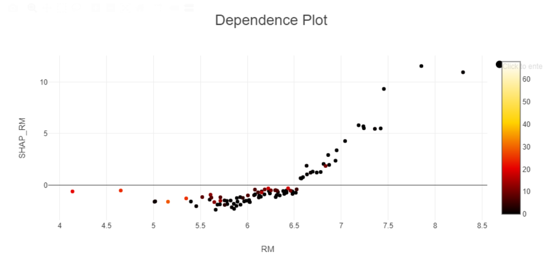
For the dependence plots, I followed the set-up from the example workflow and therefore plotted the RM column (x-axis) and Shapley_RM (y-axis) with CRIM as the colour. It appears that the majority of points on the Dependence Plot are black indicating a low crime rate in general. There are a few red points indicating higher crime rates and these appear to be around low to medium RM values, where as at high RM values, all points are black (low CRIM):

The same can be seen for the SHAP Dependence Plot:
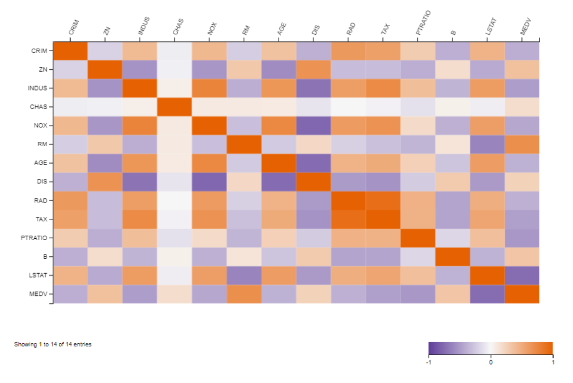
As an extra, I also performed Linear Correlation on the original data and created a Heatmap to show the correlation of all pairs of variables. Looking at RM and CRIM on this heatmap, the lilac colour represents a negative correlation:
My workflow can be found here:
Looking forward to seeing the KNIME solution this week to see how it was supposed to be done!
Best wishes
Heather