Hi, folks! Do you know what time it is? Time for a new Just KNIME It! challenge is!
Imagine you work for a space exploration company, analyzing the landing performance of its flagship rocket. Your task is to understand what factors drive successful first-stage landings, and then generate insights that could improve future landing attempts. What makes for an effective outer space mission?
Here is the challenge. Let’s use this thread to post our solutions to it, which should be uploaded to your public KNIME Hub spaces with tag JKISeason4-15 .
Need help with tags? To add tag JKISeason4-15 to your workflow, go to the description panel in KNIME Analytics Platform, click the pencil to edit it, and you will see the option for adding tags right there. Let us know if you have any problems!
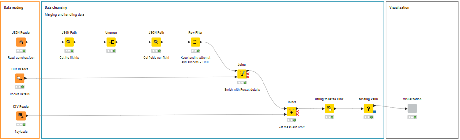
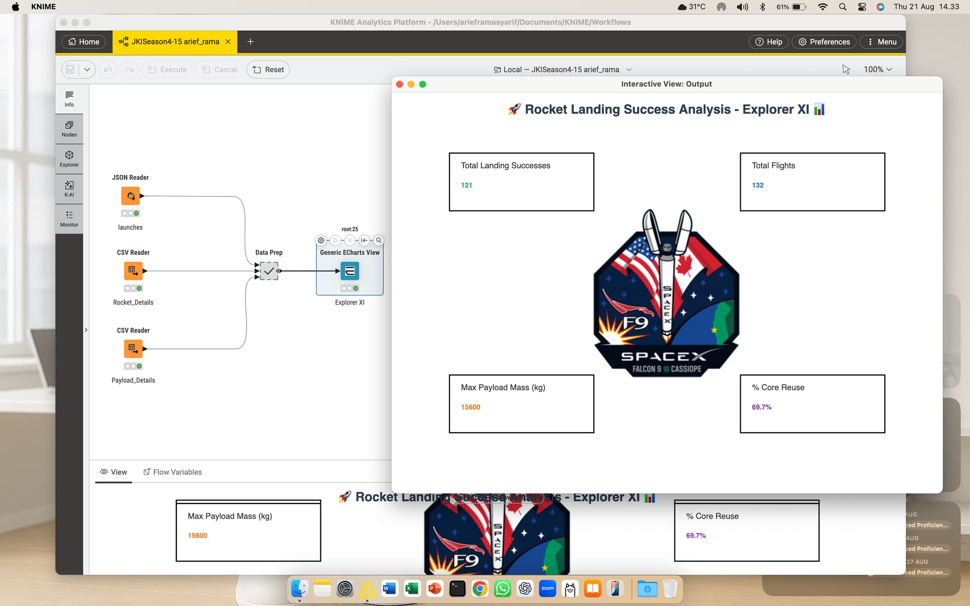
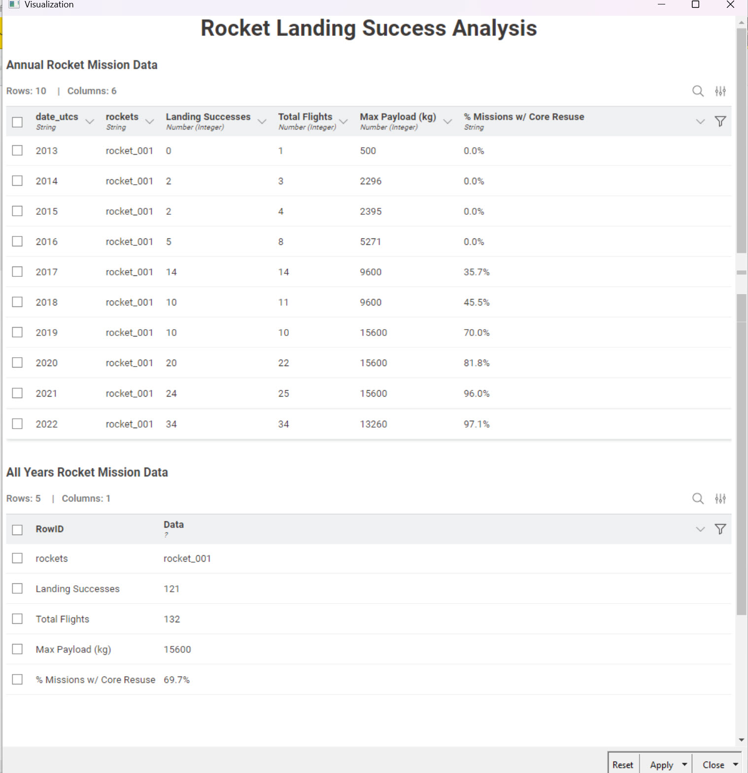
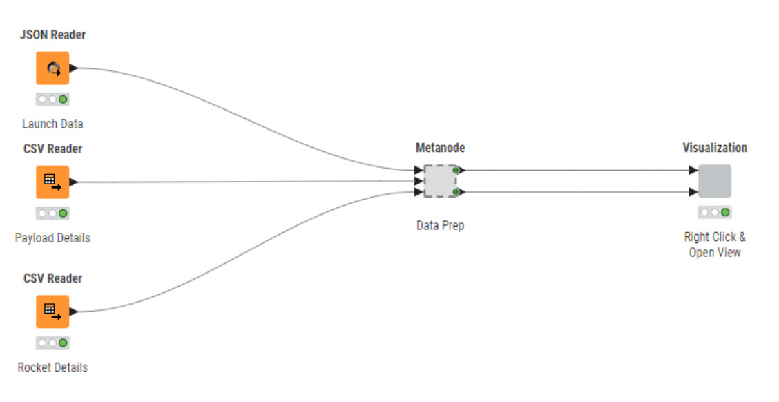
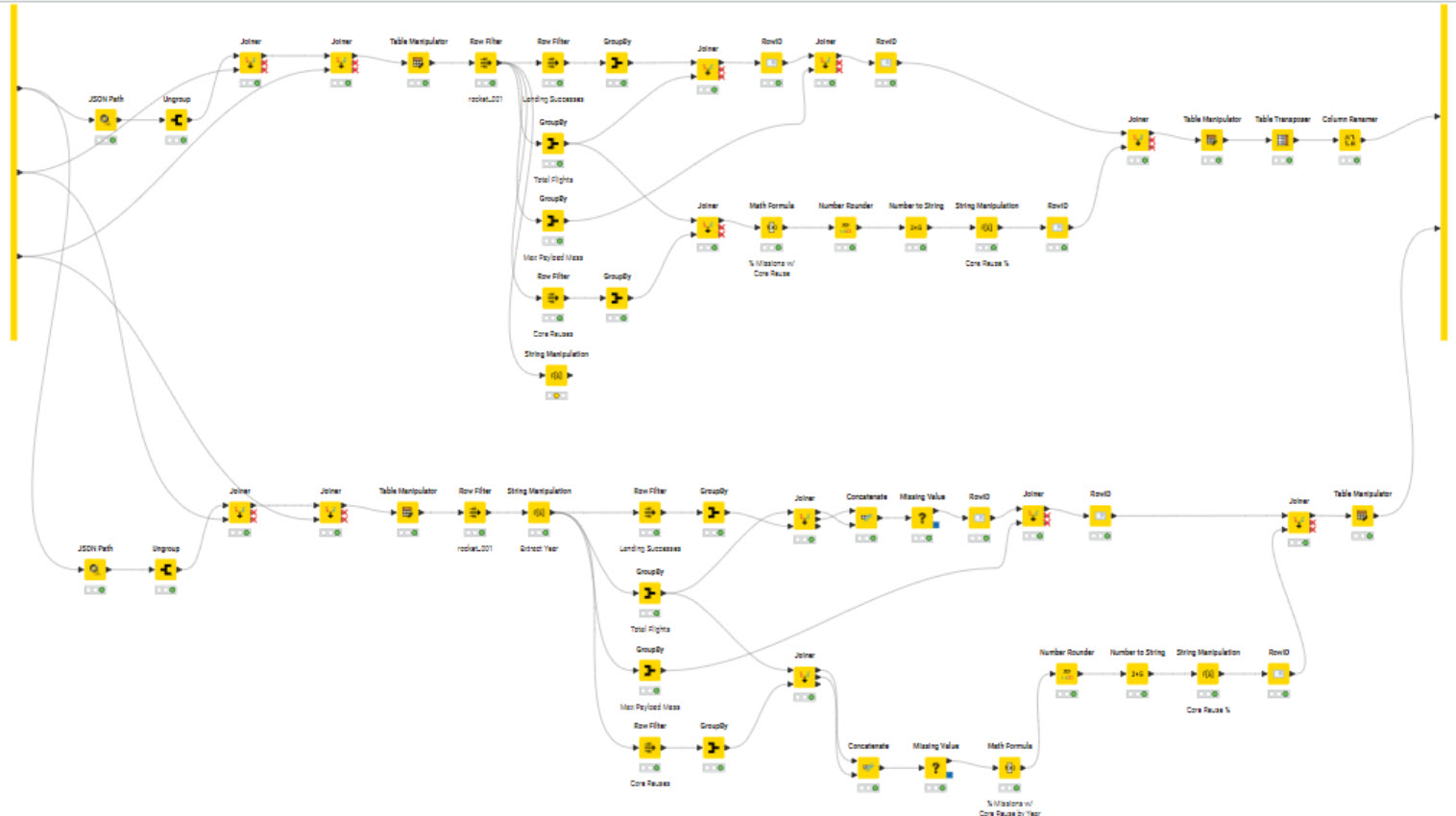
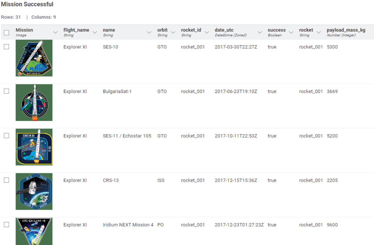
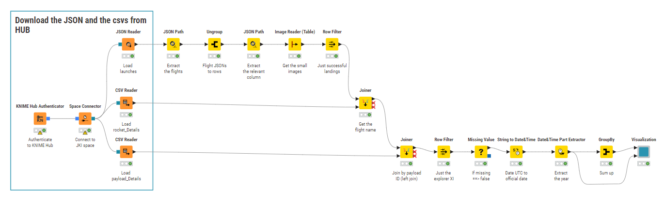
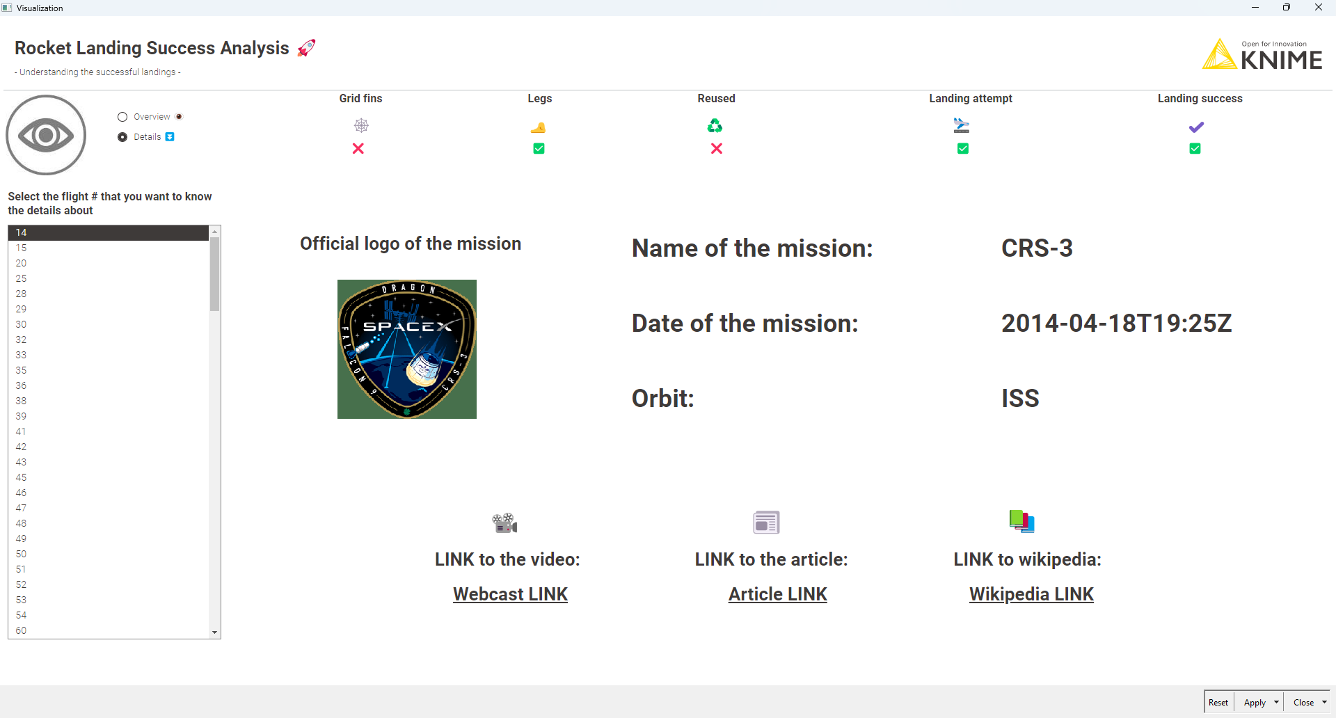
Not much issues in the data to handle at first sight, except UTC string to date.
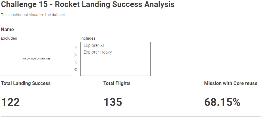
When handling in the dashboard flight selection, then, missing value is needed for proportion calculation (done in the component for me).
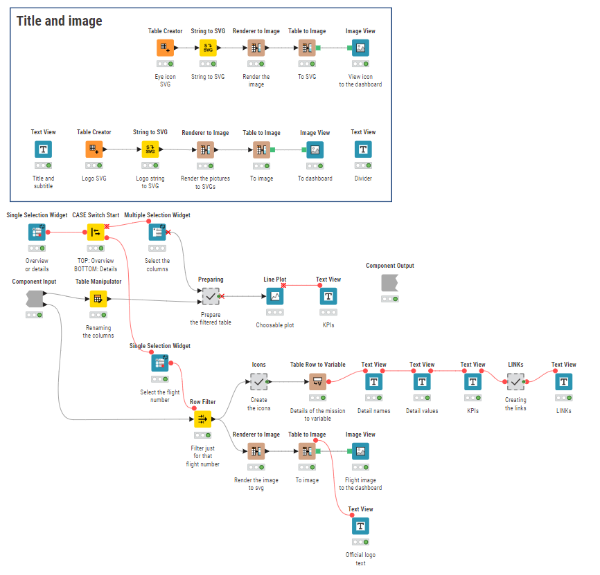
Didn’t spend much time on design - I am sure I can improve!
Looking forward checking your dashboards all!!
This afternoon in Jakarta , I just wrapped up my solution for Week 15 of Just KNIME It! Let’s keep the energy high and stay motivated to tackle these weekly challenges together!
Excited to see your takes on the challenge.
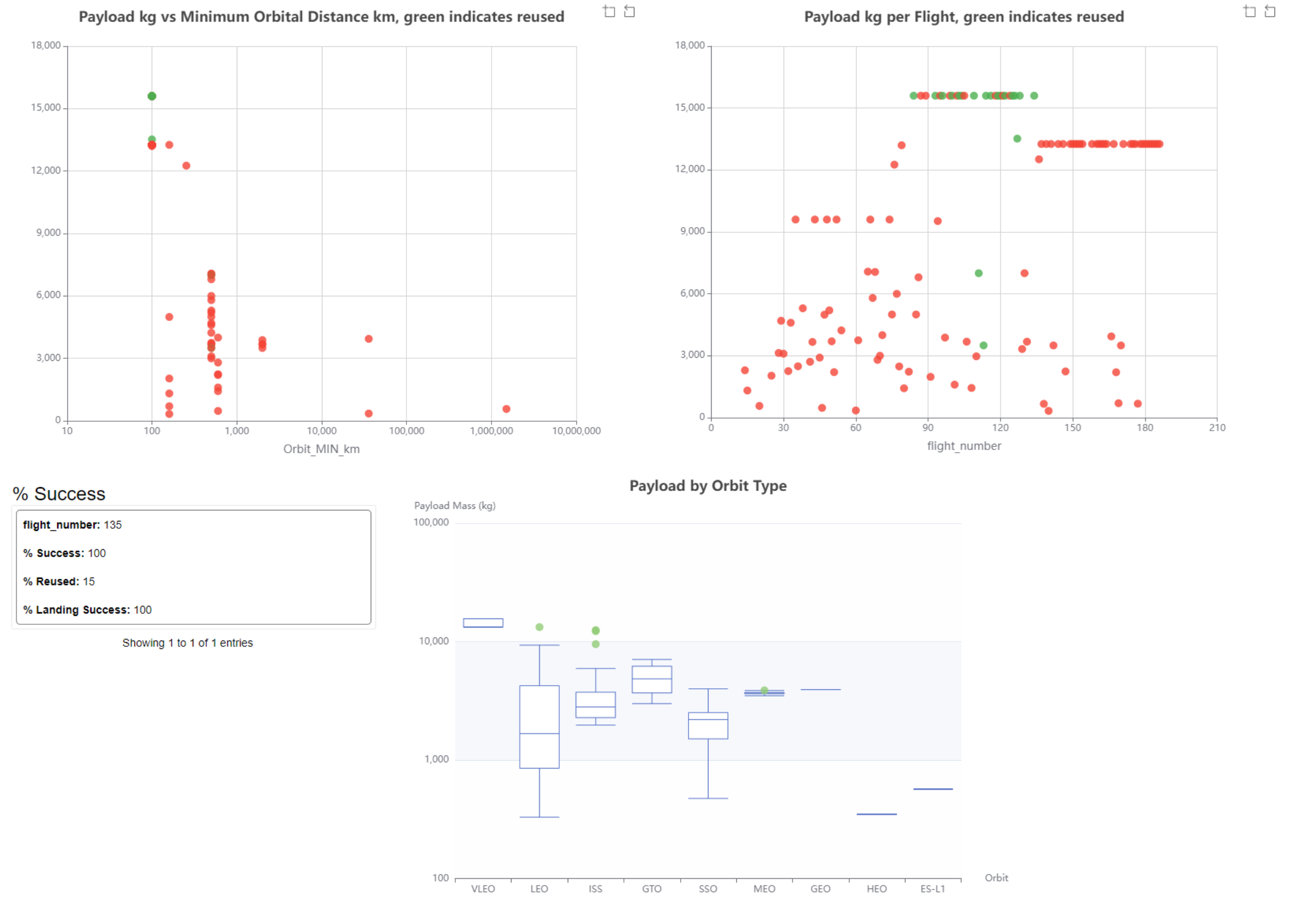
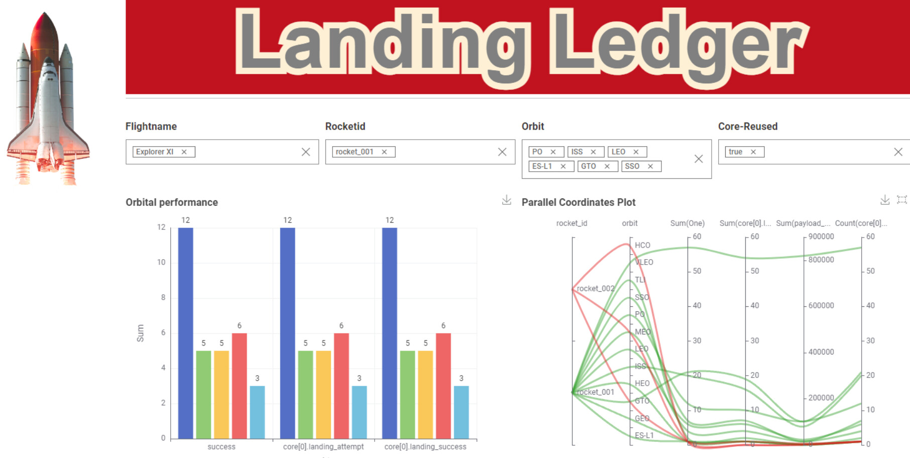
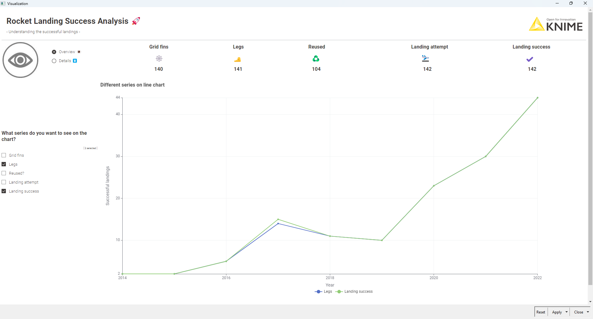
For those who want to go beyond the basics, why not try adding the extra visualizations too? Think line chart (success rate by year), bar chart (success rate by orbit), scatter plot (payload vs. mission), or even a spider chart to explore hardware reuse patterns.
As it used to be, I puttered with the visualization a lot. As the days (and the challenges) pass by I get to realize that we can visualize anything with KNIME, just like with the top notch BI softwares, but KNIME has the full capability to handle the backend as well. So in my opinion: Real real great
Our solution to last week’s JustKNIMEIt challenge is out!
Our latest data puzzle was no rocket science: some JSON parsing, a little data cleaning and a few visualizations should take you to “mission accomplished”! As always, our community went above and beyond with the visualizations: so many strong data apps this week!
For tomorrow’s challenge, grab a handkerchief and some anti-sneeze medication: we’re going to explore the world of allergens in Texas!