You are planning on moving to Austin, Texas in 2026, but you suffer from a few allergies. To be better prepared for life in your new city, you want to find out which months and seasons are the “most allergenic” there. Which findings are the most surprising?
Here is the challenge. Let’s use this thread to post our solutions to it, which should be uploaded to your public KNIME Hub spaces with tag JKISeason4-16 .
Need help with tags? To add tag JKISeason4-16 to your workflow, go to the description panel in KNIME Analytics Platform, click the pencil to edit it, and you will see the option for adding tags right there. Let us know if you have any problems!
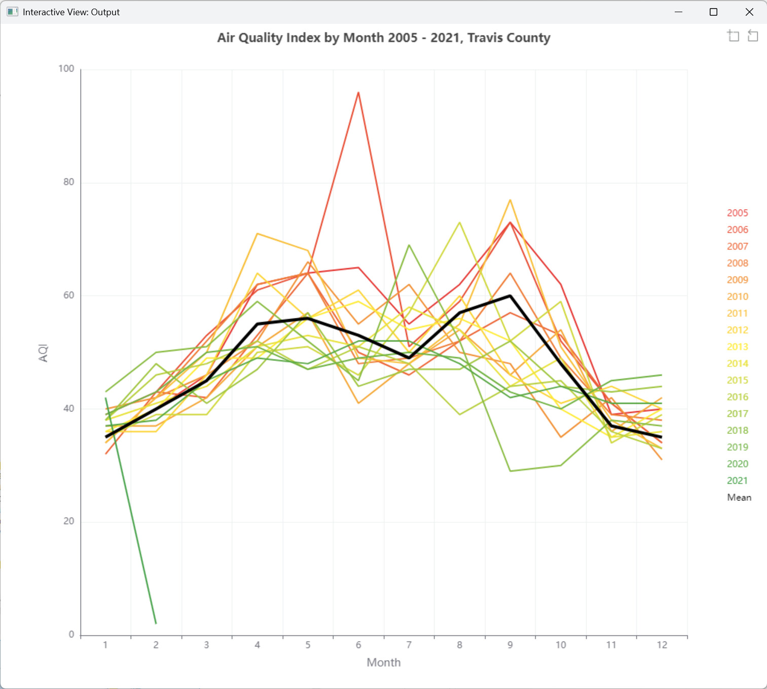
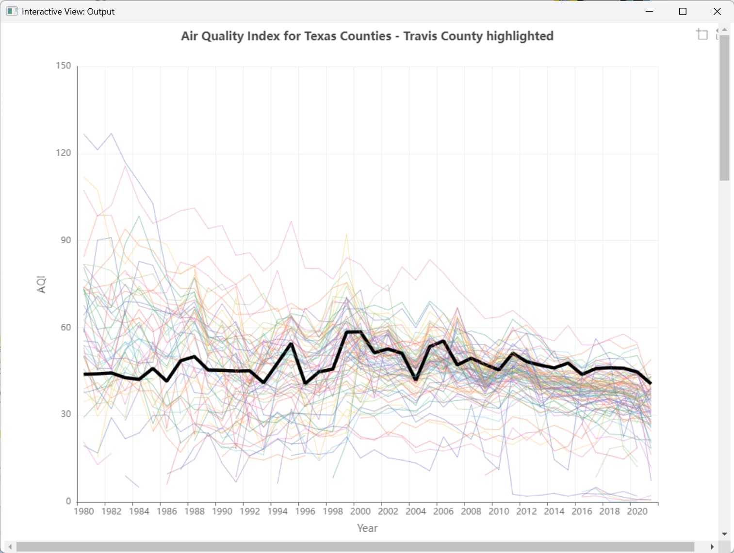
Nice one for data exploration.
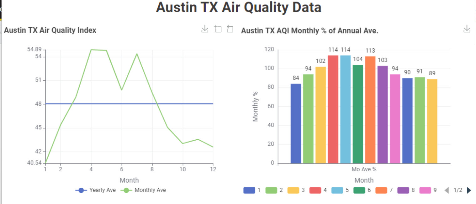
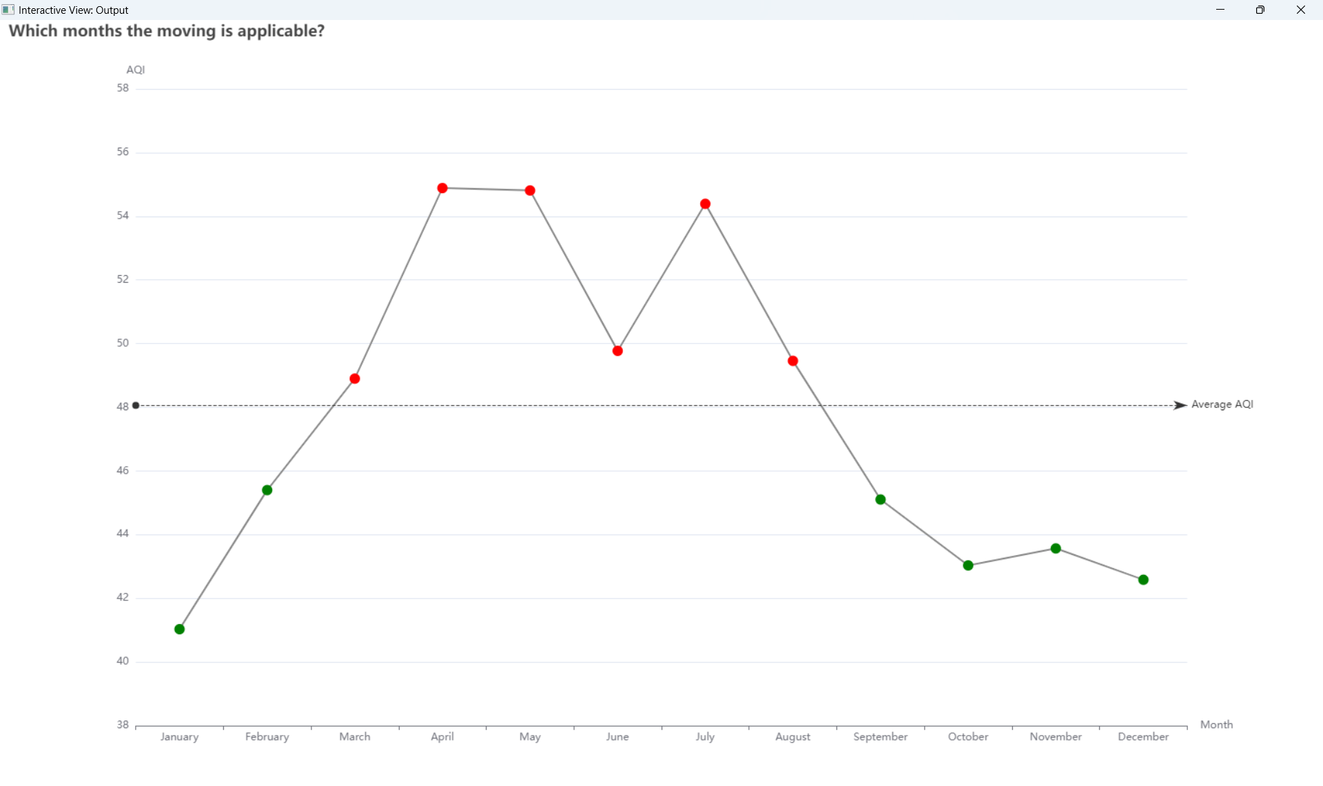
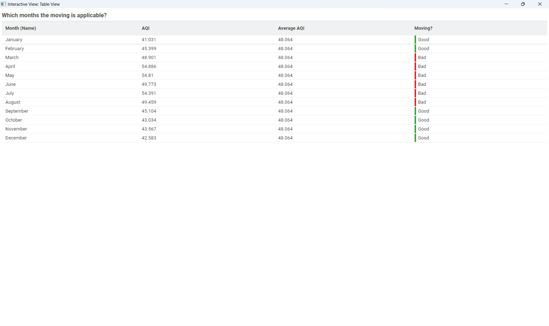
Next steps could be to identify months that are higher each year. And what value is considered as high, so it will be time to go traveling somewhere else at this period every year.
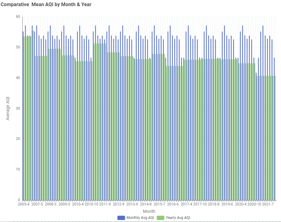
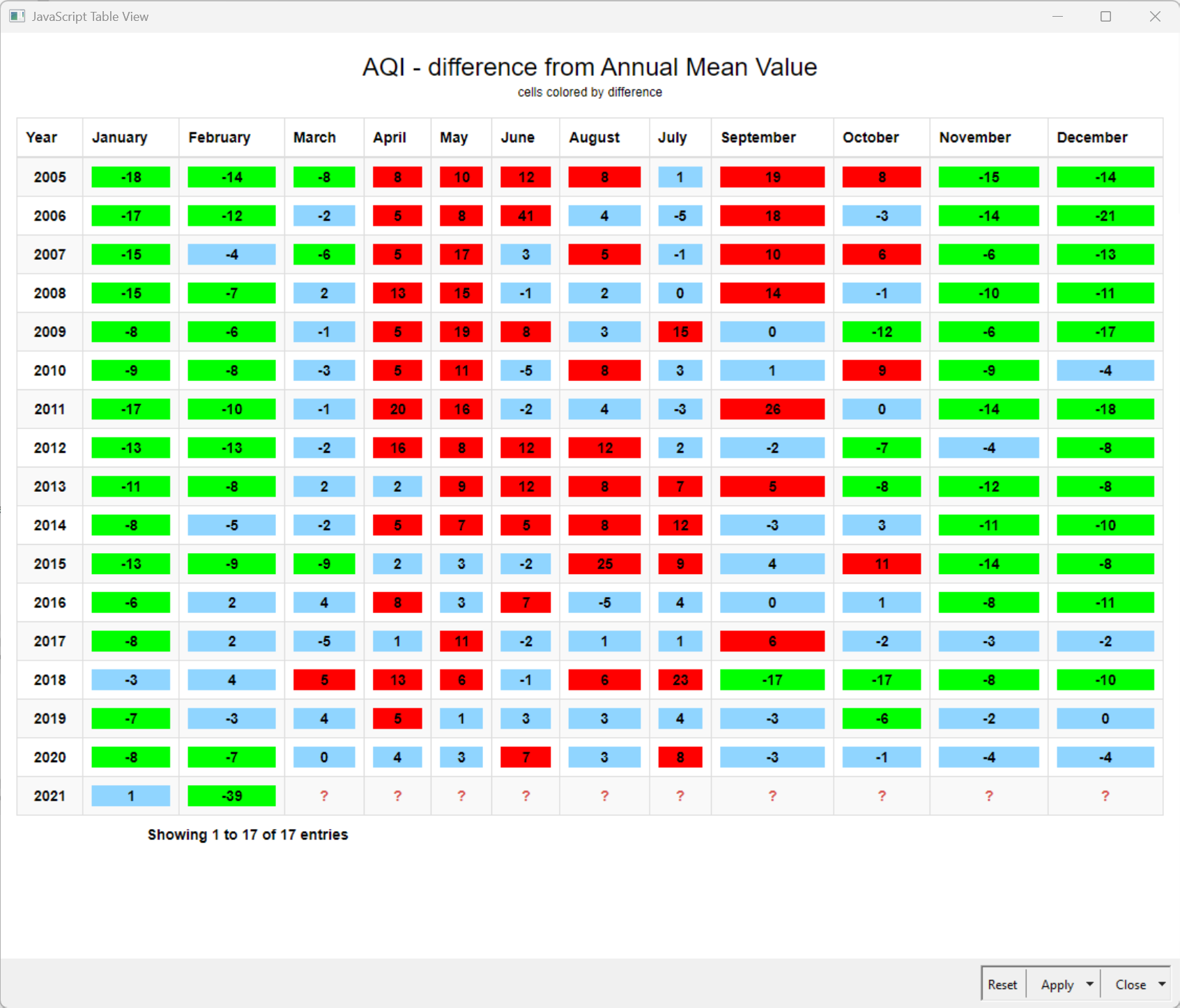
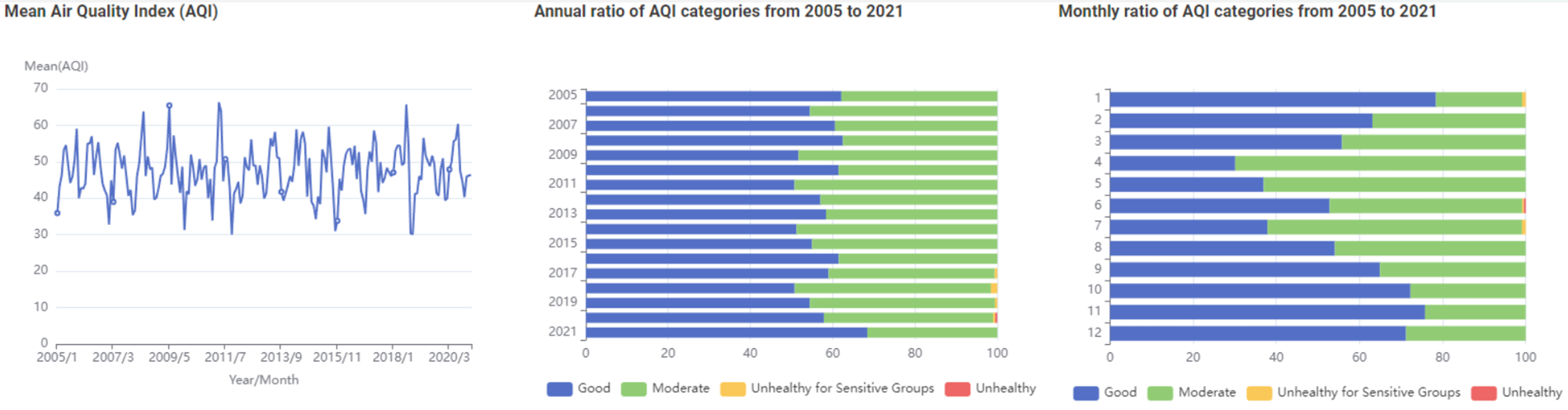
A quick dashboard to show the average AQI per month compared to average AQI per year. And the table with months higher than year.
Excited to share my take on this week’s Just KNIME It challenge –JKISeason4-16.
It’s always inspiring to explore how differently everyone approaches the same problem — so many creative angles and insights!
Looking forward to learning from your solutions as well.
I noticed that there are missing dates, where there was no data detected, but I decided it doesn’t count so much difference for the overall average. But as always, I’m open to discussion
Our solution to last week’s JustKNIMEIt challenge is out!
Last week’s challenge was not too complicated, but it still worked as a good way of sharpening data cleaning skills for insightful analyses. Did you try to work with the entire dataset? If so, that could lead to some big data practicing, too! Some of you reported findings related to air quality, including correlations with other variables. Very cool!
Join us tomorrow for a challenge that has to do with mock data creation – don’t we all need to do it sometimes?