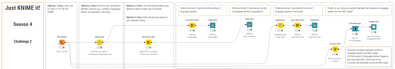
Hello, Just KNIME It! people! We’re back for the second challenge of our new season.
This week you are going to play the role of the linguist and explore which countries speak the most languages. Also: how does this relate to these countries’ vegetable growing season?
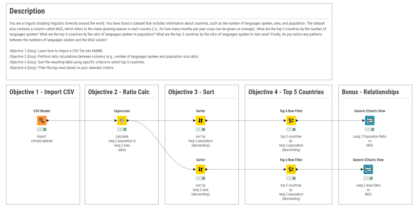
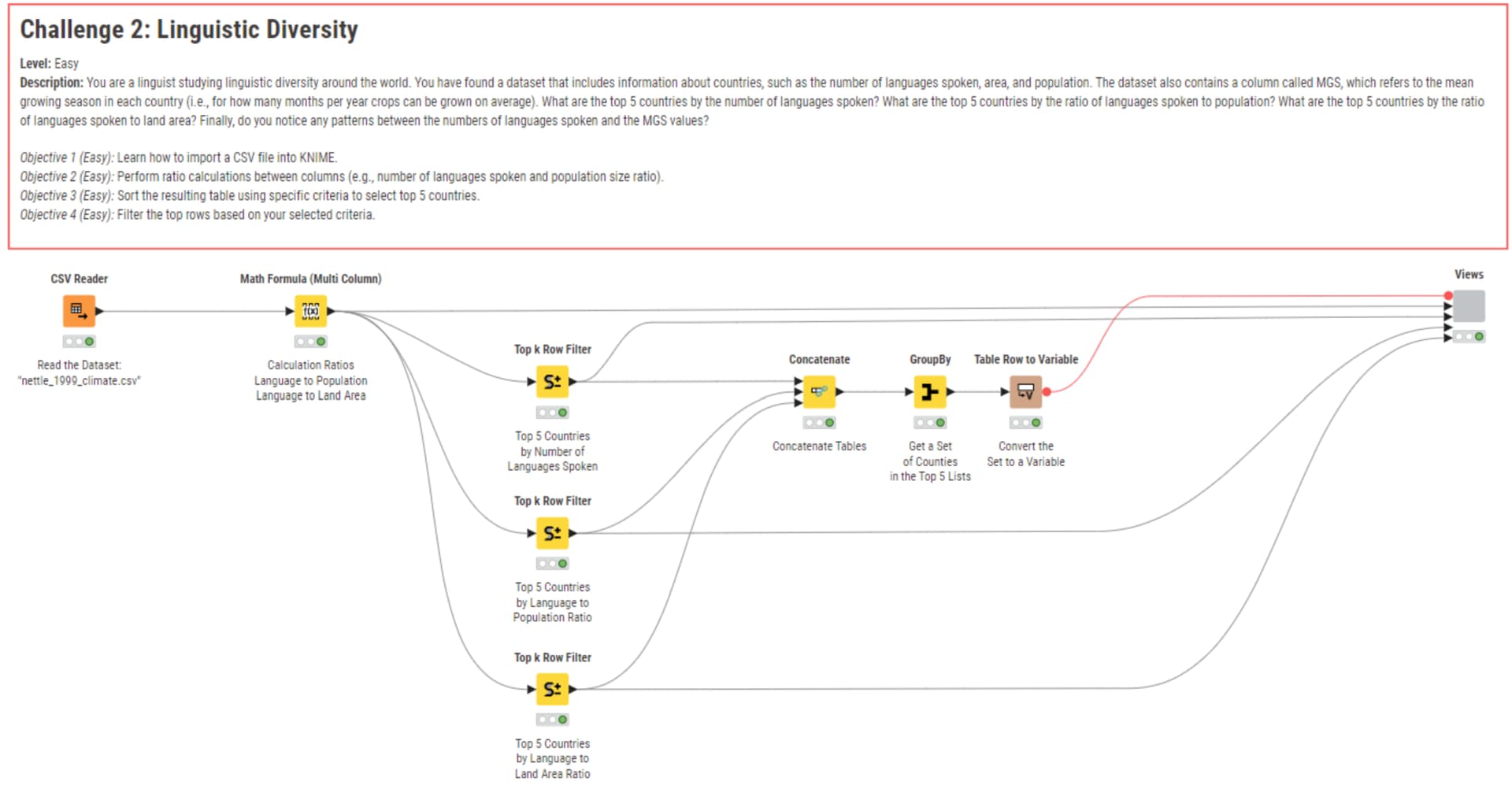
Here is the challenge. Let’s use this thread to post our solutions to it, which should be uploaded to your public KNIME Hub spaces with tag JKISeason4-2 .
Need help with tags? To add tag JKISeason4-2 to your workflow, go to the description panel in KNIME Analytics Platform, click the pencil to edit it, and you will see the option for adding tags right there. Let us know if you have any problems!
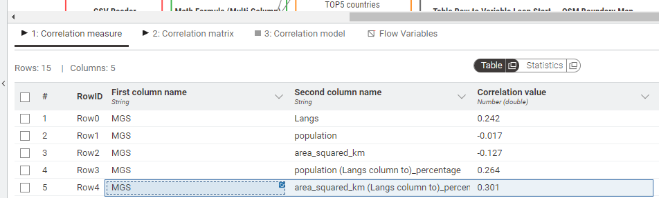
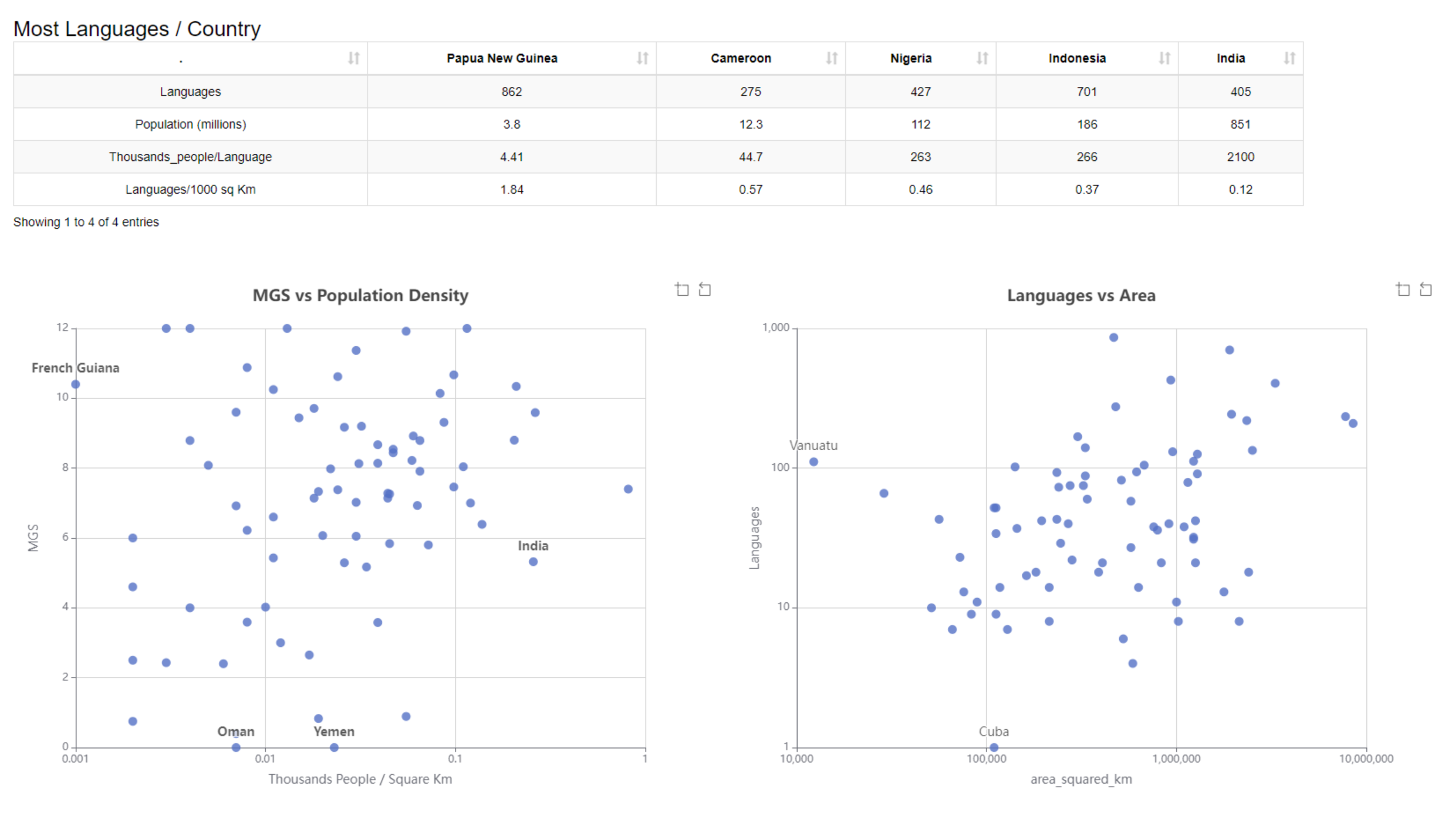
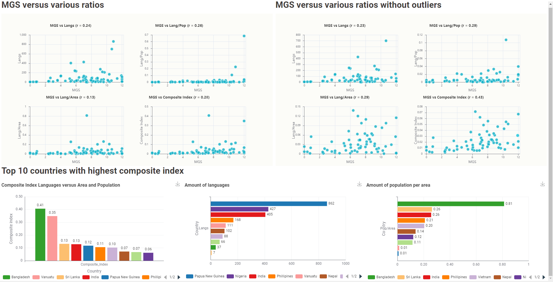
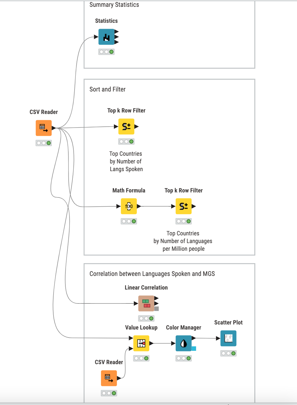
My pattern recognition was that I tried to check the correlation between MGS and the languages, via map, and statistic.
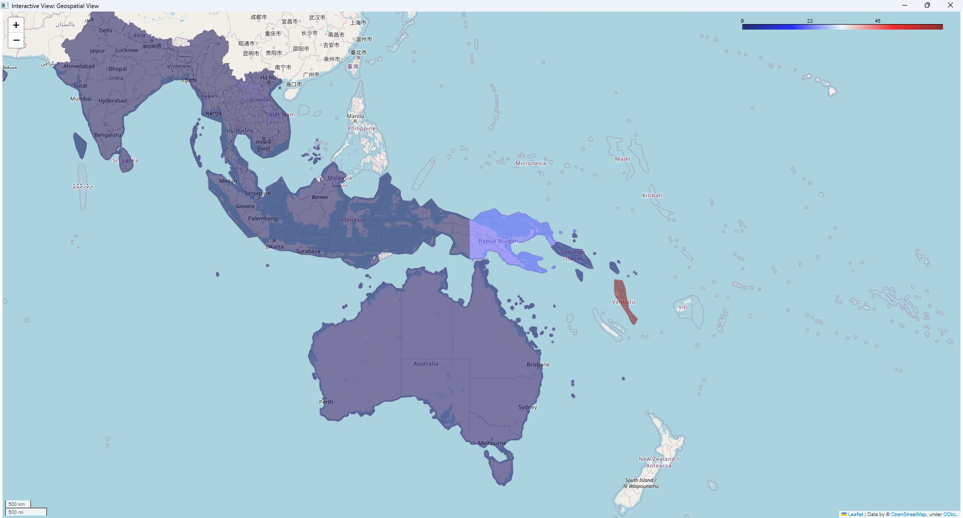
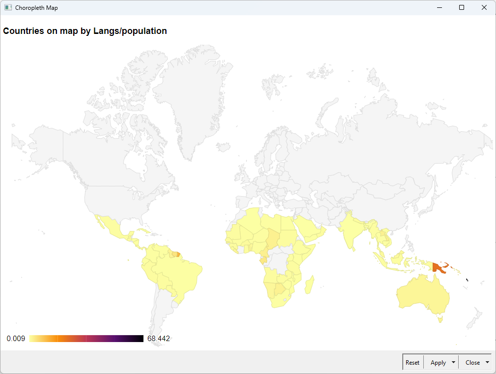
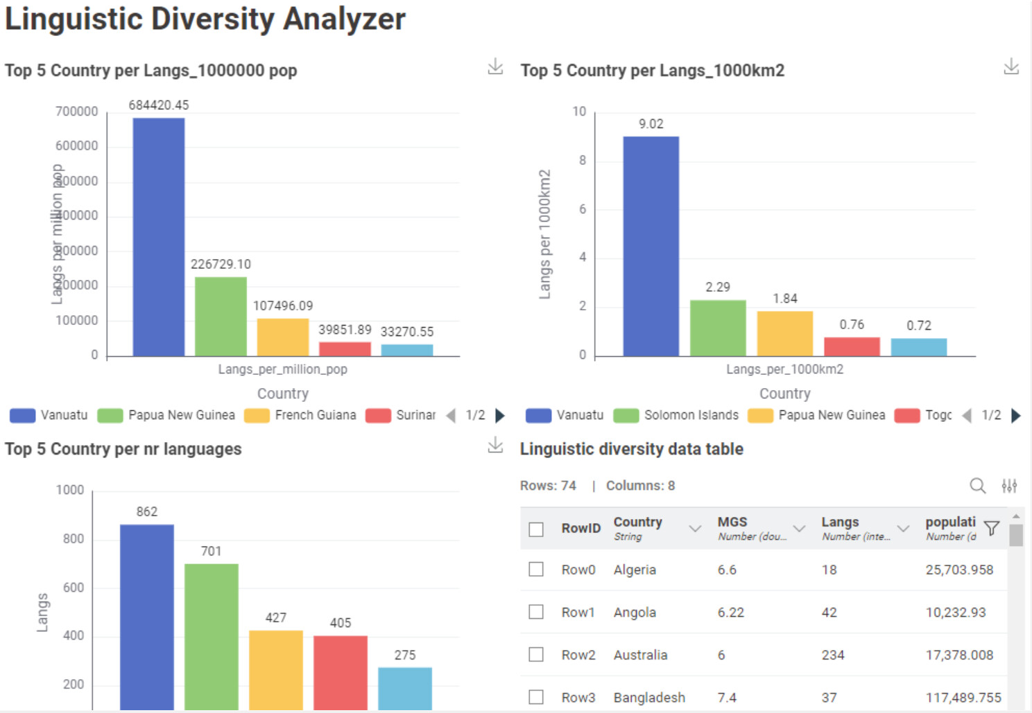
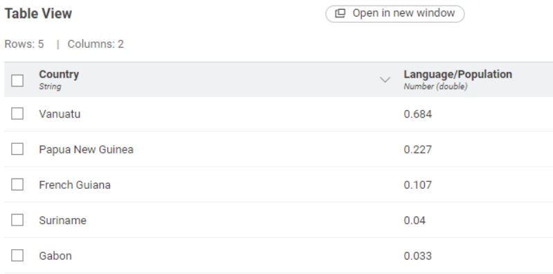
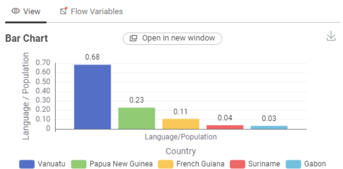
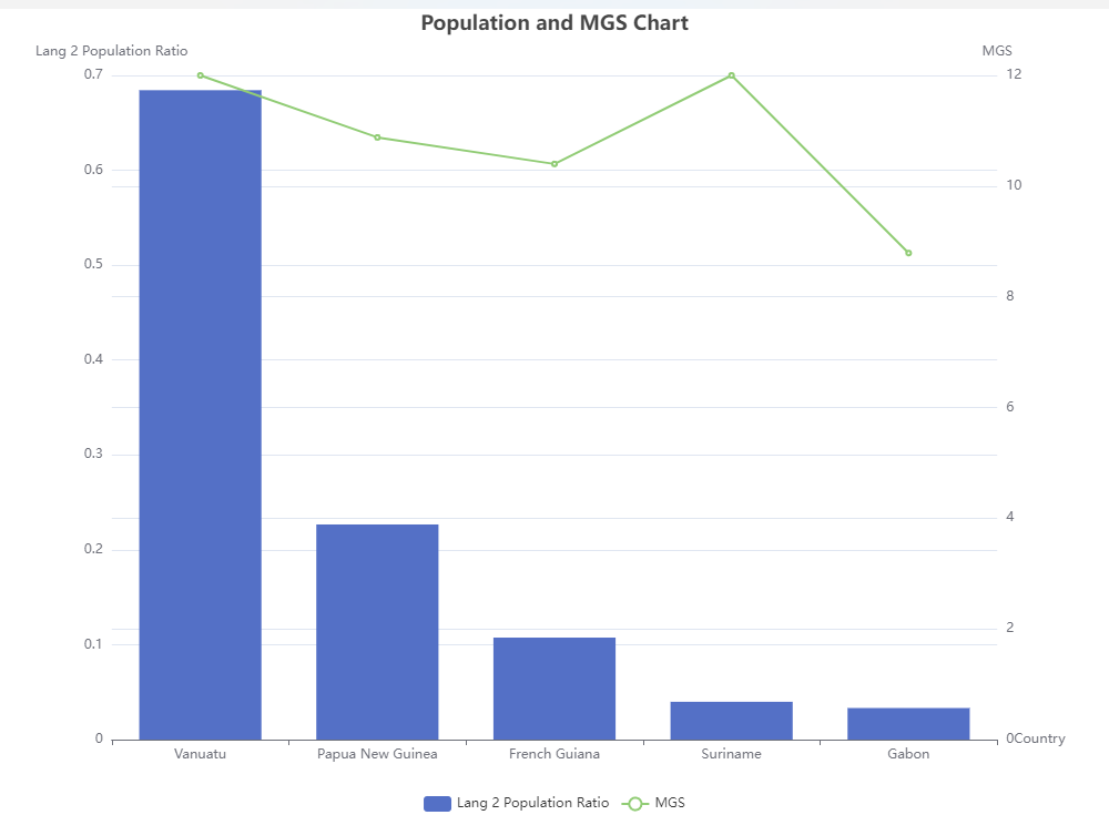
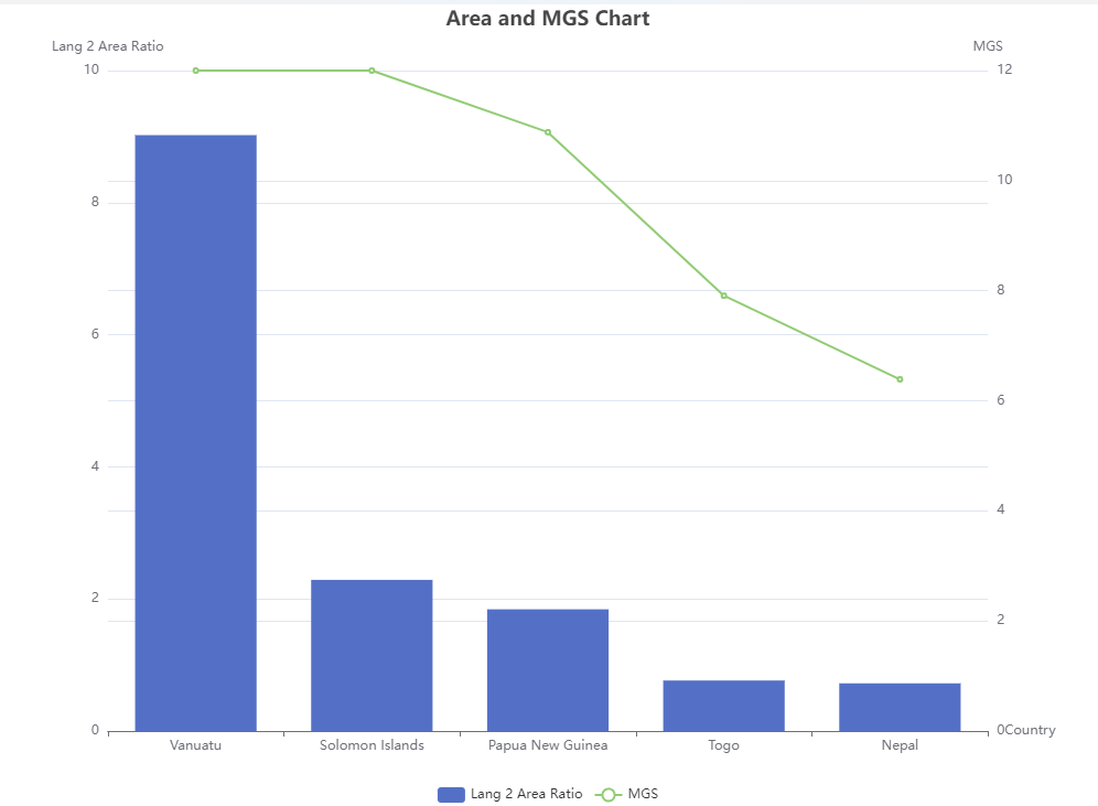
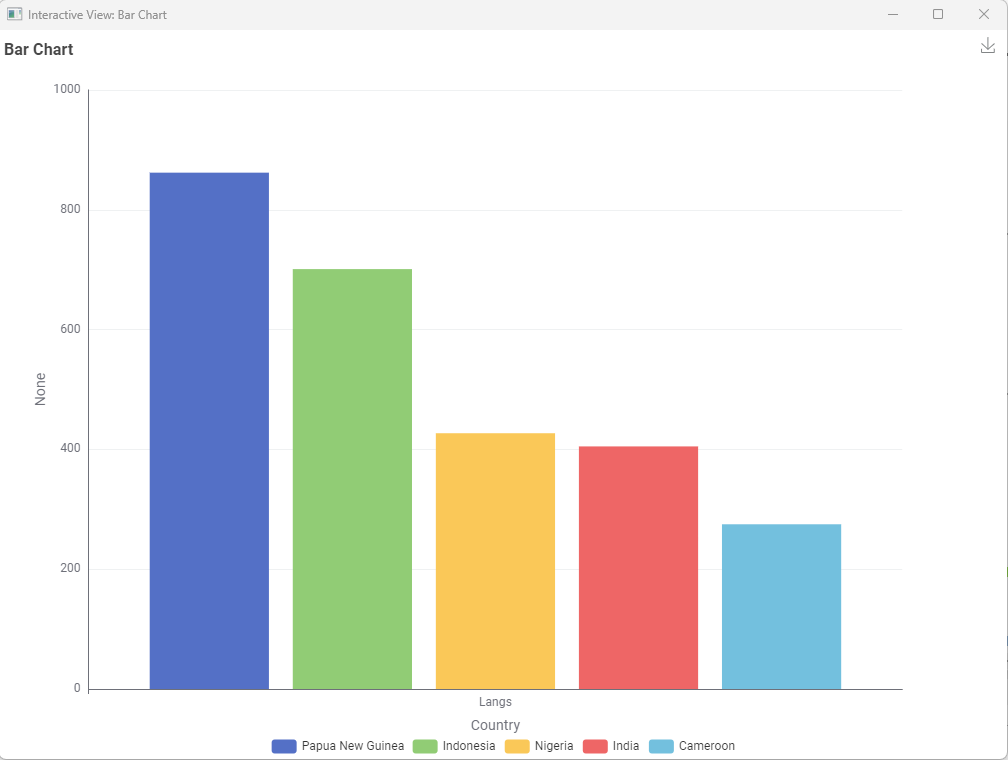
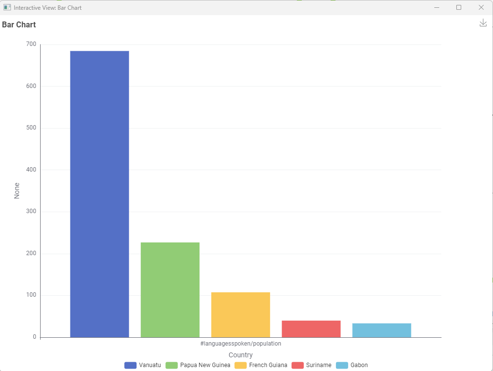
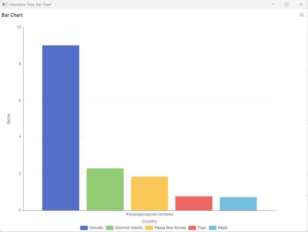
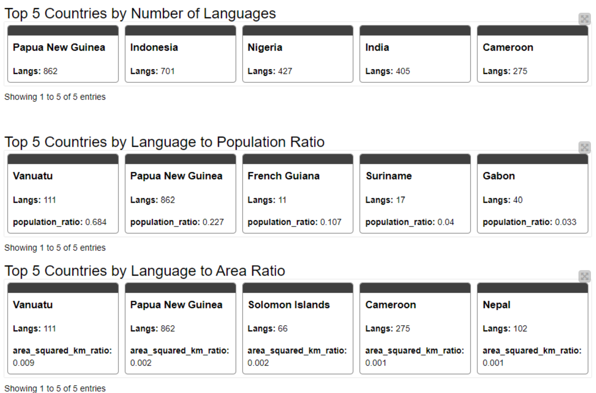
I have put the countries to a map and it can be seen straightforwardly that Vanuatu is leading the field Langs to Population (I think due to the low population) and Papua New Guinea is the second one (we do not see difference to the other ones).
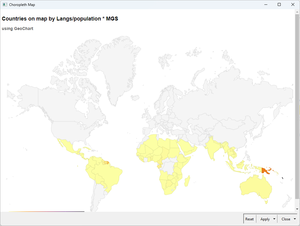
But how does it correlate with MGS? I have created a composite KPI where I multiplied the Langs/pop measure with MGS. It can be seen that the former countries are leading the list, but there is a new strong contestant: French Guinea.
Cooked up my KNIME recipe with a dash of curiosity, a pinch of trial-and-error, and lots of clicking around. Voilà — it runs! suggestions from Michelin-starred KNIME chefs are more than welcome! !
Happy to hear your thoughts, tips, or just a friendly high five!
What I really liked about this challenge was the usage of the Generic Echarts node!!!
I googled for “knime combined bar and line chart” and found a few older responses (from this very forum) that Python might be the way to go … nah, not for me (or so I thought)
But then I remembered the echarts node and that K-AI was enabled in it. So I added it, asked K-AI and nearly instant it produced exactly what I wanted in a super clean and documented way.
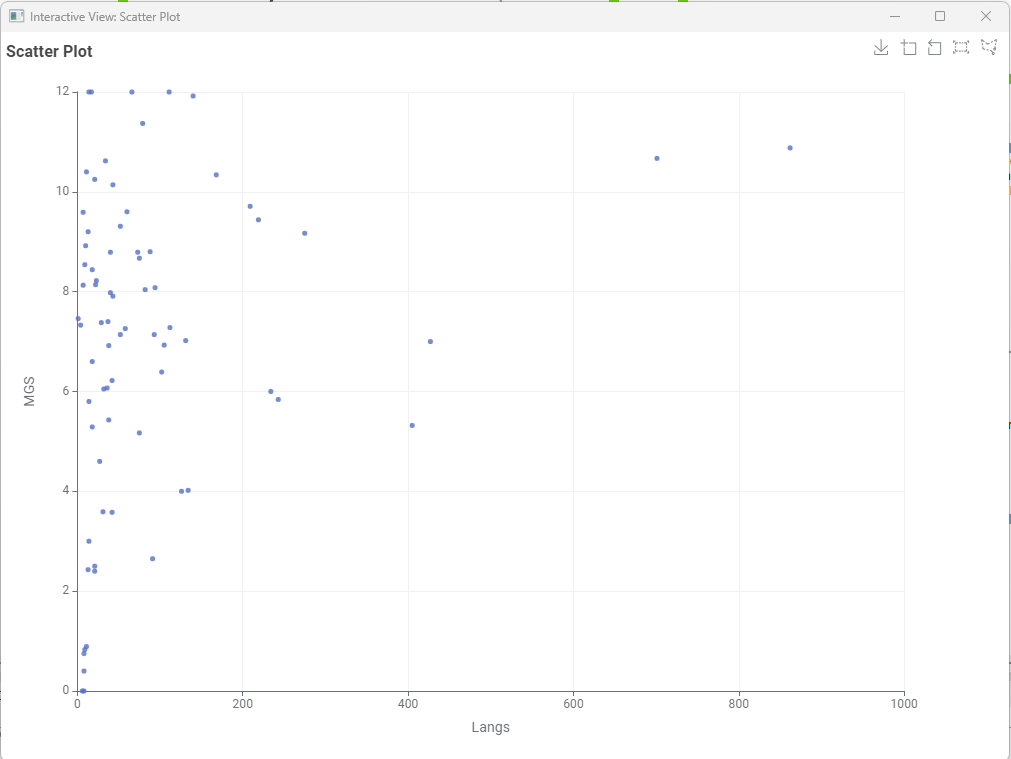
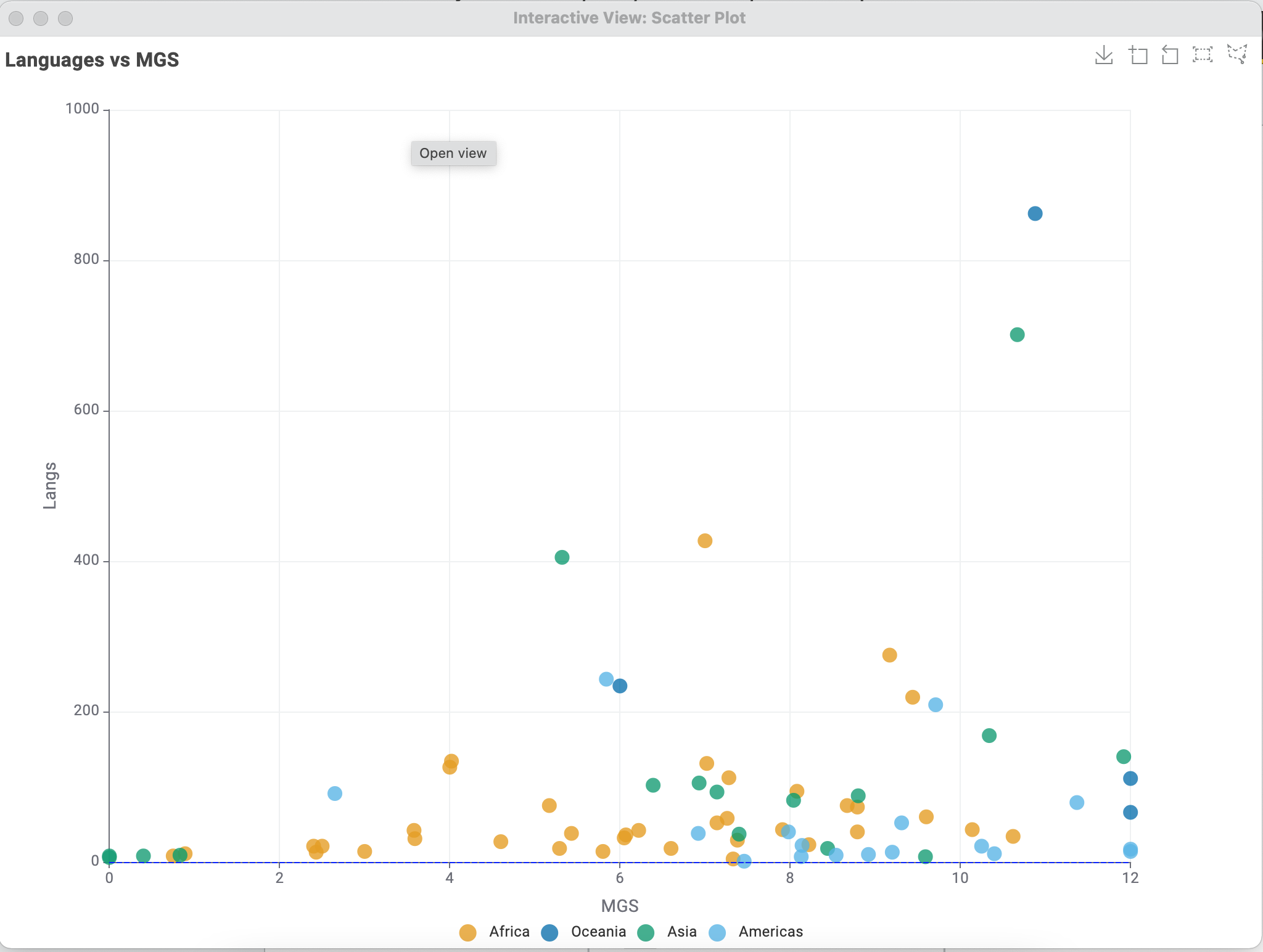
Correlation wise, I do not see anything spectacular, but I might be missing something.
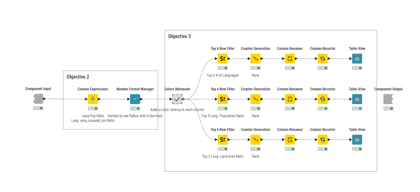
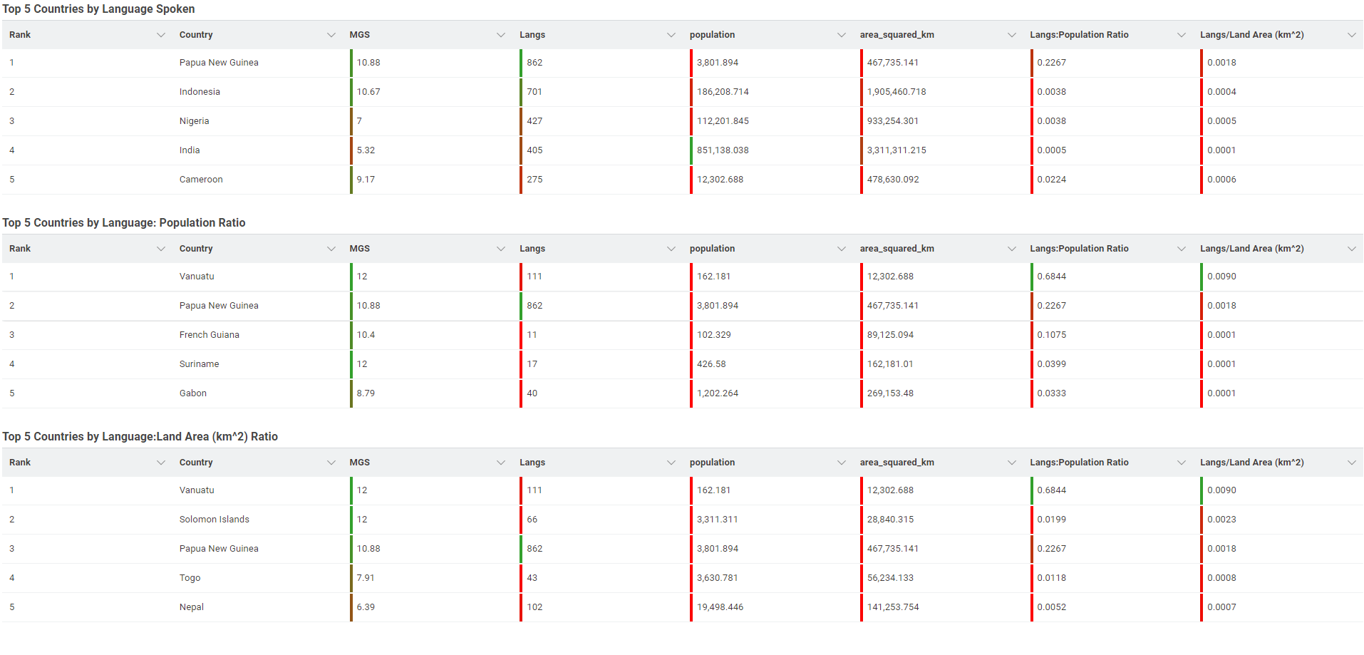
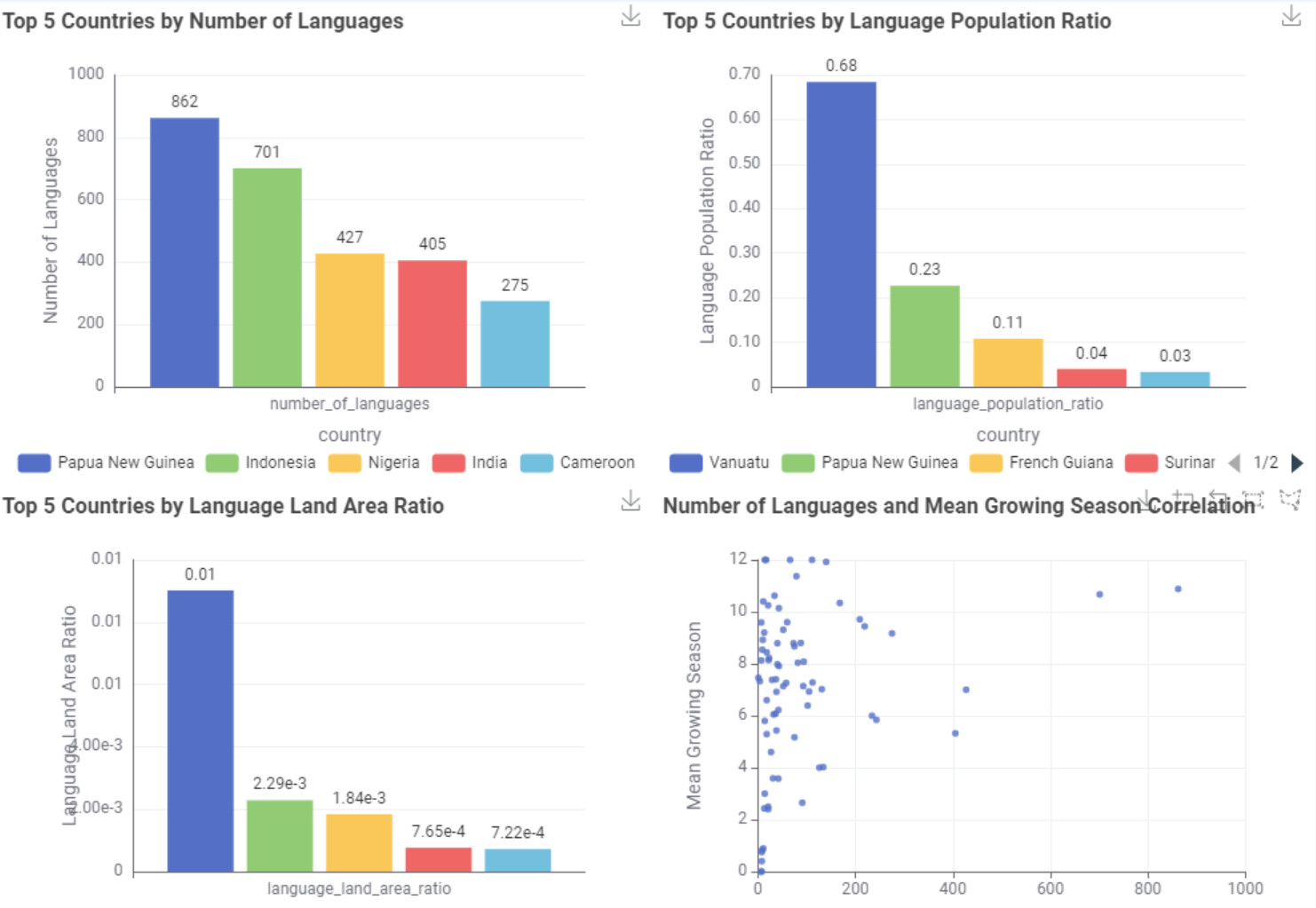
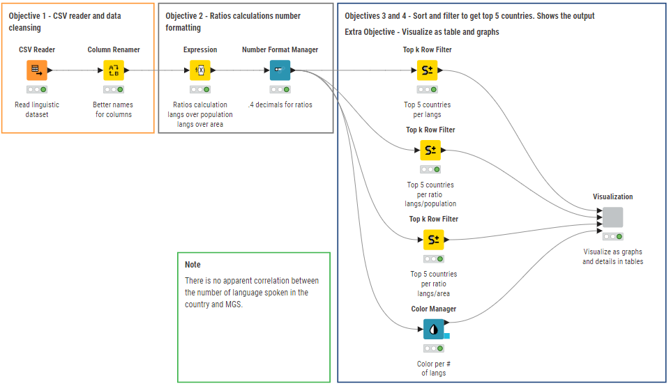
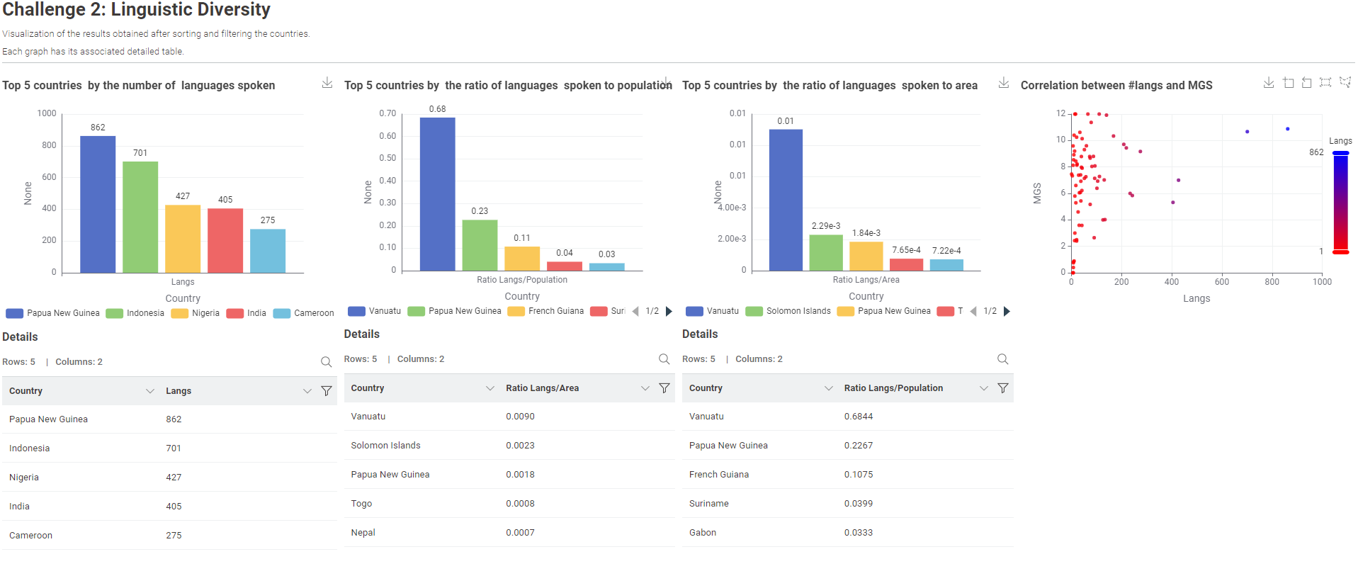
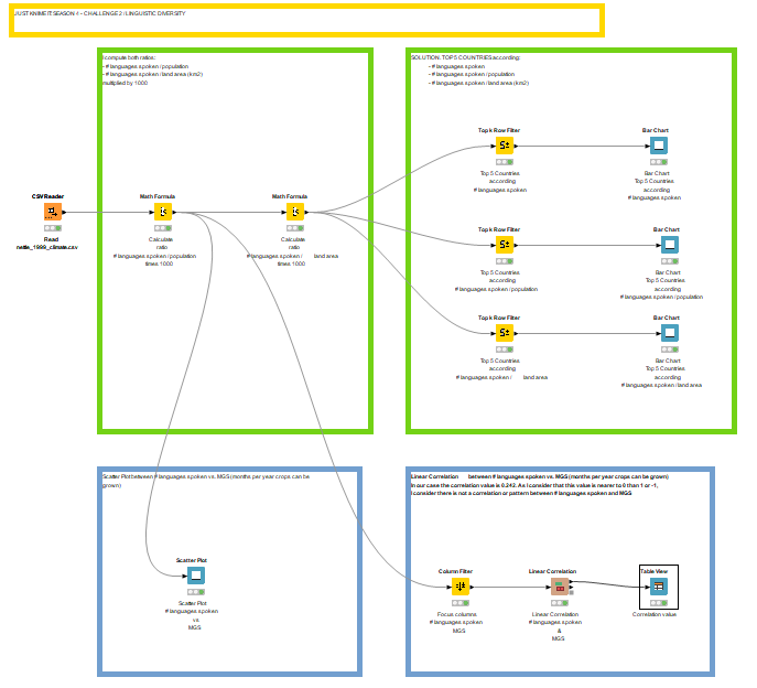
This solution aims to identify the relationship between the MGS and language diversity. The top layer of this report presents scatterplots visualizing different measures of language diversity. The bottom layer provides a detailed examination of the characteristics of countries that scored highest on my composite language diversity index, calculated as 0.5⋅(languages/area)+0.5⋅(languages/population).
My conclusion is that countries with higher MGS tend to be more linguistically diverse. Curious to see other solutions.
I uploaded my take to this Just KNIME It S04 _ CH02 to the Hub. At the moment the WF covers all the challenge requirements. I’m still evaluating to upgrade the trend analysis extra bonus with some more visualizations or layout, but my JKI dedicated time is quite limited.
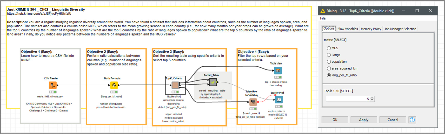
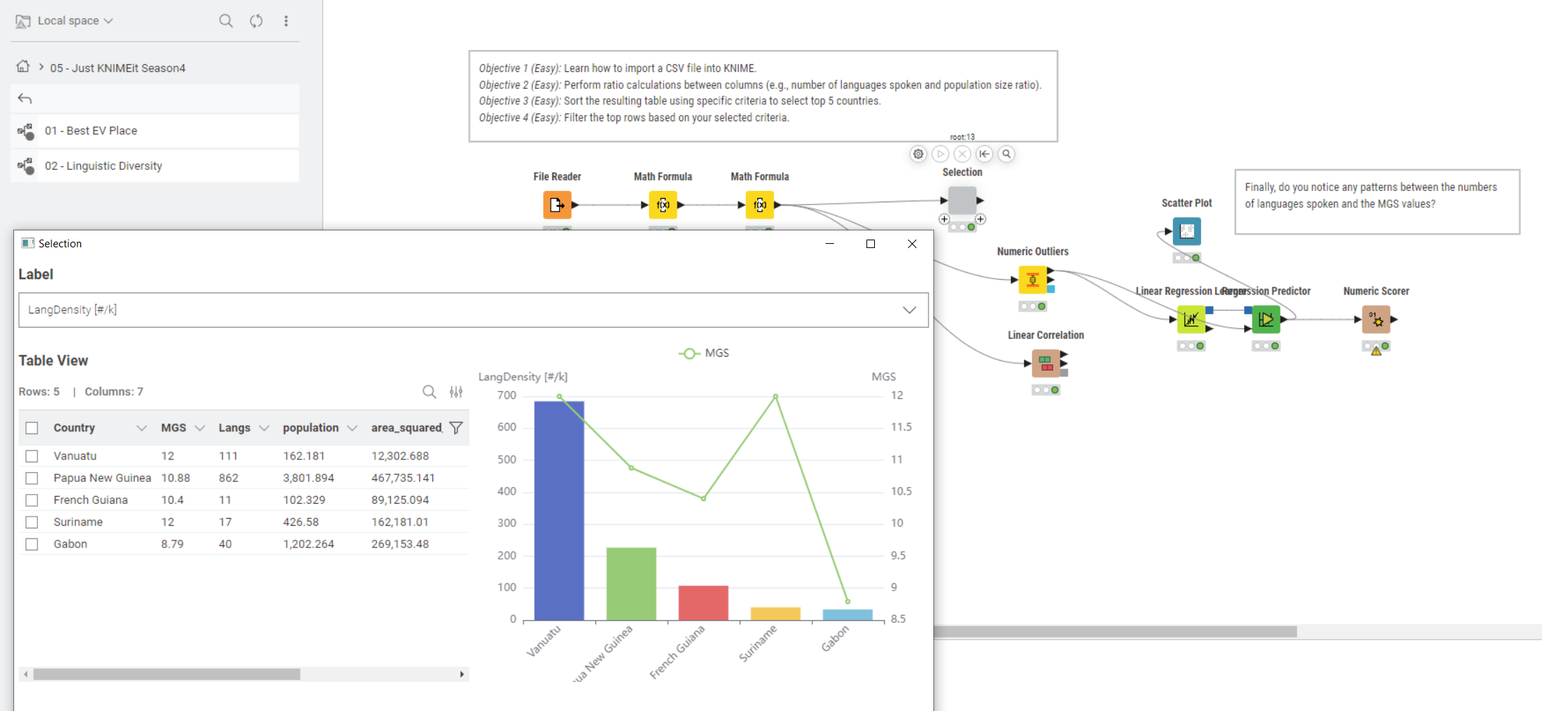
I embedded the ‘Top K’ functionality into an interactive selector component, simplifying the WF deploy.
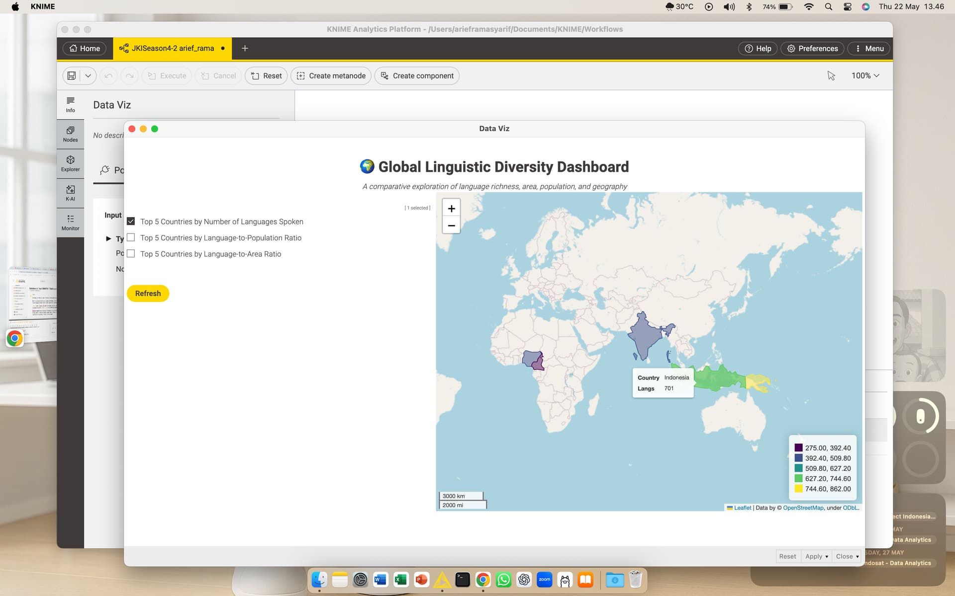
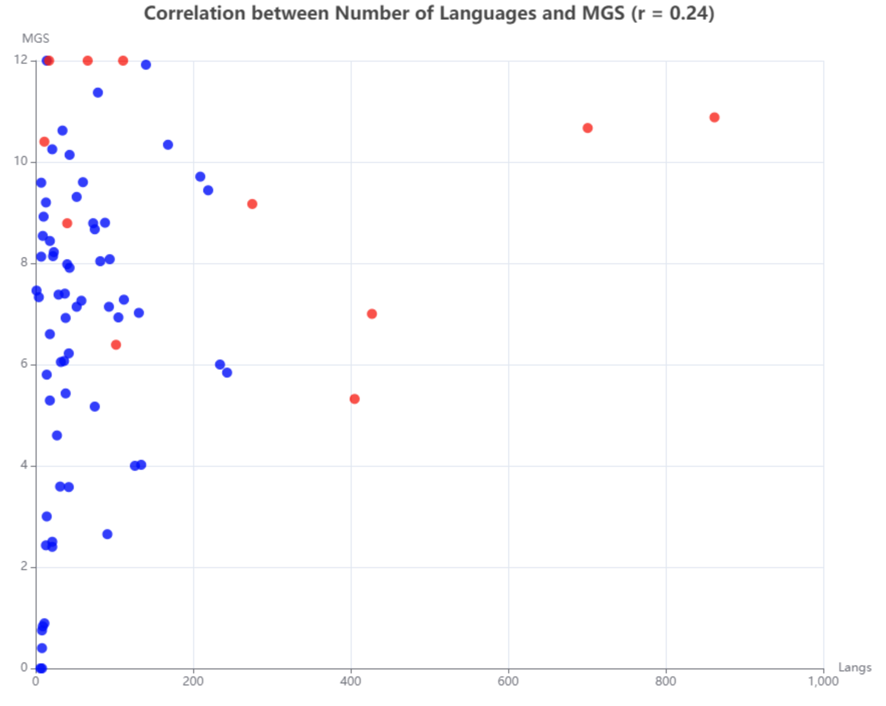
Interesting case!! I observed a relatively low correlation between MGS and Languages. Got a dataset mapping countries to continets to see if there were any further insights that can be unearthed by continent.
I used the Tile View node again, like last week, to display my top 5 filtered results and then used the Generic E Charts node to create a scatter plot of MGS against Language to see if there was a correlation between them. I also asked K-AI to calculate the linear correlation coefficient and post it in the title of the plot (showing a weak positive correlation). I then decided to highlight all of the countries that made it into the top 5 of the previous filters in a different colour on the scatter plot. Looking at only these countries, we can see that the majority have high MGS, with three having an MGS of 12 months and the lowest being around 5 months!