Happy Wednesday, everybody! Shall we hone our geoprocessing skills this week with a new Just KNIME It! challenge ?
Zurich’s city council wants you to interpret a growing dataset of citizen-submitted service reports. To ensure equitable and efficient resource distribution, the council wants to break down the city into smaller, more manageable clusters. Can you pinpoint a systematic method to group Zurich’s neighborhoods based on the incoming reports?
Here is the challenge. Let’s use this thread to post our solutions to it, which should be uploaded to your public KNIME Hub spaces with tag JKISeason4-25 .
Need help with tags? To add tag JKISeason4-25 to your workflow, go to the description panel in KNIME Analytics Platform, click the pencil to edit it, and you will see the option for adding tags right there. Let us know if you have any problems!
I was a bit lost reading the description of the challenge, hope I got it right.
First I spent time to find the original dataset with a little description (in German). Thanks ChatGPT for the translation and overview!
Here the steps:
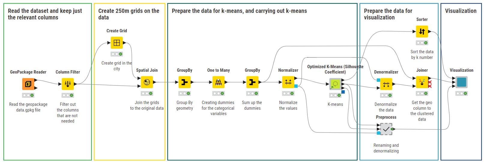
GeoPackage Reader
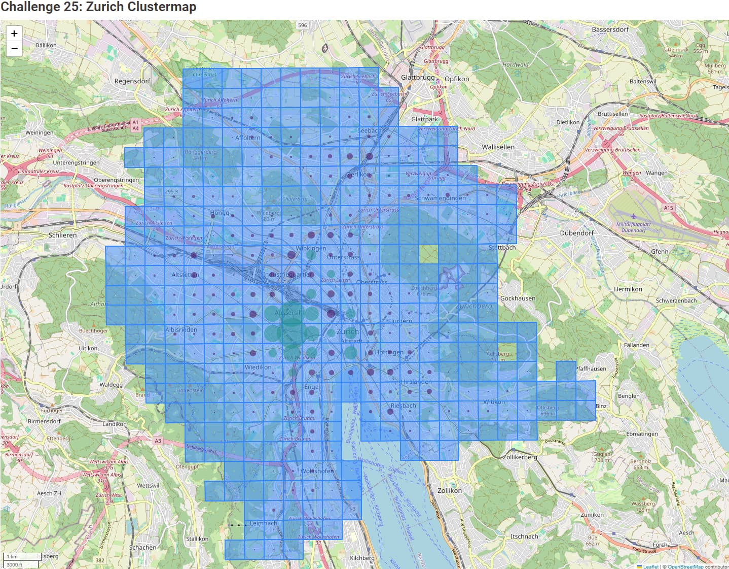
As we have a report per geo point, I grouped per neighbour. To do so, I created a GeoGrid of 500 meters.
Joining each point to the grid
I decided to compute the time of completion - not sure the updated date can be used for that, but this was the only information available.
Grouping then per gridID (neighbour) and getting some information: total number of case, unique number of case type, average solving age. I could get more information and compute some additional ratios.
Normalization
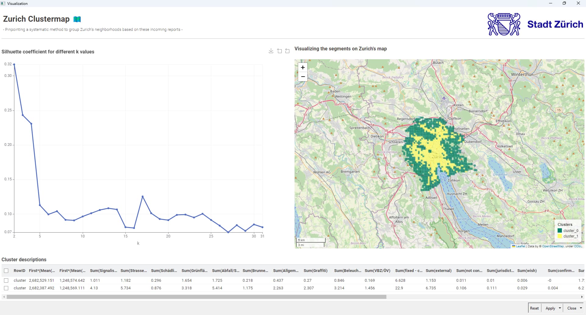
Using k-Means for clustering. Number of cluster of 3. More experiments might be used to evaluate the impact and find the best number of clusters. Or using other methods.
Visualisation of the clusters on a map (as a grid).
The result on the map shows:
Size of the circle is the number of case
Color is the cluster
It seems that the city center is a cluster at itself.
I am sure I should work on feature engineering to improve the clusters.
Also, improving the visualization so we remove the blue color from the grid.
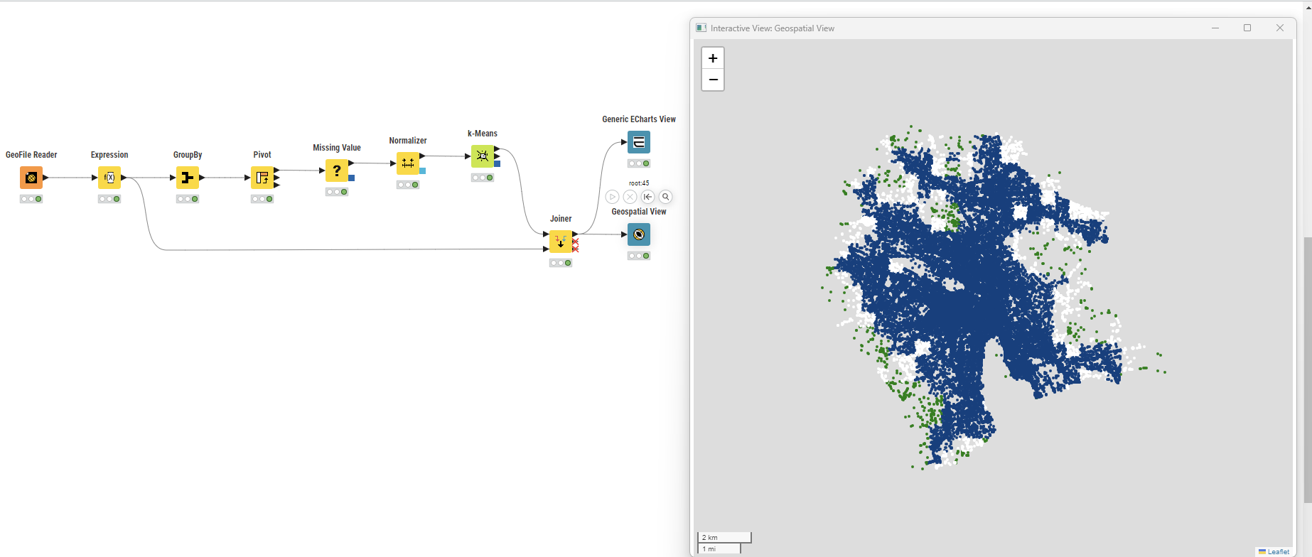
This is my first real exposure to geospatial data and I used guidance from ChatGPT and from @trj workflow.
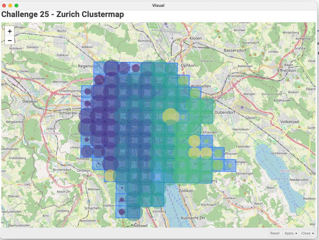
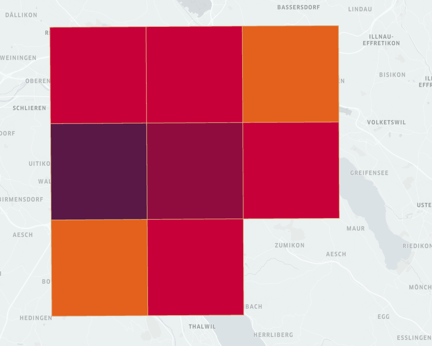
Cluster size at 8
Random seed at 1234
What the clustermap is telling me that as the there is a correlation when demand is higher in a given cluster, the average fix time is lower versus when demand in a given cluster is lower the average fix time is higher. This correlation seems about right where the objective is to complete as many jobs as possible in a high demand area in order to maximize service fees.
This was definitely another fun challenge. Cheers.
I’m amazed what KNIME Analytics can do for a open-source platform. I have used for real business use cases and have not had to pay for anything. Most platforms don’t have this unique business model.
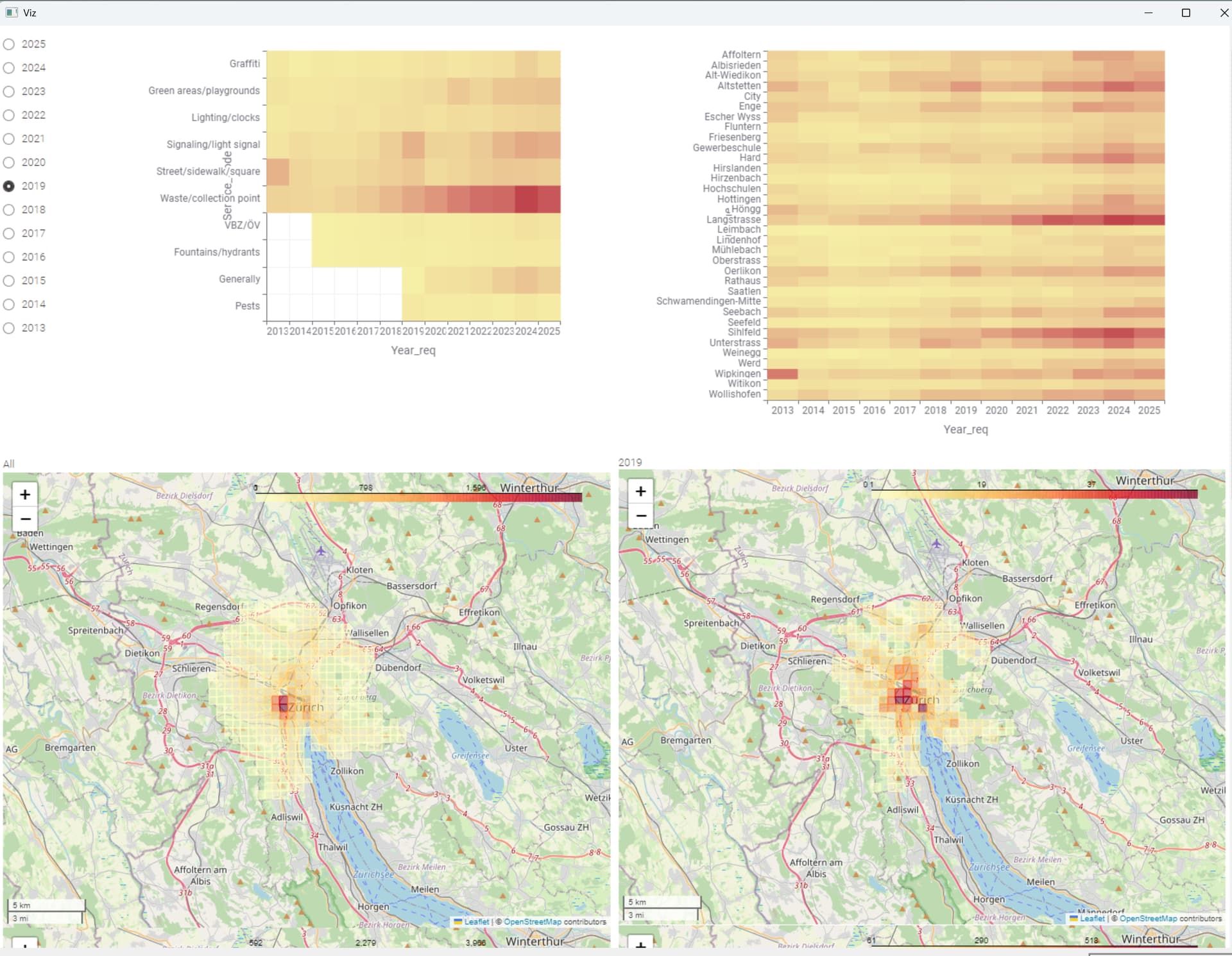
Hereis my solution. No idea if this is right since up to now I only had thorical knowledge of k-means… The number of requests vary a lot in each cluster, so I guess I do not reach the goal of distributing resources efficiently. I’m eager to see the solution. Like other participants, I’m grateful for these challenges.
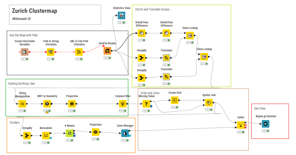
find herewith my submission : Tried the Geometry creation via easting northing way for alter metric coordinate generation alternatly. Also enriched with translate to english for understanding the groups or ticket type. relevant projection to compatible crs and proper joining and mix CRS throws errors. Tried the DBscan via the PCA but due to less features it throwed errors ..Also faced lot of time in k means ( dunno why , its to ) Lastly view by Kepler. Also found that there is no save or draft save button in kepler GL for saving the configuration ( atleast at my end i had to redo config) .. JKISeason4-25 – KNIME Community Hub
Our solution to last week’s Just KNIME It! challenge is out!
Although we had geospatial processing challenges in the past, this one was probably the one that got the most love! We were happy to see that some of you were impressed by the breadth of KNIME’s geospatial capabilities, and by how powerful it can be when combined with clustering.
Tomorrow we have a challenge focusing on a KNIME extension that we never explored before in this series: our Network Mining extension! You will create and analyze networks of countries to better understand Visitor Visa acceptance and rejection rates in Europe. We hope you join us to learn more and more about KNIME!