This thread is for posting solutions to “Just KNIME It!” Challenge 26, wrapping up our 4-week series on data classification! How can we communicate our model’s performance visually?
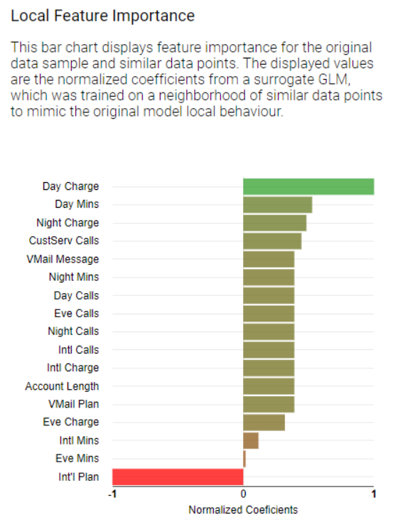
I leave it up to others to elaborate more on their solutions and provide more details on how to interpret the results of the Local Explanation View and other visualization dashboards
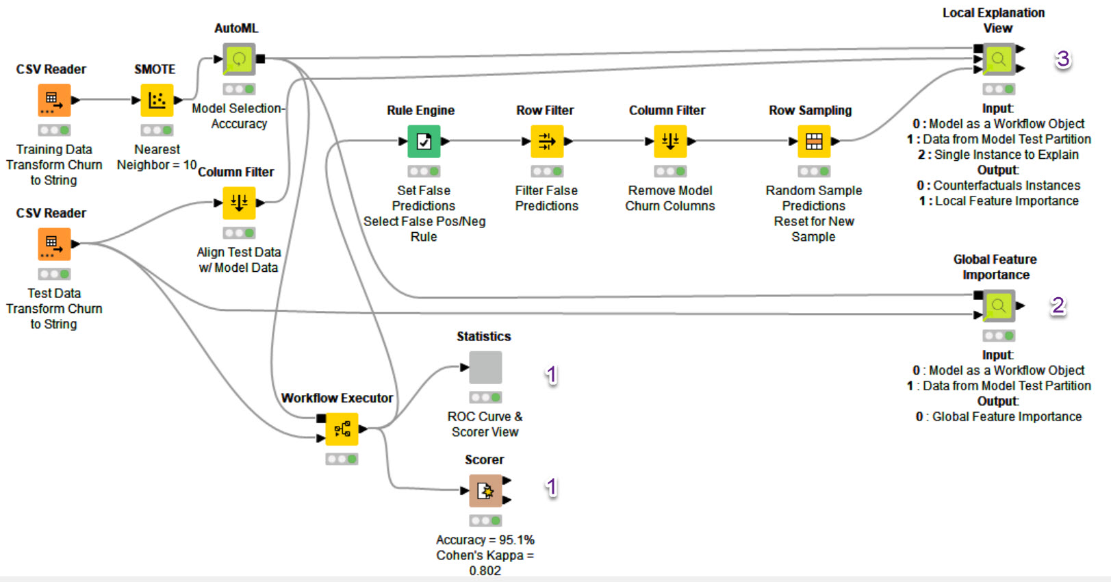
@AnilKS I like your solution, but I see that you trained a Gradient Boosted Model and scored it and explained its accuracy and other metrics with bar chart, but while explaining the global and local feature importance you trained an AutoML.
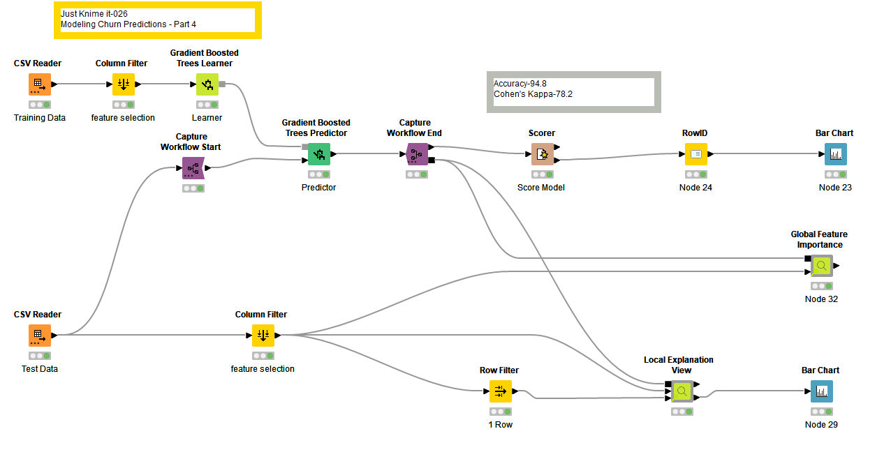
I wanted to showcase how you can explain your already trained Gradient Boosted model using the Global and Local Explanations Component in KNIME. I used your solution and removed the AutoML component from it and just added Integrated Deployment - Capture nodes to explain your existing model.
Let me know your thoughts on this, the workflow can be found here
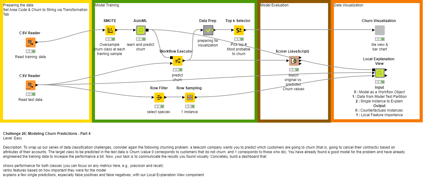
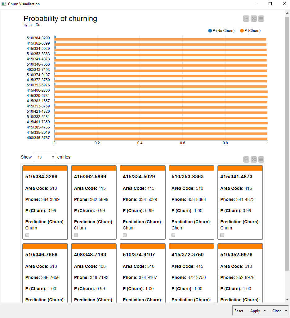
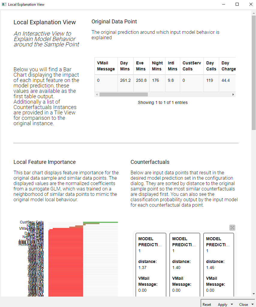
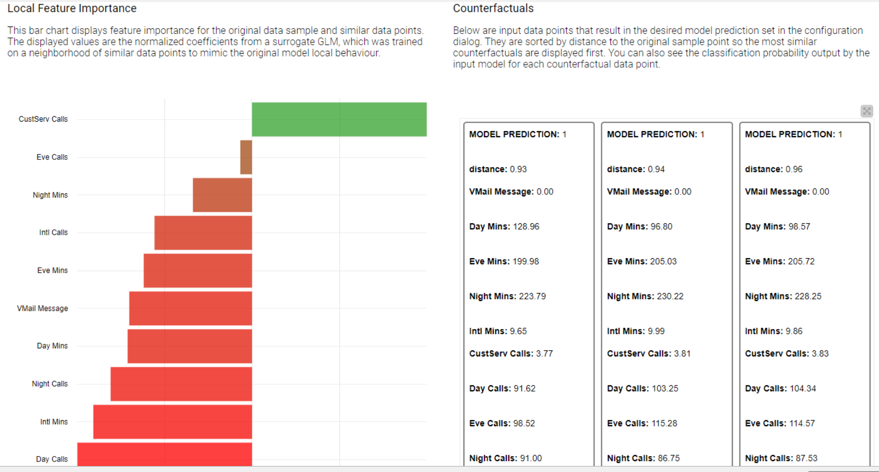
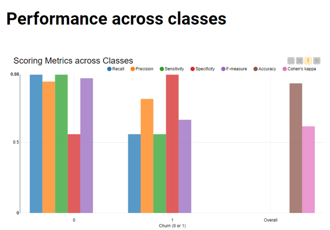
As always on Tuesdays, here’s our solution to last week’s #justknimeit challenge. We created a component to answer question 1, allowing for an interactive view that lets you compare different performance metrics for both classes Next, we used the Global Feature Importance verified component to answer question 2, and created another component to give local explanations to both a false negative and a false positive test instance. This last component is heavily based on the Local Explanation View verified component.
I hope you learned a lot about model inspection while creating these visualizations!
Dear Mahantesh ,
Really glad and thankful to see approach… i chose to use the simple graph as the current output nodes weren’t compatible for the feature importance nodes… Appreciate your help and support to suggest the extended approach ( with workflow executor nodes ) for existing problem of single models .Kudos to knime team . Who are there all the time.
Anil