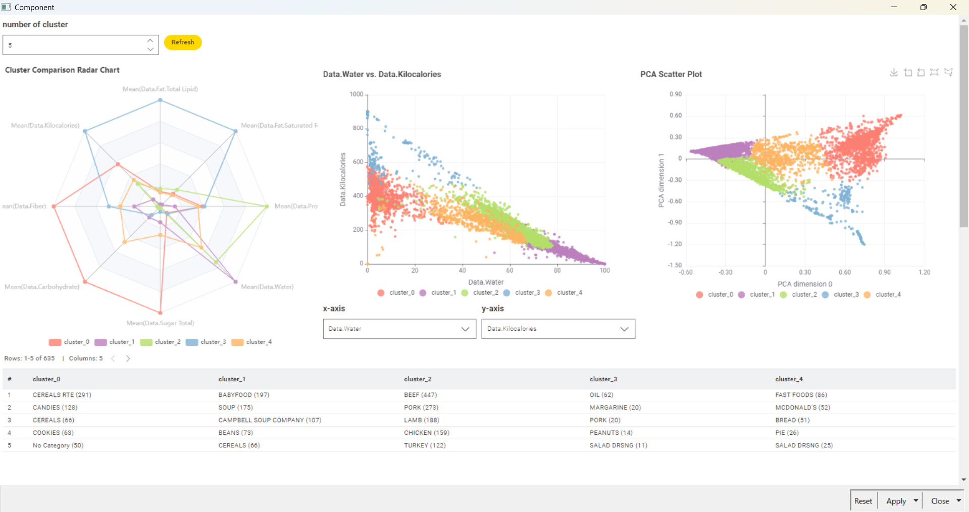
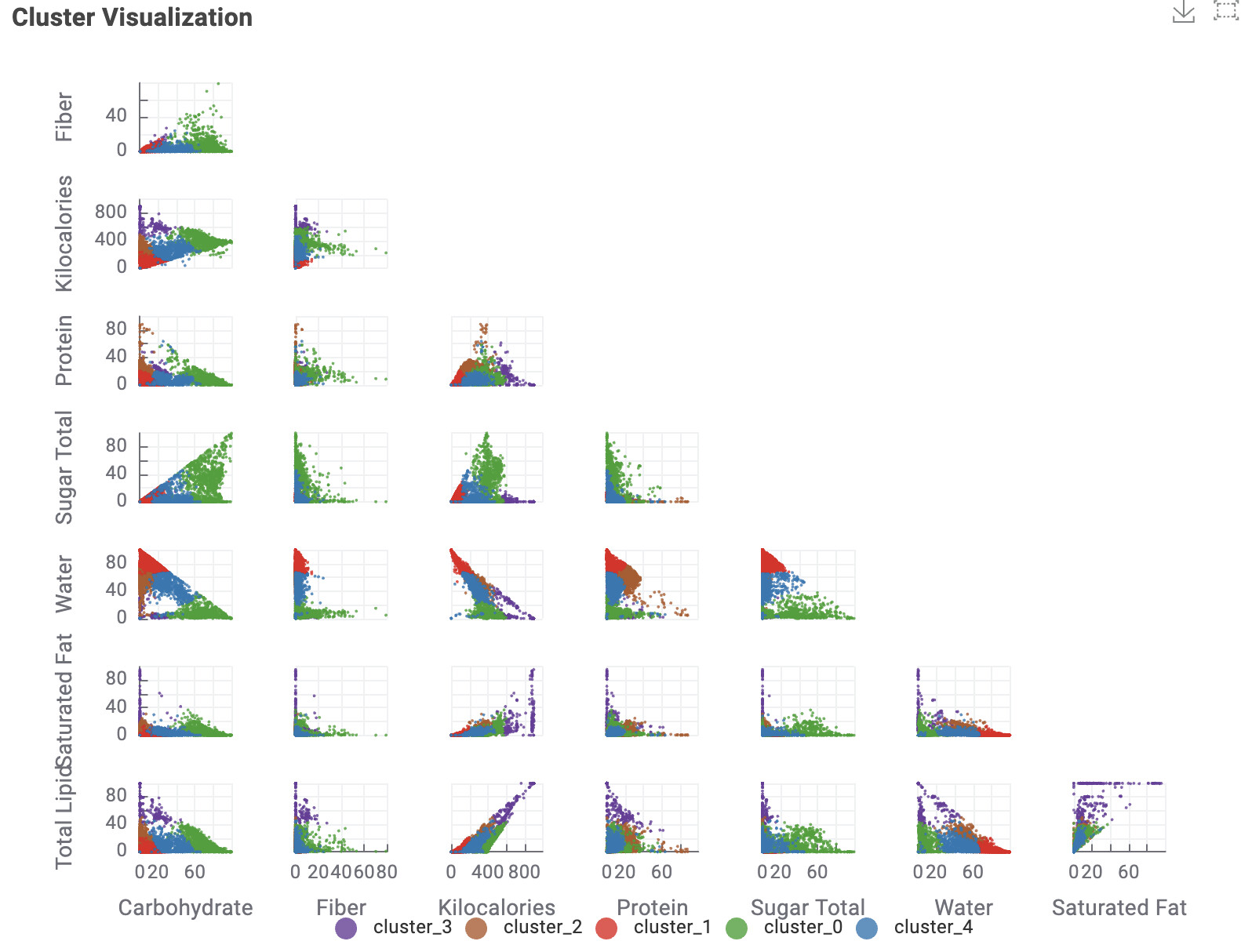
The average values of each data point by cluster have been represented in radar charts. The colors indicating each cluster are kept consistent in both the scatter plot and radar chart for easier identification. Additionally, a table has been added to allow checking the food categories included in each cluster. Cluster_0, rich in Fiber, Carbohydrate, and Sugar, is observed to predominantly include items such as Cereals, Candies, and Cookies. Cluster_2 appears to categorize meat products, while Cluster_3 seems to include oily food items. Cluster_4, which contains a balanced mix of each nutrient, categorizes meals such as fast foods.
@sryu & @tark …Nicely put … Radars are more apt than scatter here as it gives more interpretability for individual category items across many variables .
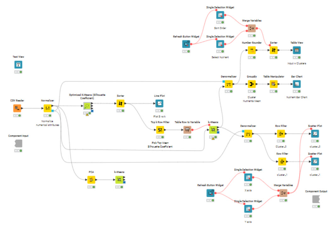
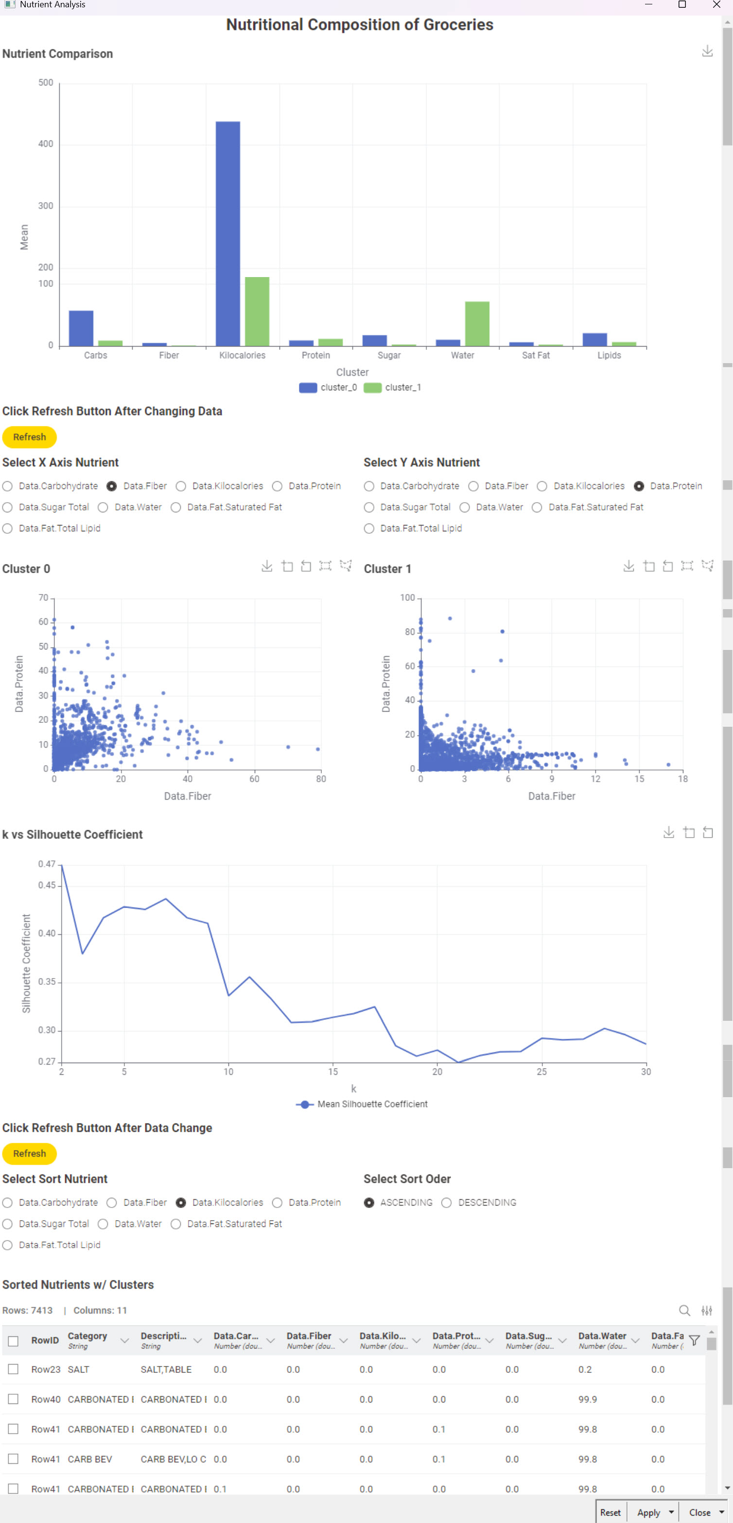
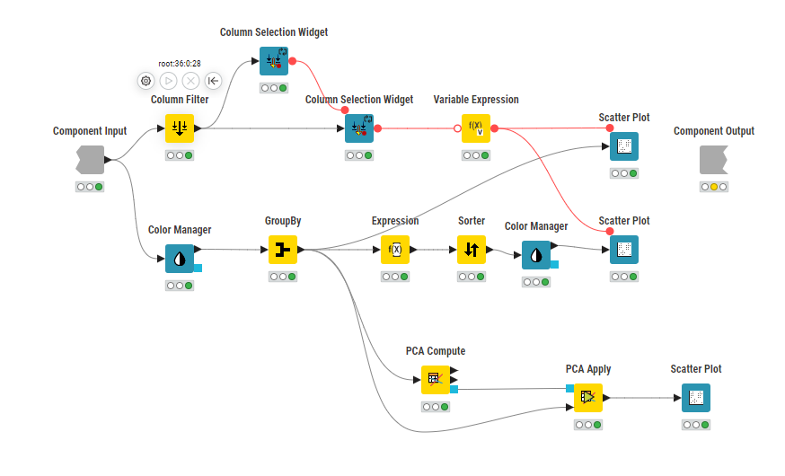
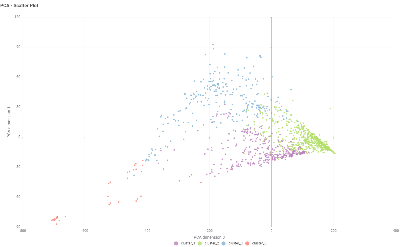
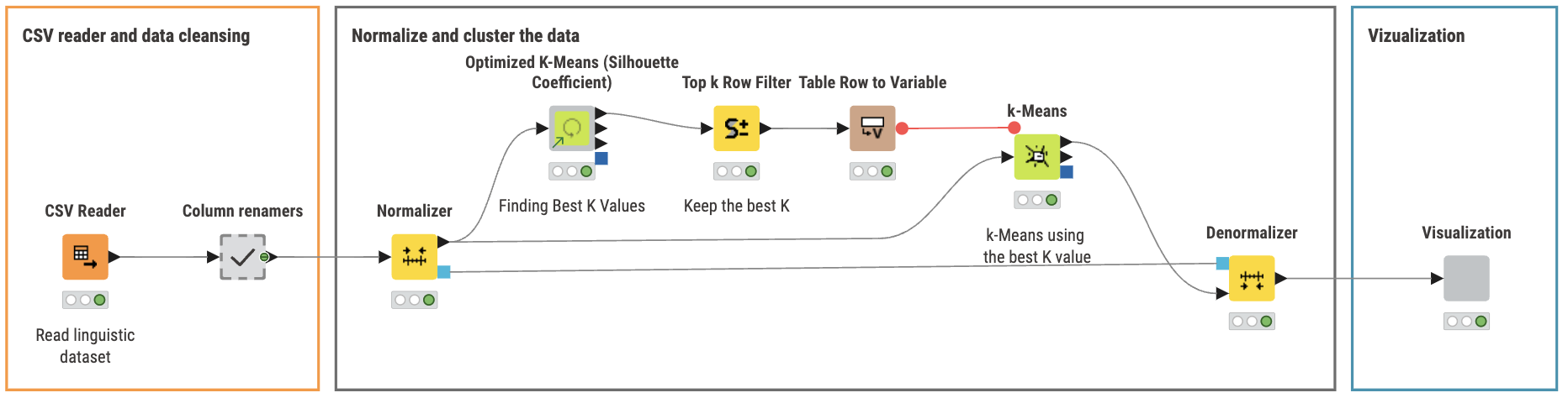
Here’s my solution. I assumed the target audience would be store managers not analysts. Consequently I kept the output fairly low tech. I used the Optimized K-Means component which produced two clusters. I takes a long time to run. I checked the PCA but didn’t do anything with it. It reduced the inputs from eight to three and produced essentially the same clusters. Its difficult to explain to non-analysts.
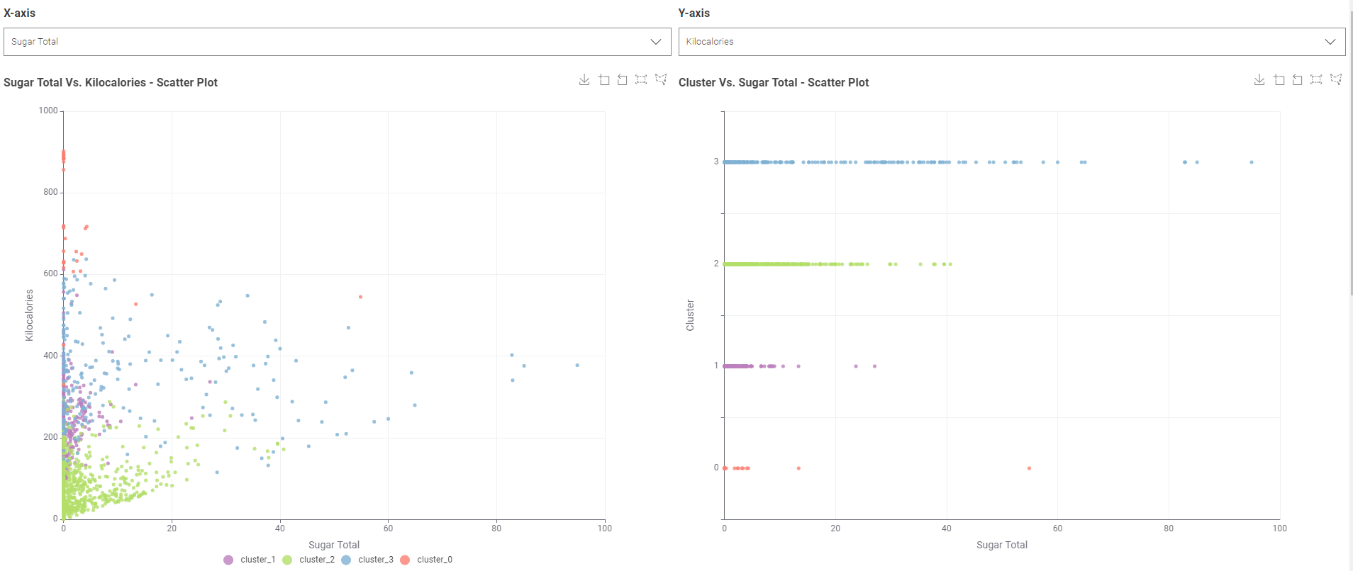
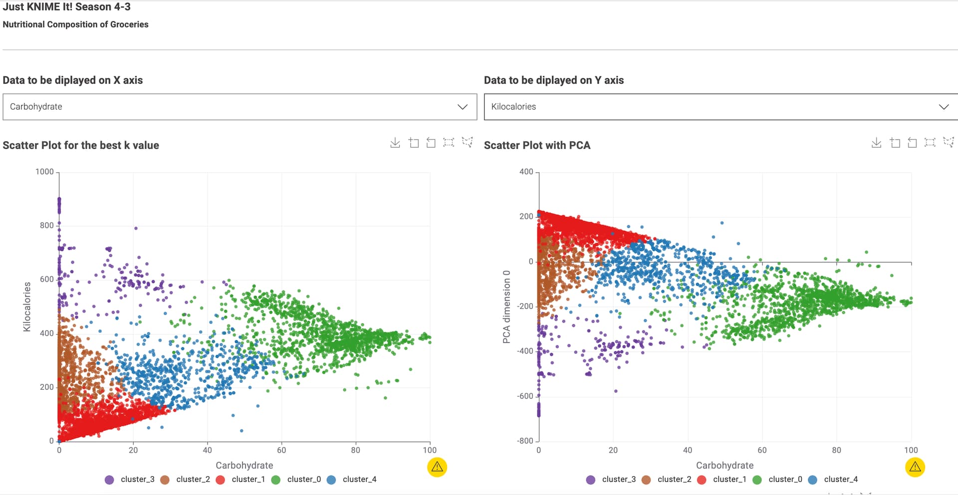
The data app is showing the scatter plot with the optimized k-value and a possibility to choose the axis values. It also show a scatter matrix to compare the results.
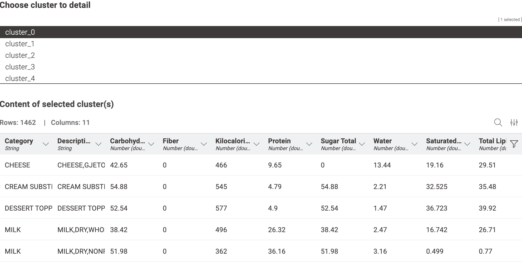
And finally a table with the content of each cluster for further understanding of the data.
The solution to our Just KNIME It! challenge on the nutritional content of groceries is out!
This challenge was based on a real-world dataset and focused on clustering, dimensionality reduction, and visualization techniques. Thanks to all the insightful solutions! It was also really nice to see some of you using the radar chart in your work.
Tomorrow we’ll come back with a challenge on TV entertainment! We hope to see you here again.
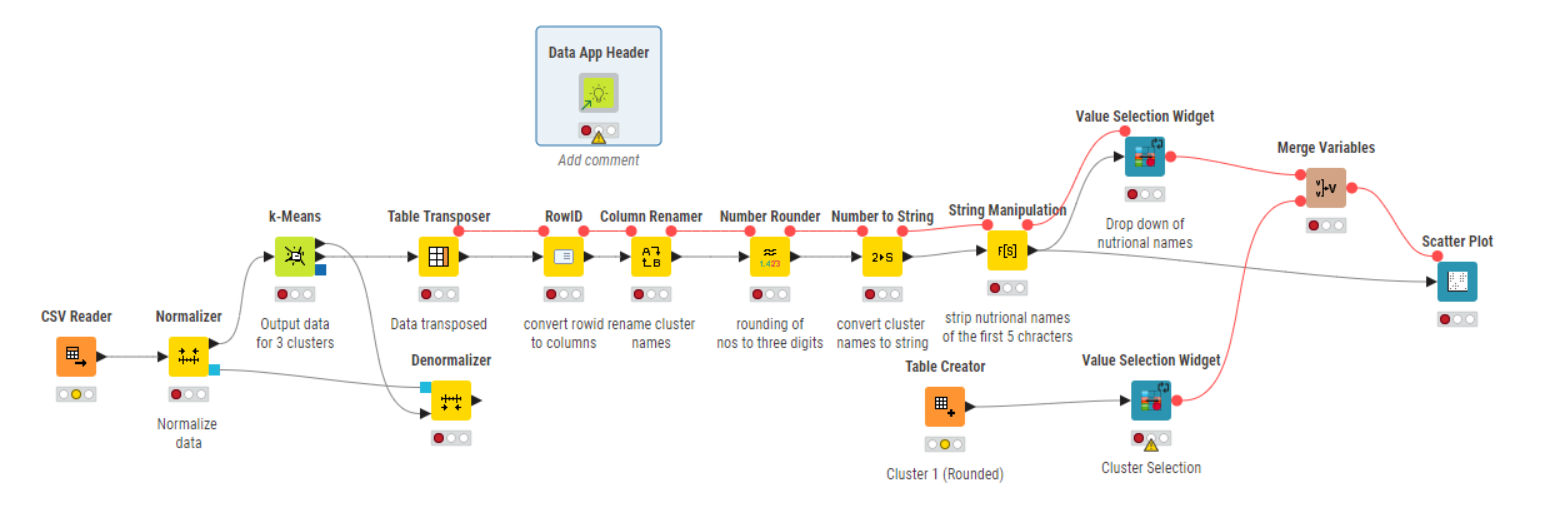
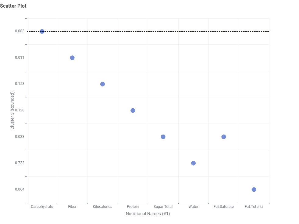
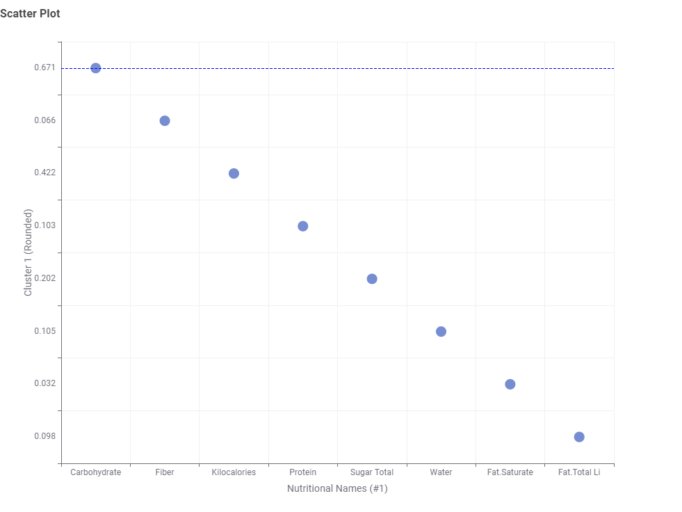
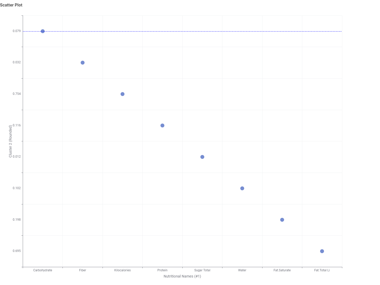
I have used the Parameter Optimization Loop to determine the optimal k-value for the k-means clustering and then performed PCA to reduce the data to two dimensions for a Scatter Plot.