Another Wednesday, another Just KNIME It! challenge for you to learn data by doing!
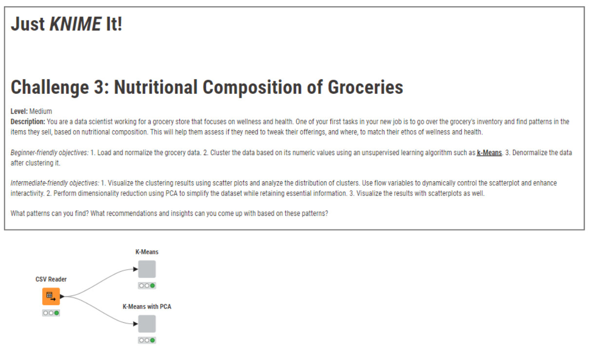
This week we have a wellness-related challenge, in the context of a small grocery store. Are there patterns in the nutrient composition of the groceries they sell? Are they balanced and healthy enough, or could they be more aligned with the store’s wellness branding?
Here is the challenge. Let’s use this thread to post our solutions to it, which should be uploaded to your public KNIME Hub spaces with tag JKISeason4-3 .
Need help with tags? To add tag JKISeason4-3 to your workflow, go to the description panel in KNIME Analytics Platform, click the pencil to edit it, and you will see the option for adding tags right there. Let us know if you have any problems!
I think it’s correctly classified as a medium challenge, not easy that’s for sure
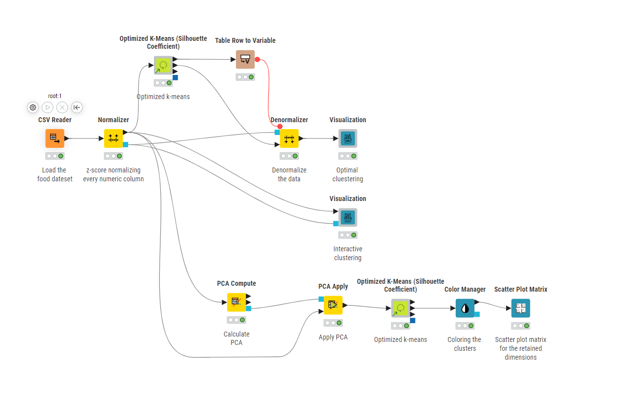
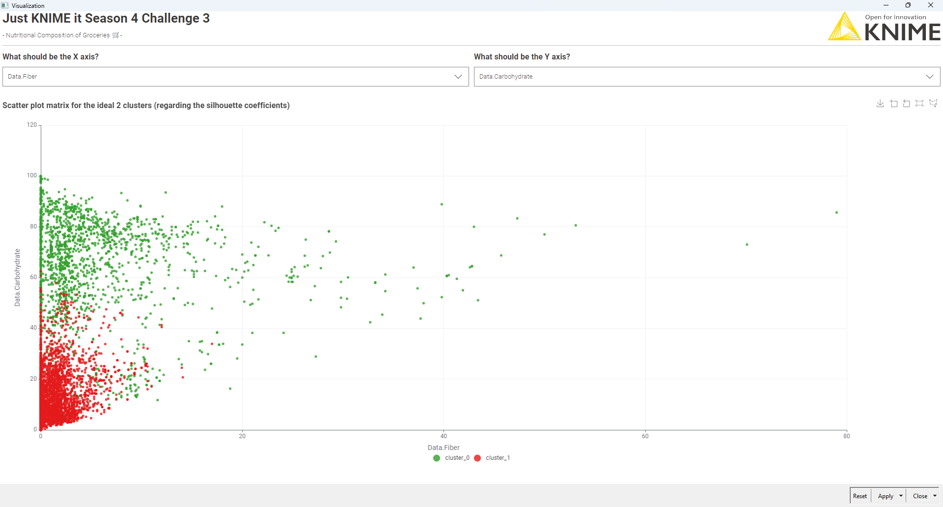
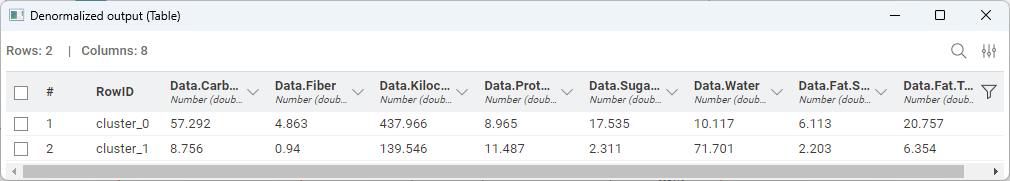
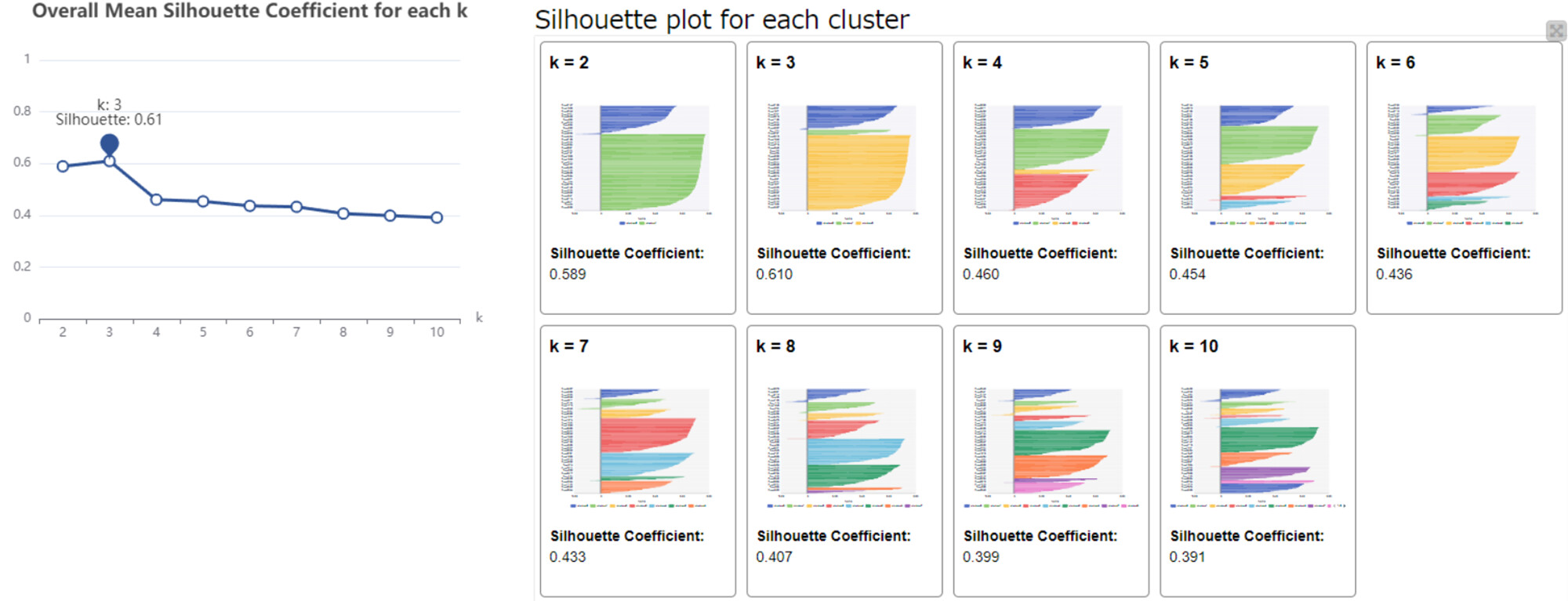
I optimized the k-means clustering using the Silhouette score, and found that two clusters perform best (although the improvement over other k-values isn’t huge).
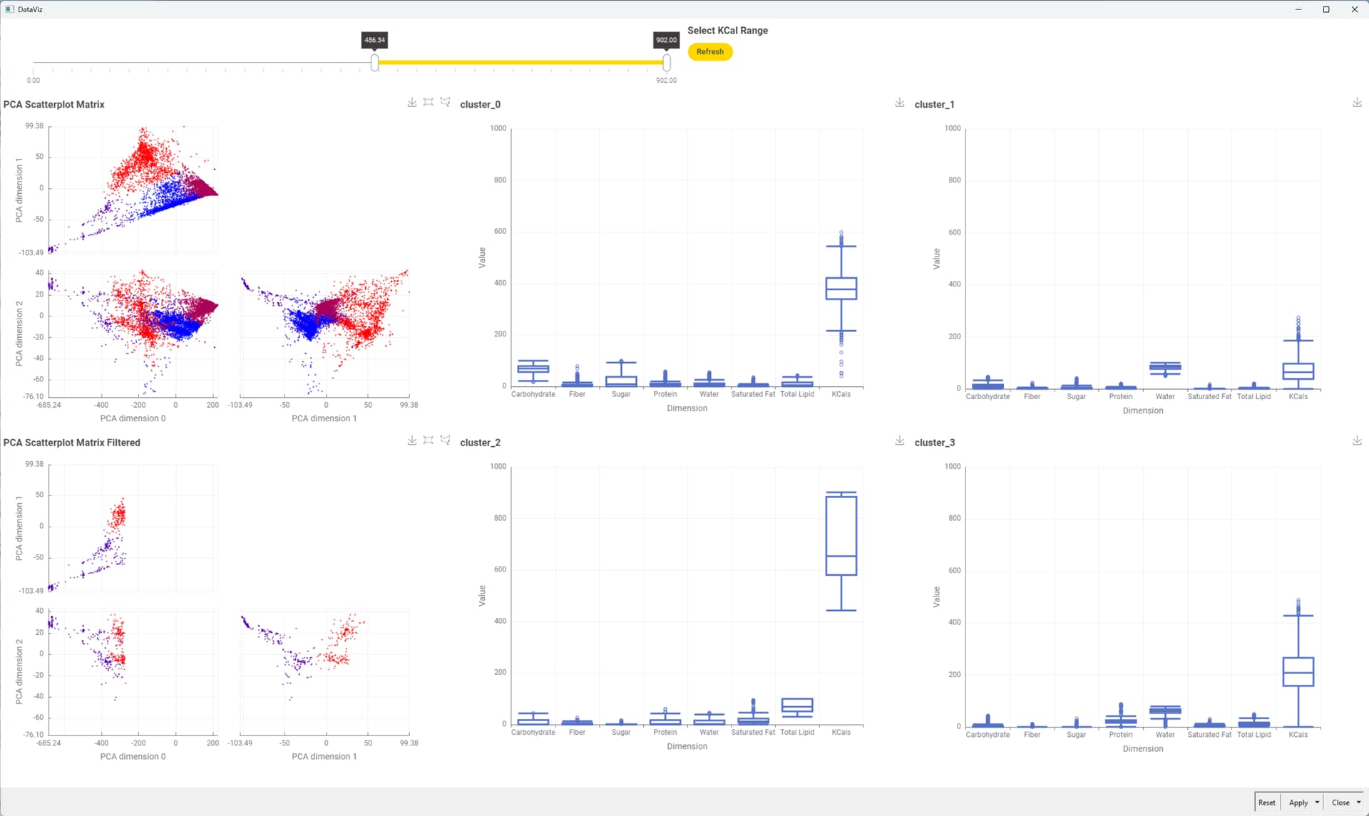
I created two dashboards:
One for the optimal number of clusters (k=2).
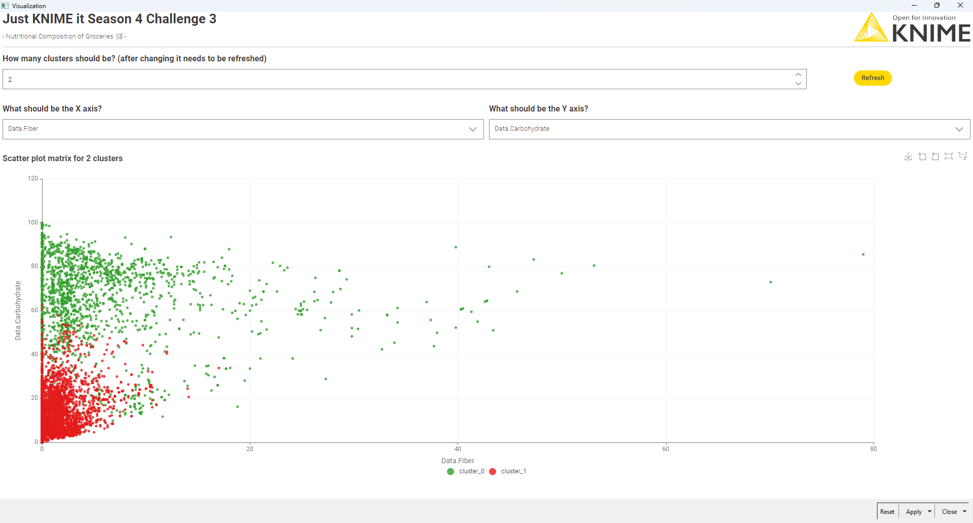
One where you can **dynamically select the number of clusters.
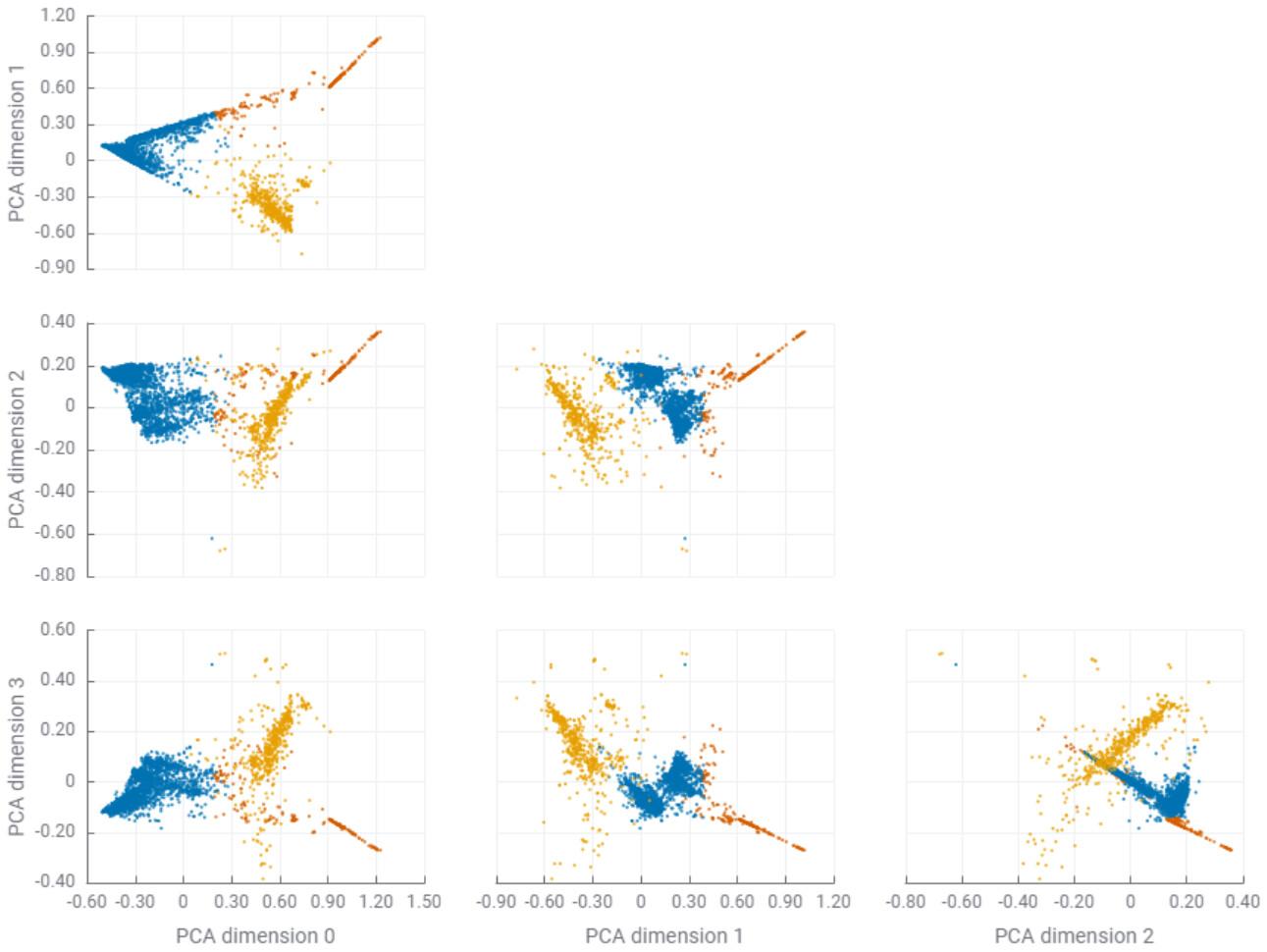
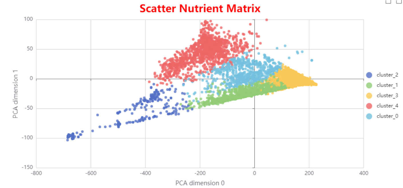
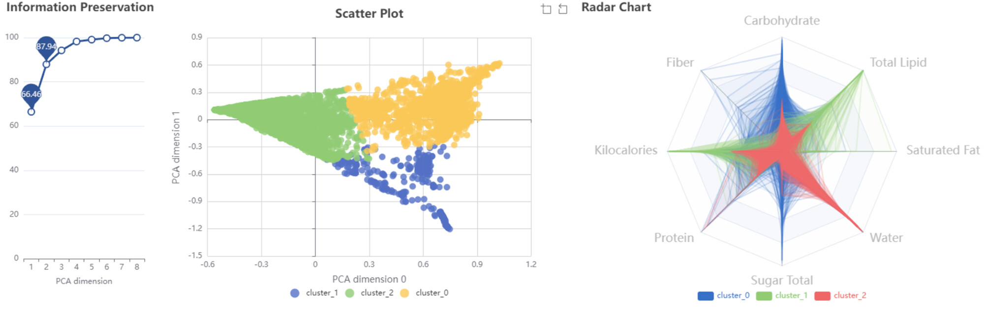
I included PCA for dimensionality reduction and reduced the data to 4 principal components. But to be honest, I don’t think PCA is particularly helpful for this use case. Here’s why:
We lose interpretability, which is key when discussing nutrition with non-technical stakeholders.
Even though PCA helps for visualization, it doesn’t offer much actionable insight in this case.
I’m not a PCA expert, so if someone has a better way to make PCA more meaningful in this context, I’d love to learn more!
Hi Berti,
I didn’t know that component (the Optimized kMeans) — fascinating stuff! I’m exploring something along similar lines, though mine was more of a handcrafted, artisan workflow (read: manual chaos). Hopefully I’ll find time to polish it and share soon.
By the way… are you secretly moonlighting as an F1 driver? Because the pace you’re moving at is definitely not street legal!
Definitely keen to look at a lot of the colleagues approach to this one as I’m not quite sure about some of the nodes I used (clustering and PCA).
In case you need to brush up your understanding of PCA, I found this video to be easy to understand [admins, please let me know if not allowed to share external links].https://www.youtube.com/watch?v=HMOI_lkzW08
Today I’ve completed the solution for Week 3 challenge of Just KNIME It! Season 4.
Excited to keep learning and growing with the global KNIME community!
I just submitted my solution for Challenge 3 – Nutritional Composition of Groceries.
My approach? A KNIME workflow that:
Normalizes nutrients (using Min-Max — because standard scores don’t digest well)
Applies k-Means clustering with dynamic k selection via silhouette scores — in two ways: first through a manual parameter optimization loop, and then (after a great tip) using the optimized k-Means component
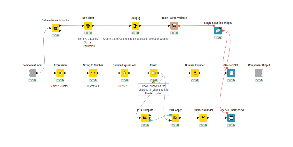
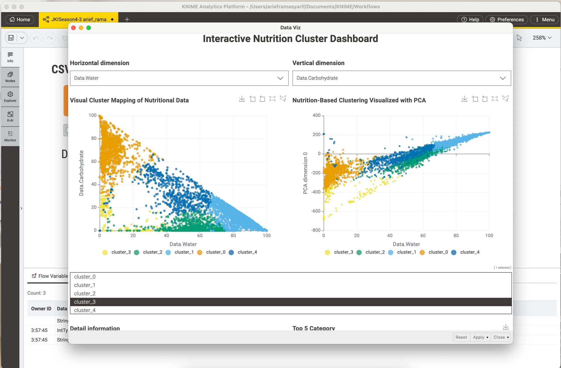
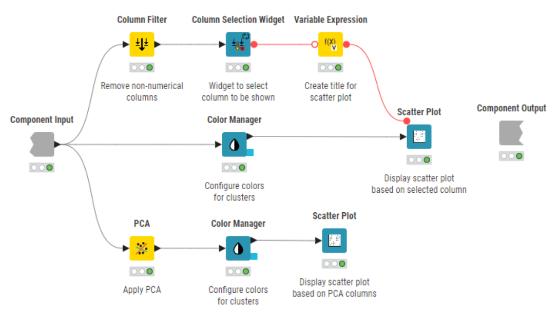
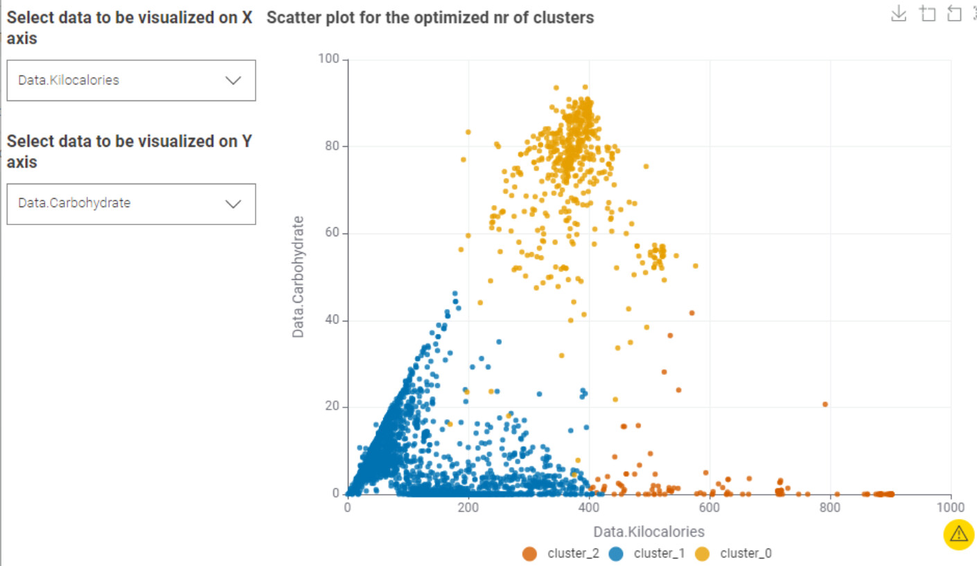
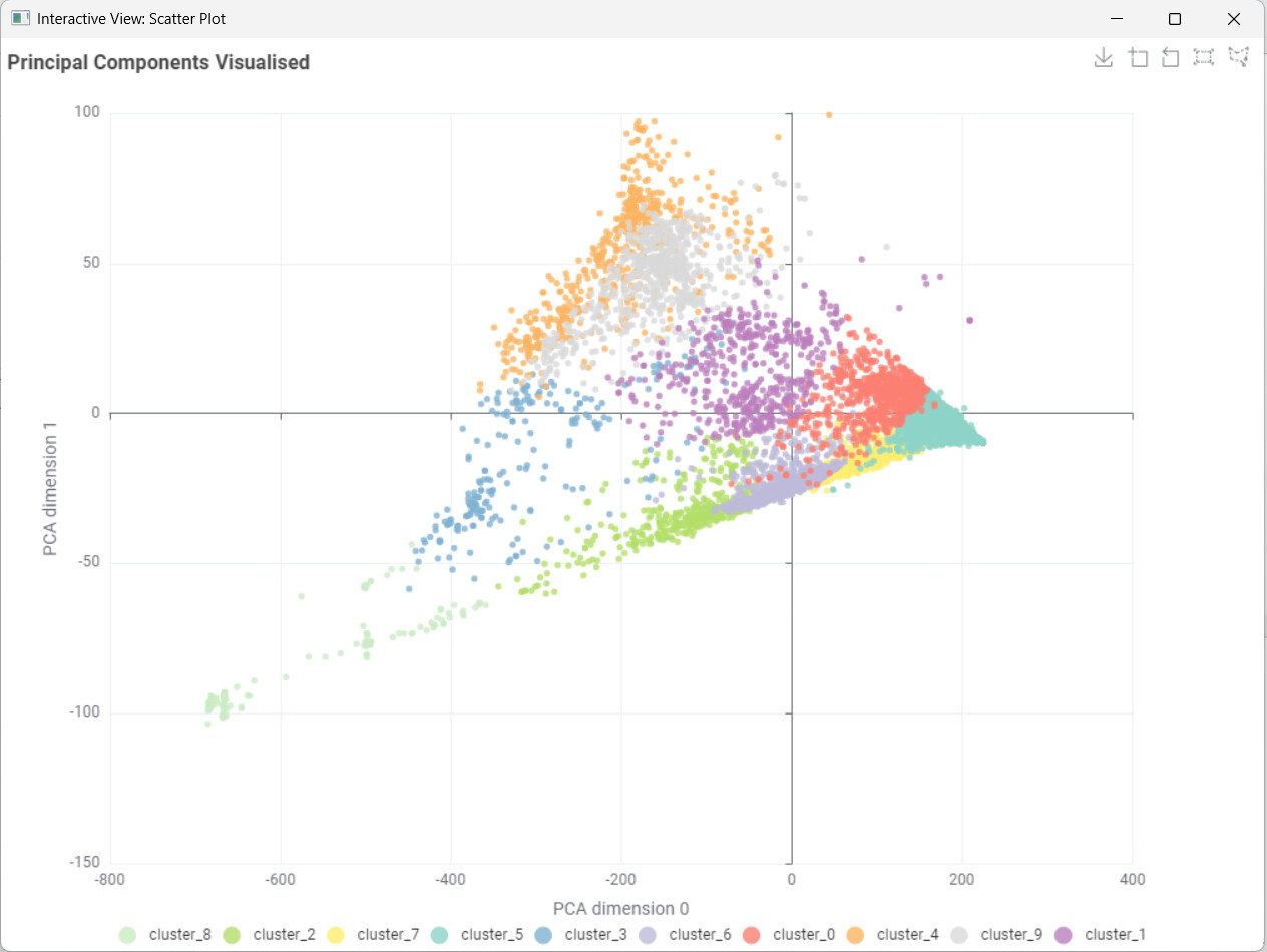
Visualizes clusters with PCA and interactive scatter plots
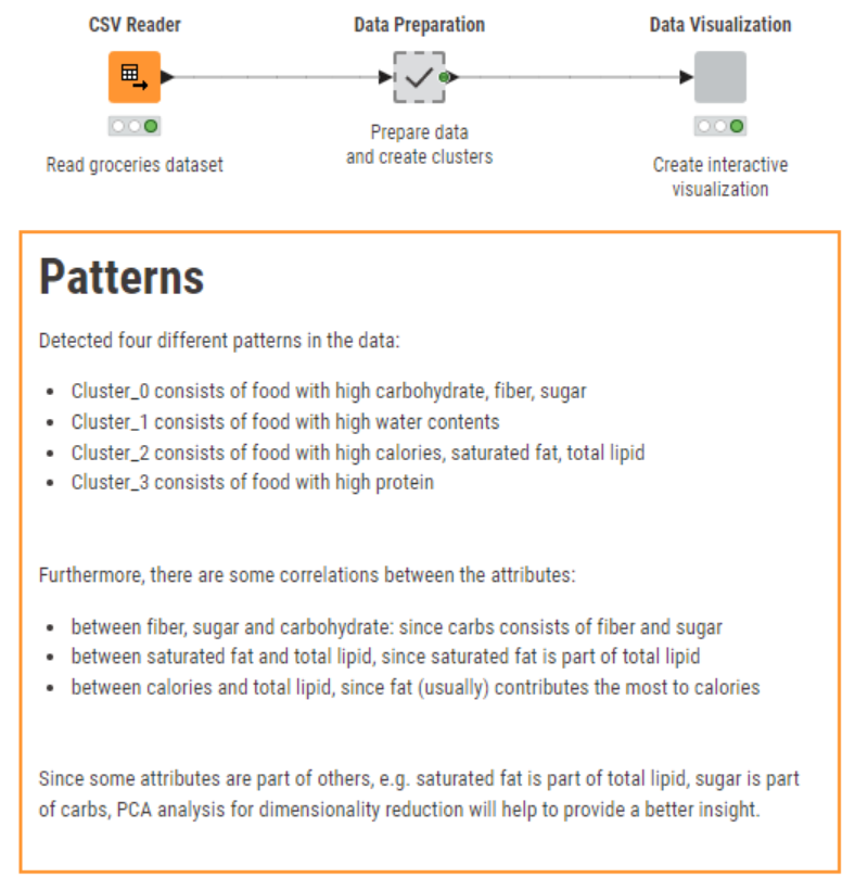
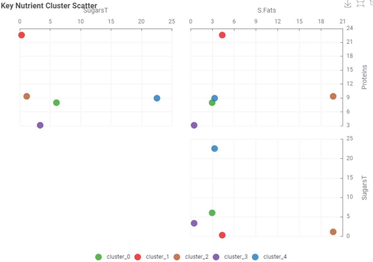
Profiles item clusters — from the suspiciously sweet to the delightfully fibrous
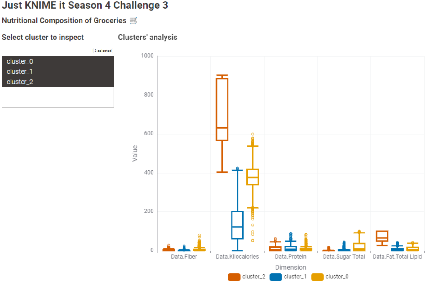
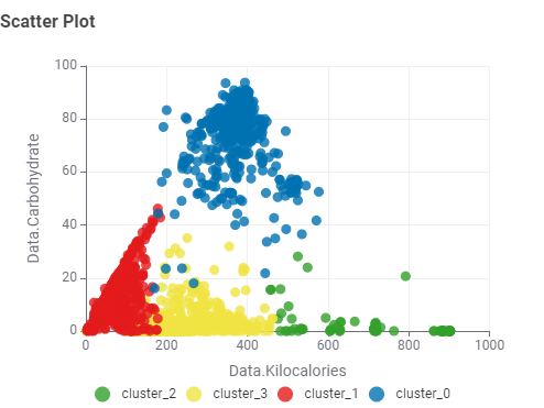
The most appropriate number of clusters turned out to be 3, based on the highest Overall Mean Silhouette Coefficient.
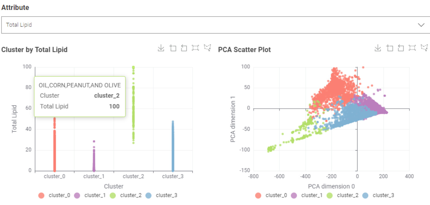
To better understand each group, I built a boxplot chart and used a table view to inspect individual items.
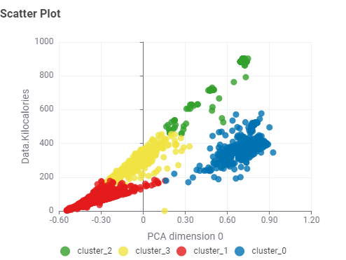
I then applied z-score normalization to deploy PCA and explore the reduced-dimensional space.
It’s not a final answer — just a healthy slice of exploratory analysis.
Looking forward to feedback, nudges, or creative remixes from the KNIME community (or fellow beach-body-data scientists out there).
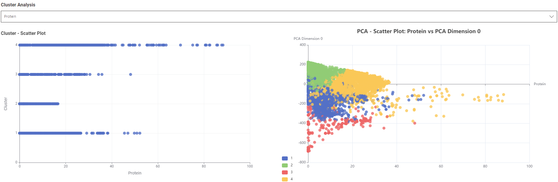
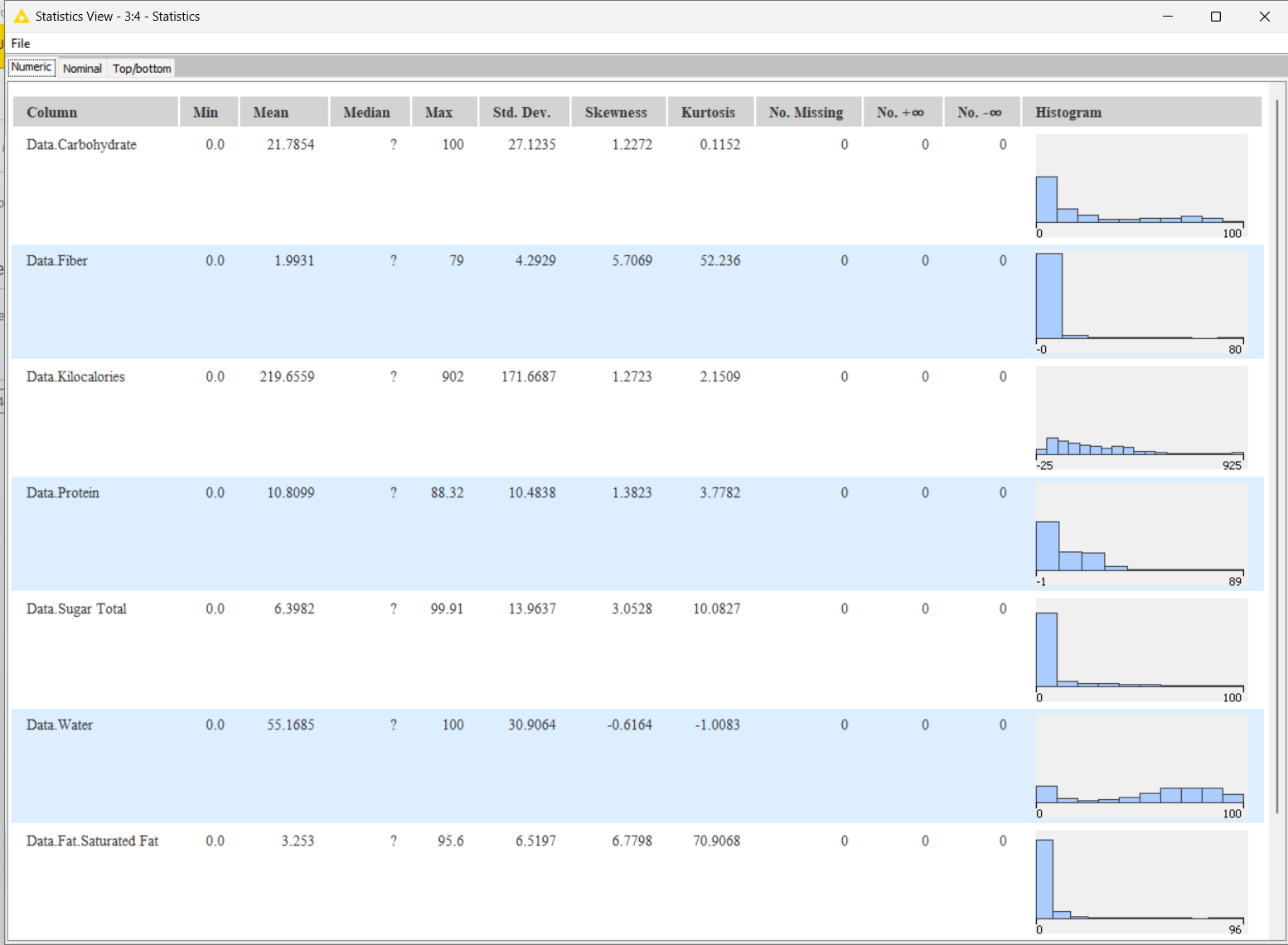
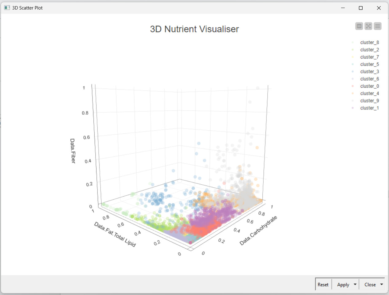
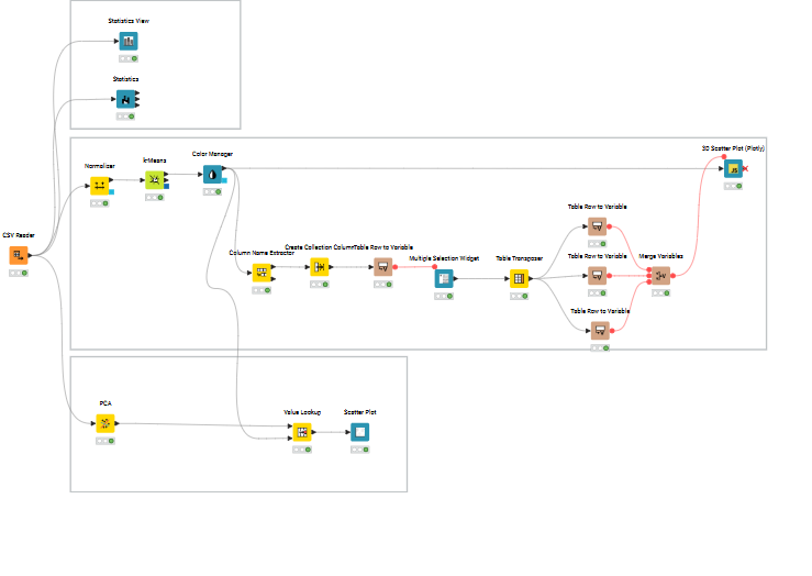
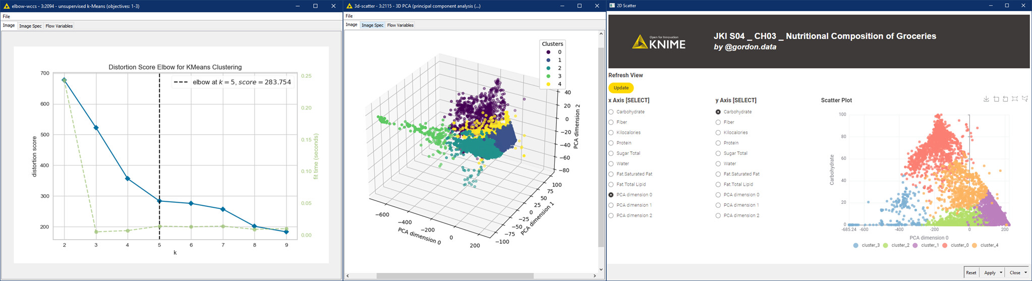
I first explored the data using the Statistics and Statistics View nodes. Chose the Min-Max Normaliser, since the data did not look normally distributed. Coloured the clusters using Colour manager node for ease of visualisation. Used the multiple section widget to get any 3 variables that can be visualised using the 3D Scatter Plot.
Further refinement would include optimising the K-means to find the best k and using that to get the clusters.
haha, I get you, have a lot of personal components and they are pure manual chaos so I know what you are talking about
The timing of the upload was a really lucky coincidence as just when the new challenge was dropped, I happened to have a free window, so I jumped on it right away
Definitely keep in touch and for sure meet in the next challenge!
I learned a lot about data science while working through this challenge. Big thanks to the KNIME community for all the shared tips and support — really helpful!
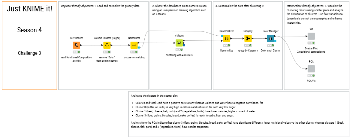
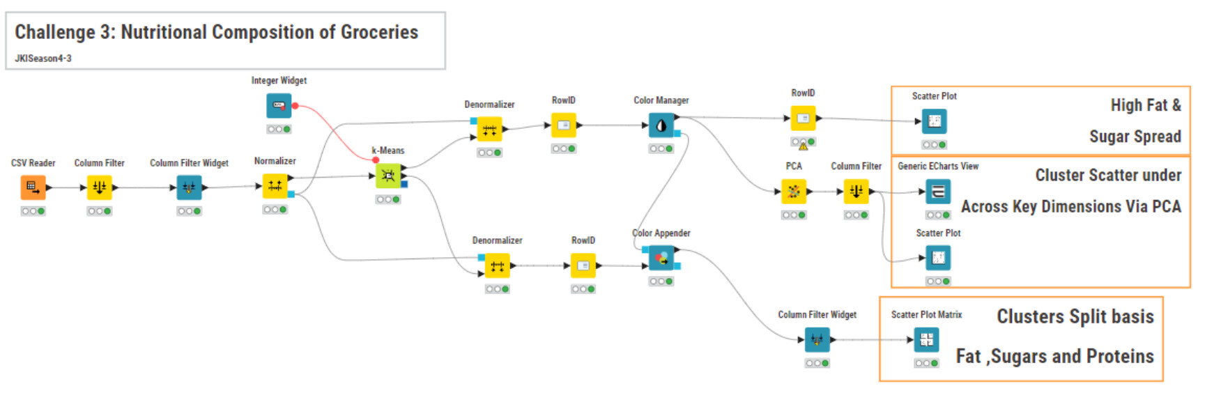
This week I tried my best to come up with an easy to understand “beginner-friendly objective” workflow. I simplified the nodes and added explanation comments down below of nodes.
Based on my “beginner-friendly objective” workflow, I derived an “intermediate-friendly objective” workflow to challenge myself and consolidate my study materials.
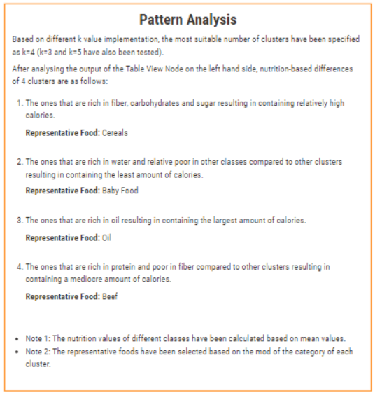
Lastly, using the Table View Node, I investigated the cluster features and wrote down an pattern analysis annotation for others to understand my work.
Here it is my take on JKI S04 CH03 challenge. I could recycle and improve some Py code from previous challenges.
I’ve automatize unsupervised Silhouette Scores based k-Means clustering, visualizing it from an elbow chart -WCSS approach-. Then a smooth principal component analysis (PCA) based on three dimension reduction.
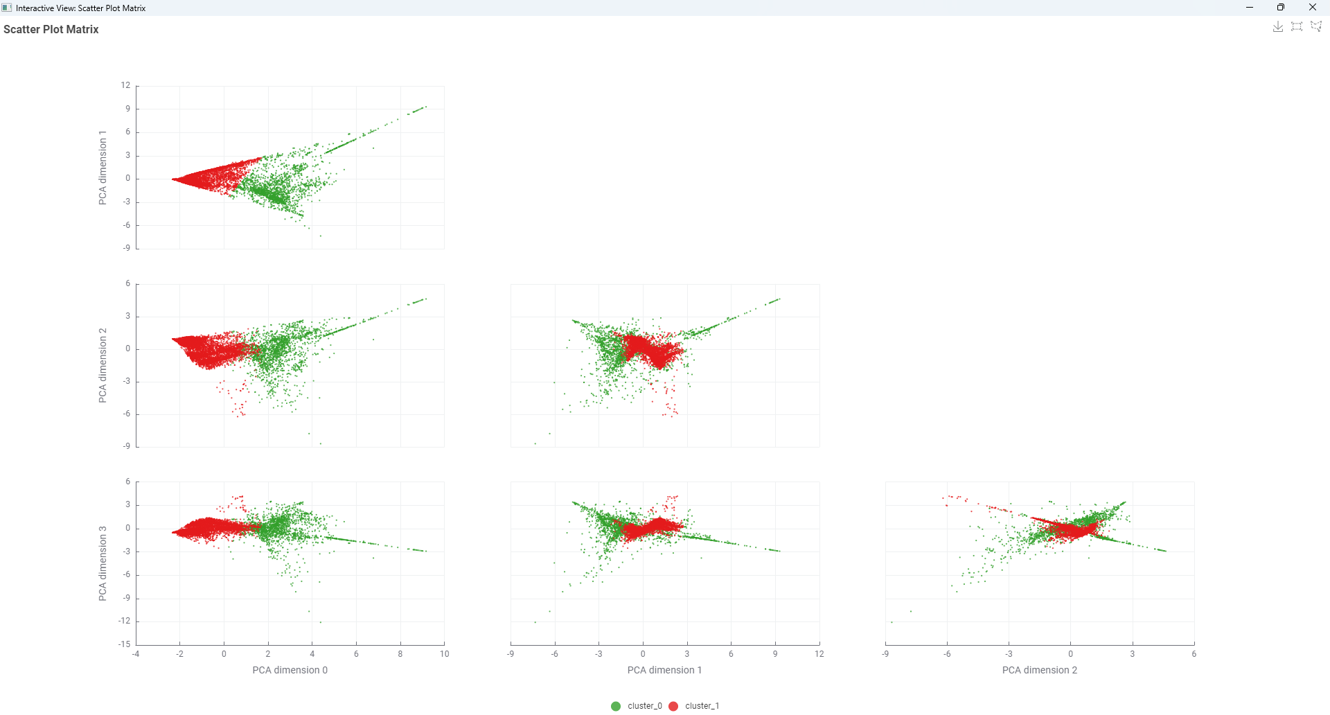
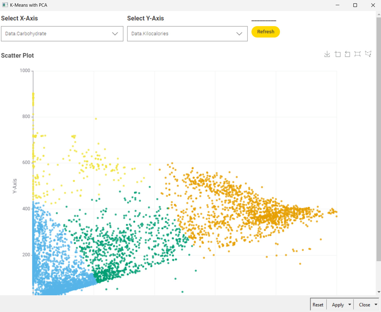
And finally I’ve deployed an app, that visualizes all the 2D possible combinations with the grocery analysed data.
Hi everyone,
I used silhouette coefficient to find the optimal k, just like someone else had already done. Radar chart might be helpful to grasp the characteristic patterns of each cluster. Thanks