Solutions to "Just KNIME It!" Challenge 5 - Season 3

:rainbow_flag: We’re well into June already, and Pride month is here. :rainbow_flag:

:knime: This week we honor the LGBTQIA+ community with a Just KNIME It! challenge, focusing on how offensive language in political speech is perceived by this community. We hope this challenge works as an opportunity for some important reflections! :thought_balloon:

Here is the challenge. Let’s use this thread to post our solutions to it, which should be uploaded to your public KNIME Hub spaces with tag JKISeason3-5.

:sos: Need help with tags? To add tag JKISeason3-5 to your workflow, go to the description panel in KNIME Analytics Platform, click the pencil to edit it, and you will see the option for adding tags right there. :slight_smile: Let us know if you have any problems!

Hi @alinebessa,

what does the colon in percentage mean?

Best
Mike

2 Likes

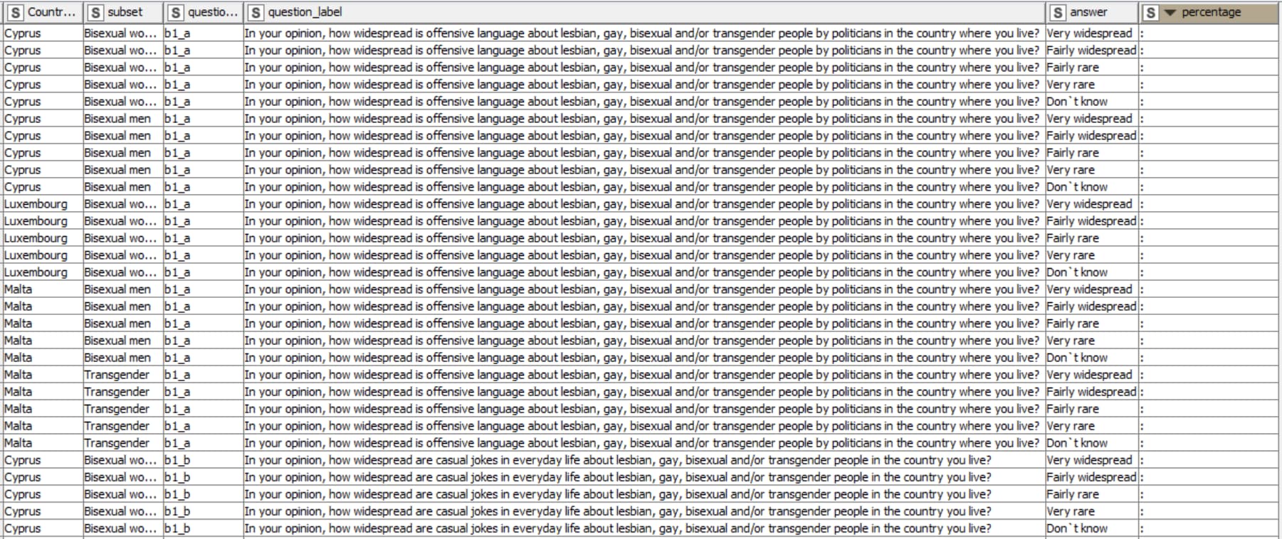
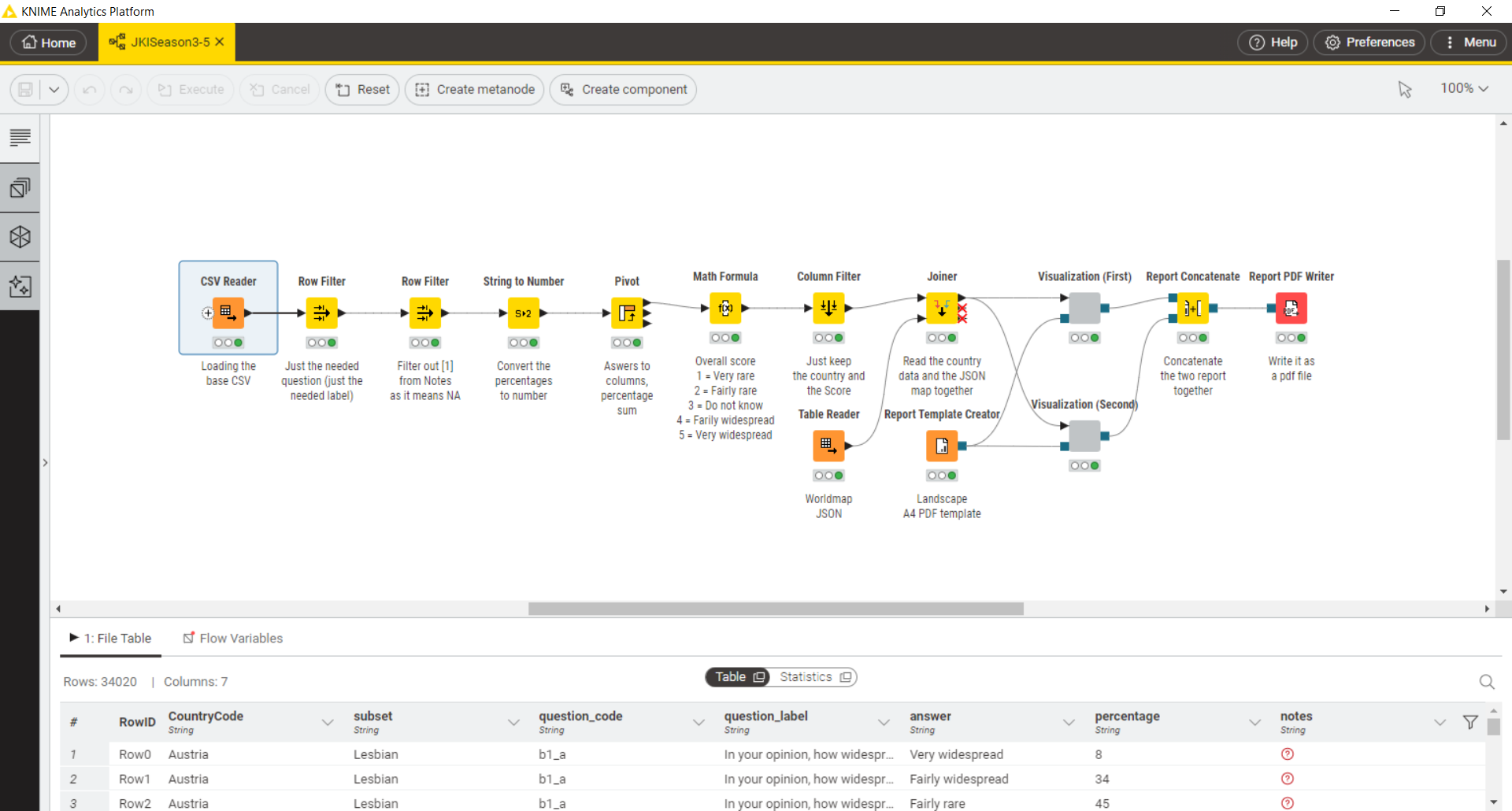
I cleaned it up - after I checked, that for all countries there were still 5 answers per subset which was the case - looks like that certain subsets in certain countries were no questioned or did not provide responses.

1 Like

Here’s my take:

  • User can filter for Answer and Subset
  • Subset and Answer refresh data for Chloropleth Map (prebuilt component…)
  • Subset refreshes data for eCharts based world map with pies for each country (amended solution from C4 from @sryu)

7 Likes

Hi @alinebessa

I’ve uploaded solution for this challenge

5 Likes

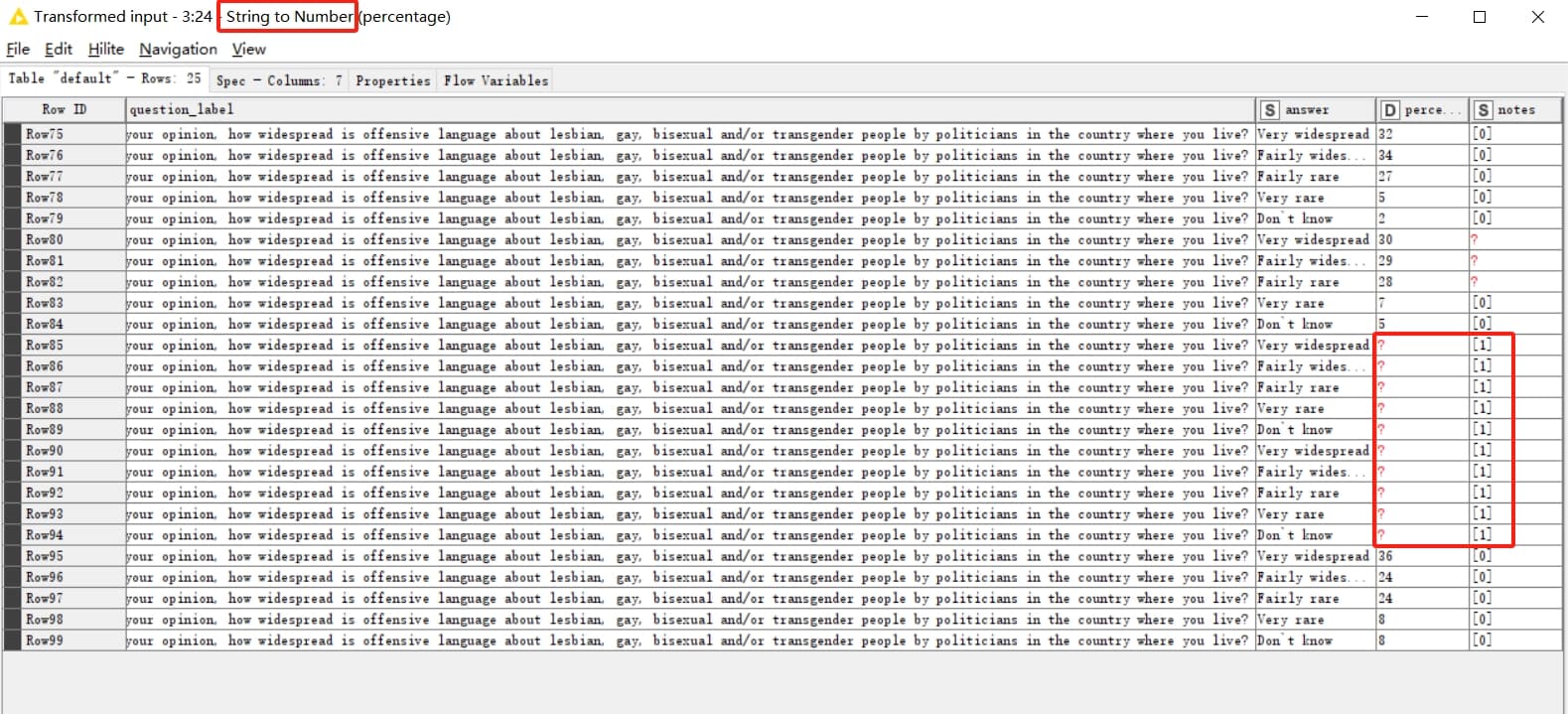
If I’ve understood correctly, when the last column Notes = “[1]” in the dataset, the corresponding entry in the percentage column = “:”. However, this does not impact the functionality of the “String to Number” node. If conversion fails, it outputs a null value(?), and these null values do not affect subsequent aggregation (group by) operations.

3 Likes

Hi, This is my workflow.

  1. The original problem is slightly different from the problem in the dictionary, so I used fuzzy string matching.Maybe it’s complicated.

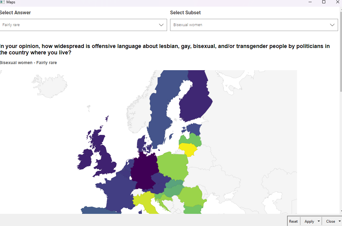
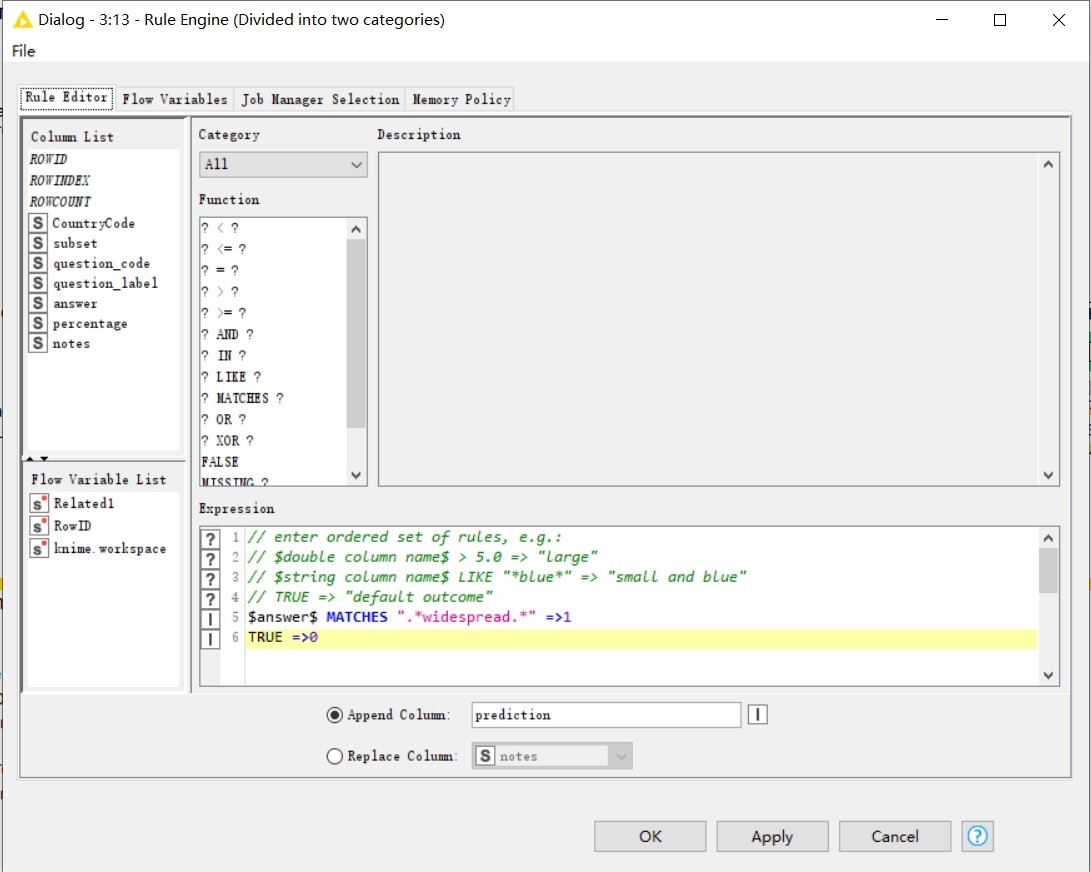
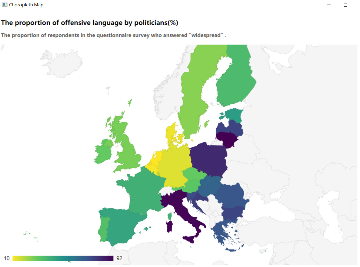
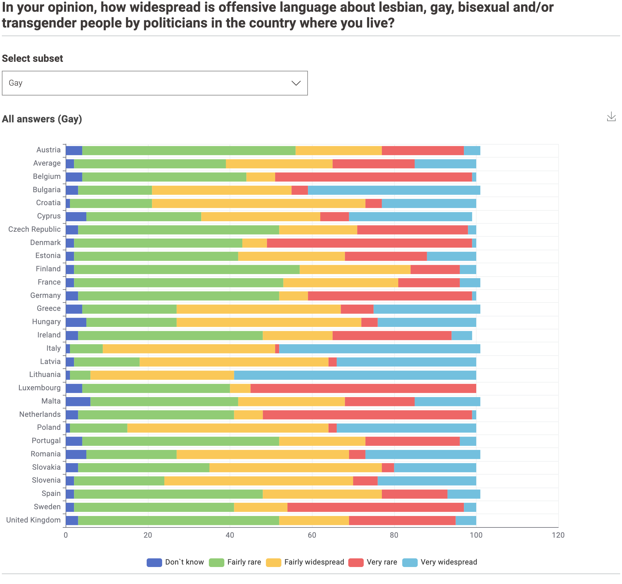
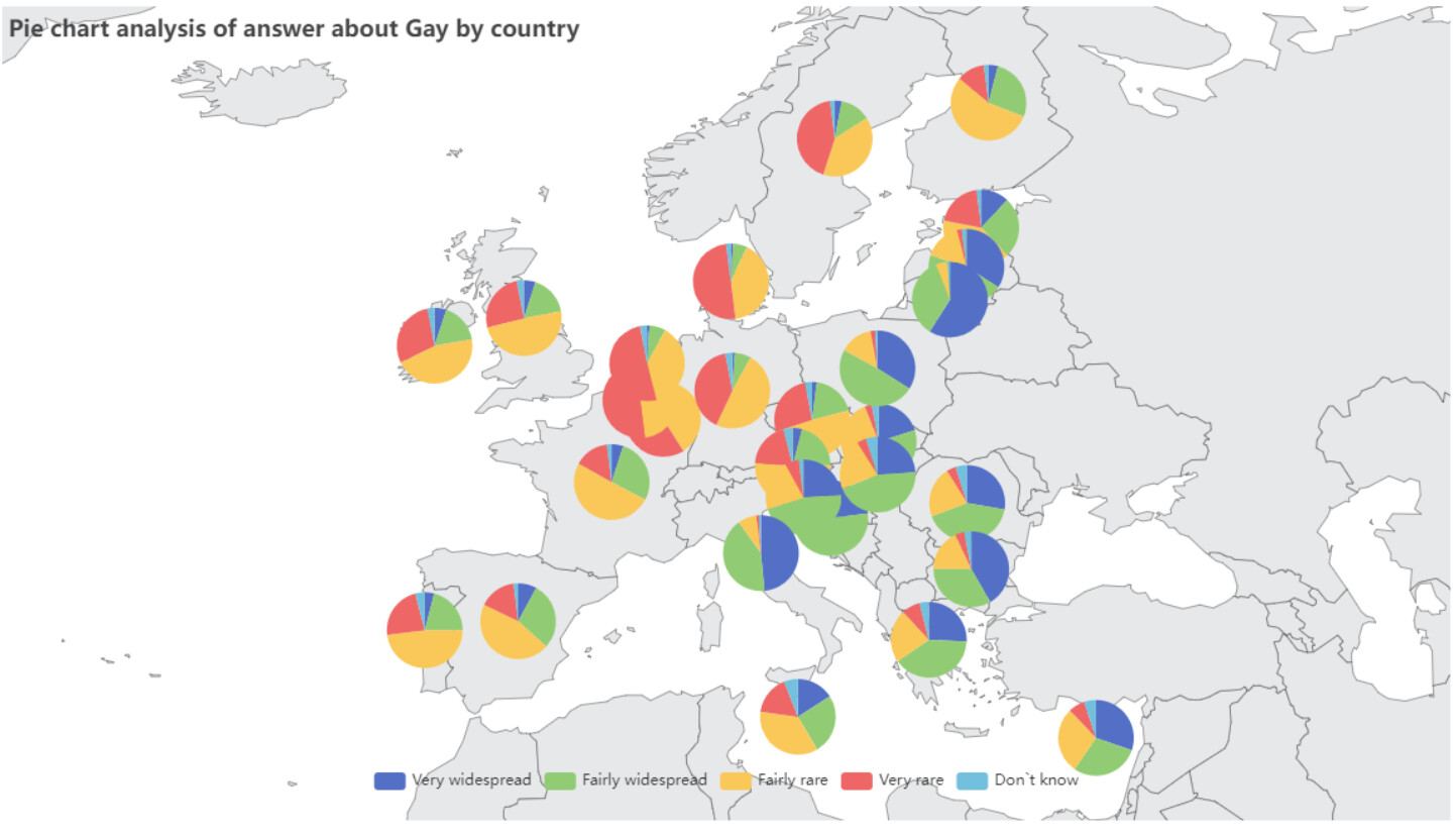
  2. Displaying multiple dimensions on a map component is inconvenient, so I have categorized the answers into two scenarios: widespread(1) and not widespread(0), focusing only on the widespread scenario.

  3. Visualize using the map components provided by KNIME. This is more convenient.
    Result:

4 Likes

Hello!!
I’m so thrilled to be able to follow this challenge.

here is the link workflow :

Best Regards,
Veni

1 Like

My understanding is that it is a NULL/unknown indicator. Maybe @michele_bassa, the author of the challenge, can clarify it more!

1 Like

Here’s my solution. Choropleth Map with subset/question/answer and table with subset/question. I set the nulls = 0 somewhat arbitrarily.

6 Likes

Hi all, here is my solution.

5 Likes

Hi all,
Here is my solution.

Interactive dashboard was constructed using a Choropleth Map and a stacked bar chart.


5 Likes

Hi all,
Here is my solution.
World map-based pie chart using Generic ECharts View were modified to zoom in on the European region by default.


8 Likes

Hi everyone,
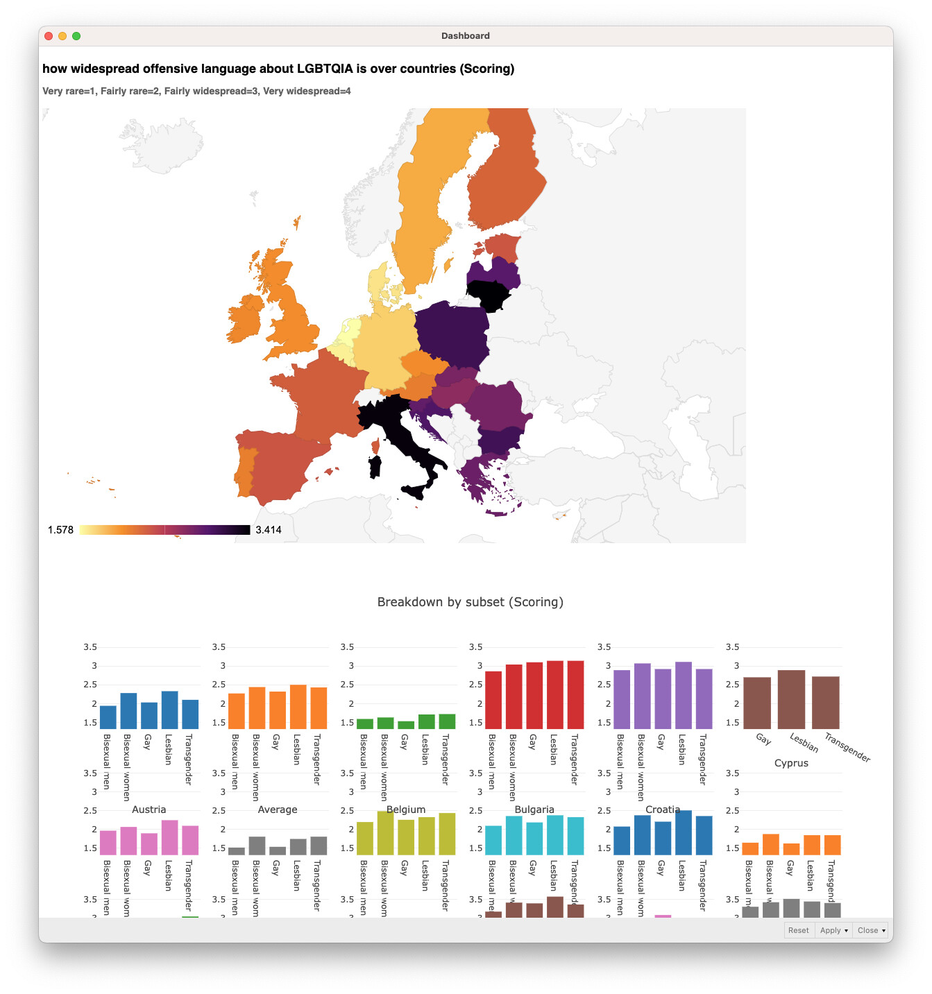
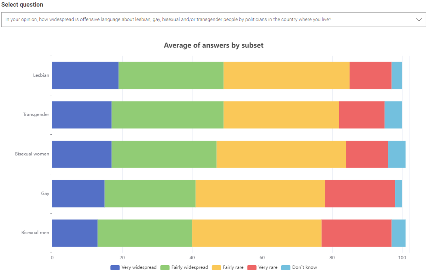
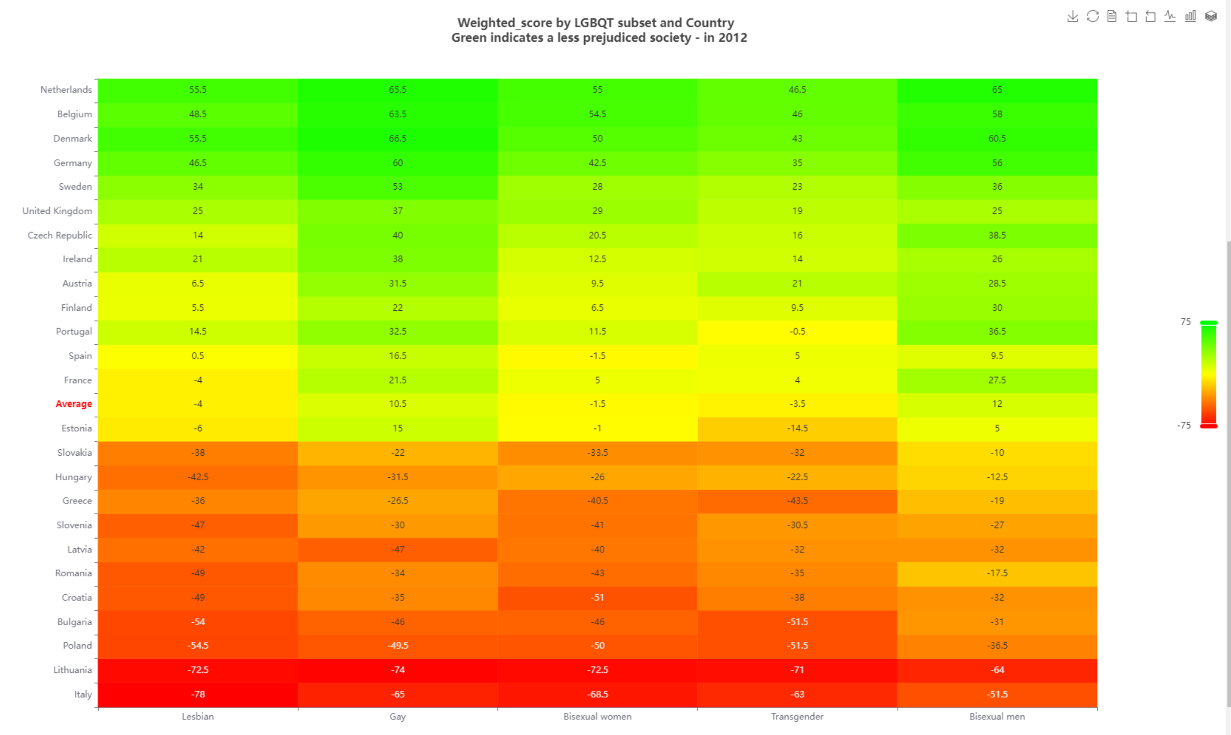
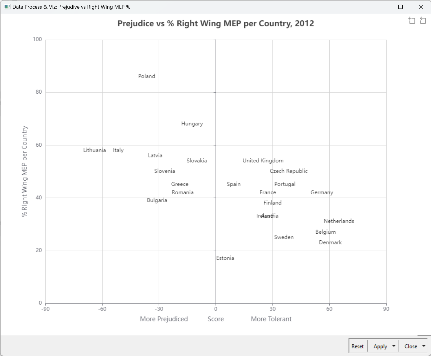
Here’s my solution. After scoring answers to the question, the overall score was calculated and normalized. Deviations of the scores from the average are indicated on the map in green and red.
Thank you.

6 Likes

Hello everyone,

Here is my workflow!

I followed a variable management method similar to @MartinDDDD !!!

First time working with variables! I learned a lot! Thanks to Martin and everyone!

Carlos

4 Likes

This is my workflow for this Challenge.

I applied a score for the possible answers from 1 to 10 and used a geospatial view to show the acceptance for the selected question.

At the end I additionally calculated an average acceptance over all questions for all countries.

4 Likes

Hello all,
I uploaded my solution here.

In this time I think it’s a very good opptunity for learnign the way of the Generic ECharts view node. Already we can get know-how to use the node from this thread !!

6 Likes

If reporting, then PDF (In my understanding, at least :smiley: )

My solution for the challange:

JKISeason3-5 – KNIME Community Hub


I think the solution could have been more sophisticated: A loop for column subset could be started and closing the loop with a reporting loop end (so it would create the pages for the pdf, one for every subset).

However sadly I didn’t have enough time for the solution to sophisticate

5 Likes

Weighted the answers

Looks like the data is from 2012: added a plot of prejudice vs 2012 right wing MEP representation / country

4 Likes

here is my submission

3 Likes