This thread is for posting solutions to “Just KNIME It!” Challenge 6. Feel free to link your solution from KNIME Hub as well!
2 Likes
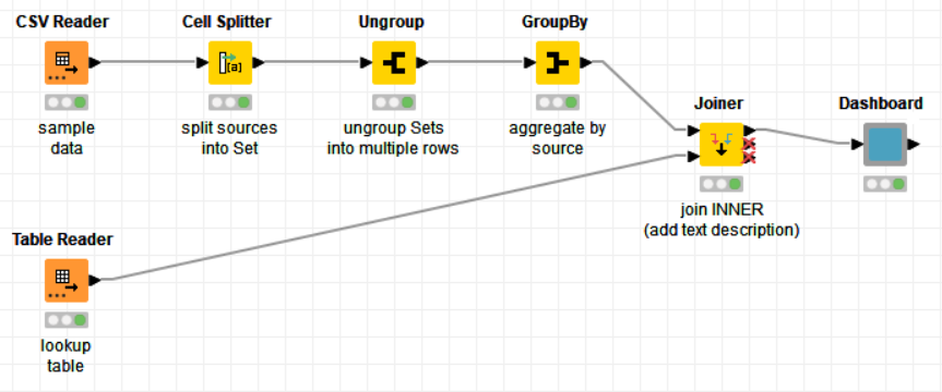
This is quite straightforward:
- Cell Splitter (using List/Set) and Ungroup node to get input table into long format
- GroupBy to count the frequency of each news source
- Joiner to append text description
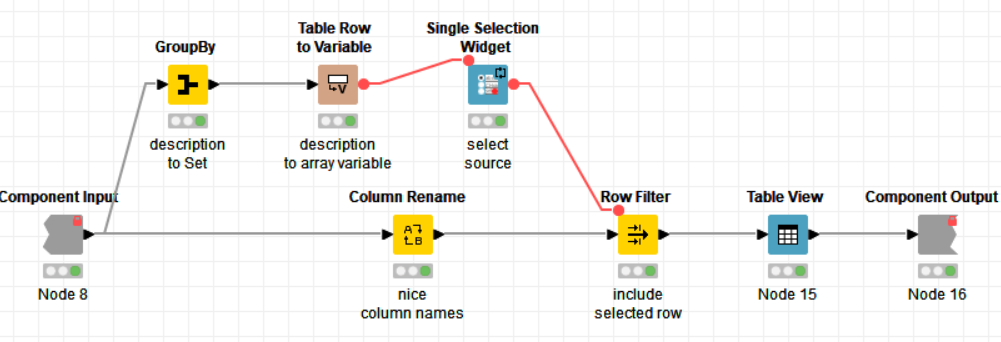
The Dashboard then uses an array Flow Variable to present the existing options to the user in a Single Selection Widget. A Row Filter then reduces the table to one row, which is displayed in a Table View. Feels a bit moot, but there’s not much left to show. Maybe someone else is more creative ![]()
PS: No Java Snippet this thyme, sorry ![]()
5 Likes
Hi all,
Here’s my solution with some visualisations.
Bye ![]()
3 Likes
Hello,
here is the link to my solution: justknimeit-6 - Raffaello Barri .
I noticed that the answers given by each person are not following a specific order (ascending or descending). I assume each person indicated the main source of information, then the second main source and so on. Given this, I added a sunburst with three levels and three different pie charts with the first the second and the third most preferred sources of information.
The loop at the beginning should make the flow robust to a potential addition in the sources list (I used regex to select attributes).
RB
4 Likes
I like bar charts - the most informative in my opinion.
KnimeIT_6.knwf (18.6 KB)
1 Like
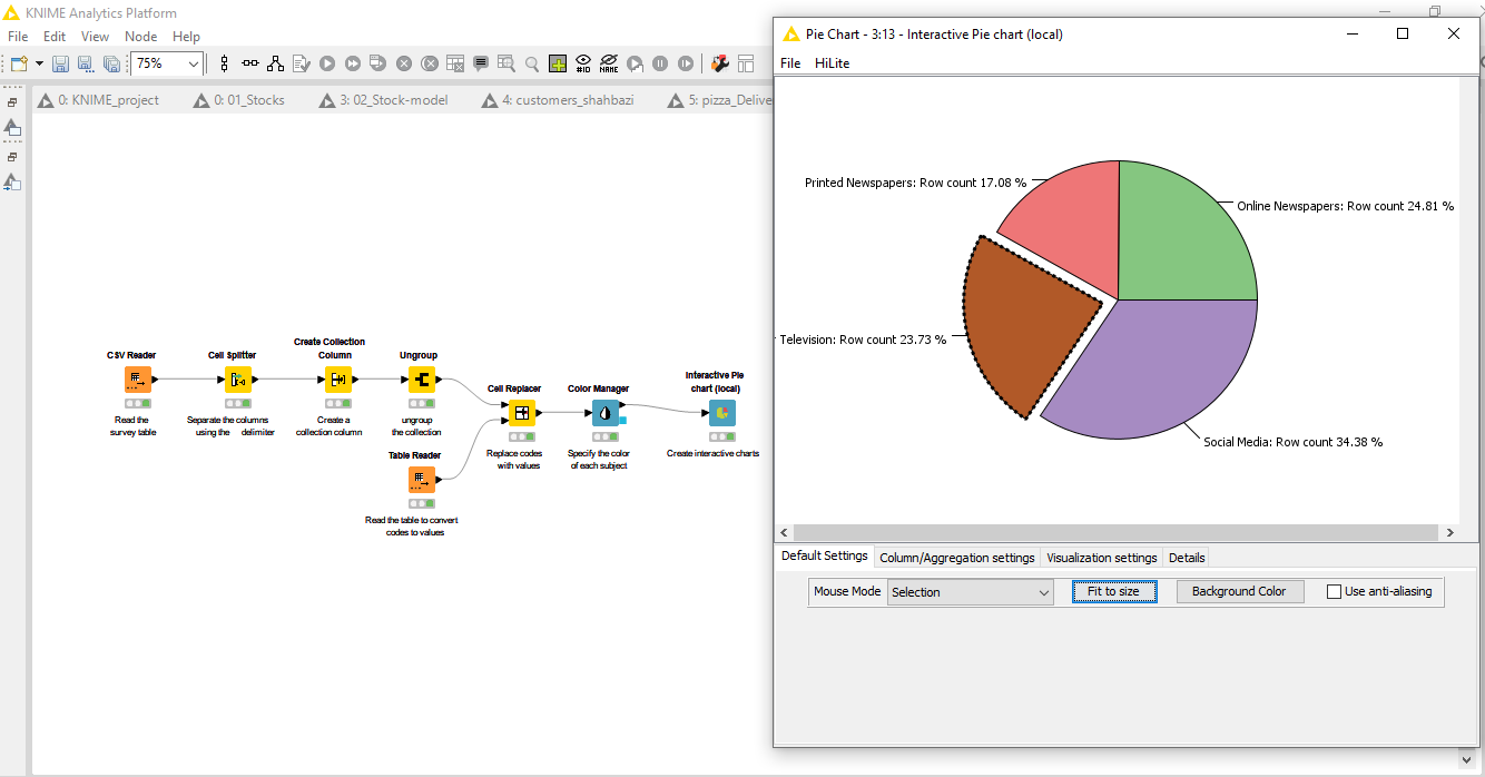
Hello KNIMErs,
TGIF and here is my solution to #justknimeit-6 :
KNIME Hub > gonhaddock > Spaces > Just_KNIME_It > Just KNIME It _ Challenge 006
In this opportunity for the first task, (1) replace codes with corresponding names; i just took this @iris solution that I really like. I realized that this is the perfect fitting task whether to apply it.
I’ve acknowledged the reference sources in both, the ‘Description Panel’ and in the ‘Workflow Annotations’ as well.
For the second task, (2) to create an interactive dashboard that shows how many times each option has been selected; I’ve selected the ‘Bar Chart’ plot showing up the total counts for each option in the ‘Source’ column. To achieve the results the selected approach has been a Logical Indexing
regex match method, then counting occurrences by ‘News Source’ afterwards.
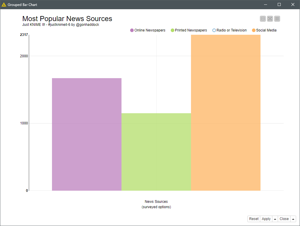
The dashboard should allow users to filter for the options they are interested in.
Latest but not least for the bonus:
As I feel somehow challenged… (3) Note: Feel free to use this challenge as an opportunity to explore different visualization nodes!
Then I’ve decided to explore an R Sankey Diagram as an interactive dashboard, that pops up in your favorite web browser. To achieve this results I’ve assumed that the string sequence in ‘Source’ column, keeps survey’s selections ordinal / preferential sequence.
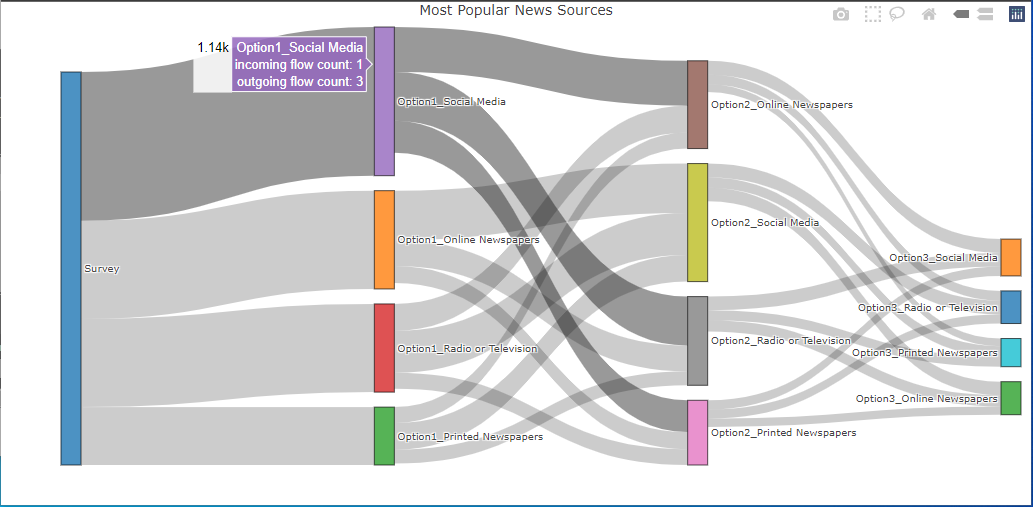
BR
7 Likes
Hi everyone,
Here is my solution
4 bar chart, 4 description text.
2 Likes
The link was broken.
Sorry for that, now it works back again.
BR
1 Like
I took an extremely simple approach to this solution, as well, and realized I had never been formally introduced to the Ungroup node. This helped me avoid multiple Joiner nodes after splitting the source column, which I’m probably addicted to. My interactive histogram is also not incredibly deep but the user can select a description to see the values.
3 Likes
Whoah! I don’t think I had ever seen this type of viz in action!
3 Likes

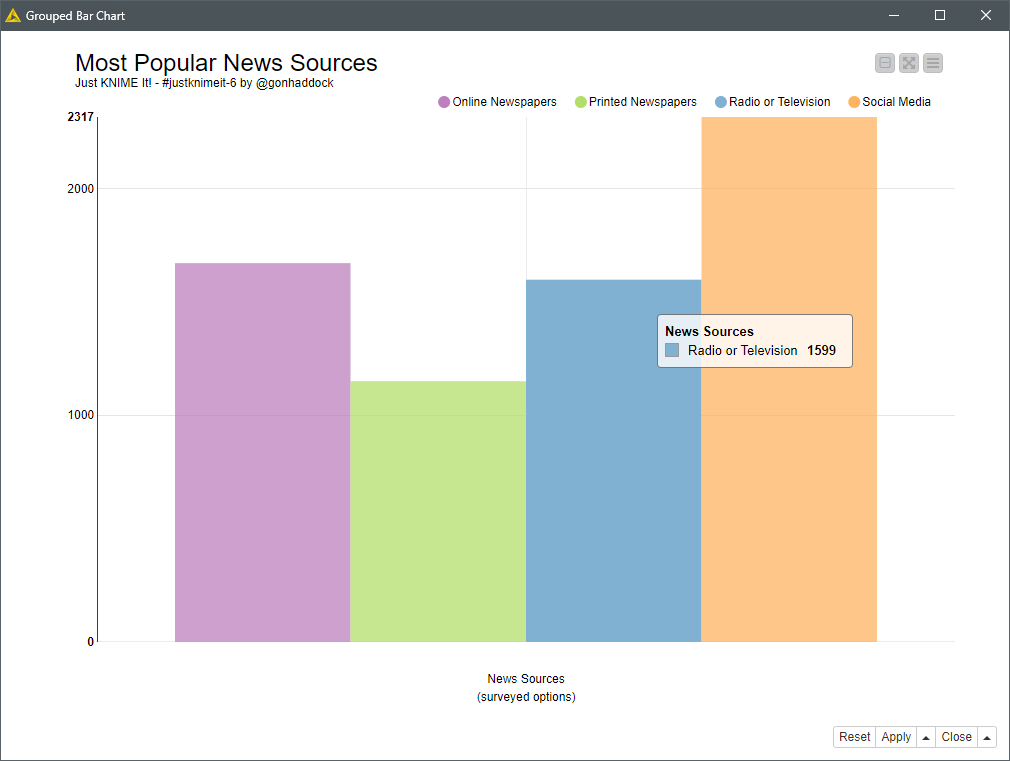
My take on Just Knime it Challenge 6
Most Popular News Sources
Fields were limited so visual werent asthetic… and less flexible for selection.
Just Knime It- Ch6 Anil

AKS
5 Likes


3 Likes
Hi KNIMErs;
here my solution ![]()
![]()
Take care
Regards
3 Likes
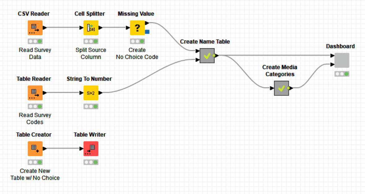
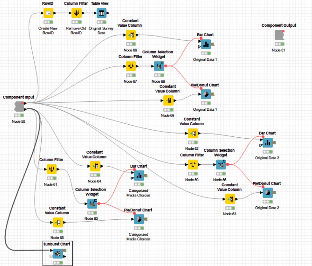
Here’s my solution. There’s a bug in the Column Selection widget. Armin Ghassemi Rudd provided me a workaround. This was my first attempt at developing and interactive dashboard so its a little crude, but seems to work fine. I added a " No Choice" category so they can be counted. I have two sets of choice bar and pie charts so the user can compare two choices at the same time. I joined print papers/radio & TV and social media/online papers to create traditional vs. online categories. The Name Table metanode is pretty messy both conceptually and visually. I couldn’t think of an easier way to do it.
REF Challenge 6 w Dashboard 1.knwf (1.0 MB)
2 Likes
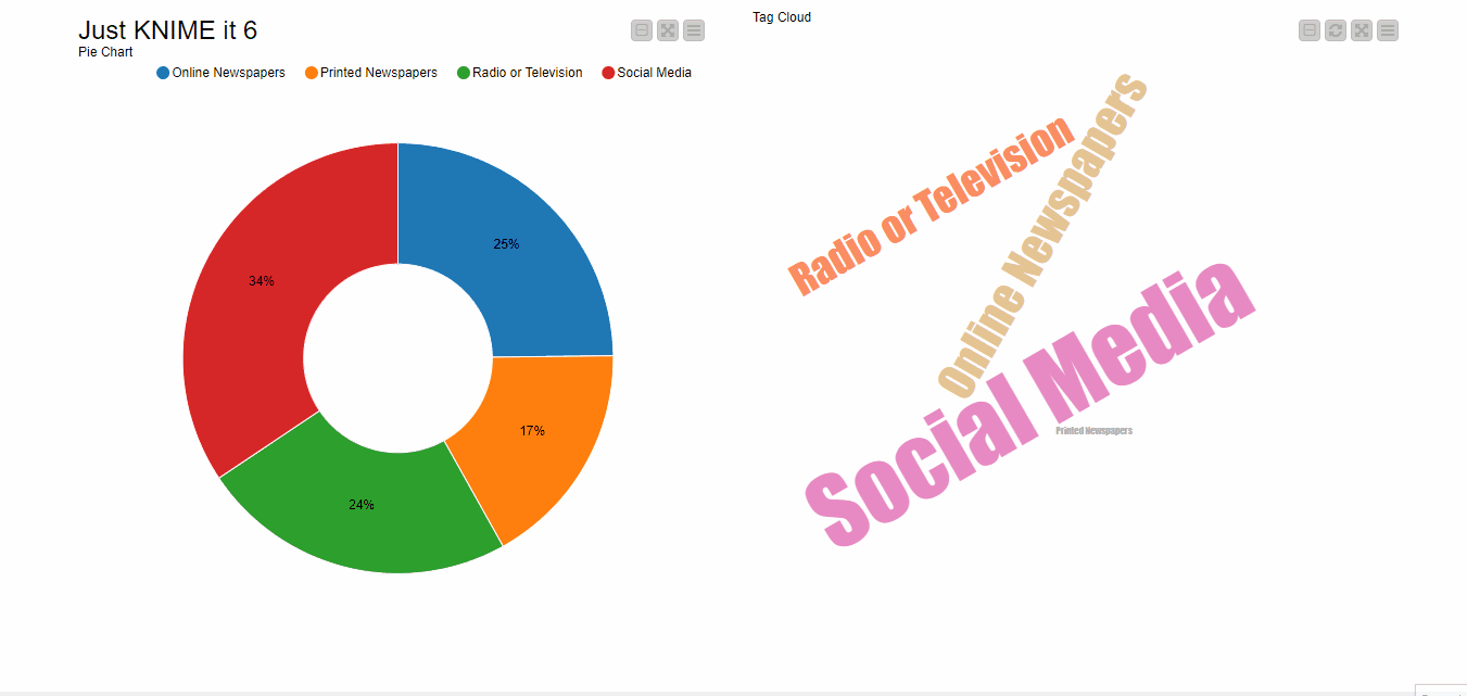
As always on Tuesdays, here’s our solution to “Just KNIME It!” challenge 6. ![]() We used two rather similar charts (donut and bar) for didactic purposes, just to complicate the workflow a little bit while still keeping it easy enough for a baseline solution.
We used two rather similar charts (donut and bar) for didactic purposes, just to complicate the workflow a little bit while still keeping it easy enough for a baseline solution.
You folks are very inspiring and are bringing lots of knowledge here! Keep up the excellent, collaborative work! ![]()
![]()
And see you tomorrow for a new challenge.
1 Like