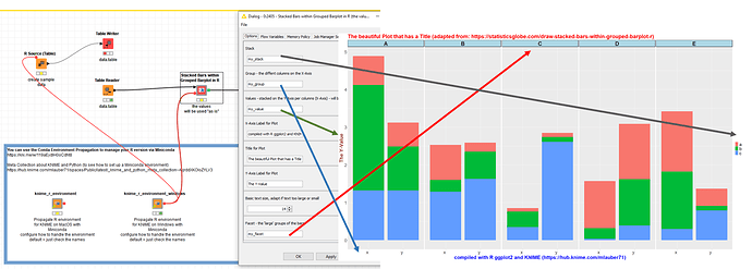
@Timoalt welcome to the KNIME forum. As it happens I am preparing a few examples of advanced graphics with KNIME and used your question to adapt an example of Stacked Bars with Grouped Barplots.
In you case it might be
Region = group
Year = facet
Satisfaction = stack
Percentages = value
You would have to prepare the data accordingly. The values would be taken as they are so you will have to calculate your percentages before (and make sure they add up to 100% per sub-group). And you will have to install R and KNIME - in the example this is done using Miniconda and Python. If you plan on doing more complicated graphics it might very well be worth the effort.
This is meant as an example you could adapt to your needs and explore further graphics with R and Python (Matplotlib, Seaborn, …). A larger article might be up-coming about this.
–
Edit: There is a new KNIME 5 version (R Graphics - Stacked Bars within Grouped Barplot in R – KNIME Community Hub). Also, you can read about “Exploring the Power of R Graphics with KNIME: A Collection of Examples“
