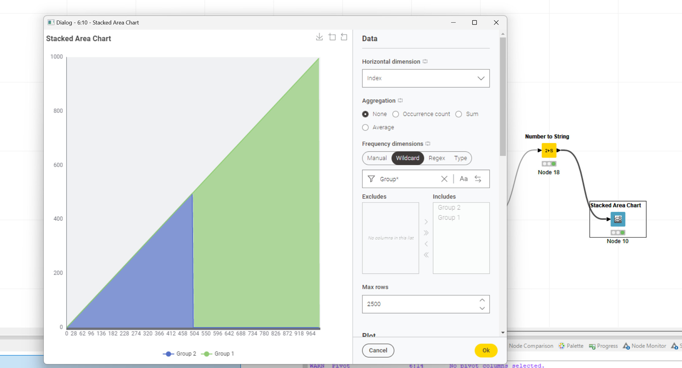
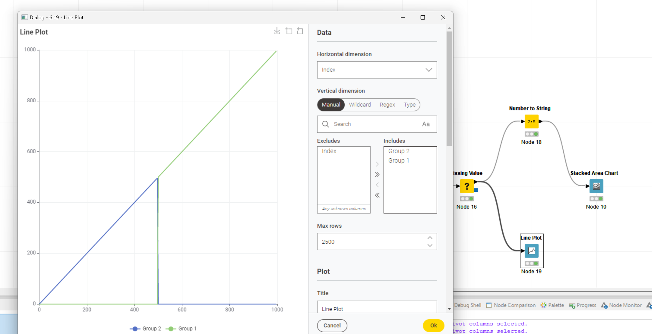
These two are likely related. Echarts offers categorical and numeric/continuous axes. You can distinguish them by looking at the ticks. For categorical values ECharts places the ticke between values (as kind of a border), such that labels are also between ticks. For numeric axes, ticks and labels are placed exactly under the respective values.
The problem here is that the Stacked Area Chart only supports categorical values. As a result, you see the gaps on the left and right ends, which each are half the with of the space assigned to each value. It is a bit difficult to see with as many values, but if you try with only 3, it is quite obvious.
Talking about categorical values. This also means that you need to make sure that all values are in order and distances between them are equal. ECharts does not take care that the axes resembles time linearly.