Good Afternoon everyone,
I am writing to you, because I’m having strange looking line plots and don’t know where it is coming from.
I am happy about everyone which has a suggestion what I could improve.
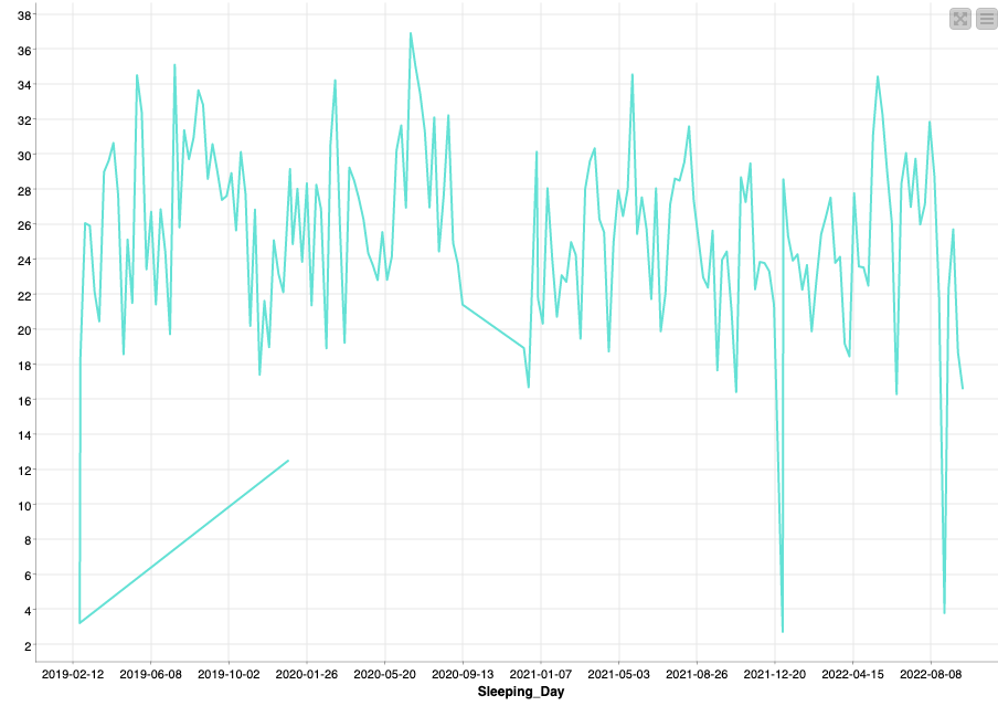
The Plot look like this:
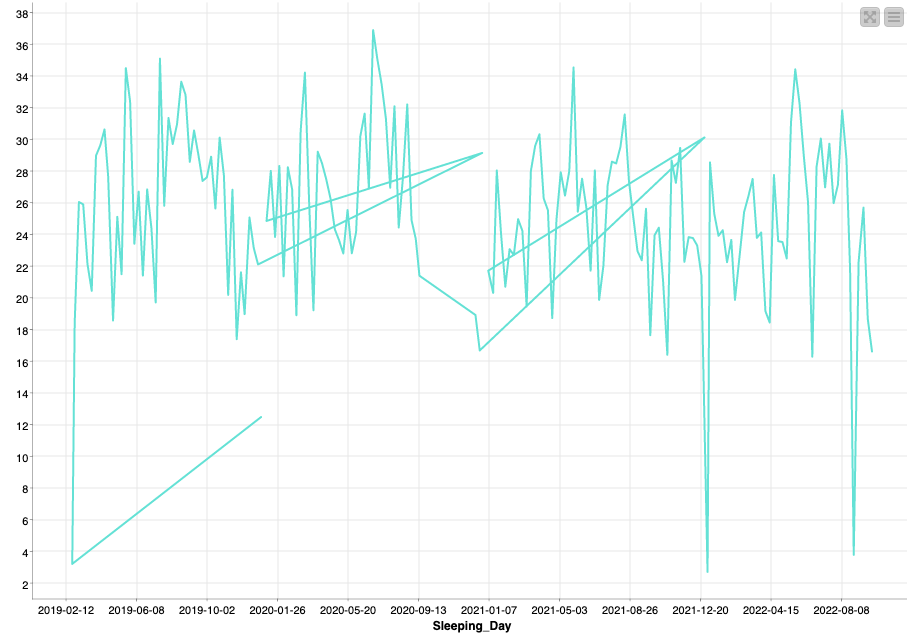
You can see in this plot on the X-Axis a date type variable and on the Y-Axis an Integer.
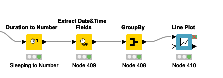
The Workflow for generating this plot looks like this:
I wonder why the plot looks so strange, and could imagine that it has something to do with my GroupBy function.
The GroupBy function has the following settings:
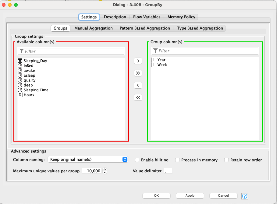
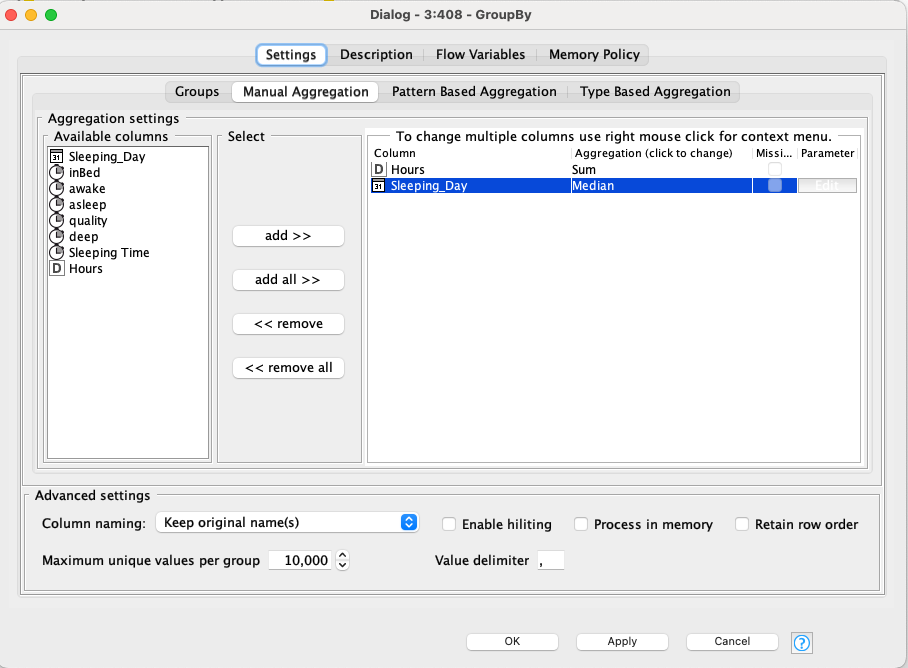
Maybe I have a thinking Mistake, but I am building the Median of the Sleeping_Day, because I want to have in the Grouped Dateset also a Date type variable for plotting it properly.
When I select first as the aggregation function for the date, the plot looks much better, only at the beginning it has some strange line again, as you can see here:
Does someone have an Idea where this behavior is coming from?
Also, if you have some recommendation how I should better process my data for plotting it good, please feel free to advise any time ![]()
I wish you a nice rest of the day. Kind regards, Alex
