Hi,
FYI - applying both bug and feature label as it might match both.
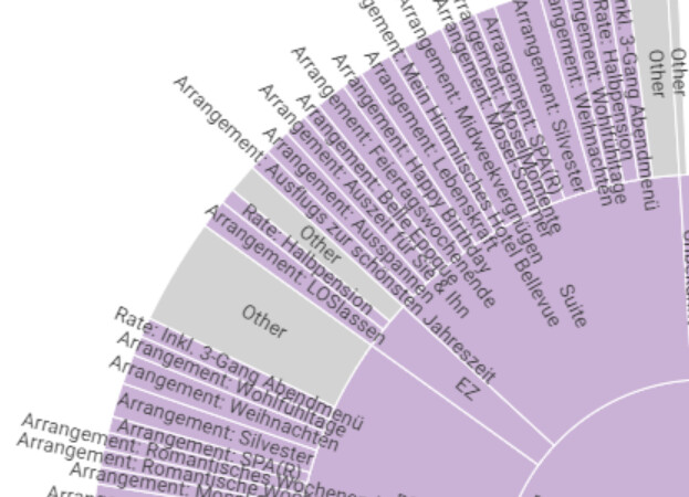
When there are rather long labels they are overlapping other shells of the sun burst chard. Since there is currently no CSS support, I believe it would be best to have them aligned left / right respectively starting at inside and expanding outwards.

For inner shells, in I’d suggest to add overlay hidden as a precaution as well. Upon hover the tool tipis displayed revealing the full label. That approach might also be an option for the initially described issue too.
Best
Mike