Hi,
I am plotting last 24hours data in the line Graph, where i have taken Time on X-axis, but the graph is not plotting the Time in ascending order though i have used ORDER BY in my Query and i have tried with Sorter also in my original data, still not able to plot.
Please help me with a solution.
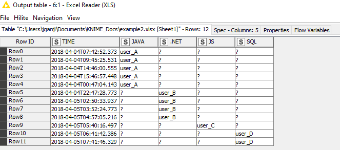
In My example Table, Time is in ascending order only:
The problem here is that when you extract the hour value and append an ‘h’, you’re then converting that to a string, which will sort differently than numeric or datetime values.
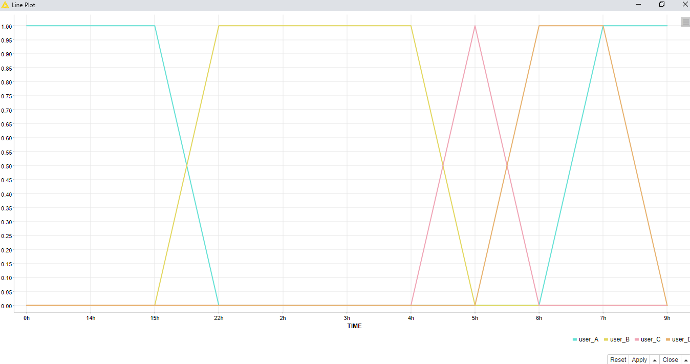
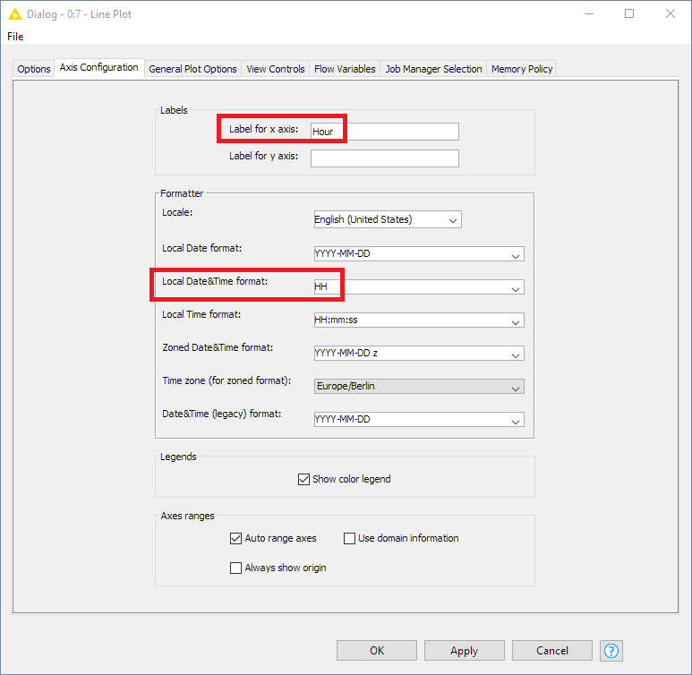
Instead of extracting the hour from the original datetime, I would instead just keep the timestamp as it is, and change the formatting of the axes in the Line Plot node itself. For example:
Hi @ScottF,
Thank you for the solution, but using the same data m plotting Bar and Stacked Graphs too, for those it require nominal values, hence i did extracting hours separately and manipulated it
!! Also i don’t see the each hour in the plot that is present in my table.
could you please suggest other solution. That would be helpful!!
I suppose the other option would be to only apply the String Manipulation when you need it for the other plots on a separate branch of your workflow, and keep the numeric hours for the Line Plot.
You definitely don’t want to sort on a string-formatted hour here, since that will throw everything out of order.
I think here if you do all your aggregration using the numeric hour value, and set up your sorting properly, then if you add String Manipulation node to convert the type just before the Bar Chart node you should be fine.
The problem I think is that you do the type conversion too early in the process. That make sense?
Team,
Any suggestions for Stacked Area Chart for Ascending Order of Time? or is it not possible to configure only one workflow for all Line Graph, Bar Graph and Stacked Area Chart. Can anyone suggest?
Maybe something like this? I’m still not exactly sure what your visualizations are supposed to represent, but maybe it will give you and idea of the process discussed above.
Well, as I mentioned, I’m not sure what your ideal visualization is, so the workflow is really intended to show how the nodes work, and not provide a comprehensive solution. You know your data best, after all.