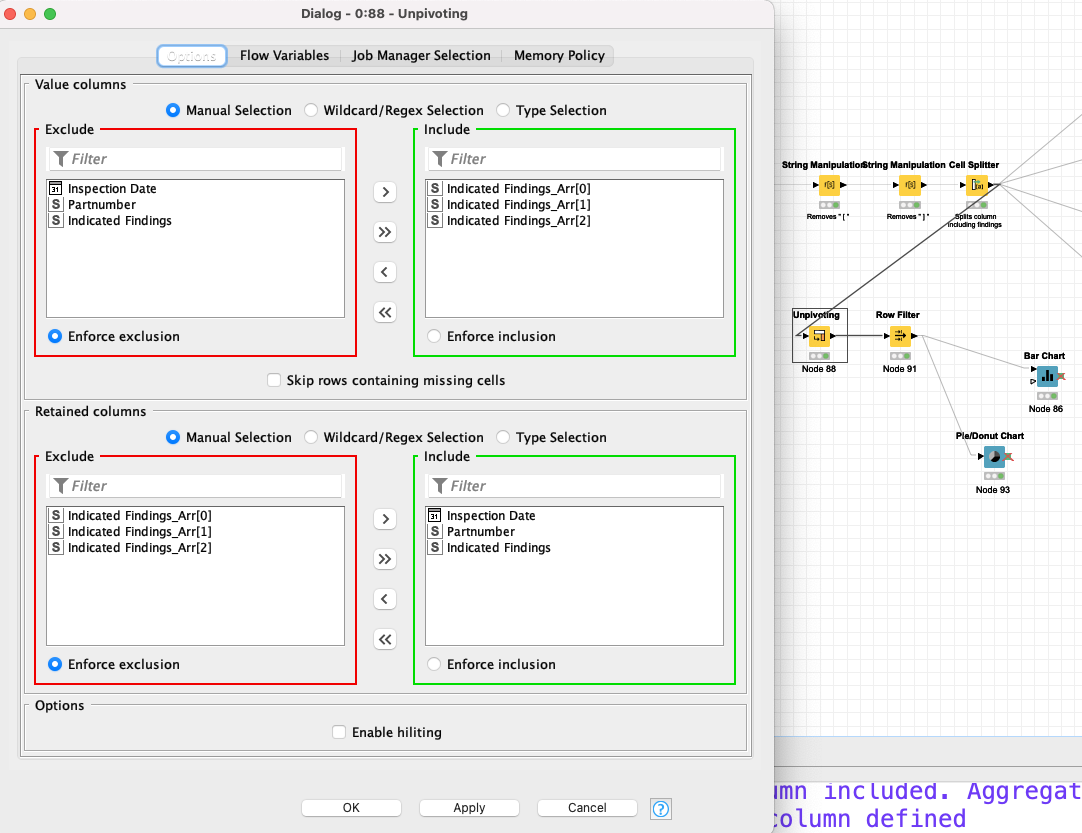
the unpivoting worked pretty well, yet it did´nt bring the output I expected. As you can see in the example workflow I provided it is possible that there are two findings possible for one text/component. What I wanted to do is to assign the texts to the corresponding finding.
If the text includes only one finding it counts for one category.
If the text includes two findings, like e.g. row 1 (cracks and nicks) or row 2 (cracks and dents) it creates a new category with these two findings connected. I expected that in this case both cracks and dents/nicks would be counted to the corresponding category. It seems that I need to split the string first so I get the two (or more) findings seperated right?
When you use the value counter node instead of the bar- or pie chart you can see the additional categories. How can I avoid this to happen and let the workflow count “correctly”?
Sorry for the misconception. I´ll try my best to make it clear:
The table “Possible Findings” which I provide contains Findings/Words that can be found in the column “Finding” in excel-sheet “Inspection_A”. This “Finding” column also includes rows/cells which don´t have one of those words from “Possible Findings”. These specific rows we already filtered with the "Regex Find All node.
After unpivoting (which you explained) I got a new column that shows which of the “Possible Findings” word was found in the “Finding” cells. If two words were found, we got a string consisting of two words.
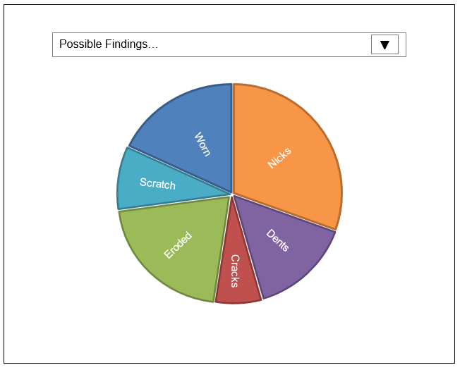
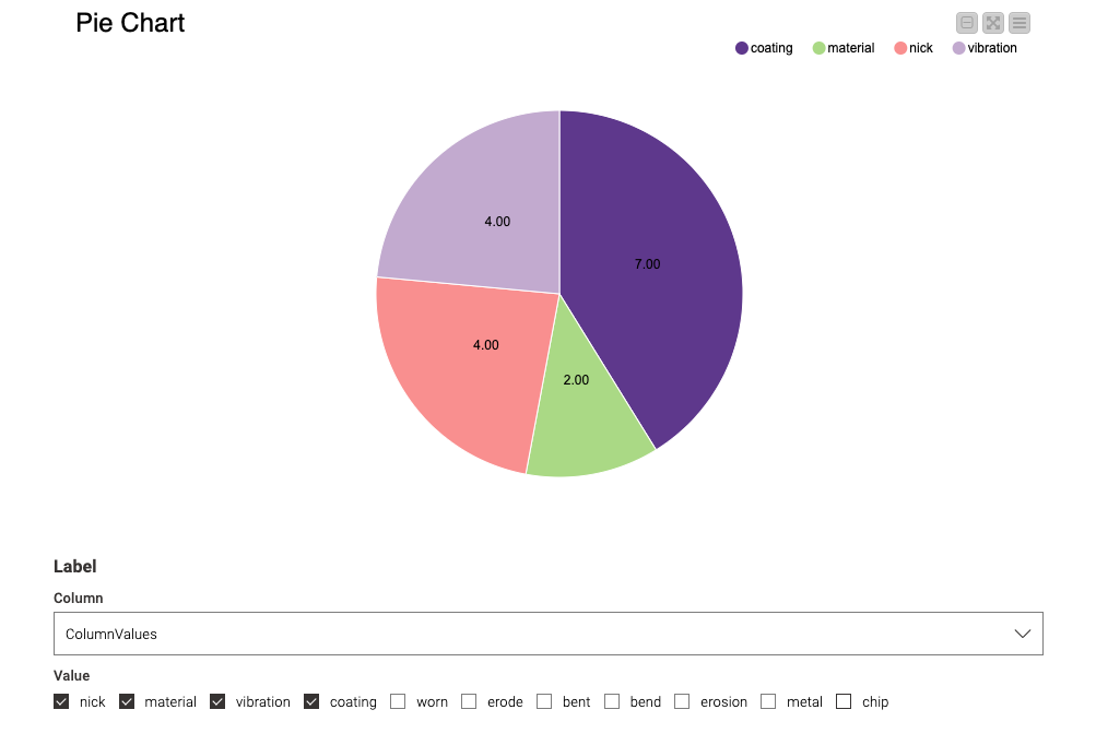
What I want to do now is to have an interactive filter, where you can select one, two, three or many more words to show the findings in a bar-chart or pie-chart. The result should look like this:
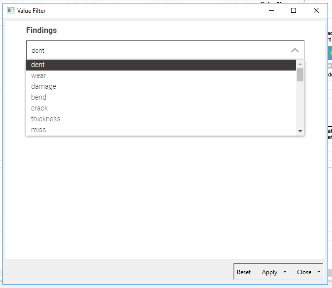
I also tried to use the Interactive Value Filter Widget, managed to have the drop down menu, but was not able to connect it with the Pie-Chart oder Histogram:
Is there a way to connect the Interactive Value Filter Widget with the visualization like a Histogram or Pie-Chart? I thought about a “fusion” of those two nodes as one node but so far it seems a little bit unrealistic to me.
I hope I could describe my problem more clear than before. I´d really appreciate your help with that.
Great, please attach your knar file (knime file) where you used the Interactive Value Filter Widget and I think we can make the interactivity work by putting the nodes in a component. You can see a discussion of how to make use of widgets here.
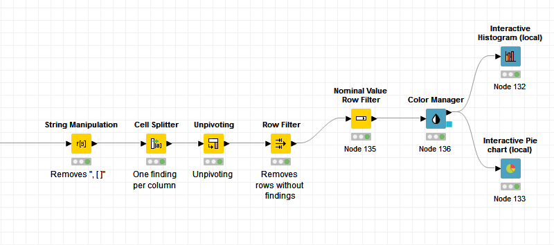
find attached the example workflow where I use the interactive value filter widget prior to the pie-chart node. I also provide the new example data I had to do some editing on to make it more similar to the real data:
Reading your article (Widget vs. Configuration Nodes) made me think about the need of widgets because I will use KNIME Analytics Platform exclusively. Right now I am not completely sure if I will still need the widget nodes or can switch to the configuration nodes.
When executing the interactive value filter widget all checkboxes or the list (for multiple values) are enabled by default. Using the real data there will be over 40 different checkboxes for different findings. If you only want to have the pie chart for e.g. 10 findings, you have to disable all the others by hand which takes a lot of time. Is there a way to disable them by default?
After putting the widget and the pie-chart in one component I expected these two elements could “communicate” with each other. But checking or unchecking the boxes does not do any change to the pie chart. What did I miss here?
Additional to the pie chart a histogram would be helpfull. As far as I understood I need the value counter node first to get a double-type value to the histogram. Is that also possible in the “new built component” or do I have to count the words previously?
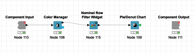
I decided to use the Nominal Row Filter Widget (and I enabled Re-Execution) since it had the same appearance as what you showed me and it worked with the Pie/Donut Chart. Interactive Value Filter Widget does not seem to work with the Pie Chart. Some charts don’t play nicely with Interactive Value Filter Widget.
Reading your article (Widget vs. Configuration Nodes) made me think about the need of widgets because I will use KNIME Analytics Platform exclusively. Right now I am not completely sure if I will still need the widget nodes or can switch to the configuration nodes.
Widget nodes make everything easier since you can deal directly with your output. I would recommend widget over configuration for most tasks. I would use configuration only when I don’t want someone else to make changes to what I’ve done but I want to be able to edit my own work later. (This is a subtle point, but I think it is covered in the article.) There is also an article dedicated only to widgets if you would like.
When executing the interactive value filter widget all checkboxes or the list (for multiple values) are enabled by default. Using the real data there will be over 40 different checkboxes for different findings. If you only want to have the pie chart for e.g. 10 findings, you have to disable all the others by hand which takes a lot of time. Is there a way to disable them by default?
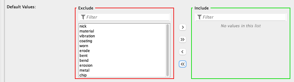
Yes, if you want them disabled by default make that choice in the Nominal Row Filter Widget:
After putting the widget and the pie-chart in one component I expected these two elements could “communicate” with each other. But checking or unchecking the boxes does not do any change to the pie chart. What did I miss here?
This seems to be an issue with the code behind the Pie Chart but my specialty is the nodes, so I can only speculate. This is why I used the Nominal Row Filter Widget because it didn’t depend on the code, but the workflow information. In a setting with more data, this may cost computationally (i.e., run slower).
Additional to the pie chart a histogram would be helpfull. As far as I understood I need the value counter node first to get a double-type value to the histogram. Is that also possible in the “new built component” or do I have to count the words previously?
Sorry, I don’t follow. What would you like a histogram of? Do you mean a bar chart?
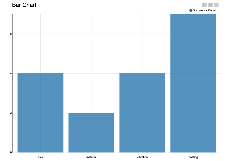
I now used the Nominal Row Filter Widget and it worked as perfectly as you explained. I also added the bar chart to have an alternative kind of visualization in hand. And yes, the bar chart is what I meant, not the histogram, sorry for confusing. I got now the final workflow I was working on to.
Thank you very, very much for your help and the support! I highly appreciated your advices and tipps. It would have taken way longer without them.
Have a great weekend, thanks again and best regards!