Hi,
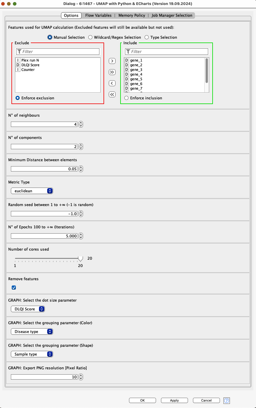
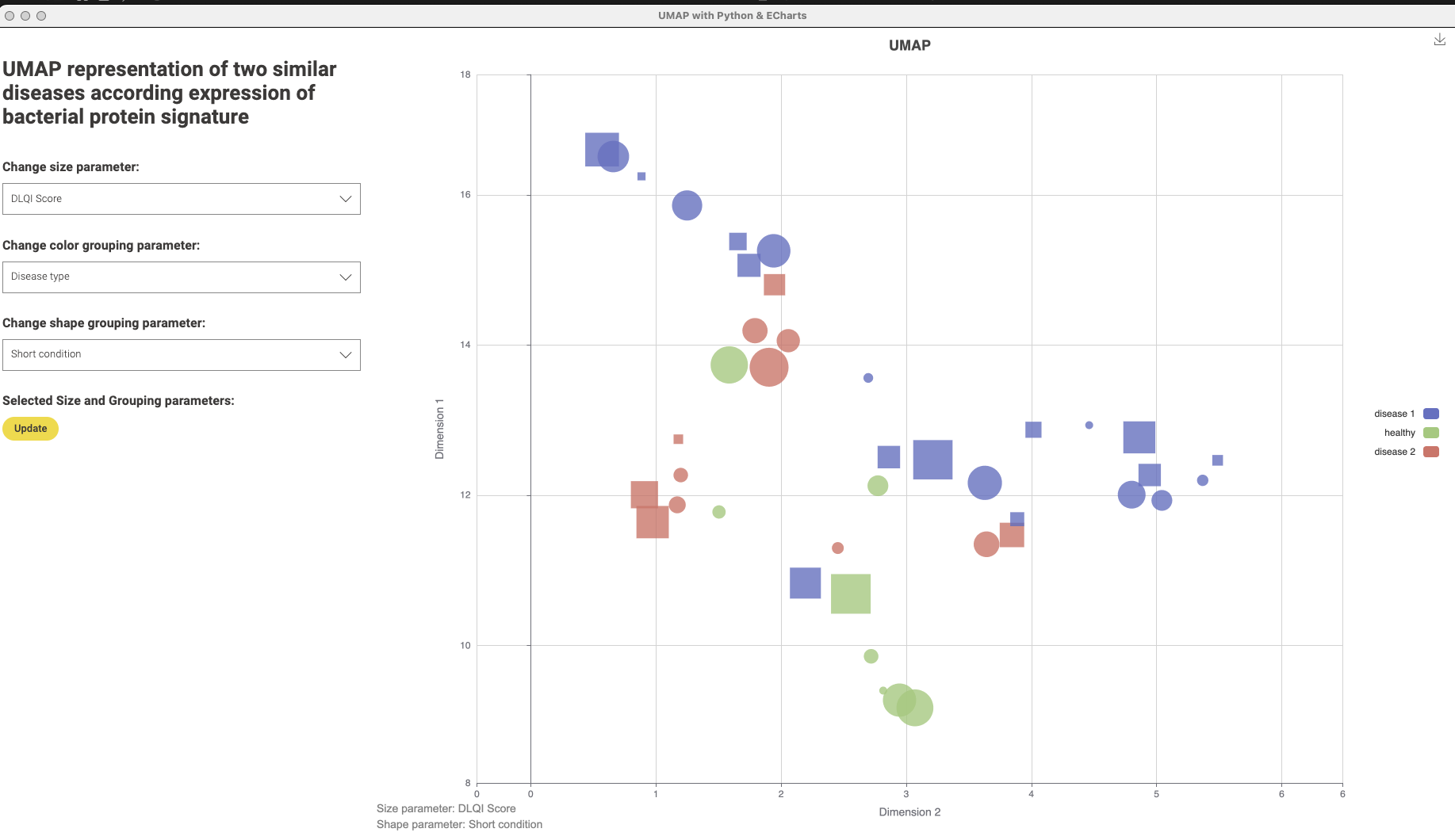
When I started working with KNIME, I was always looking for a more flexible dimensionality reduction technique beyond the usual options like t-SNE or PCA. UMAP stood out as a powerful method, but there wasn’t an easy way to implement it in KNIME. So, I created a workflow that integrates UMAP with a custom component, combining Python for data preparation and ECharts for visualization.
This approach breaks through the limitations of color assignment and shape modulation within the graph, providing full customization and a visually appealing interactive output. I hope this workflow proves useful and that you enjoy exploring it!