Hello,
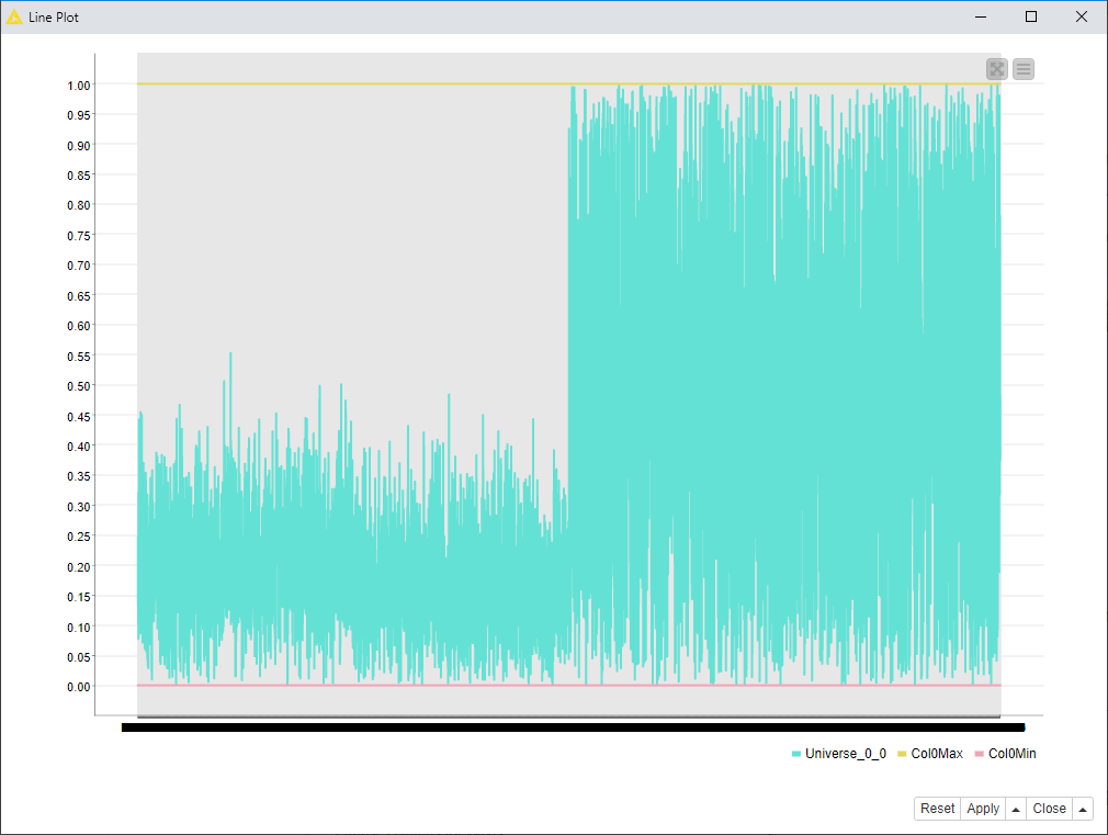
I’m trying to replace Excel for data analysis and for the visualization of the production process in the time (over 250 000+ values). In the first step I’m stuck in the point, that I would like to visualize scatter plot with the bottom and upper limit line. The values for the limits are in the separate columns, I have tried Scatter plot JS and Erlwood 2D/3D plot, but in both cases I’m able only to visualize only main value.
I didn’t find any example of that case. I will very appreciate any help!
Hello Scott, thank you for your reaction. As you can see in the line plot you can’t see the distribution of the values, this is the reason why I use for all analysis only dots.