Hi,
is there any node or methode to visualize a PMML Cluster model (output of k-means node) ?
Thanks,
Michel
Hi,
is there any node or methode to visualize a PMML Cluster model (output of k-means node) ?
Thanks,
Michel
Hi Michel,
It depends a bit on what you would like to see. There is not a single node, but different techniques. If your data has 2 dimensions, you can simply add a Color Appender and assign a color based on the cluster to each row, then use a Scatter Plot node to see how the clusters are distributed. If you have 3 dimensions, you can do the same with the 2D/3D Scatterplot node, but it will only be really useful in an interactive scenario, not so much in a static report.
Alternatively, for 3 or more dimensions, you can try to reduce the dimensionality of your dataset with the PCA node and then visualize it with a scatterplot. Of course some information will be lost by the dimensionality reduction, but you can still get a glimpse at the data and cluster assignment.
Kind regards,
Alexander
Hi Alexander,
thanks for your suggestions. Actually I want to show mor than 3 dimensions, about 20. The main purpose to get impulse for further analyse.
I could not found any “visualizing” for clusters with more then 3 diemsnions. I hoped, over PMML it would be possible.
I’m going to use for now Excel and later I’ll write some code in Python to get the desired representation of clusters.
I was surprised regarding the missing represantation. I can rememeber, “my” very first tool 20 years ago (CA Clever Path Analysis Server) did it.
Warm regards,
Michel
Hi Michel,
Can you show a screenshot what visualization you expect? We can extract info from the PMML document and visualize it, but I am not sure what you are looking for.
Kind regards,
Alexander
Hello Alexander,
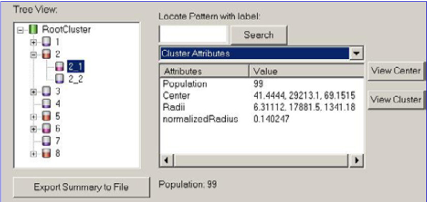
I only have a tree view, (right 20 years old ![]() )
)
but I would like to have a table to be able “compare” the individual features with each other.
In the cells of the Excel sheet I currently only have the average values, I would like more:
Min, max, …
And also cluster attributes such as
Centroid, Radius,…
I also have ideas for the visualizations, but I won’t show them until it has reached a certain level of maturity.
Warm regards,
Michel
Hi Michel,
This information is not contained in the PMML document anyways. But you can easily create it yourself from the table KNIME outputs from the k-Means node. Just add a GroupBy node, group by the assigned cluster and aggregate the other attributes (mean, max, min, …). You can then also add a Math Formula node to calculate the radii from the min and max values, if you want.
Kind regards,
Alexander
Hi Alexander,
thanks, already did it ![]()
Warm regards,
Michel
This topic was automatically closed 7 days after the last reply. New replies are no longer allowed.