Breakpoint node in webui is a great example for the webui migration being done without even basic testing:
- using Windows Server 2019, Windows 11 and Linux
using classic and “modern” ui (Knime 5.10 and Knime 5.11 nightly)
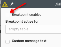
if you default to pop-out, half the checkboxes have a visibility less than 5%
- the most relevant, top level entry, has
the smallest font size
a different font
is clickable
is differently aligned
meanwhile the first checkbox has
a different font
is larger
is not clickable
further, if you SELECT the first box, the second box becomes less visible - which is likely the total opposite of what is supposed to be the case.
this is just one example and essentially affects all node configurations if you use the pop-out mode in fresh installs.
and to add to this:
using the built-in configuration window is not acceptable.
if you use column names with more than 6 letters, using standard nodes like Column Filter with a restricted width is not usable.
radio buttons are virtually invisible, too
and:
you call it String, the icon was S in the old ui.
in the new ui, I assume you want it to look like a T for Text but this is what is being shown:

zoomed:
this is neither a T nor an I and bluntly screams: we don’t use our own product or test it.
further, the 123 and .00 have approximately the clarity and readability of an inkstain with 2mm x 2mm
The people working on the new UI seem to be clueless. I think they just crank stuff out.
Hey @fe145f9fb2a1f6b,
Thanks for the detailed report — those screenshots make the issues very clear.
Checkboxes / radio buttons: you’re right, that’s not acceptable. This was a bug and it’s already fixed in our codebase; it shouldn’t have slipped through. The fix should already be in 5.11.
Dialog layout / hierarchy: the points you called out (font size/weight, alignment, clickability) are really helpful. One upside of the modern UI migration is that these controls are shared across dialogs, so fixing the underlying component improves consistency everywhere — but we still need to get the defaults and styling right.
Icons / “string” marker: agreed this looks bad. What you’re seeing is likely a rendering artifact from the browser’s scaling/anti-aliasing at certain DPI/resolution combinations, which makes thin strokes look distorted. That’s not an excuse — we’ll investigate and adjust the icon assets/rendering so they look crisp across setups.
We’ll follow up here once we’ve validated the fix and have a timeline for the icon improvements.
Thanks again,
Daniel
2 Likes