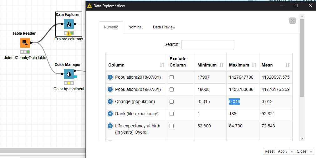
Solution to an exercise for data visualization. Visualize data in a scatter plot, explore columns with the Data Explorer node, and explore rows in an interactive Table View. Build an interactive dashboard with two or more views. CHECK YOUR ANSWERS: Data Explorer: 1. 174 countries/territories are represented in the data. 2. Most countries/territories belong to the travel risk categories 1 (exercise normal precautions) and 2 (exercise increased caution). Only a few countries belong to the categories 3 (reconsider travel) and 4 (do not travel). 3. The maximum pace at which a population increases in a country/territory is 4.6%. Scatter Plot and Table View 1. Latitude and life expectancy have a positive correlation in the data. 2. The countries with a very high life expectancy in the southern hemisphere are located in Oceania or Americas. Interactive Dashboard The countries in the southern hemisphere with a very high life expectation are Argentina, Australia, Chile, New Zealand, and Uruguay.
This is a companion discussion topic for the original entry at https://kni.me/w/5T70RbcIFjo8HY80