Hi all,
I’m a newbie here.
I’d like to generate a bar chart with TWO x-variables.
My original dataframe is made up two groups : gender (2) and work department (6).
Each specific combination of gender and department displays a promotion rate.
I would like to display the promotion rate (Y-axis) for each combination of gender and department (12 in total).
My table after pivoting is as follows (12 rows, 3 columns) :
Gender Department Promotion rate
W Marketing 0.14
W Sales 0.2
… … …
M Marketing 0.28
M Sales 0.23
… … …
I can not do that currently as I can select only one category dimension within the Bar Chart node.
Thanks a lot.
Could you use a stacked bar chart as described in this post?
2 Likes
Thank you very much for your quick reply, that was helpful.
After rearranging my df, I could get what I want with the Bar Chart node !
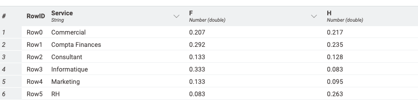
I proceeded as follows :
Eventually obtained this :
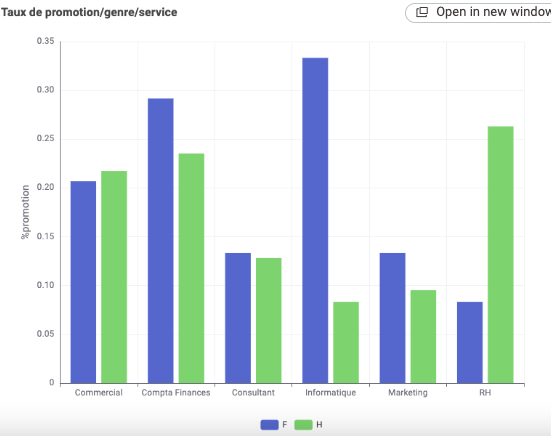
Problem solved !
2 Likes
This topic was automatically closed 7 days after the last reply. New replies are no longer allowed.