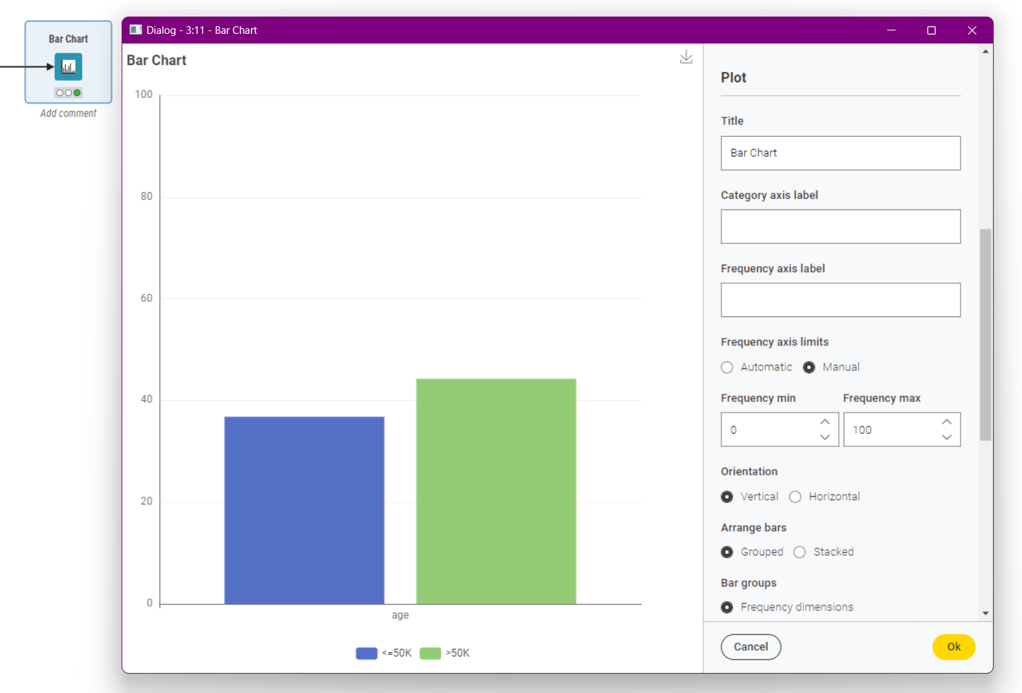
I am relatively new to KNIME and I was wondering whether it is possible to adjust the ranges in a bar chart. As an example I have values ranging in the bar chart from 0.7 to 0.95. By default the axis ends at 0.95, however I would also like to have the bar chart start at 0.7 (without normalizing data). Ideally, I’d like to have a set range of 0.5 to 1.0 shown as axis so I would be able to make multiple charts all having the same ranges which I can then easily compare. I have looked at Setting y-axis on a bar chart, but it does not really help.
Yes, it’s possible to adjust the range on the y-axis in a bar chart in KNIME. You can set the frequency axis limit option to “Manual” and define the minimum and maximum values for the frequency axis. Try selecting the manual option and set the frequency minimum to 0.5 and the maximum to 1.0. This should allow you to have consistent ranges across multiple charts for easy comparison.
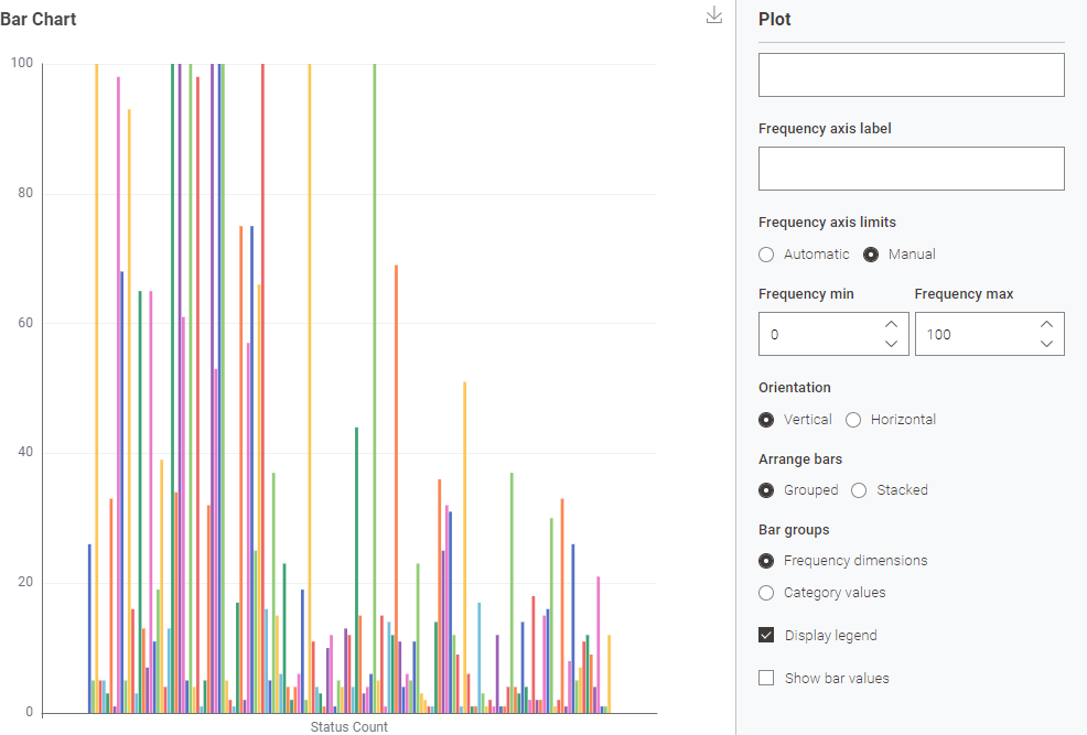
Thank you for the quick replies. I am unfortunately limited to using 4.6 as for now. I would preferably use the JavaScript extension Bar Chart as I also would like horizontal view. Is there anyway I could add the ranges to the JS Bar Chart?