In my data for polling places in the USA, I count how many polling places are in each county over time/poll instances. I want to display the data in a line plot, for each county a line, and I would like the lines to get coloured according to the value it represents.
Therefore, I pivoted the data and wanted to apply a Color Manager node on it. However, I only can apply the colours to one single column. Therefore, I created a colour model with the min/max value of the count data and the Color Manager node and tried to apply it to the pivoted data by a Color Appender node. However, there too, I can apply the colour only to one single column.
In a second attempt, I pivoted the data coming out of the Color Manager node, to realise, the colouring was erased by the pivot node.
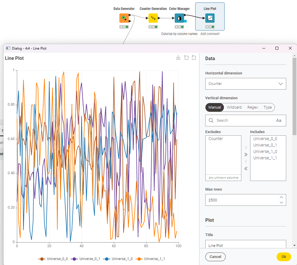
the Line Plot works with Color Manager, if you select Color by= in the Color Manager and the table being structure with one column per category (plus one column for the horizontal axis). In this case each line is colored by the category (i.e. column) it represents.
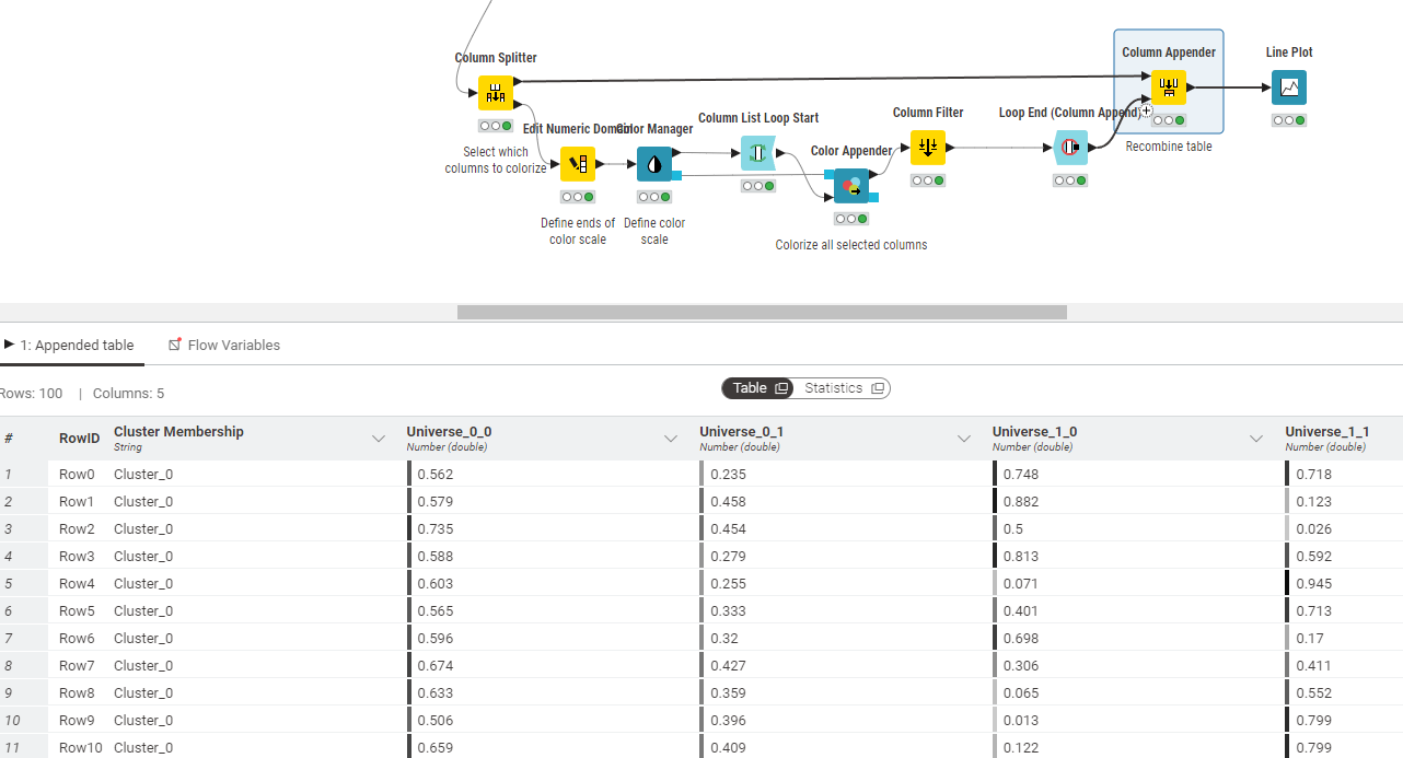
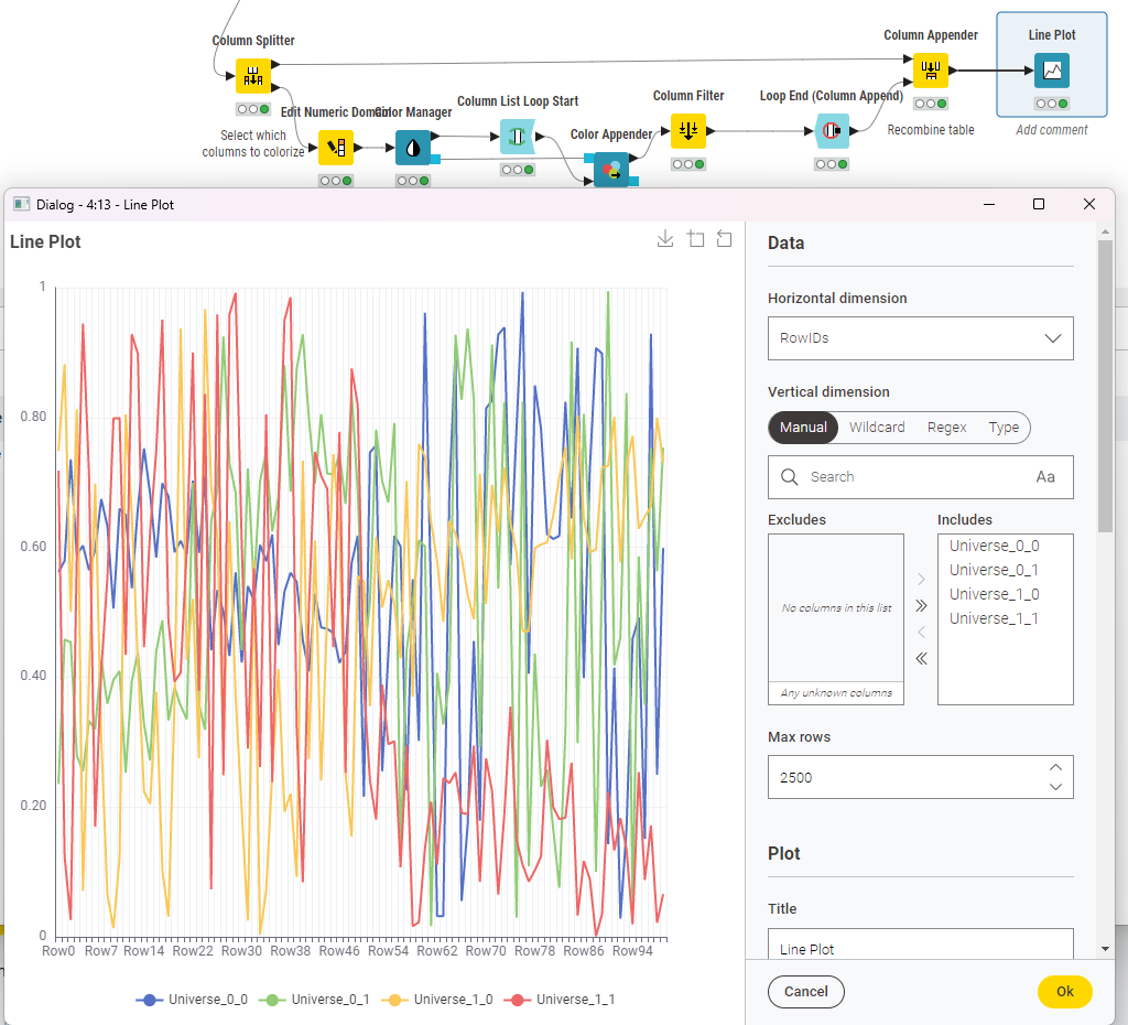
The Line Plot does not support color scales coloring lines by their value on the vertical axis. However, if you want to colorize multiple columns for use with the Table view, you can achieve this by using a loop.
Here is a workflow including two examples: Color Manager.knwf (92.2 KB)
I could not find a setting to make it obedient to the value/cell colours. If I understood @armingrudd correctly in Color manager: how is colour applied? one has to employ the Generic ECharts View node with quite some “programming” if one needs dynamic column selection and more.
Do you agree that the Column Filter node is not necessary?
Dynamic number of columns can be handled with the Line Plot node itself. In the vertical dimension section you can switch to various modes for column selection. For example, in the default manual mode, if you add the “Any unkown columns” option to the “Includes” list, then any column which is not in the “Excludes” will be included.
I suggested the Generic ECharts View node for gradient coloring based on the Y axis values and mentioned the fact that you can handle dynamic number of columns with Generic ECharts View as well when you asked:
I have been fumbling around a bit with the generic ECharts view and have got a feeling that it is not dynamic in the sense, that when the number of data columns changes, the code of the node has to be adapted manually.
You are right, the Line Plot only supports one color per line assigned via the column names (upper branch). Many columns with color (the lower branch) currently only works with the Table View.
Regarding the Column filter, yes. I added the Column Splitter before the loop later and forgot to remove the Column Filter.