When will this wasted space be corrected. The previous node was better.
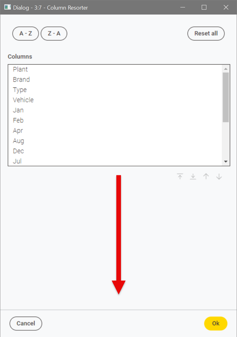
the same issue is true for many many nodes and was reported more than a year ago…
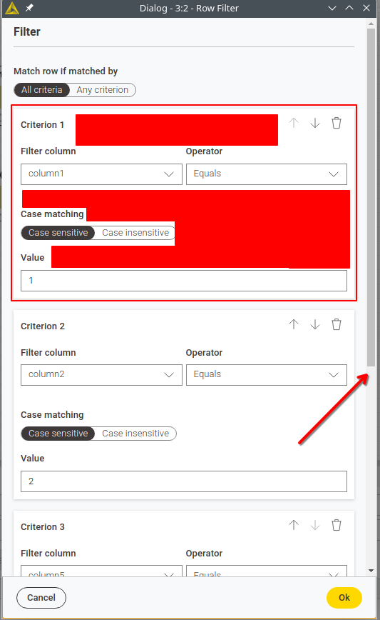
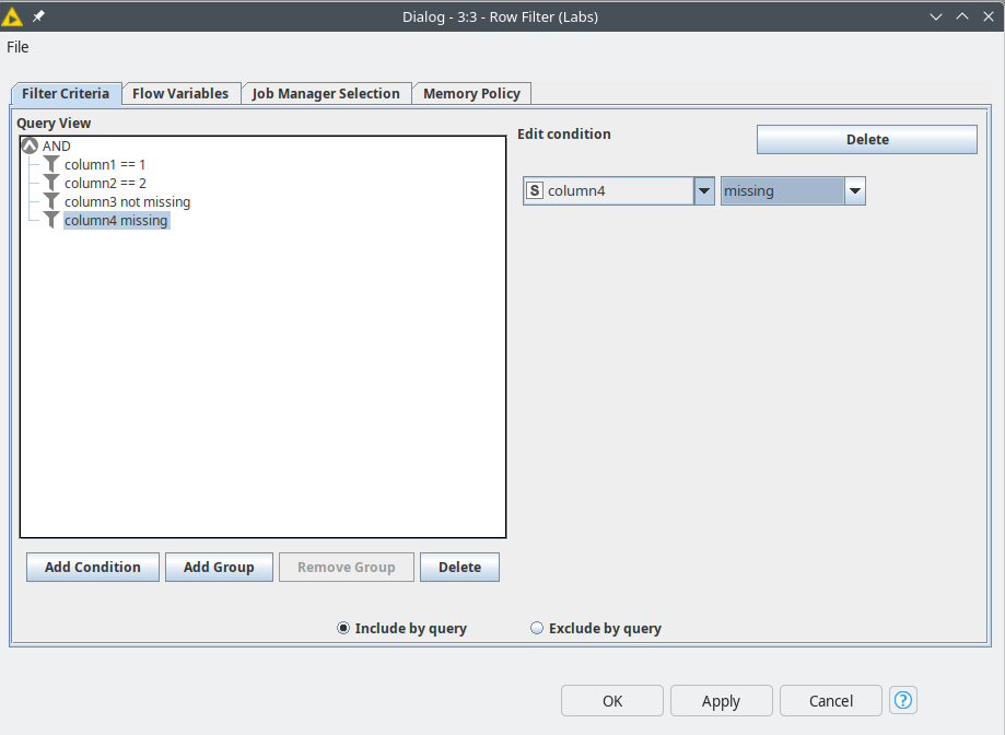
and in contrast, if you look at the new Row Filter node and compare that to the Row Filter (Labs) node, 2 filter criteria are occupying all space and if you have 3 or more filters you want to apply in one step, you are greeted with a ugly scroll bar and dont have a chance to see everything in 1 view
dead space in red, ugly scrollbar, hiding relevant information - you really get a feeling that the people in charge of the modernUI don’t use Knime and don’t talk with users either.
a lot more information available with a lot less clicks. just open the node and check what is configured.
The UI team seems to have no understanding of UI design. It’s really bad design.
Is KNIME going to respond to this? The new Column Resorter is terrible.
@Christopher41, obviously I can’t speak for the KNIME team, but I know from discussions that they are working hard to make modern UI more efficient where (and when) they can.
I feel your pain though, especially when I have a table with a large number of columns.
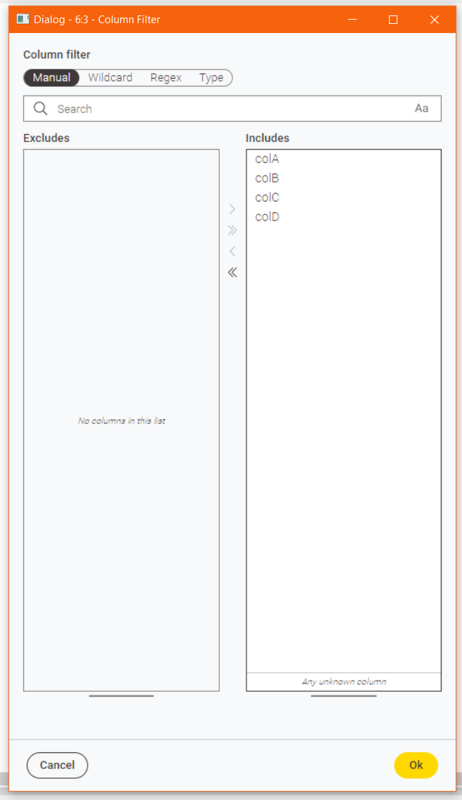
A similar issue was raised re the Column Filter node:
Subsequently, (in KNIME 5.4, I think) “handles” were added to the dialog to allow expansion of the list boxes.
ie

I’m hopeful that this functionality is in the pipeline for all similar nodes, but I imagine that is a question of priorities in terms of when this happens, and I would still prefer the list boxes to be fully expanded to the available space from the outset, and that they expand/contract automatically with the dialog.
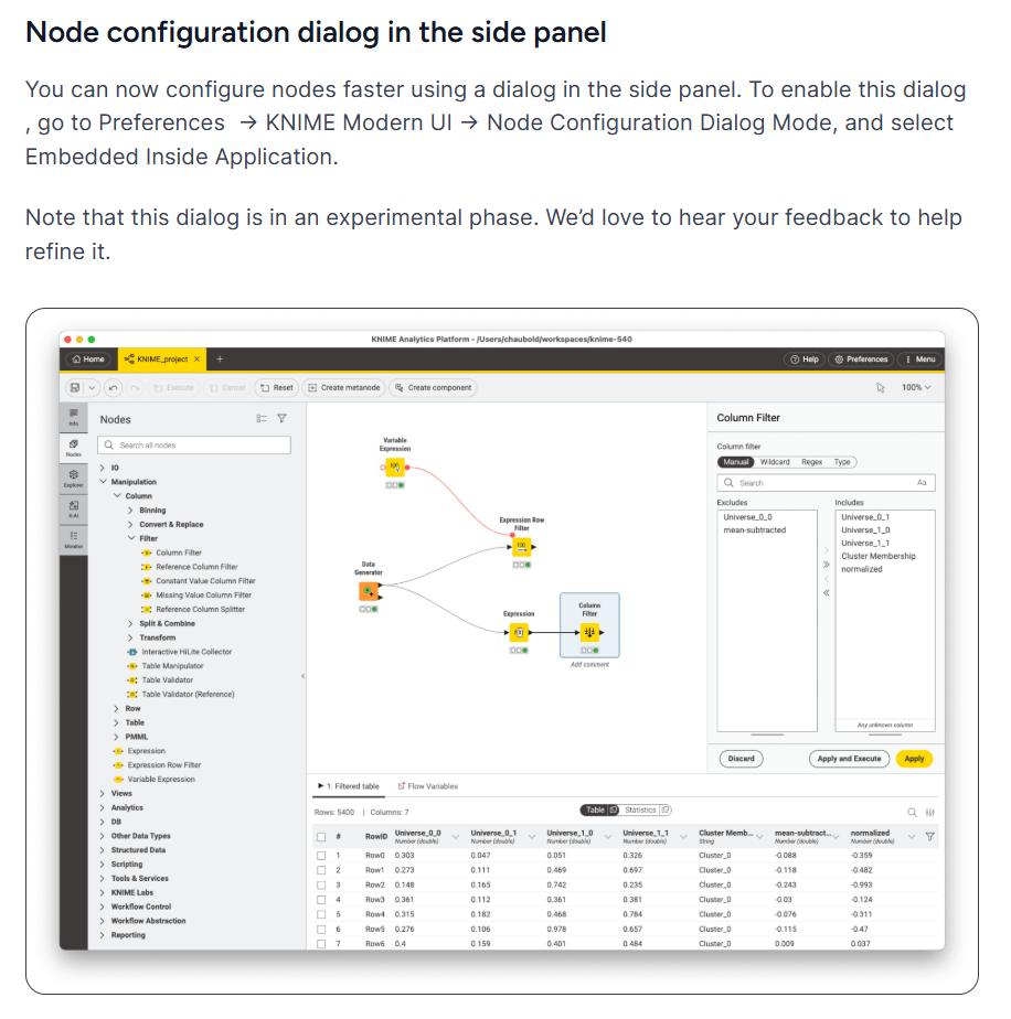
I feel these dialogs will probably feel somewhat better once they are being used in the Modern UI in “embedded dialog” mode (also introduced as an “experimental” feature in 5.4)…
source: https://www.knime.com/blog/whats-new-knime-analytics-platform-54
… but I do still share your reservations on the amount of space taken up/wasted, and you are right that in comparison to Classic UI, none of the dialogs are nearly so screen-real-estate-efficient - something I, and others, have fed back elsewhere especially with regard to data tables.
For now, whenever I want to do some “Column Resorting”, I prefer to use the Table Manipulator node over the Column Resorter node.
I have several reasons for this. Firstly Table Manipulator is still a “classic” config node ![]() , but additionally it not only lets you move the columns around, but also it lets you rename them, and you get a live preview of the output.
, but additionally it not only lets you move the columns around, but also it lets you rename them, and you get a live preview of the output.
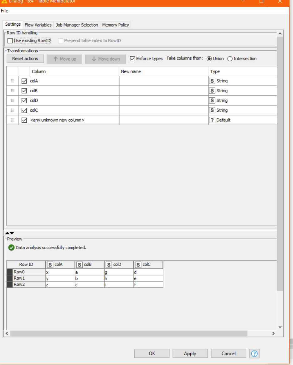
What’s not to like? I live in hope that such functionality will remain when it too moves to the Modern UI, as this is such a powerful node, but will have to wait and see.
1 Like