Hello
I’m a bit stuck on using the ECharts view on my data.
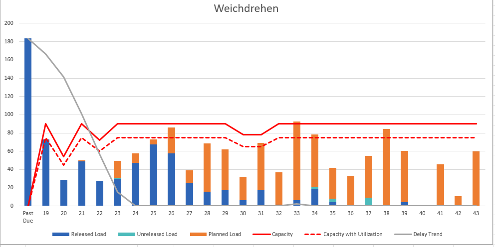
I’m trying to recreate the following diagram we have in Excel:
I’m working with the following table, columns go up to 44, I’ve already “pushed” the header down to row 1:
Column 1
Column 2
Column 3
Column 4
E
F
G
H
I
J
K
L
M
N
Status
Past Due
19
20
21
22
23
24
25
26
27
28
29
30
Planned
?
25
33
45
40
67
39
47
50
40
101
43
26
Released
47
39
31
24
8
16
11
21
14
12
?
1
3
Unreleased
2
28
17
27
26
16
7
1
6
3
4
15
0
The status column refers to the “category” while the top row is past due or the calendar week.
I will always be the same 3 or 4 rows for the bars.
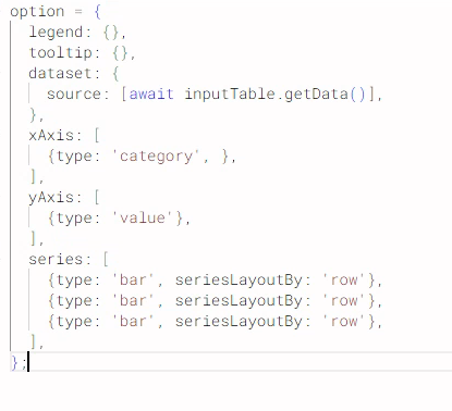
I could manually set up all the columns but I figured it should be easier to use the dataset option.
Thanks in advance
@rkehrli maybe you can take a look at this example. Use Data App Elements to fill in variables that then steer the graphics.
You can use AI like ChatGPT to create the code.
@GHoertner you could try and indeed use ECharts with Data Apps where you configure just a few things like the columns you want to use, the statistic and then the option to sort by the values.
[image]
As a benefit I put in a Python node that can then extract an EChart image as a PNG file from the PDF
[image]
Another option is to use Python (and ChatGPT) to create dashboards and graphics
https://medium.com/low-code-for-advanced-data-science/knime-and-python-graphics-another-collection-of-examples-7674a1f5613f
1 Like
@mlauber71
Thanks for the inputs, as for my “issue” I worked around it by unpivoting the table
I’m “confronted” with quite a few diagrams that are easy to make in Excel but quite a bit harder to get the data right in KNIME.
I feel like I need to dig a bit more into Python
2 Likes
@rkehrli the baaics are quite simple. KNIME already provides a python environment with matplotlib and seaborn.
AI like Chatgpt can easily write code to create images. You can just provide a sample from the hub and explain what you want.
If you want it more KNIME like you can use flow variables for certain parameters or file names and so on. Once you get the grip it is not that hard and you can create complex images.