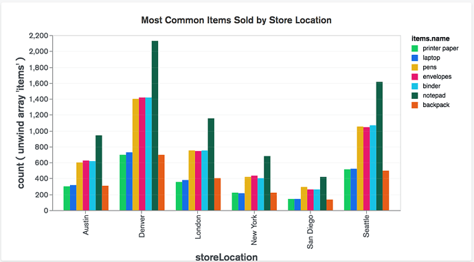
The below graph is a just sample grouped bar chart … I want to perform a grouped bar chart with two categorical variables like below. In KNIME bar chat node takes only one.
Hello @KashyapGohil,
here is nice workflow example with various Bar Charts:
Take a look and if any questions feel free to ask 
Br,
Ivan
hello @ipazin
For example, in the above chart, if I want to total sales of items. name by store location then I have two categorical attributes and I wanted the sum of total sales in Y-axis.
So, I think that’s not possible with Bar chart Node !!
Please correct me if I am wrong.
Hello @KashyapGohil,
not exactly sure what you mean by two categorical attributes. Maybe you need to transform your data prior to visualizing it? You can try explaining it with data (dummy works just fine).
Br,
Ivan
hello @ipazin
Suppose that, in the above graph, I have to like two columns one is store location and the second is the name of the item so that currently I have to categorical variable in my dataset and the graph instead of count if I want to show total sales for a particular item for each store location.
so this type of problem we can solve using grouped bar chart, But in the bar chart node configuration dialog, we could only choose one categorical column. To do this kind of group bar chart which node is to be used?
Hello @KashyapGohil,
if I got it right you can still use Bar Chart only you might need to rearrange your data a bit. Can you share some (dummy) data and expected view from it?
Br,
Ivan
Hello @ipazin,
I had attached a dummy data excel file below please find it. The data contains 4 columns and I specified knime datatypes in headers, and the dataset is for telecom company data by their respective service area so in order to I have to plot the sum of the total subscribers for each service area for each company. You can filter row for only 2013 and try this.
So, for us in the above graph total subscribers are on the Y-axis instead of count, company is on the X-axis instead of store location, and service area in the legend instead of items. name.
dummy_data.xlsx (11.0 KB)
Hello @KashyapGohil,
as said you need to “only” pivot your data using Pivoting node. Here is example on KNIME Hub:
I added newly Refresh Button Widget node (available from v4.4) to create interactive Bar Chart based on year(s) you choose (all visualization nodes are wrapped inside Component). Give it a try and if any issues/comments feel free to ask.
Br,
Ivan
Thank you @ipazin for your approach I will look into this and ping you in case of any queries.
This topic was automatically closed 182 days after the last reply. New replies are no longer allowed.

