Hello @ipazin,
I had attached a dummy data excel file below please find it. The data contains 4 columns and I specified knime datatypes in headers, and the dataset is for telecom company data by their respective service area so in order to I have to plot the sum of the total subscribers for each service area for each company. You can filter row for only 2013 and try this.
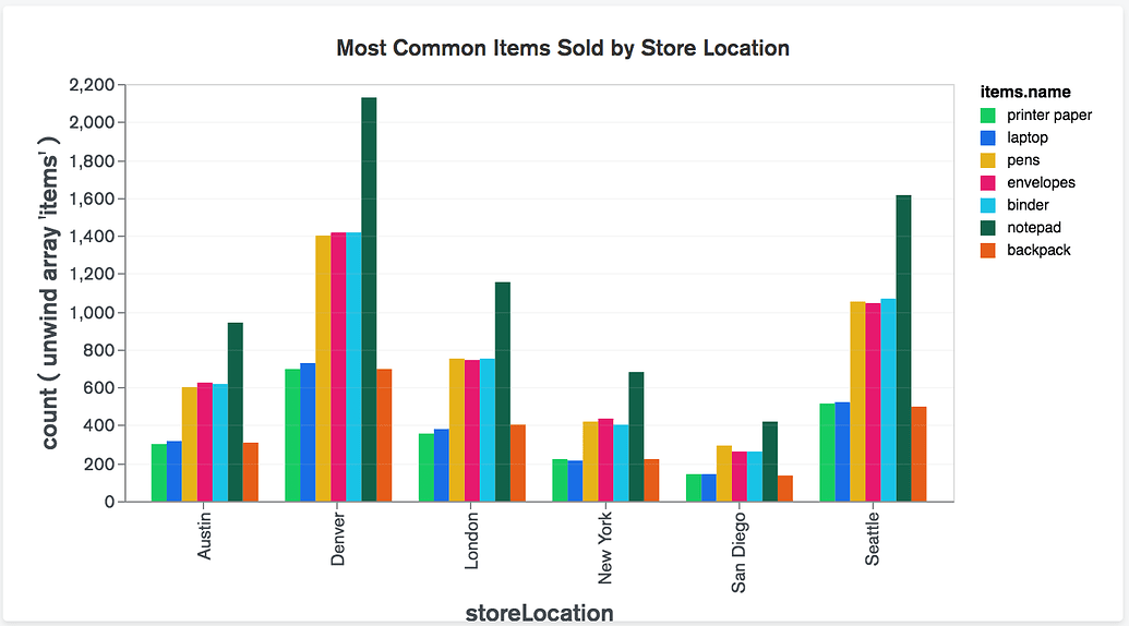
So, for us in the above graph total subscribers are on the Y-axis instead of count, company is on the X-axis instead of store location, and service area in the legend instead of items. name.
dummy_data.xlsx (11.0 KB)