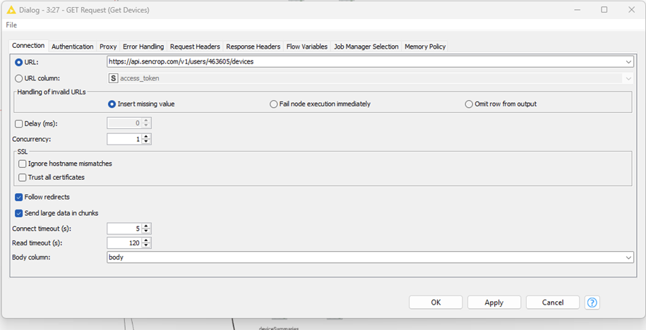
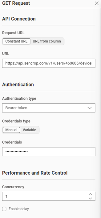
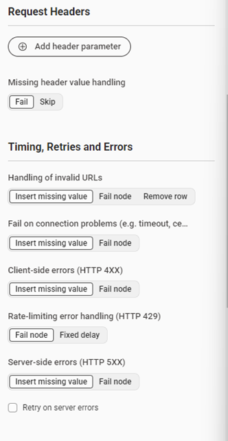
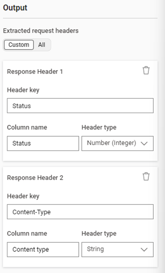
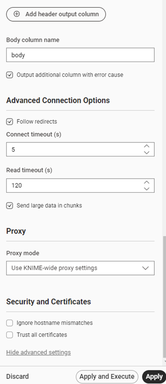
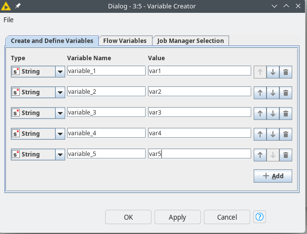
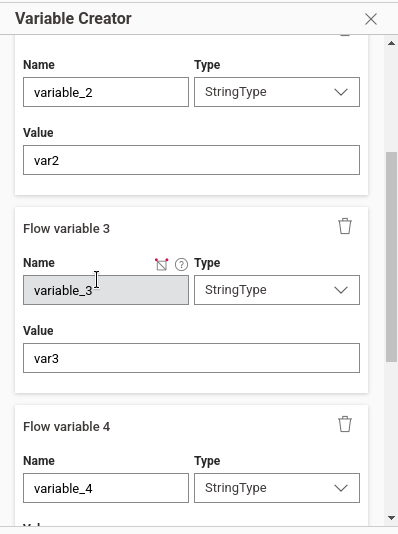
That was quite a disappointment this morning. I installed the latest update just last week. I had a feeling this would happen. This is what the dialog looked like before the update: neatly structured and concise.
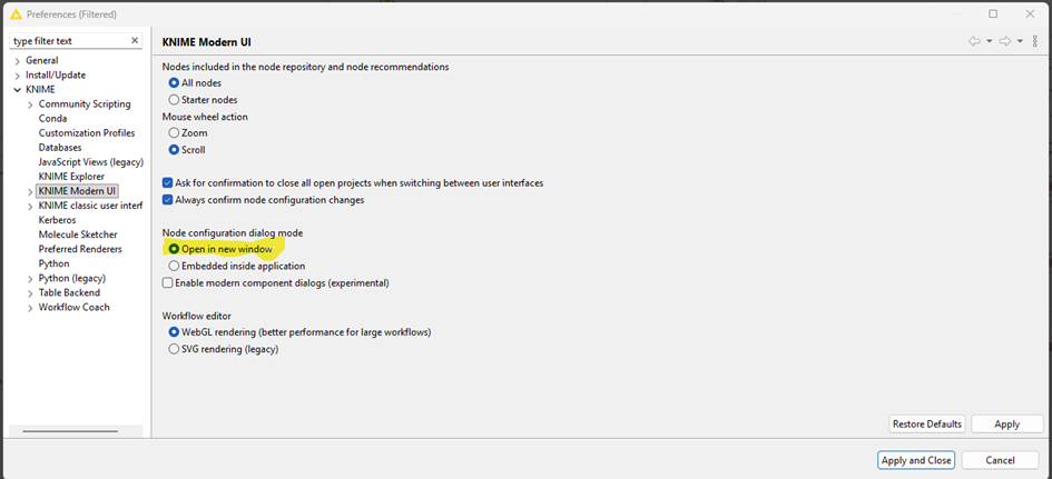
didn’t know about this option to Open configuration dialog in new window. Tnx! Will help me a lot.
Agree with you about this design. Definitely will take time both to adapt and during development but I believe eventually we will get used to it and KNIME team will hear the feedback and find a way to make it more user friendly.
I’m using KNIME since long time as it is was helping me to improve my daily jobs (both in terms of efficiency and quality).
Sorry to say, but I think that the idea of “the users will get used to it” is not very user centric in this case.
It should be part of a SW development process to think about user interfaces in a very early stage.
Adapting the UI to a (small?) group of SW developers with only smartphones (I assume that’s the “reason” of such an UI) will help you to loose many other users.
Some time ago KNIME had a big USP with it’s approach of low coding. Today KNIME is in a huge market of low coding platforms. Not sure whether such approaches will help to keep and extend market shares.
didn’t mean to be user centric with my comment Just wanted to point out that it always take time to adapt to a change - whether it’s sw tool design, job change or a new life situation. I’m also a long time KNIME user and postponed new UI for as long as it made sense. Now using it for a while and although still missing the old UI (and some nodes/features) from time to time, I’m getting to see and appreciate the features and possibilities of a new one. From experience the KNIME team does listen to user feedback and tries to make changes where they can and where it doesn’t clash with underneath engines/structure and that should be design and overall user experience in KAP while workflow development.
Regarding marketing approach, business decisions and market shares - although we are free to comment I believe it’s hard to read as we don’t know all the parameters…
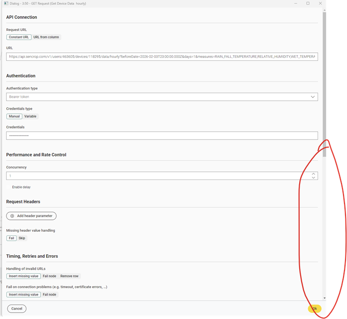
The new KNIME UI dialogue is poorly designed—lots of wasted space and unnecessary scrolling. The old layout was compact and clear; the update makes dialogs harder to use and more tiring.
I am Femke from the UX Team at KNIME. Thanks a lot for taking the time to share this feedback — it’s very helpful for us and I need to say, that I can fully understand the frustration. Let me explain a bit the reasons:
What you’re observing is a side effect of a larger transition that is currently happening in KNIME. Right now our top priority is migrating all nodes from the old configuration dialogs to the new UI framework. As long as both systems exist in parallel, we have to maintain two different technologies, which significantly slows down development and improvements. Because of that, our immediate focus is on completing the migration of nodes first, even if the design is not yet fully optimized in every case.
Another important aspect is that we are not designing each node individually. Instead, we are building a general UI framework for node configuration dialogs. This means we need to develop UI patterns that work across a wide range of nodes — from very simple nodes with only a few settings to complex nodes with many configuration options. Finding the right balance for both cases takes some iteration, and having more nodes migrated helps us better identify which patterns work well and which need improvement.
That said, the current layout is definitely not the final state. As we migrate more nodes and gather feedback like yours, we continuously refine these patterns.
In addition, we are currently working on redesigning many of the basic UI elements (such as input fields and other controls) to make them more compact and space-efficient. You should start seeing some of these improvements appear over the next weeks.
So in short: finishing the migration is the current priority, but improving the compactness and usability of the dialogs is very much on our roadmap, and feedback like yours helps guide those improvements. I hope for your patience and I promise: things will improve step by step.
Thank you @FemkeVegel for the insights, highly appreciated!
I just want to emphasize what @PatrikS said: we are seeing a focus on top to down vs. left to right (as it has been). So please keep in mind, that the dialogs are getting longer and longer and I haven’t seen any tabs in the new dialogs. This is why I just stay with the old UI.
So my wish would be, to keep/introduce tabs with the new UI as well, as I’d say 99% of the users work with KNIME on a Computer monitor and not a mobile phone. And therefore tabs for grouping are much better to work with than long vertical scrolling. Just my 50 cents. Thank you.
Hi @Awiener ,
thanks for your Idea. I agree that the current layout is not good for long and complex dialogs.
Regarding your idea of using tabs: in the classic dialogs we had several nodes where settings were dependent across tabs (for example, changing a setting in Tab A could affect options shown in Tab B). Was that ever an issue for you?
Also, how would you define what should go into a tab? Would you expect the structure to be exactly the same as in the classic dialogs, or would you organize things differently?
More generally, is there something you currently like about the embedded MUI dialogs?
And one more thought: could you imagine a hybrid approach where each node has a small embedded configuration dialog, but also allows opening a full-screen dialog through an interaction (for example, double-clicking the node or clicking a button on it)?
I’m glad you brought up accessibility, something that is often forgotten. And I actually have some good news on that front:
With the redesigned UI elements, accessibility was one of the topics we explicitly addressed. The new components will include proper focus states, improved color contrast, and more compact typography and UI elements. Accessibility has been considered from the beginning as part of the design process.
We’ve put quite a bit of work into this over the past year, and I’m really looking forward to seeing these improvements appear in the product soonish.
thats difficult to believe if you see the expression node, endless scrollbars, selection boxes being way to short, slim or hiding content overall.
people always thing they need to reinvent the wheel. Guess its hard to imagine that the previous “framework” for the ui that eclipse provided didnt already went through design and accessibility cycles. Re-inventing something throws away all the progress and knowledge that went into it in the past.
the best joke I encountered today: now all nodes contain an “show advanced options” button.
after clicking that, I can scroll up again and look / search where an option might have become visible or added. advanced options arent grouped but in their sections (which makes sense), but they arent highlighted (e.g. at least until I close the node configuration once) or standing out.
why not give me a setting in the preferences to have the advanced settings shown all the time?
why not give me an option to have the toggle on top instead of at the bottom?
Firstly, to be clear — these are my personal opinions and they don’t matter nearly as much as yours.
Like @FemkeVegel, I also like seeing honest feedback, even brutally honest feedback, and the only way we can solve user experience issues is to get real feedback from real users. Thank you for sharing your thoughts and I hope one day soon you feel that the new UI was worth all of the intermediate iterations. Although I personally haven’t switched back to “KNIME Classic” in quite some time, I do hope we continue to support the tried-and-true UI until most (ideally all) users feel that there’s no reason to switch back.
As a long-time KNIME user who works at KNIME now (I’m not a UI designer… 5+ years mostly working on KNIME Hub infrastructure under the hood!), I agree with some of the concerns here. There’s probably too much whitespace in the node dialogs and the Show advanced settings button would ideally be optional or removed. Bringing back some form of tabs is an interesting idea in my opinion.
Whitespace in particular is something I’m personally sensitive to. One small victory I was happy about was getting the header bar shrunk down in height (see below, it was 2x taller in early versions of the new UI) to allow more room for the canvas.
In the new node dialogs I agree there’s a bit too much space between items. That being said, I was personally very excited to see a dedicated panel for node dialogs so that I didn’t have to constantly open/close modal dialogs.
Overall, I think we’ve had a large number of improvements between the two versions. I personally love the hover controls on nodes and dragging from node ports to add more nodes (in either direction) or clicking Ctrl + . to quickly add a node.
Your feedback is valid, appreciated, and heard. Thank you for sharing it.
I expect 90% of the people working with Knime do so from a monitor that is WIDEnotTALL. there is literally zero justification to design elements that reverse that ratio, especially if you consider that workflows are also primarily designed left to right.
If you flip the whole concept to Microslops Power Automate approach of Top to Bottom, then surely, your new ui concept makes more sense. at the same time people will start pivoting their screens and have to ask laptop manufactures to come with laptops featuring vertical keyboards and screens
I find this conversation pretty interesting! The good news for me is that I see that KNIME reacts to this and seems to take user input seriously, to also embrace it for future improvements.
The one thing that I don’t like, to be very honest here, is that the elephant in the room is not addressed. From what I can see, this change to a new UI is not only driven by having it look more modern, but rather by making KNIME completely available in a web browser, which might be a feature of your premium product, the KNIME Business Hub. I would have loved to be honest and hear this as one of the reasons as well.
I’m not complaining here about anything so far. It worked well for me. Although I must say the way the new user interface deals with flow variables is subpar. That’s at least the thing that most annoys me, and I totally get it. You can make this great tool available because you’re also selling a premium product. Wonderful! Great! I love this model because it enables me to do things I never thought possible before, in a corporate environment, and now, with the new plan options, also maybe even in a not so corporate environment. Things like data apps and fully automated schedules become available to nearly everyone, so I definitely think that you should follow this route.
All I’m saying is I would have preferred if you somehow had mentioned that, because I think that is the underlying strategic move why you’re moving into the new user interface, or isn’t it?
Things like data apps and fully automated schedules become available to nearly everyone, so I definitely think that you should follow this route.
I personally agree; making it feasible for small businesses and individuals to use features previously only available to companies who had the resources & infrastructure to install KNIME Server or KNIME Business Hub is something I have been excited about for years. However, of course I care about all users (paid or not) and I’m very proud to work at an organization that does have a truly free & open source product in our stack that doesn’t paywall users at the earliest opportunity.
Someone else like @christian.birkhold could respond far more accurately about the strategy behind why the UI migration is happening; I’m not directly involved in any of those product decisions. My main role here at KNIME is to be a Kubernetes/CloudOps/DevOps nerd and I was only sharing my personal thoughts. Nobody asked me to reply to this thread and I don’t speak for KNIME as a whole so please don’t consider anything I say to be “an official response” whatsoever. I just happened to see this thread and chimed in with my two cents.
I know we’ve made a lot of improvements to KNIME Hub & KNIME Business Hub, in fact it’s been my life’s work for half a decade now, so I can see where you’re coming from. I believe one important motivation for the UI migration I didn’t see mentioned in this thread is that a lot of new users who are not seasoned pros might find a simpler UI and browser-based editor easier to work with (not web tech embedded in desktop software like what we’re discussing here, but truly browser-based like in Google Chrome or similar). For this we would need to move to web technology and replace a lot of Eclipse-isms (such as modal windows) in order to achieve browser compatibility. Although “KNIME Classic” is something many people in this thread know well and are comfortable with, when I first joined KNIME, I saw fairly common feedback from new users that the software was too complicated or hard to learn. If I’m not mistaken (I hope someone corrects me if I’m wrong), the browser editor, increased whitespace, simpler controls, and suppression of advanced settings were intended at least in part to make the overall UI less intimidating for new users. I’m sure that Femke and everyone else on the design team care quite a lot about making KNIME as functional as possible for users of all experience levels though, so thank you again for all of the feedback.
it is kind of nice, but also frustrating (because the issue is only growing) to see that this is still a topic.
A while ago, I already posted about this topic: Feedback: knime Evolution , UI&UX
Nothing has changed…or to be accurate, lots of things have changed, but not in the desired direction.
One more thing to add:
Why does it sometimes take like 1-2 seconds for the new desgin dialogs to open..let’s say column filter when the old ones were open in milliseconds?
Another thing that eats away at user experience.
Hello,
Wow, I can hardly keep up with translating and reading everything. Thank you all very much for your feedback. It seems that the dialogue described at the beginning still has errors. I have created a new post.