Heyhey.
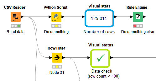
While working with Knime workflows, already for some time I have thought that it would be really nice to have some visual cues for no-click status info on the data in workflow. Starting from a basic rowcount, then maybe even a little table or, even, tiny chart. Something like this, just less ugly ![]()

Something like this?
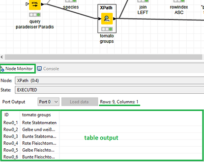
The node monitor shows the row and column count, table output, execution state.
Charts probably cost too much performance, everything else is already there ![]()
Close, but better ![]()
I sort of hate this table preview option, because
- it is slow (at least it was, on big tables, v4.3)
- it is buggy (sometimes it works, sometimes it doesn’t, it has problems with metanodes)
- it shows too much info
- it takes up space in the workflow design area
- I still have to click on nodes to see info
- It shows just dumb data
Yeah, I don’t use it as well. That screen estate is taken up by the Console in my case.
For output inspection I rebound the hotkey to open the first table output to the spacebar. That way I can open and close the output table with my left hand.
That probably doesn’t really fit your need, so can you elaborate a bit more what you’re imagining? If I had to guess I’d say you’re suggesting nodes with dynamic icons?
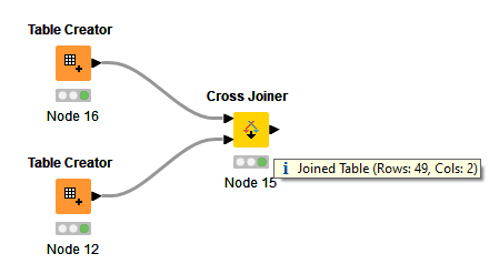
If you want row/column counts at a glance, you can hover over an output port

Thanks, that I know that hovering over node output I can see number. But I have to go there, put cursor over that tiny triangle (lot of people are zooming out their large workflows, too), and also it is just number, while a bit more advanced status visual would allow much more - an easily perceptible status overview, possible problem indicators, etc. The functional diagrams in form of Knime workflows are cool and beautiful, however my feeling was that nodes appearance possibly can be more helpful than just traffic light of execution status. ![]()
@Thyme Yes, Shift+F6 is useful, one of my best friends in Knime UI ![]()
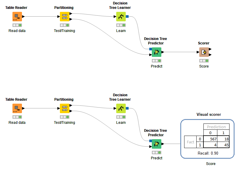
Yes, my idea is dynamic objects that, connected into workflow like nodes, would show useful information that is immediately visible. They would also - if needed - go outside node standard side constraints, to make information more standing out.
Imagine a machine learning workflow, where, instead of need to look into scorer node each time after adjusting and retraining, you would have a little confusion matrix table with chosen metric right there, after the predictor node!
You could make a component that takes the Predictor output and creates a table/image at the output. Open that component output, move the window to a separate screen and don’t close it. The data will update upon re-execution.
Ah, that’s a clumsy workaround. ![]() Anyways, this forum topic is for ideas, right? Not looking for workaround here.
Anyways, this forum topic is for ideas, right? Not looking for workaround here. ![]()
Yes, and it’s not my intention to deflect your contributions. However, if I can show you parts of KNIME that you might not be aware of, I’ll do it, in the hopes of helping you at least in some way. One could say I’m acting as the devil’s advocate here ![]()
Thank you very much for being helpful. ![]() Will let you know the very moment you show me parts of KNIME I am not aware of
Will let you know the very moment you show me parts of KNIME I am not aware of ![]()
![]()

